Output's brand identity for tax app Pie takes the stress out of money management
London-based design agency Output has today unveiled its brand identity for Pie, a new money management app that takes the stress out of filing taxes. Working with bold colours and clear shapes, the look serves as a suitable companion to Pie's tools and systems.
Created to democratise tax for the masses, Pie gives users everything they need to manage their taxes without anxiety. This is achieved by combining people's available balance with a real-time view of their tax bill, ensuring that they aren't given a nasty surprise by a hefty sum at the end of the financial year.
It's a clever response to a sector fraught with confusion. With most people finding tax boring at best and stressful at worst, Pie offers a practical solution. And with 12 million employees, freelancers and company owners in the UK all looking to get their finances in order, there's certainly an audience crying out for what Pie has to offer.
Operating out of a single app, Pie inspires people to claim what's rightfully theirs. Armed with this name and vision, its founders turned to Output to bring it to life visually and design the overall look and feel of the product.
Brand Purpose
"Pie came to us for the complete package," says Mark Robbins, brand design director at Output. "A great name, a bold vision and a new product allowed us to tell a compelling story and create a distinct, cohesive experience across the whole Pie ecosystem from day one.
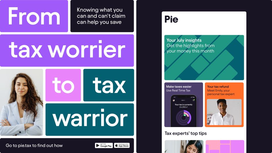
"We gave them a simple design idea with loads of potential: a divisible design language, built from a pie chart, that provides direction for everything from icons to out-of-home campaigns. Foundations for the best start and ideas well into the future. We're super-excited to see where the brand and product go from here."
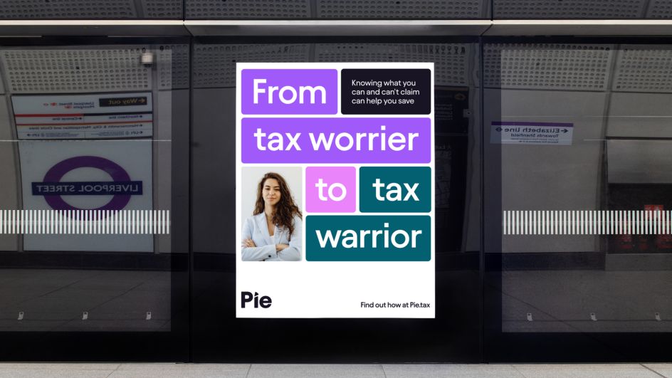
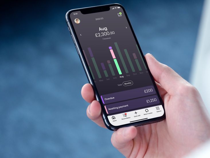
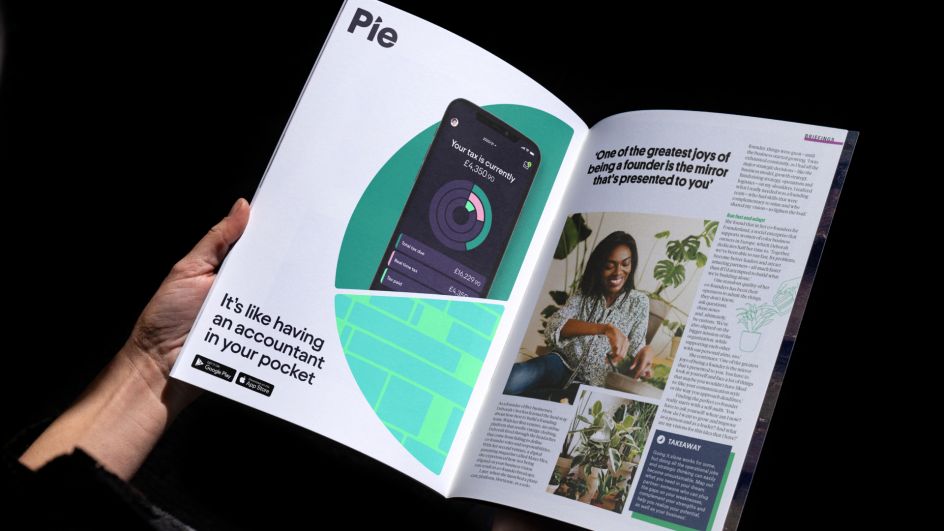
The unifying idea of the pie chart can be found across all elements of the identity, from a subtle slice in the Pie logo to the data readings on the real-time displays. By working with these graphics, Pie has an ownable and flexible visual system encompassing iconography, layouts, components and a digital product language.
Regarding copy, Pie recognised that many people are missing out on money owed to them. So in order to inspire them to take control of their taxes with the help of its tools and knowledge, Pie's proposition is driven by the promise, "It's your money, keep it."
Tools and design language
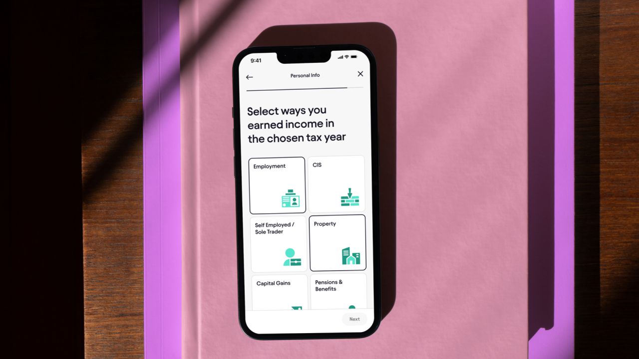
Tools, knowledge and experience are the pride of what Pie has to offer. With relevant information, users will have a clear overview of their situation. This clarity extends not just to Pie's systems but also its design. Icons and graphics are broken down into component parts, extending the theme of knowing exactly what's happening underneath the hood.
The colourful graphics and dynamic motion language also create a rewarding experience for users and encourage them to return to the app. This is crucial as Pie relies on the regular uploading of user data, plus it further takes the stress out of logging in to check on your balance. On top of this, it helps to bring abstract data, such as invoices and expenses, to life more concretely and engagingly.
The overall result is designed with ease in mind. Whether that's by making it easy to sign up to the app, link your bank account or file your first return, Output has created a brand identity which provides genuine use.
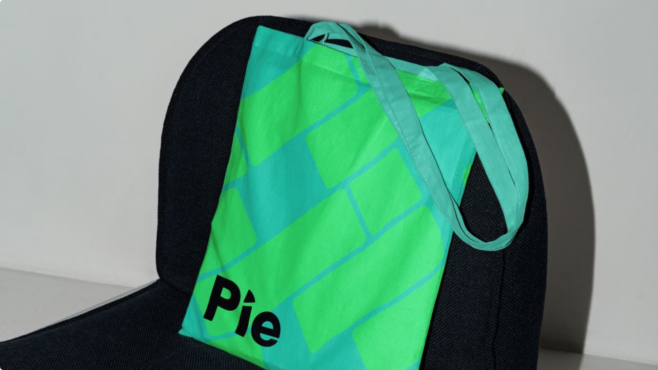
And by providing Pie with a brand book, the company now knows how to develop the brand everywhere, whether by creating in-app experiences, instructive reports or engaging social posts.
"The Pie design language is all about breaking things down into their simplest pieces," says Sam Hodges, digital design director at Output. "This is seen in visual elements that illustrate data, but also the structure of a user journey, like onboarding through the app. The website breaks down how Pie works for different types of careers.
"Every tax situation is different, so giving context is the key to simplifying it. Making tax simple is really just about breaking it down because when people understand it, they feel they can control it. It makes for a useful product, and it's how brands build trust."
Editor's Picks


Trending


Podcasts


Editor's Picks
Further Reading