McDonald's turns its paper bag into a tribute to Norwegian architecture
Sometimes, the simplest ideas are the best. And this paper bag design for McDonald's in Norway, created by Makerie Studio, hits all the right notes.
These day, it seems like we can barely look at the internet, whether we're using our phone, laptop or tablet, without being assaulted with flashy, irritating ads. (This website is, of course, a marked exception.) Sometimes, you wonder why brands bother because surely annoying your potential customers is ultimately counterproductive.
Especially when there are many more pleasant places to place your ads. Few of us, for example, object when we see an advertisement for a new movie on the side of a bus shelter or a poster at the train station. That's largely because, in those situations, we're idling around, and any visual diversion or stimulation is largely welcome.
Often, the same goes when we're eating, especially when we're sat munching on our own.
Some of my happiest childhood memories were reading the content they used to put on the back of the cereal box at the breakfast table. For young people today, that might sound weird, but back in the '70s, there were usually special magazine-like articles, competitions and more surrounding your favourite stuff, from pop bands to TV shows. (You can see some classic examples here).
Now, McDonald's in Norway has delivered a new take on using packaging as a communication mechanism. It's an original and fun idea and has been brilliantly executed.
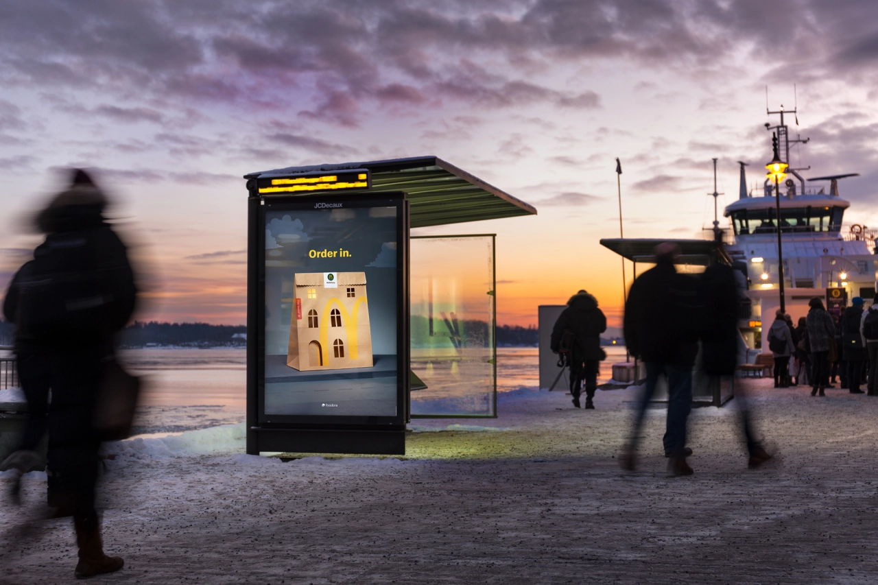
The campaign, led by Nord DDB Oslo , features the classic McDonald's paper bag, hand-cut to resemble classic apartment buildings of Norway. It's a subtle way to reflect that, in the days of delivery apps, we're as likely to enjoy a burger at home as in a fast-food restaurant.
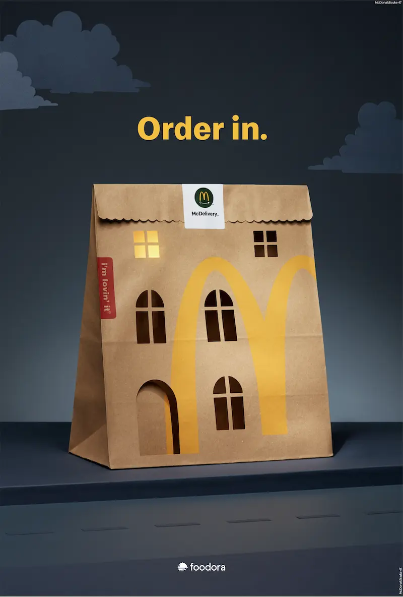
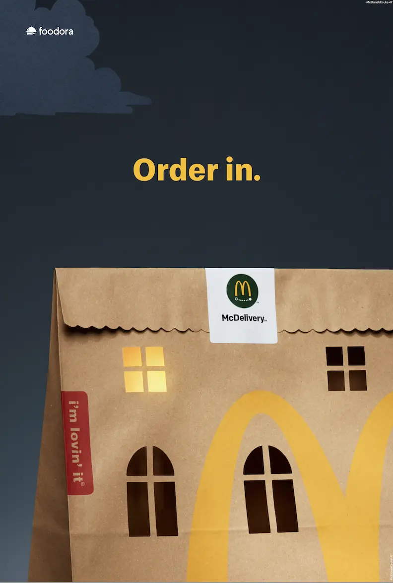
Remarkably, every element in the campaign imagery, including the window light, was created in-camera. Captured by photographer Catharina Caprino, the paper art transformation is the handiwork of a professional paper artist, Julie Wilkinson, from Makerie Studio.
The minimalist ad strikes a delicate balance. "The craft needed to complement the idea without overtaking it," explains Zakarias Nadir, creative at Nord DDB Oslo. "We aimed to maintain the right equilibrium, ensuring the McDelivery bag was recognisable as a building while retaining its iconic appearance," says the creatives behind the campaign.
The campaign will be featured throughout the largest Norwegian cities this winter and on social media.
Editor's Picks





Trending






Latest Jobs
Senior Front End Developer at Crown Creative
Full-time·Belfast·£50k–£60k
Creative Social Content Producer at Bompas & Parr
Contract·London·£32k–£40k
Client Partner at Halo
Full-time·Bristol·£30k–£36k
Design Director at Human After All
Full-time·London·£66k–£88k
Senior Designer at Creative Spark
Full-time·Manchester·£35k-£50k
Midweight Editor at Earworm
Full-time·Bristol·£28k-£32k