Margot Lévêque on her new font foundry, and why she stuck to her guns on the name
Claude Type is nothing to do with AI, but in fact a quiet, deliberate argument that craft and slowness still matter in 2026.
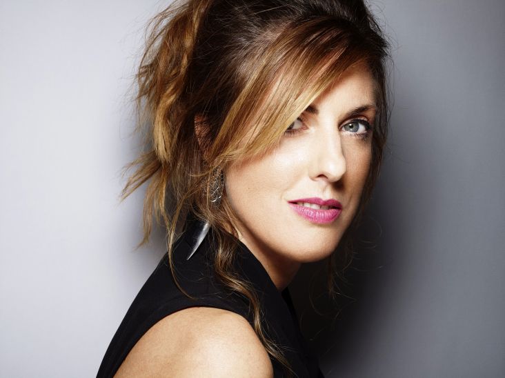
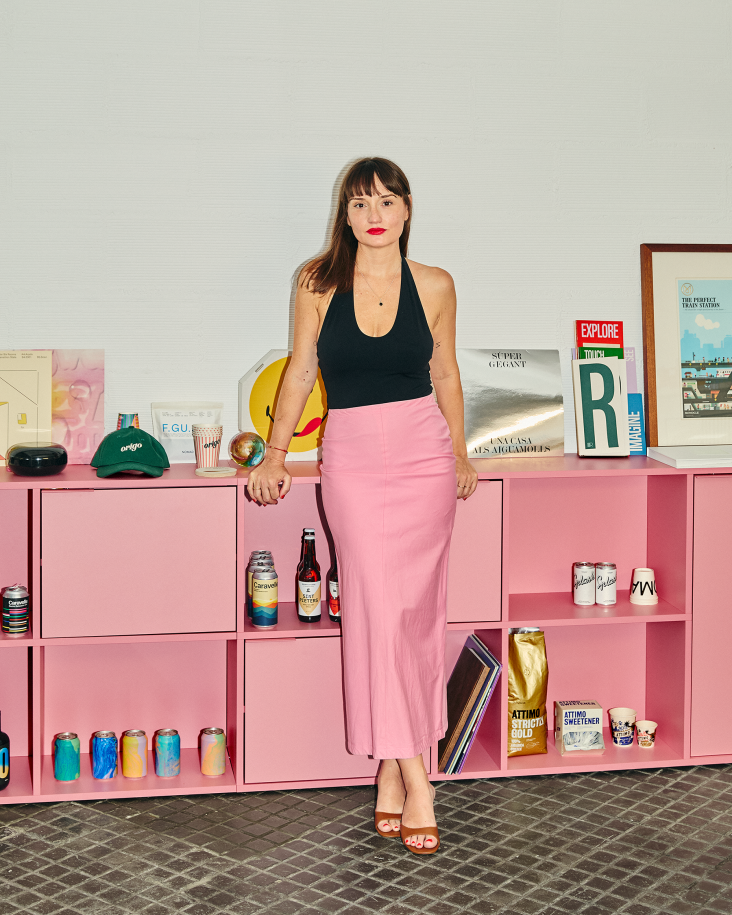
When Margot Lévêque, the French type designer whose client list reads like a Who's Who of cultural institutions (Hermès, Vogue, Prada, A24, Apple, Lemaire), launched Claude Type this January, she'd been quietly building it for three years. She had also, at one point, nearly abandoned the name entirely.
"I wanted to give up more than once," she writes, "especially when Claude AI was released. I even changed the foundry's name for almost a year, but it never felt right. In the end, this tribute was too sincere from day one."
She held on, and the name stayed. Which feels entirely appropriate, because the whole Claude Type project is, in its quiet way, a rebuff to the culture of fast, automated and "good enough". A foundry built not for volume or velocity, but for something closer to its opposite.
What's behind the name?
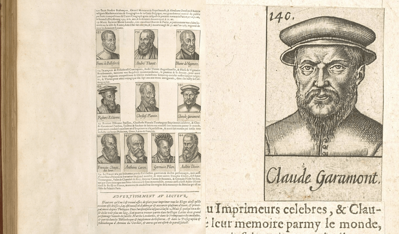
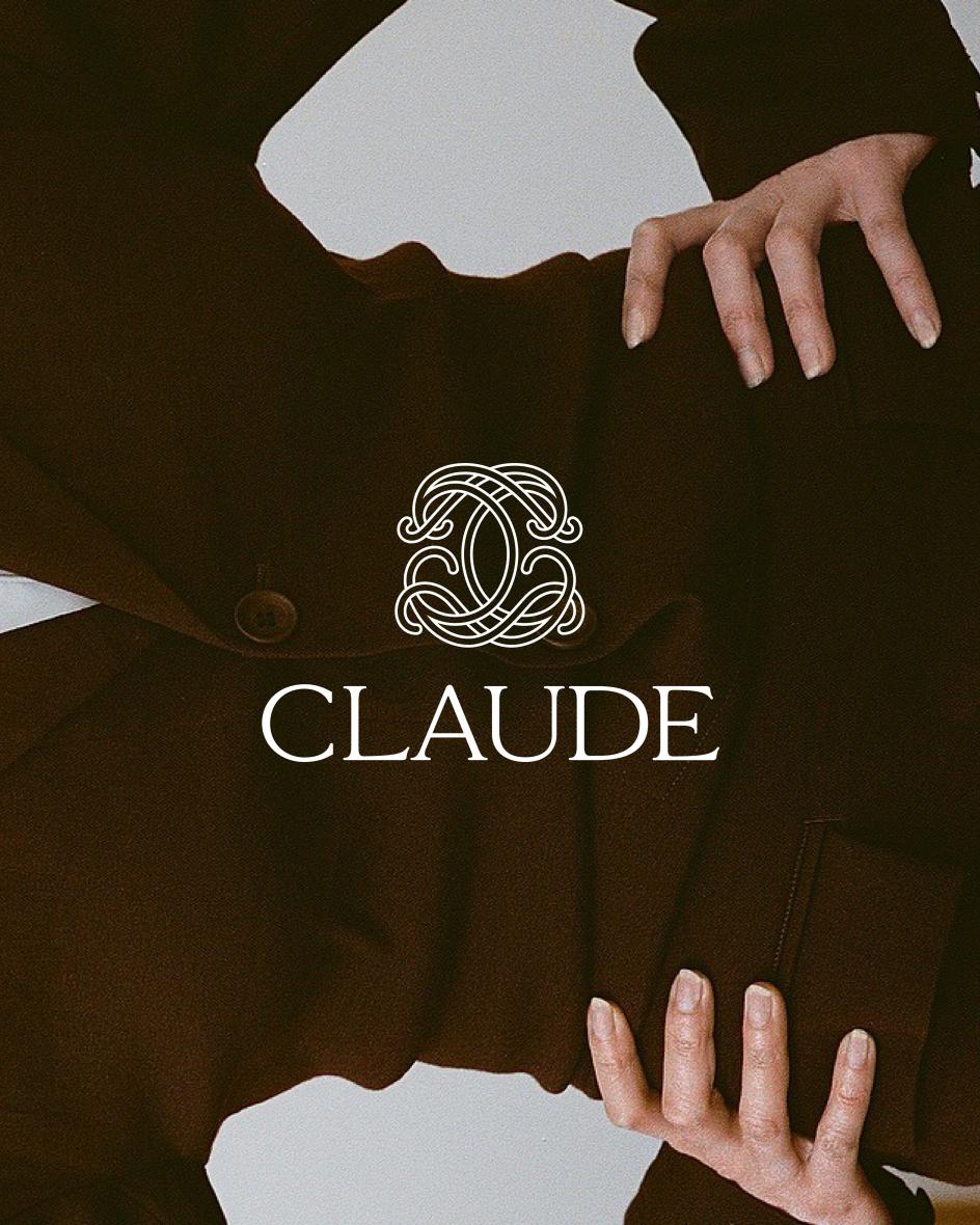
Margot's new font foundry is named after Claude Garamont, the 16th-century French punchcutter widely regarded as one of the great renovators of typography, but that's not quite the whole story. "Claude is also a tribute to Claudine, my grandmother," she reveals. "She was the person who quietly taught me what elegance means—a certain kind of chic, an old French sensibility, timeless and subtle—that's stayed with me ever since."
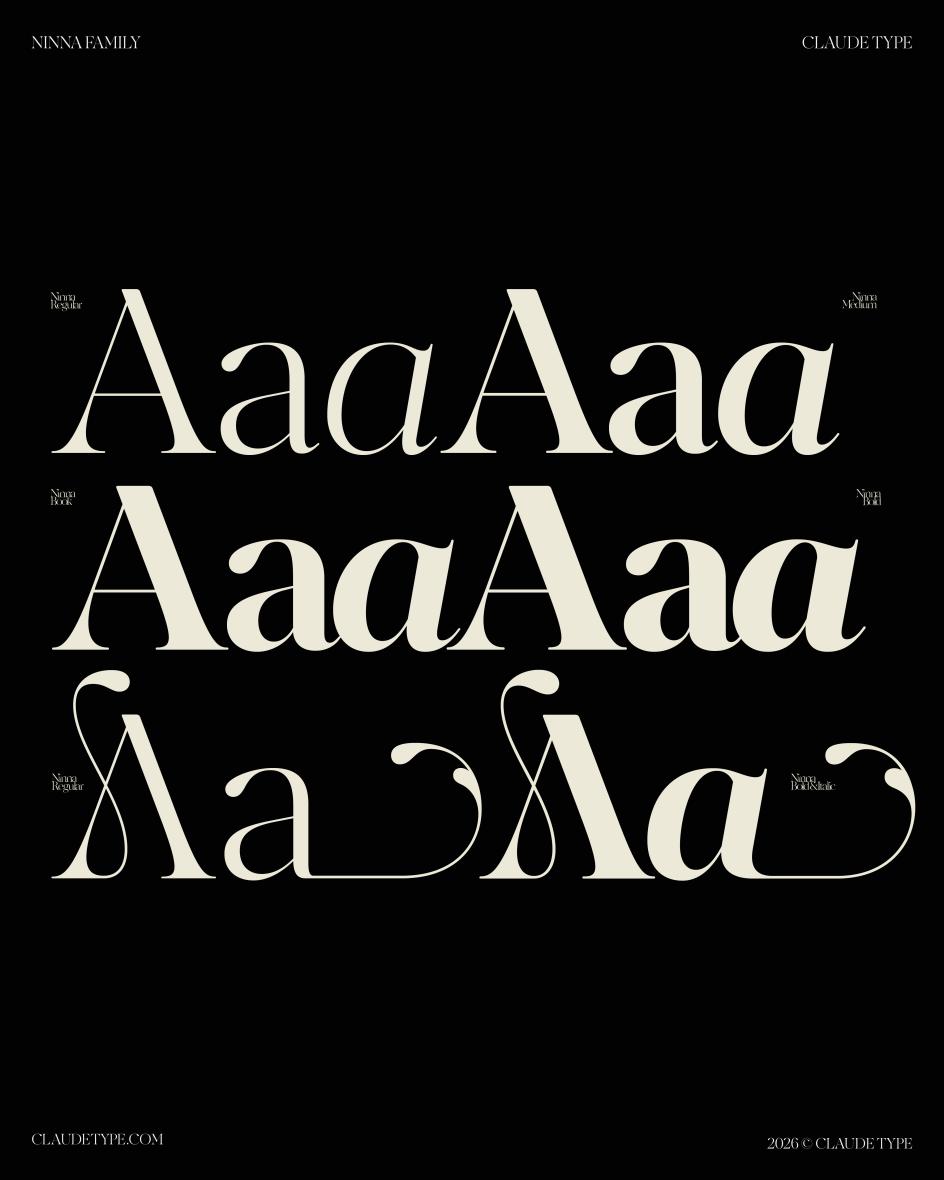
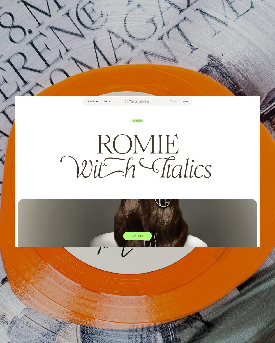
The dual tribute tells you a great deal about how Margot thinks. She moves between the historical and the personal, the monumental and the intimate, and finds the distance between them smaller than you might expect. "As a student, I kept coming back to Garamond again and again, but over time it started to feel a little too distant," she recalls. "I felt the need to get closer, to touch that heritage and gently shape it, to let my own voice exist within it: that's why I created Romie."
This headline font, which became the seed of the foundry, took seven years to develop. Her other typefaces, Kalice and Ninna, took between three and four years each. For Margot, this is not a source of embarrassment but a point of principle. "Slowness, for me, is not a constraint. It is the work."
The couture model
Margot has worked as an art director at Louis Vuitton in Paris and at Pentagram with Paula Scher, which gives her a particular vantage point on the relationship between type and the broader creative world. Claude Type is conceived explicitly as a couture atelier, not a traditional catalogue: "a place where each typeface is made slowly, with time and intention, the way a dress is cut before it is ever worn".
"It is the first space that truly feels like me," she writes. "A reflection of a vision I have carried for a long time, that typography deserves to stand beside fashion, photography and art, with the same visibility and the same respect."
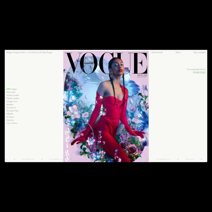
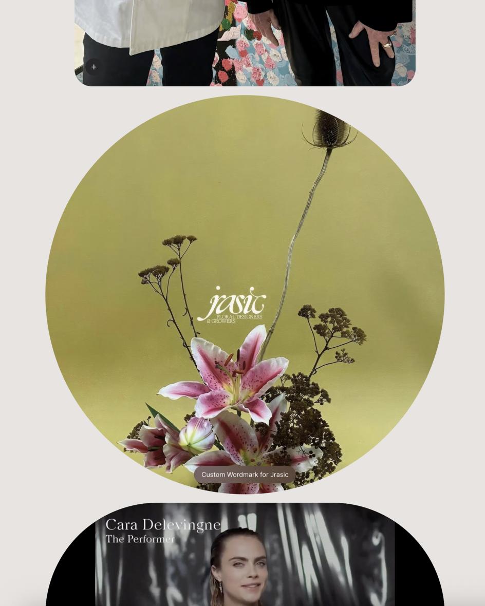
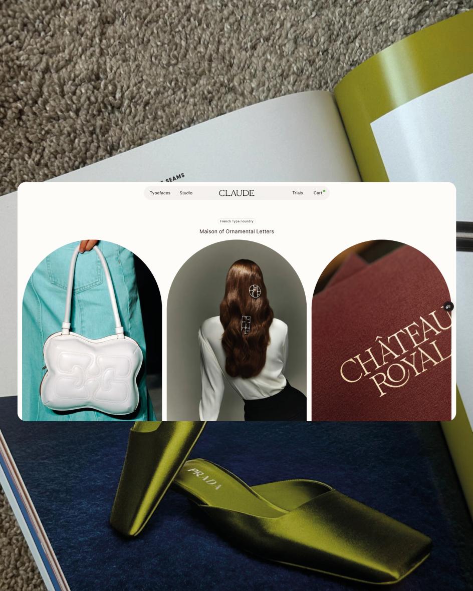
The entrancing website, shaped with International Magic and developed by 27Bureau, further reflects that ambition. It's not a font catalogue so much as a maison: spare, considered and quietly confident in a way that louder things rarely manage.
The personal made professional
For all its elegance, Claude Type also emerges from something more raw and practical. For years, Margot sold her typefaces under her own name, a decision that made the work feel uncomfortably exposed. "Creating Claude Type was a way of taking a step back, letting the typefaces take centre stage, while giving myself room to breathe."
"Over the years, I received many requests from established type foundries to distribute my fonts," she adds. "But deep down, I always wanted to carve out my own small space in this vast world of typography: a quiet place, with no oversized catalogue, where typefaces are designed with time, care and intention, like the ateliers of couture houses, where artisans spend years crafting a single dress."
There's something refreshingly unromantic about this bit of the story. The foundry Margot always imagined was only possible because she spent years doing the work that paid the bills, and was rigorous enough about reinvesting those earnings that she eventually had the freedom to build something that looked nothing like what already existed.
Key takeaway
That last point is probably the most useful takeaway for creatives here. Claude Type was not built because the market needed another font shop. It was built because Margot needed a place that reflected how she actually sees the world—one that did not yet exist—and she spent years, and considerable money she'd earned doing other things, making that place real.
In a creative landscape where the pressure to ship, scale and automate has never been more intense, there's something inspiring about that approach. The foundry is the long-form argument. Seven years on a typeface is the methodology. And holding on to the name, even when an AI tried to claim it, is the ending the story deserved.
Sometimes the most important thing you can do is take your time.

Editor's Picks


Trending


Podcasts

Editor's Picks
Further Reading