Margot Lévêque launches her new foundry with four type families to choose from
For renowned type designer Margot Lévêque, work and self-care have always gone hand in hand. With the launch of her new foundry, she wants to reduce the mental load that comes with being one of the most prominent typographers working today and focus on learning and having fun.
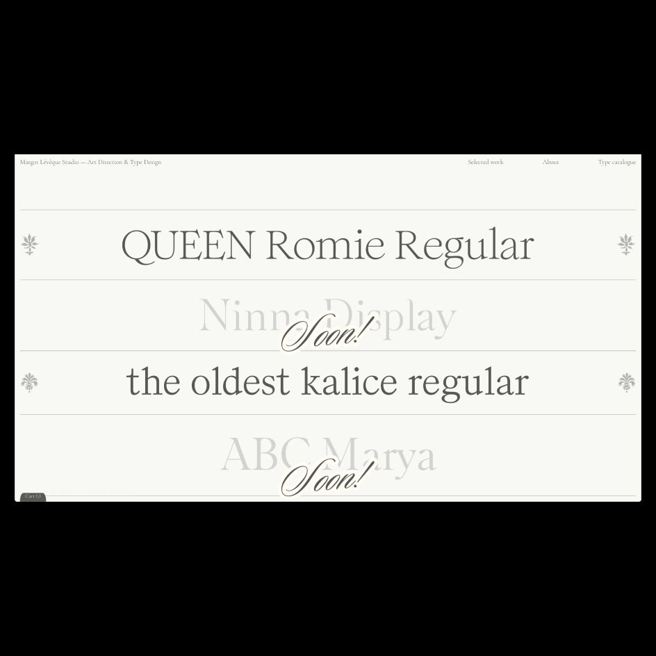
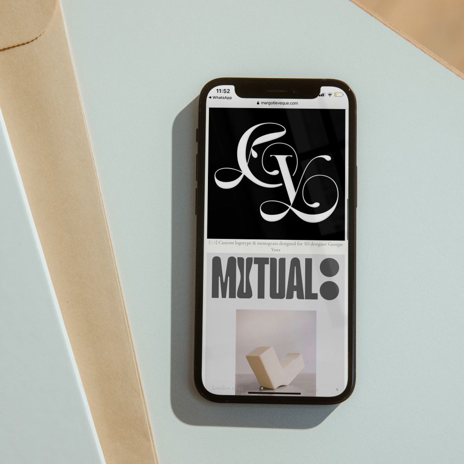
Unveiled at the same time as her resigned website, the Margot Lévêque type catalogue includes four typefaces spanning different stages of her career. Long-time fans of Margot will recognise Romie, which appeared in the book The New Black Vanguard designed by Mark Owens. Her first typeface, Kalice, is also currently available and will be shortly followed by the New York-inspired Ninna, Marya, and Romie 2.0.
Redoing her website and launching a foundry have been ongoing ambitions for Margot, but a recent hack that left her untraceable for two months confirmed that the time was right for an upgrade. Not one to rush her creations, instead preferring to take the time to make work she's completely satisfied with, Margot embarked on this project with characteristic thoroughness. "I decided to do it right: accountant, lawyers, web designer: I didn't want to have any problem, and I wanted to be well surrounded," she tells Creative Boom.

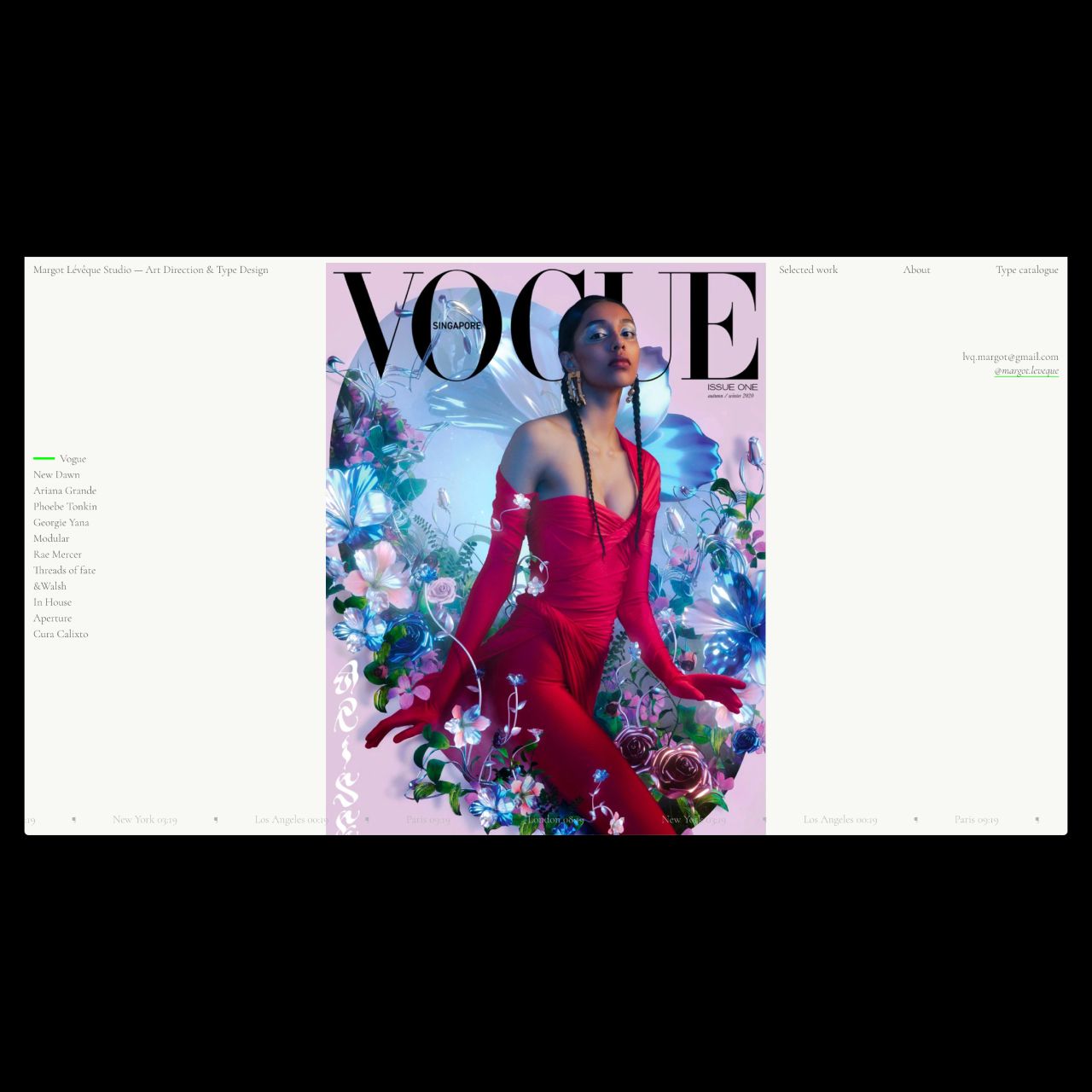
Created in collaboration with coder Carlos Mayo, Margot's new website stays true to her design vision and is a worthy showcase of her work. And the inclusion of her foundry is a big step in terms of Margot's career, but not necessarily for the reasons you would expect.
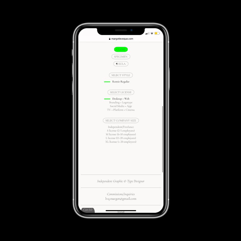
"Before, I used to sell all my fonts by email!" she explains. "To be honest, I also decided to create this foundry to take the mental load off. I receive between 10 and 20 emails a day asking me for information, trials, licenses... Not to mention my professional emails for my freelance work; it was starting to be too many emails. Sometimes I spent the whole day answering emails. As you can imagine, it was time for me to automate it all!"
I'm not really a foundry, but rather a person who is still learning typography, having fun.
In terms of the challenges involved with pulling together the various typefaces, Margot points out that designing the typeface is actually the easier part. "Then, you have to master it, do all the settings, kerning, and do the whole production part," she says. "Finally, there is the commercial part: licensing, how to protect your work, and what rate to apply. For the prices, I called a lawyer and an accountant. It was too hard for me to put prices that did not make sense."

Despite being an undoubtedly important step in her design career, Margot isn't getting carried away or setting her sights on a particular goal. Her main focus, as always, is the handful of typefaces in her foundry. She adds: "I like the idea of my tiny little typographic catalogue improving, maturing, taking its time. I'm not really a foundry, but rather a person who is still learning typography, having fun, and offering a service. It looks like me; I'm still learning every day."
And of the typefaces available, does Margot have a favourite? "I can't choose! ALL OF THEM! But it's true that I have more emotions when I think back to the first one: Romie. Discovering The New Black Vanguard at Strand Book in New York City, while I was walking down the street, was one of the most important moments of my life. It's one of the reasons why I continued to draw typefaces."
Editor's Picks


Trending


](https://www.creativeboom.com/upload/articles/90/908fdb6378db1e95d12595416f54e6336d5e80b8_732.jpg)
Podcasts


Editor's Picks
Further Reading