'We can be successful without working 12 hours a day': Margot Lévêque on her fearless practice, unfinished projects and self-care
Totally prolific, outrageously optimistic and typographically preeminent, the Parisian practice of type designer Margot Lévêque is one unlike any other: day to day bouncing from the fashion industry's leading brands to the music platform of the world's largest technology company – all whilst finding the time and contentment for self-betterment.
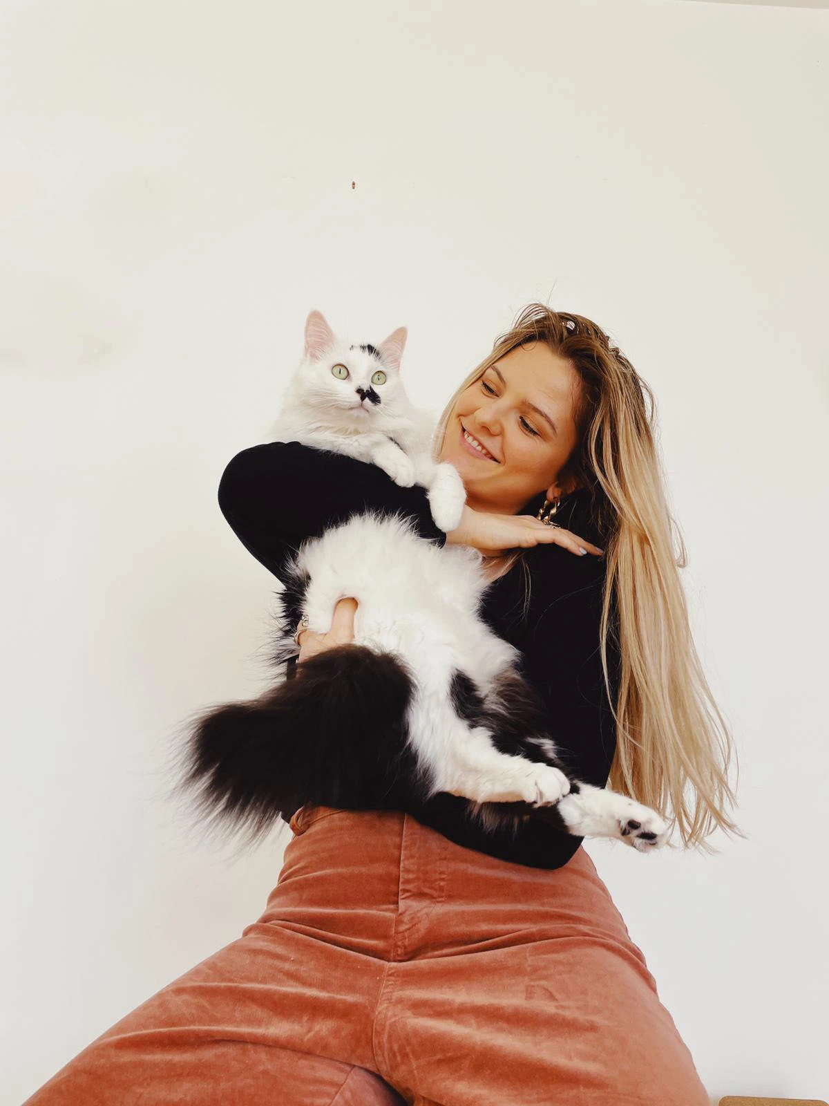
Alongside her cat Panpan – named after Pantone – Margot has independently forged a creative path that suits her, balancing delicacy and audacity within her uncompromising, fearless practice; resulting in some of the most beautiful typographic forms in design today.
Nothing short of extraordinary, Margot's masterful practice is not only grounded in a historical and contextual understanding of typography but driven by conceptual thought, unrivalled passion and the ability to surprise – marking her as a paragon of the contemporary design scene. We've had the opportunity to speak to Margot about what she wants to see more and less of in the typographic industry, the significance of personal projects and the necessity for self-care.
Hey Margot! How are you doing?
Hello Harry! I'm doing great, thanks for asking. How're things? Thanks for reaching out! I don't have time to do many interviews anymore, but for Creative Boom, of course, I said yes!
For the Creative Boom audience who don't know you, what's your story? How did you get to where you are now?
I'm a French art director and type designer currently based in Paris – but it's true that during the Covid-19 pandemic, I was not really in Paris but in the countryside! I did a bachelor degree in graphic design followed by a Masters degree in type design. After my studies, I went to New York to work at Pentagram with Paula Scher.
I like to say that I'm currently working 60% for clients/studios around the world, 20% on my own type foundry and 20% on myself (yoga practice, journaling, meditation). These last 20% are the backbone of the other two!
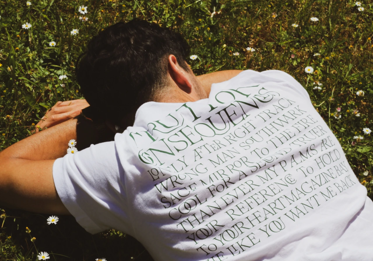
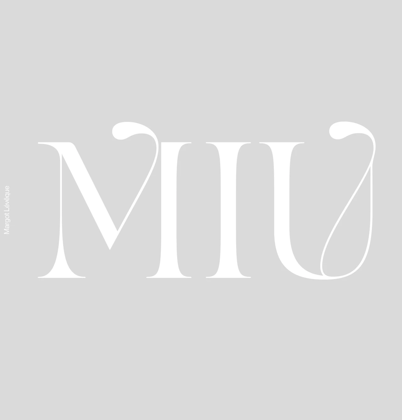
Your personal projects seem to be quite significant in your practice, such as your 'In House' series, which we always love watching! How did this come about? Why is it important to you?
Personal projects are the only things that made up my portfolio. I'm lucky, I've been super busy – however, I'm often under NDA, so I can't show anything. Personal projects are the only way for me to keep visibility. For me, social media is the new way to say, "cuckoo, I'm here!"
For five years at school, I only did personal projects. It wasn't paid, but I gave all my heart to create something I really liked because I had only one thing in mind: building a solid portfolio. Now, I'm doing exactly the same, but it's paid! What a cool life!
Above all, personal projects are the only moment where I feel free: without constraints, without limits. It seems obvious to me to keep this way of the process. Without personal projects, I wouldn't be noticed as much!
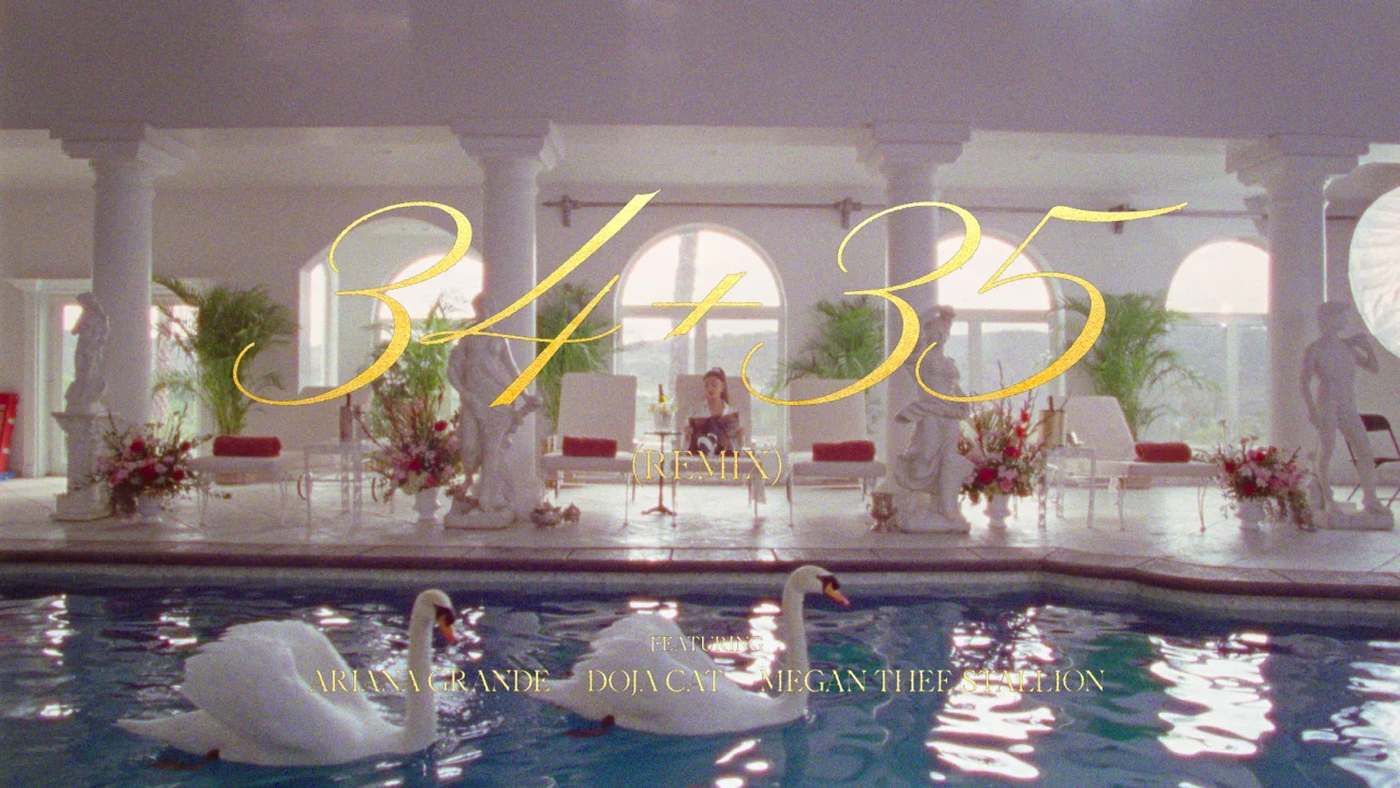
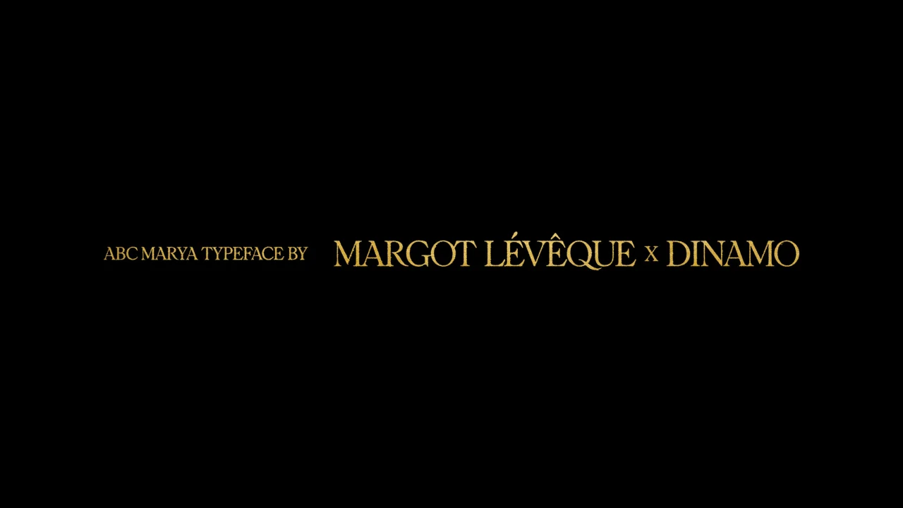
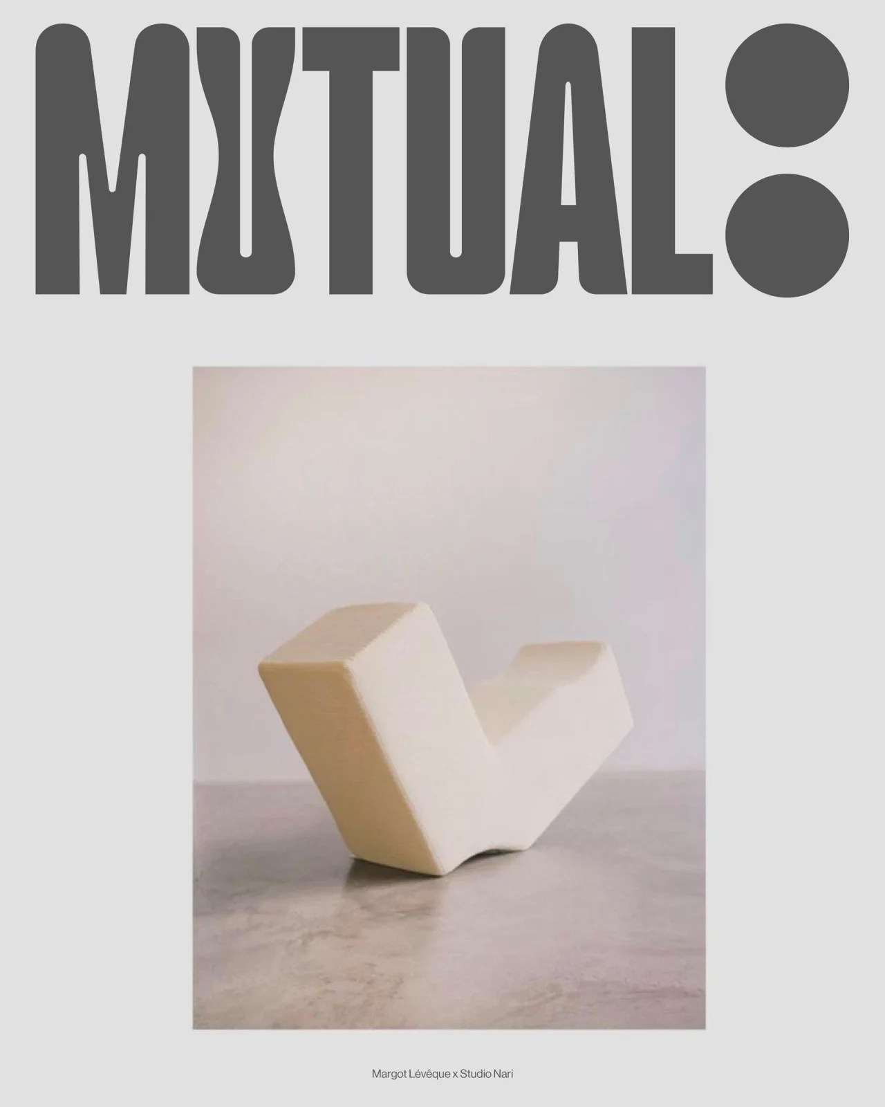
The work you do with studios like Nari is absolutely prolific. What is your process for working with a studio, and does the process differ when it comes to working solo?
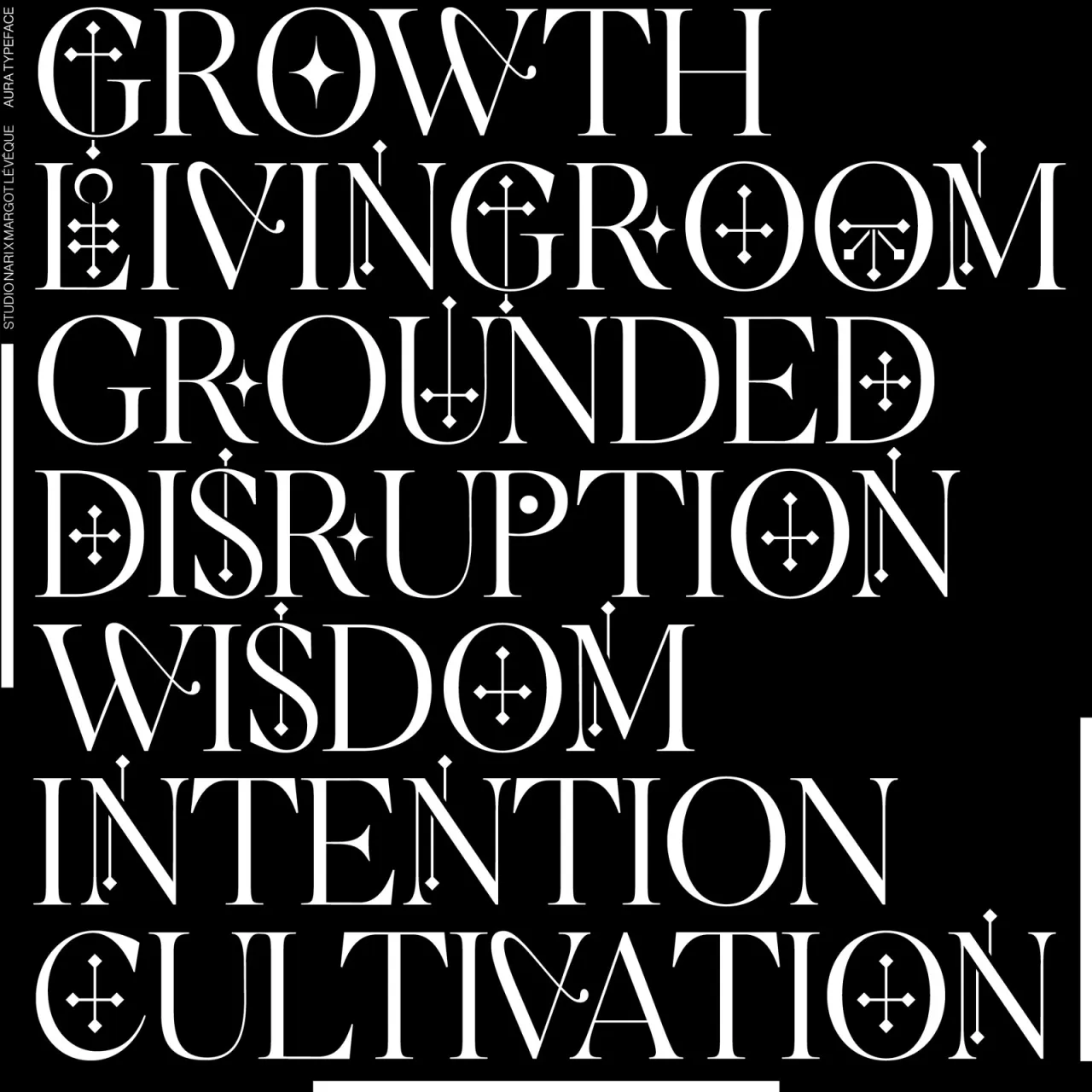
I'm grateful to work with Caterina. She contacted me more than a year ago, and she never let me go. With Studio Nari, everything is always super friendly and great. The communication with Caterina is fluid; we understand each other right away. She sends me a mood board, then I manage (I think!) to understand what she wants very quickly. I guess she is happy with me, so she calls me back often… Well, you'd have to ask her to confirm this.
Of course, it's different because when I work with studios or agencies, they send me their inspirations and a specific brief. Luckily, they often send me a mood board with my work in it – easy! I know exactly what they want.
For years I've had a special knack for sending presentations – I ask myself: am I super proud of what I'm sending? If the answer is no, I keep working. I give as much to the studios as I do to my own work.
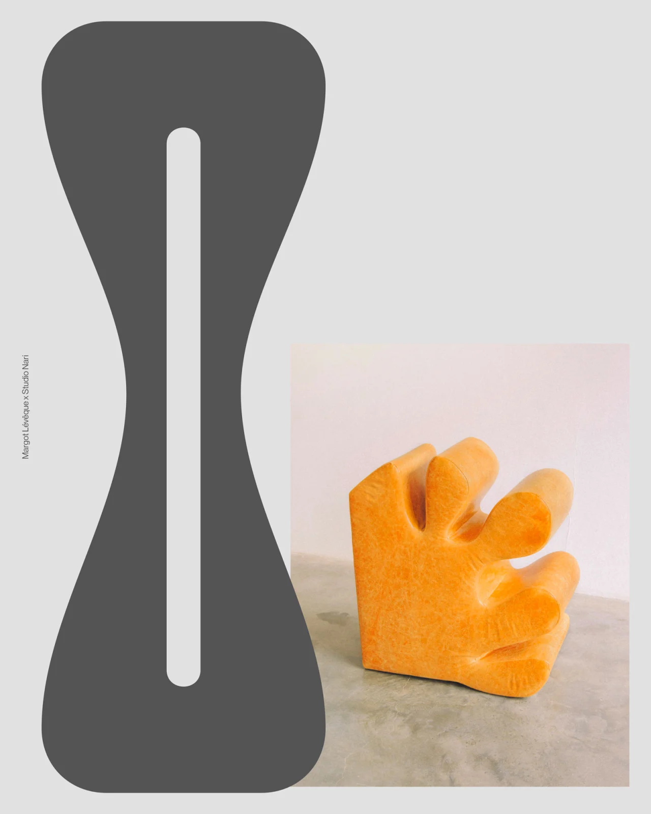
It's super interesting to see your unused sketches for Nike Legacy; how important is it to highlight un-used and rejected work?
I've been doing this for years now. That's how I managed to get a lot of visibility on Instagram: by posting my work in progress. I'm lucky; I'm very comfortable with imperfection because, in our field, it's all about 'tastes and colours'. For some people, these sketches may seem like finished logos, and for others, they may seem like awful logos! Concerning my fonts, it's the same. I think design is so subjective that, although there are rules – you never know when a typeface is considered finished. I feel very comfortable posting finished or unfinished projects. As long as I'm happy with what I've created, that's all that matters.
There is so much work and so much time that goes into type design – it must be such a long process before you get to share and release the final finished product. Do you find this exciting or frustrating?
No, because as I said above, I start posting and showing my drafts even when I'm still in stage 1. I never reveal my fonts at the end when it's ready to be released. I also think that's the reason why it motivates me to finish them. Because, yeah, it's really time-consuming.
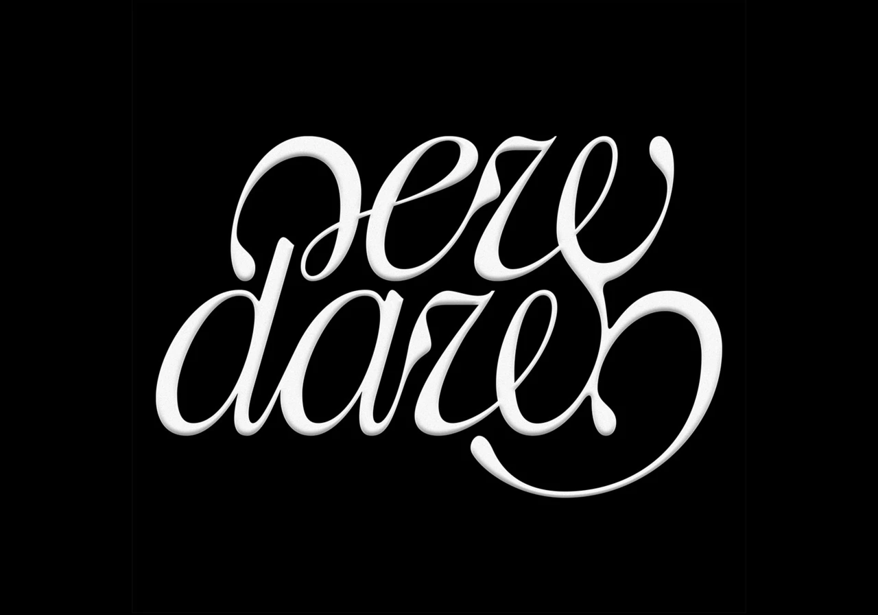
To be honest, the process is so exciting that I don't find it frustrating. I refused many requests from foundries to sell my types (except Dinamo because they offered me something that suited me well, and I am a fan of their work) because I want to take the time to learn at my own pace. If you're in a hurry to get a font out, I don't think that sends a good signal. There is so much to learn. After four years of type, I am still a beginner!
You've been so busy! What are a few of the highlights from recent work?
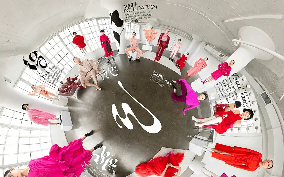
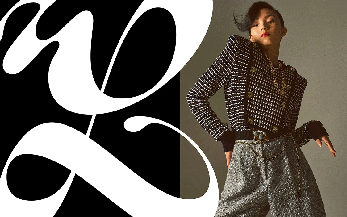
2021 is a special year, with a lot of work behind the scenes. Many projects are in progress, but I can talk about anything. All my clients (Louis Vuitton, Prada, Apple Music, A24…) made me sign an NDA. I show on the internet 10% of what I really do; it's crazy! In the beginning, I found this frustrating, but then I took a step back, and I realised how lucky I was that I didn't have to canvas any studios. I'm proud to say that I'm busy and that I found my way. I wish everyone could be at peace in their work like I am today.
I think I found a good balance in my own life: I'm an independent, and also a human being! For this reason, I can't be efficient 24 hours a day, seven days a week! That's why several months ago, I started hiring freelancers. People don't necessarily know, but it allows me to take days off and also work alone anymore – which is so cool. I love to say that my life mission is to show that we can be successful without working 12 hours a day. Life is short!
What do you find most rewarding about your practice?
I love this question, but I'm having trouble finding the inspiration to answer it... The thing that makes me happiest is the feedback from my clients. I'm really happy to get positive feedback from what I create; I'm proud to have clients who trust me and to be paid super well.
What do you want to see more and less of in the typographic industry?
Less: I would say less plagiarism (can I still dream?), but I know it's part of the game. I admit I had some very bad experiences; I felt like someone was stealing a part of me. Now, after having overcome a dozen plagiarism, I learned to live it differently. It's better to be inspiring than inspired!
More: type!
Finally, what question do you wish I asked you? And what is the answer?
"What would you change about your life now?" I would answer, nothing at all.
Editor's Picks





Trending




Latest Jobs
Growth and Client Development Director at 3800
Part-time·Sheffield·£60k-80k
Talent Agent & Producer at The Jacky Winter Group
Full-time·Los Angeles·$70k-$85k
Account Director at How&How
Full-time·London·£73k-£79k
Brand Copywriter at Origin
Full-time·Porthleven, Cornwall·£35k–£40k
Senior Designer at Creative Spark
Full-time·Manchester·£35k-£50k
Senior Creative Lead at Random Studio
Full-time·Amsterdam / Paris·€90k-€110k