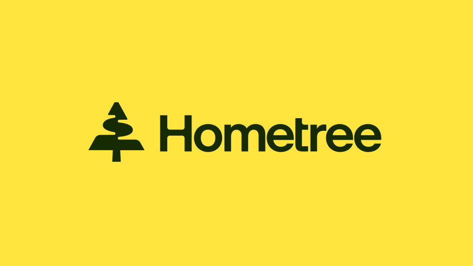
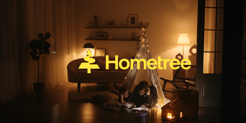
How&How makes net zero less daunting with colourful Hometree rebrand
Branding agency How&How has made the prospect of achieving net zero less intimidating with its latest rebrand for energy services provider Hometree. Brought to life with refreshing colours and slick UI, the new identity repositions the company as the ultimate 'Transition Companion'.
Whether due to the spiralling costs or the environmental impact, everyone is keeping a keen eye on their energy usage of late. In fact, throughout a lifetime, heating is the biggest contributor to a person's carbon footprint, prompting people to wonder how to curb their emissions.
While most individuals are all too aware of the damage that excessive greenhouse gasses can inflict on the climate, the solutions can seem frustratingly vague or out of reach. People want to do their bit to get as close to net zero as possible, but how? That's where Hometree comes in.
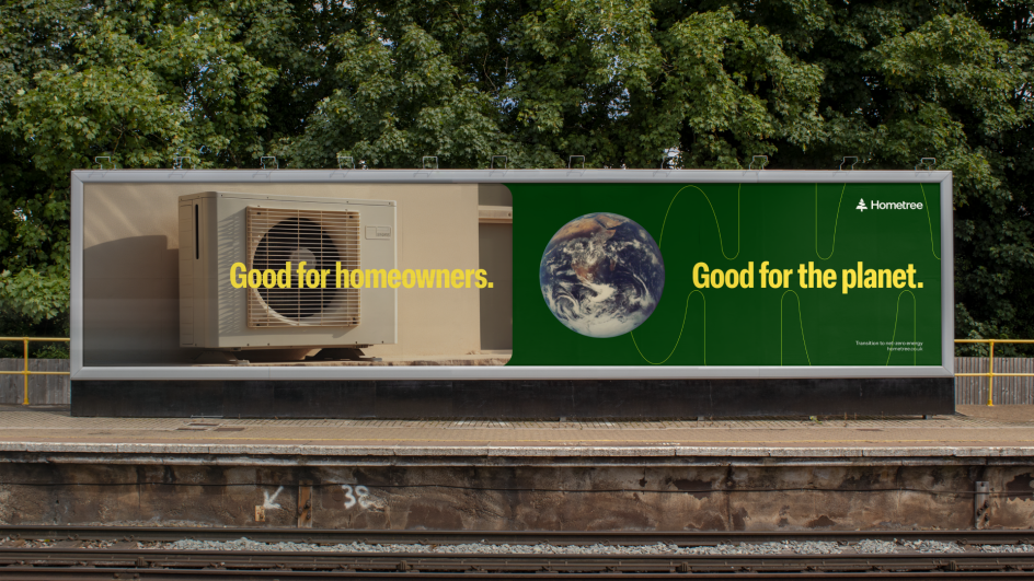
By collaborating with How&How, Hometree has set up its stall as the ultimate 'Transition Companion'. In practice, this means it will help customers to shift away from their boilers and instead start using a more sustainable heat pump.
This is all part of Hometree's goal to support "the full energy lifecycle in the home". With many existing customers already coming to Hometree for boiler repair and home emergency breakdown cover, the provider was ideally placed to pinpoint potential heat pump users and assist them on their way.
It's a noble cause, but standing in their way was the visual challenge of communicating this goal to its customers. Changing the energy infrastructure of a home requires a swathe of factors that aren't always within a person's control, so the provider and How&How had to tread carefully.

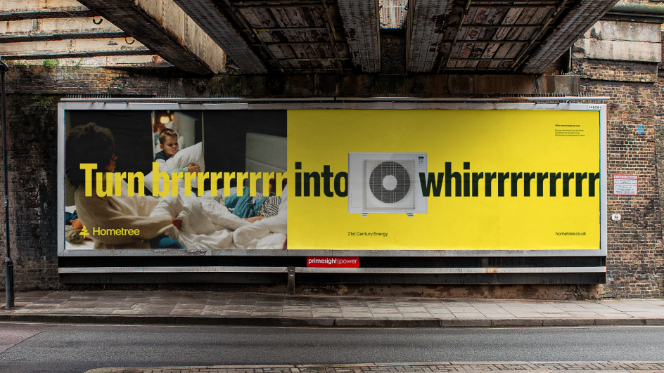
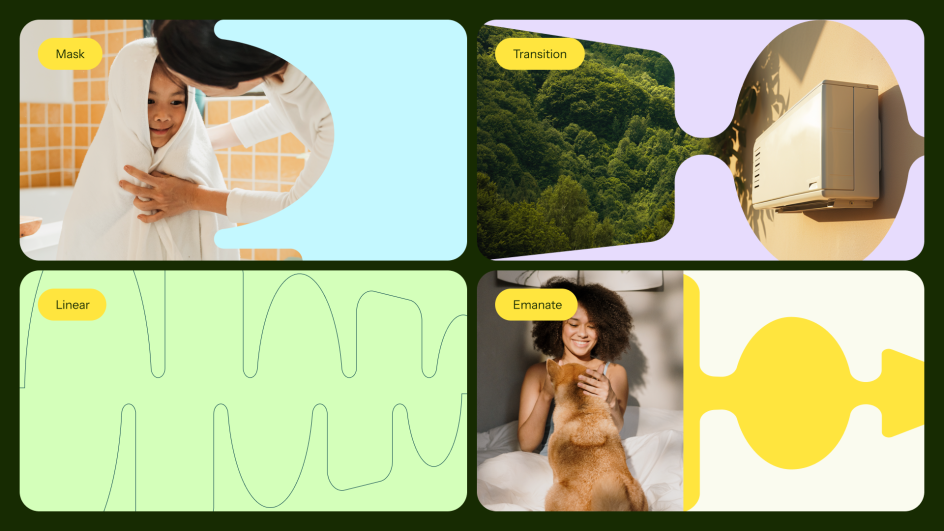
"We wanted to show that it doesn't have to be a headache to get from brrrrr to whrrrrr!" explains Cat How, ECD at How&How. "So we combined the vibrant positivity of energy and progress through our pulsating logo and paired this with the comforting glow of a warm family home."
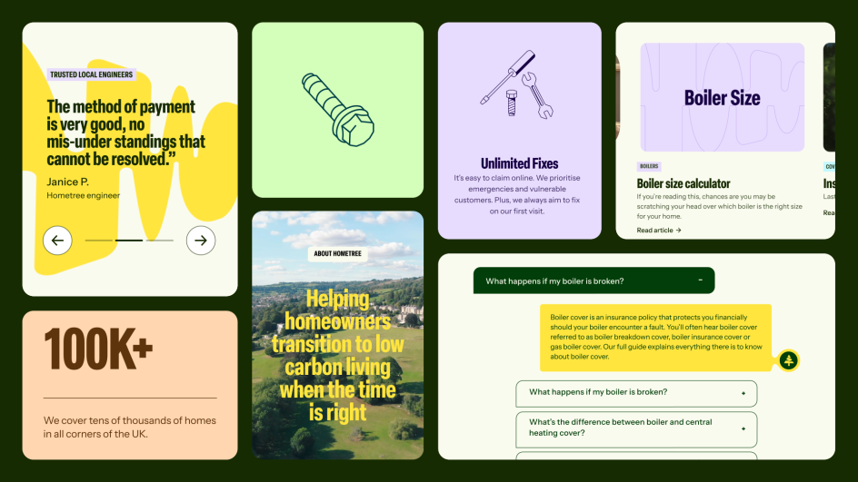
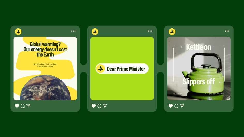
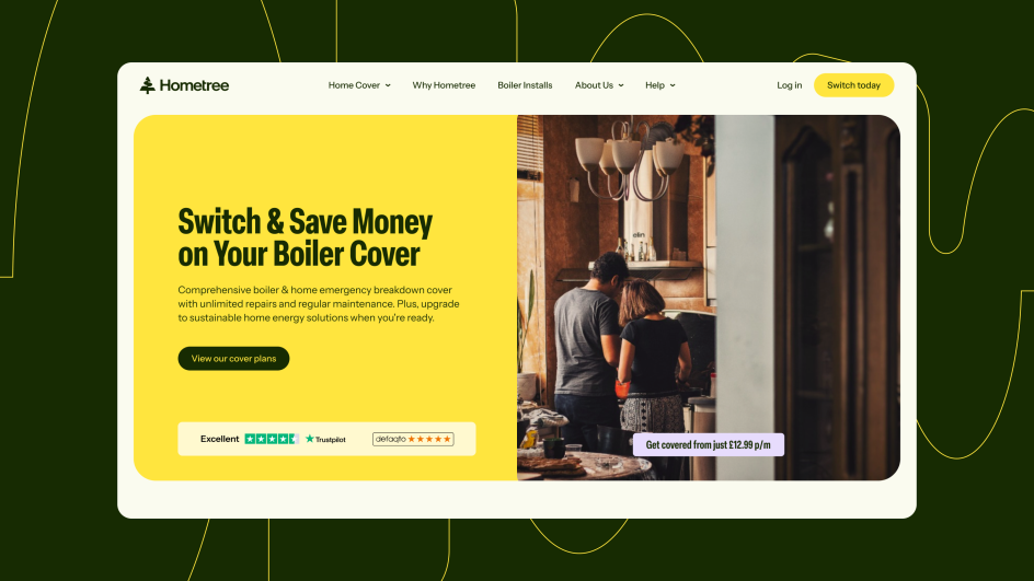
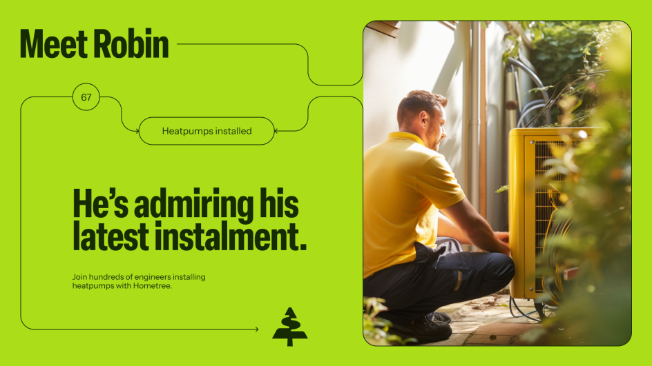
Alongside this positive approach, How&How created a logo that doubles as an interactive assistant. Named Maple, this element guides customers into taking tangible steps towards the green energy transition. This is further underlined by an art direction that pairs imagery of energy-efficient hardware with cosy home scenes and personable service providers.
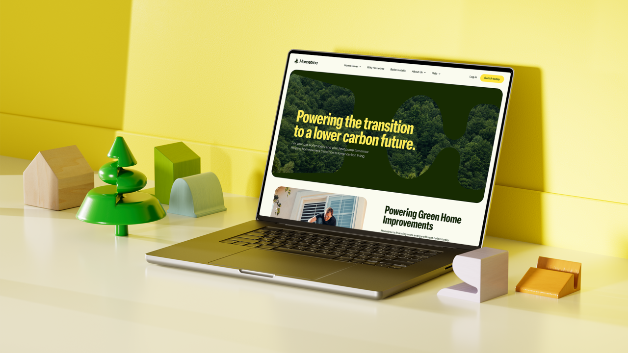
On top of this, a colour palette dominated by yellows and greens rounds out the visual identity. These colours evoke a feeling of warmth and relatability while also looping back to Hometree's green credentials and environmental ambitions.
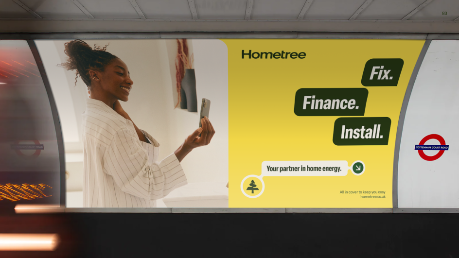
With a huge percentage of Hometree's audience coming to them via their website, How&How also prioritised developing a digital strategy. The brand system needed to work across it seamlessly while still evoking the same sense of refreshing honesty, ambitious authority and effortless warmth.
All their hard work has paid off, though, as Hometree now has an identity both they and their customers are pleased with. "It was such a pleasure working with How&How on our rebrand, and we're super proud of where we landed," says Natasha Berthiaume, Head of Brand at Hometree.
"They have a strong track record in creating highly aspirational identities and slick UI design systems for a whole host of brands across many different industries. In addition to their excellent design work, we were impressed with their ability to simplify complex ideas into a clear and motivating story. Their methodical process made the whole process super smooth—plus, they're lovely people to work with—which is so important when collaborating on these kinds of projects!
"All in all, it's been a delightful journey with the How&How gang—and we're excited to continue building on the Hometree story based on the excellent foundations they have set with our new identity."

Editor's Picks


Trending


Podcasts


Editor's Picks
Further Reading