DixonBaxi captures the spirit of real football fans with Everton FC rebrand
Brand consultancy DixonBaxi has collaborated with Everton FC to create a new identity for the club that remains true to its roots and the spirit of the fans, as well as laying the foundation for its digital-first future.
For more than 140 years, Everton FC has been pushing football forwards thanks to the excellence of its players and the passion of its fans. Now it's time for the club to move forwards and properly enter the digital age with the help of an exquisite rebrand courtesy of London-based brand consultancy DixonBaxi.
Tackling the rebrand of one of England's founding football clubs is no small order. The Blues have always led by example, and DixonBaxi were keen that their new visual identity should continue this trend and build on the club's deep-seated morality. This meant that Everton FC needed a bold, unapologetic system of expression which added a fresh worthwhile voice to its historical legacy.

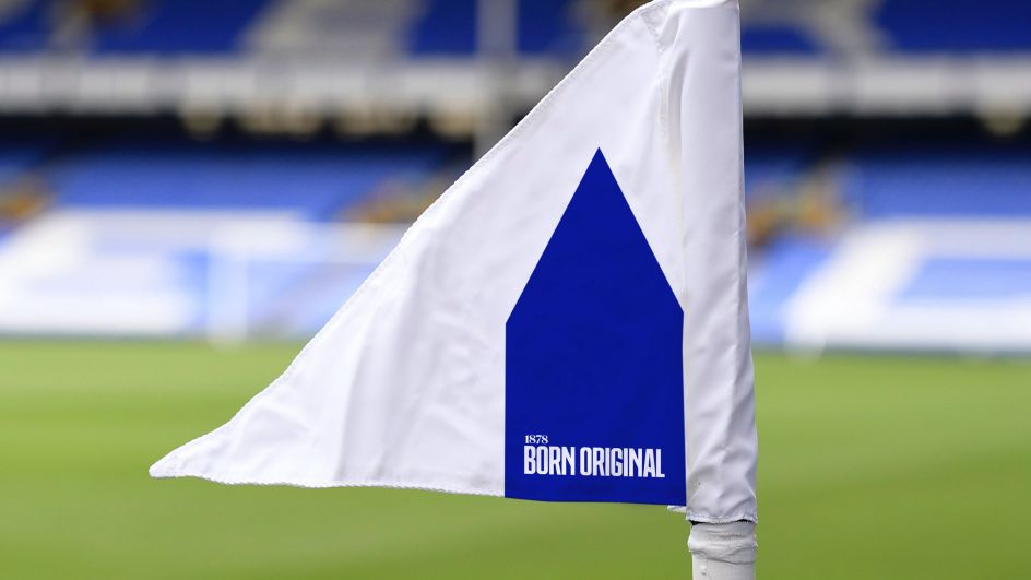
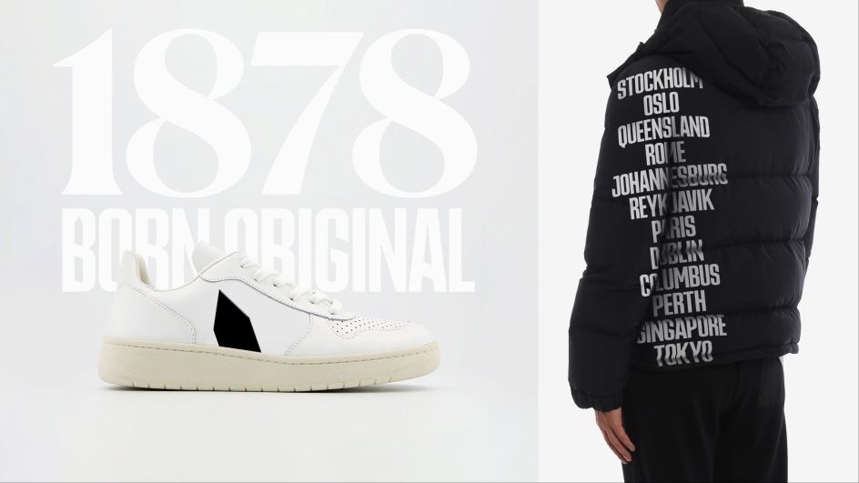
At the heart of the new visual identity is Prince Rupert's Tower, a village lock-up that forms the centrepiece of the club's crest. This pointed structure already has an iconic silhouette, so it made sense to use it as the foundation of the rebrand. Standing for everything Everton, the tower not only exists within the crest but also amplifies Everton FC's significance on a global scale.
"The Tower heralds Everton's perspective or symbolises it with quiet confidence," DixonBaxi explains. "As the pulse of the club's visual identity, The Tower carries the ideas and ideals that drive Everton, readily signalling them on a global stage. The signature flexes to create "The fabric of Everton", subtly working the design language across products and materials. Even the typeface, Rupert Condensed, is born of The Tower, featuring the same dynamic angles."
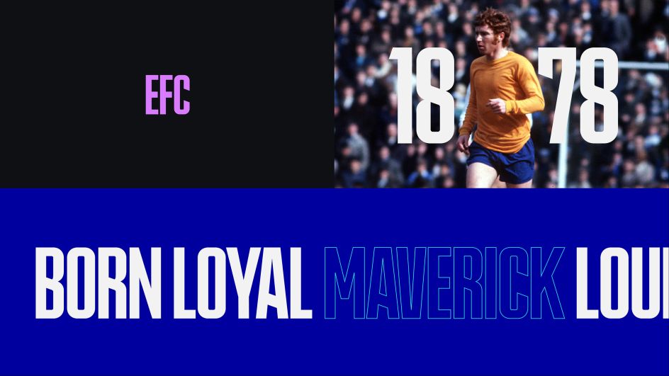
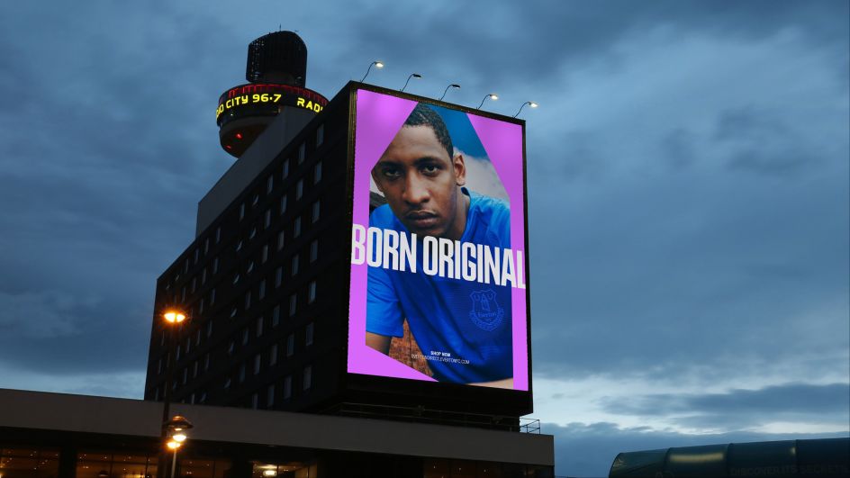
The font in question, the suitably named Rupert Condensed, is a custom font with elements of The Tower's pointed roof. "It's bold, striking and full of attitude. Paired with Canela, the typographic system achieves a balance between uncompromising historical character and a bold new take on impact."
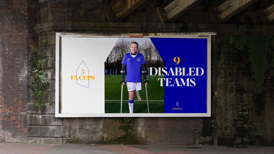
To help Everton FC shine no matter the context, DixonBaxi created three different colour palettes to help it suit any occasion. These include a premium palette, a club palette, and a swagger palette. More traditional colour combinations allow Everton to effortlessly perform well at corporate events, while the "boldly modern" mix of tones is tailored towards fan-facing messaging.
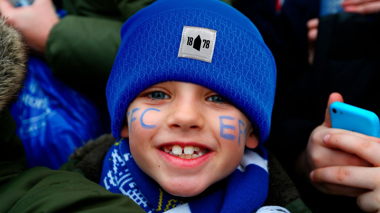
Any football fan will tell you that their club's colours are of utmost importance, and perhaps there's nowhere more true than with the Blues. Each new colour in the palette carries an element of the club's history. There's the black based on Everton toffee, while the infusion of pink is inspired by kits from 1982. As for the blue itself, a new shade symbolises the future aspirations of the club, as spearheaded by this rebrand.
Speaking of the future, motion graphics are also on hand to bring Everton FC into the digital age. The system of graphics created by DixonBaxi has both swagger and spirit and demonstrates an aesthetic that feels premium and aspirational. At the same time, though, these motion graphics are of the people and are concerned with delivering excellence to those who deserve it.
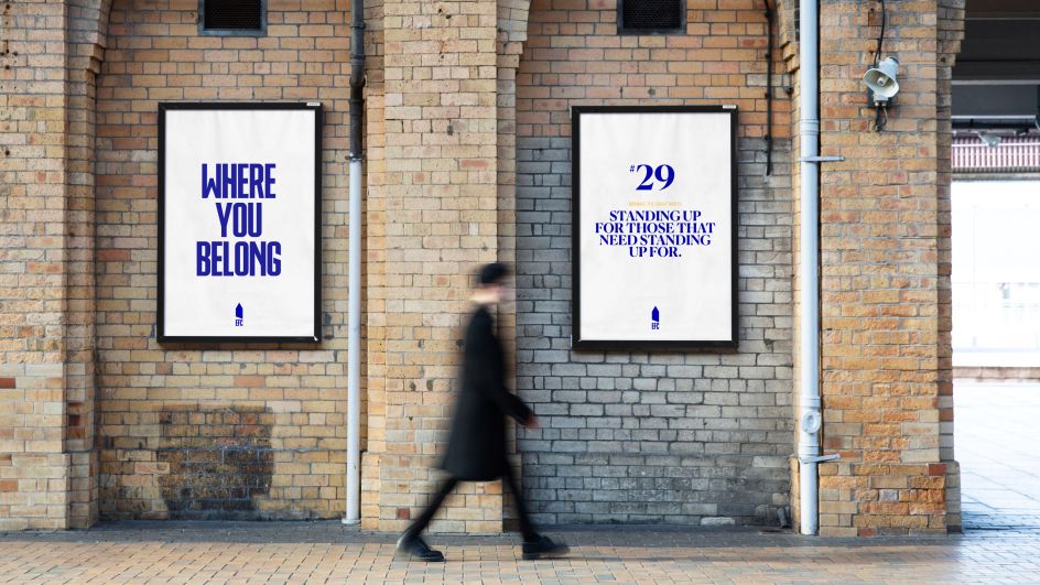
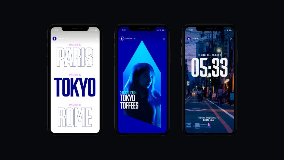
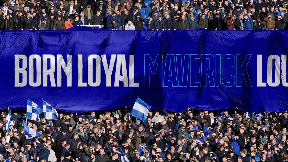
When it comes to talking to the fans, the new identity uses a tone of voice that captures the spirit of real football fans and delivers its messaging from the Everton perspective. "It's a written identity that enables the club to capture and create spirited moments in their narrative."
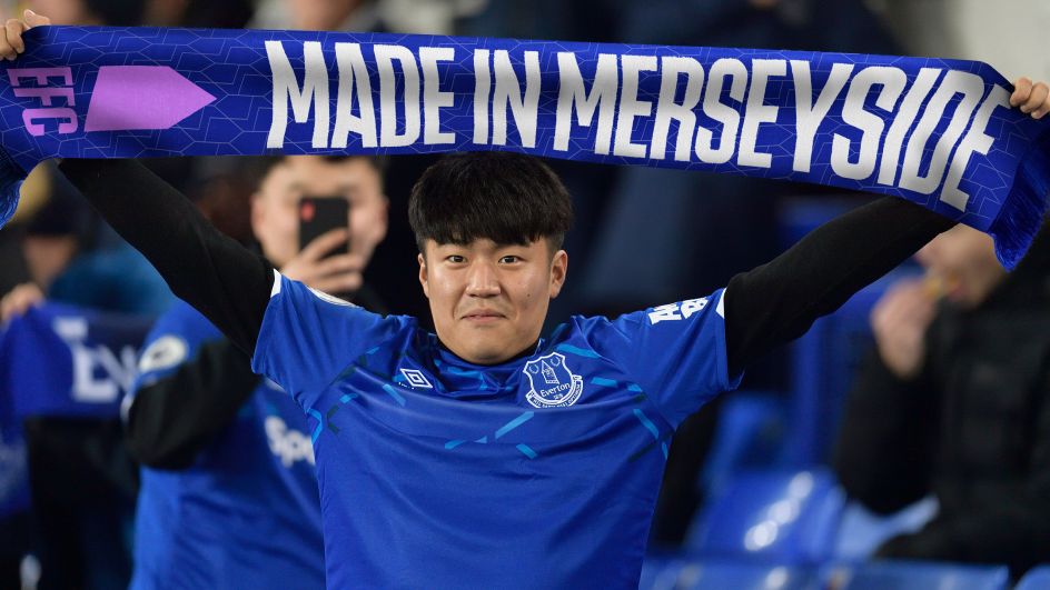
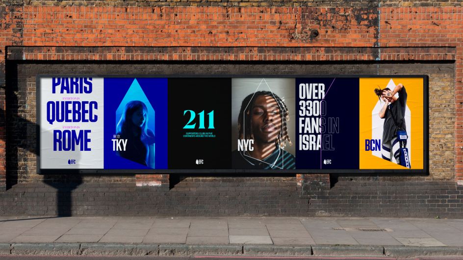
A key part of this messaging is the mantra 'Everywhere is Everton'. This phrase celebrates the club's heritage without tying it to one location. That way, the club can speak directly to fans wherever they may be watching and participating worldwide.
By focusing on what the club means at a local and global level, DixonBaxi has managed to create an authentic identity that crosses borders. Although at its core, every part of the design and the strategy was built around one central strategy that's as Everton FC as they come: winning the right way.
Editor's Picks


Trending


Podcasts


Editor's Picks
Further Reading