Studio Nomad evolves Tottenham Hotspur's brand identity
The club's new identity reimagines Tottenham Hotspur's rich history through familiar yet digital first assets.
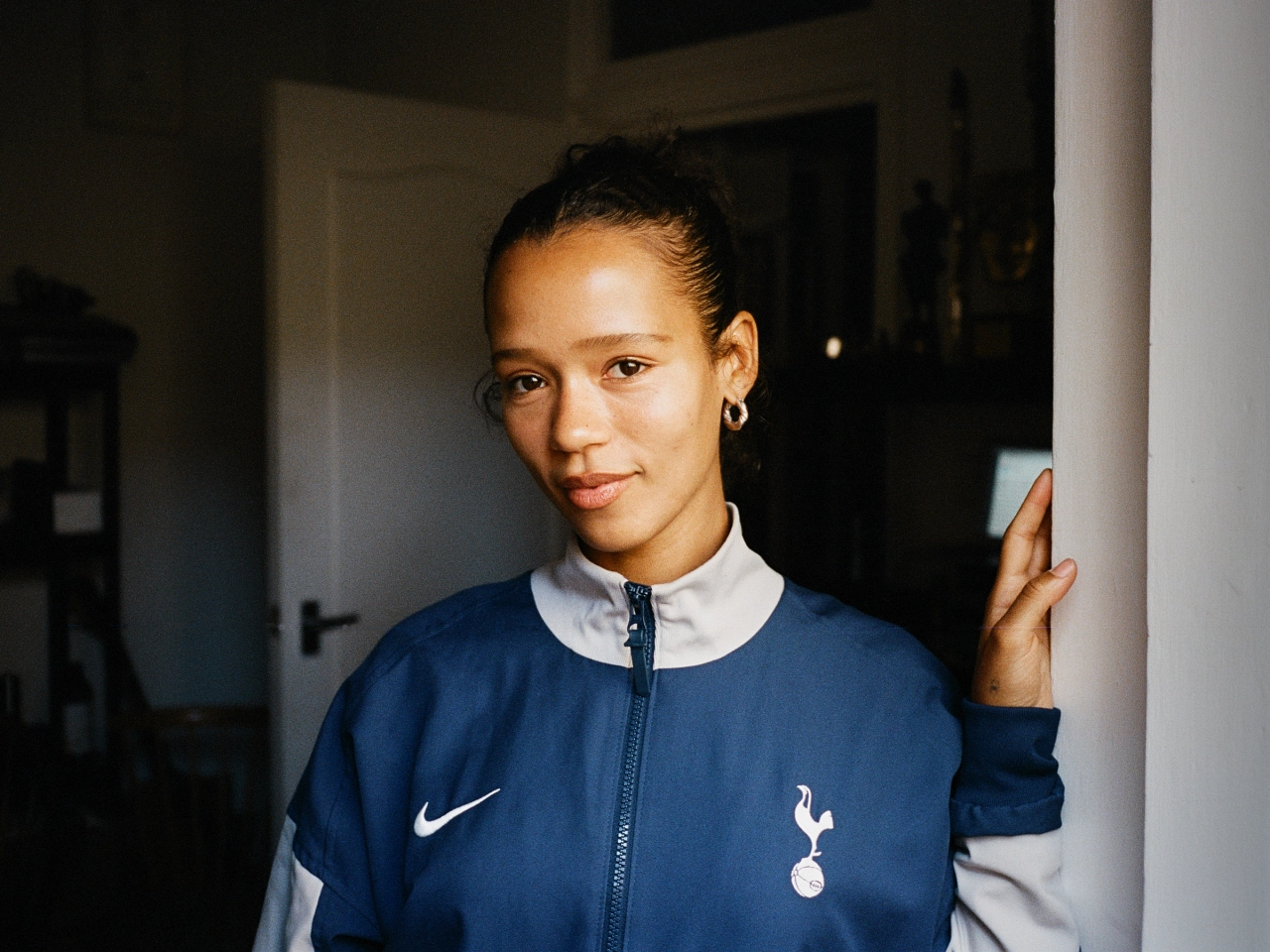
Following a nine-month collaboration with sports branding specialists Studio Nomad, Tottenham Hotspur has unveiled a new visual and verbal identity that celebrates the world-famous cockerel and communicates the club's daring spirit.
With any football club rebrand, you must engage all stakeholders if you want it to be received well. Founded in 1882, Tottenham Hotspur - affectionately known as 'Spurs' - claims to have three million fans in the UK and over 180 million worldwide, so changing an identity that they are undoubtedly attached to is no easy feat.
For this project, Nomad gathered input from over 300 current and former players, coaches, key staff and fan groups and worked closely with THFC's in-house creative team to fully understand what Tottenham Hotspur means to them.
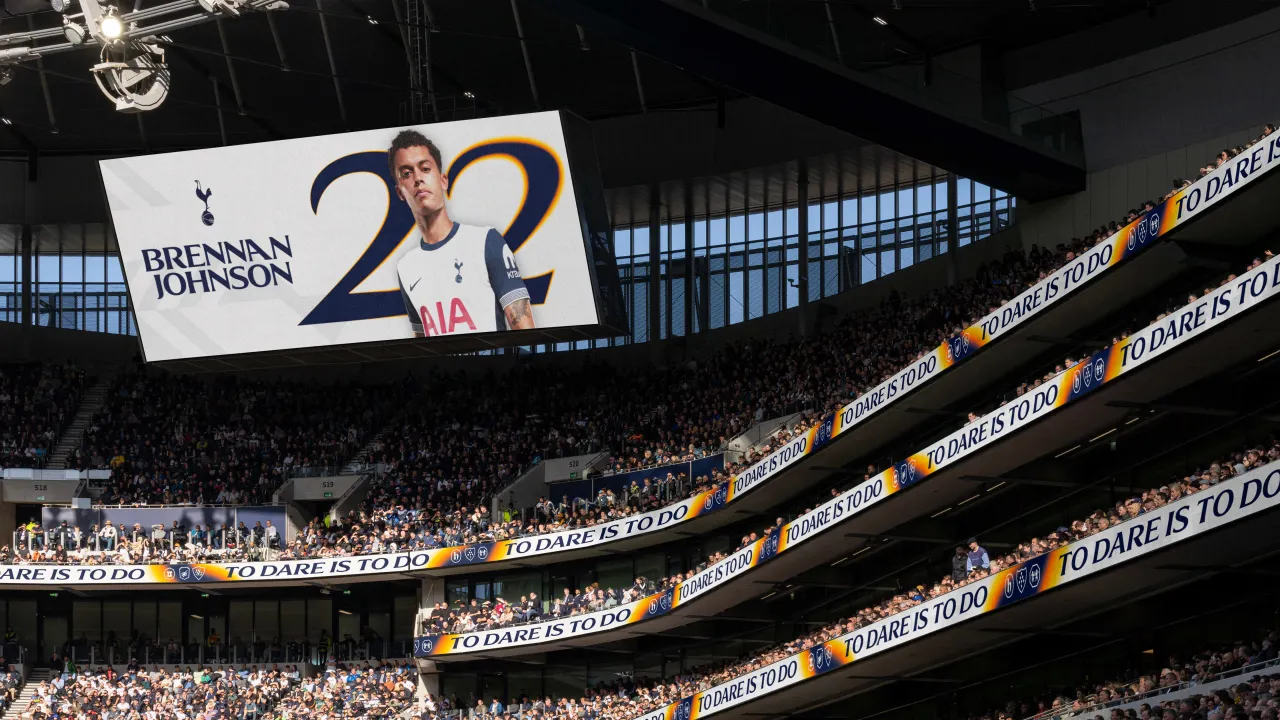
To respectfully build on the brand's rich history and heritage, the studio also worked with icon specialist Chris Mitchell to create a new version of the cockerel symbol based on the original he created 18 years ago.
Tottenham Hotspur was one of the first clubs to modernise its identity in 2006 by simplifying the badge around its world-famous cockerel. Since then, it has stood alone and become so iconic that other clubs followed suit with their own identities.
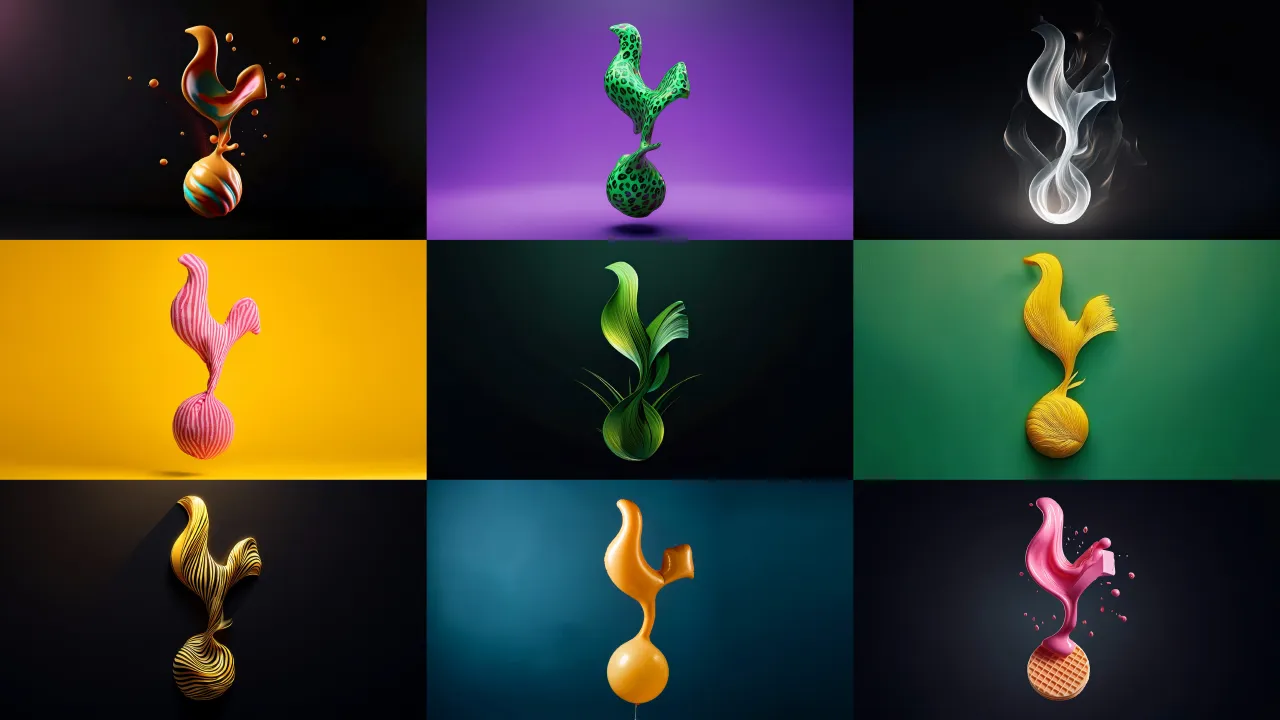
The Spurs Club badge now stands prouder than ever, supported by a simplified silhouette cockerel that allows for a more playful expression of the brand.
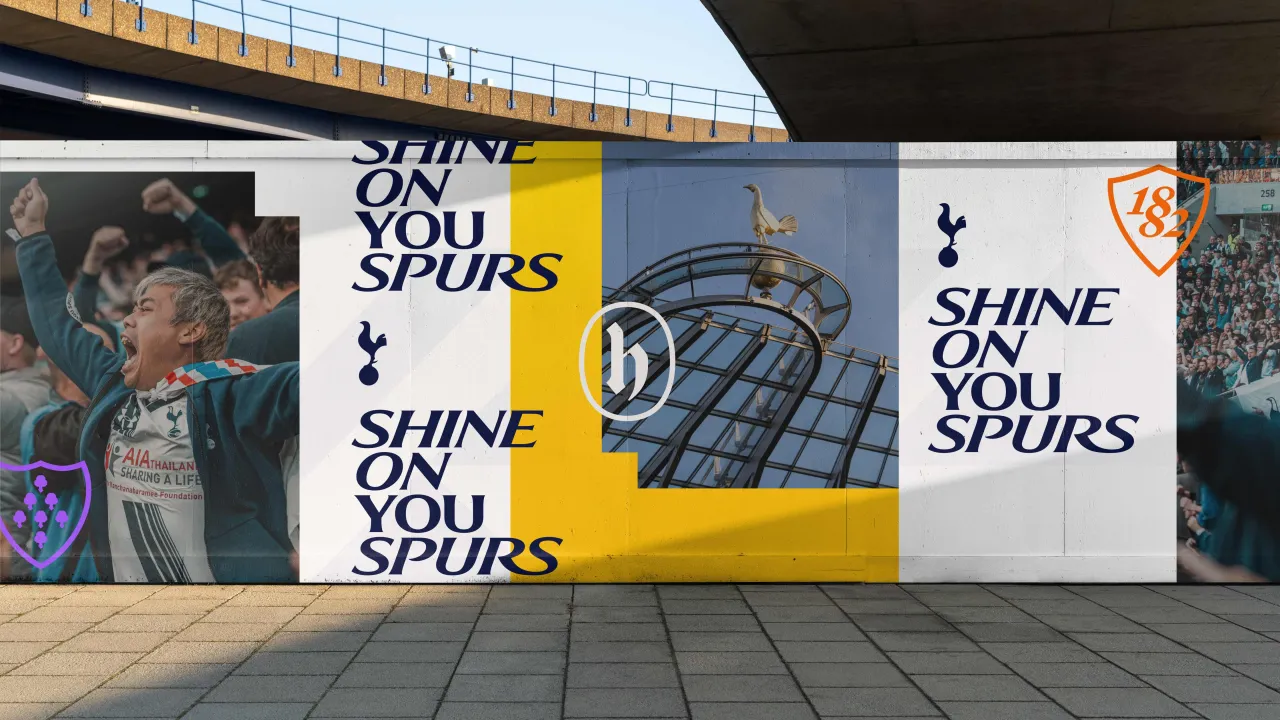
Nomad also reintroduced the THFC monogram and introduced new colours, patterns, and hallmarks linked to the club's heritage.
The monogram has been a fan favourite since the 1950s and has featured heavily through the Club's badge for many years. In collaboration with type specialist Miles Newlyn, Nomad modernised and remastered it.
On the rebrand, Tottenham Hotspur executive director Donna-Maria-Cullen says: "We have taken aspects from our history, our emblems, our imagery, and we've taken them forward – we've now got something that we have built from listening to everyone at the club, on and off the pitch, and the consistent message coming through. This is something that everyone can unite behind."
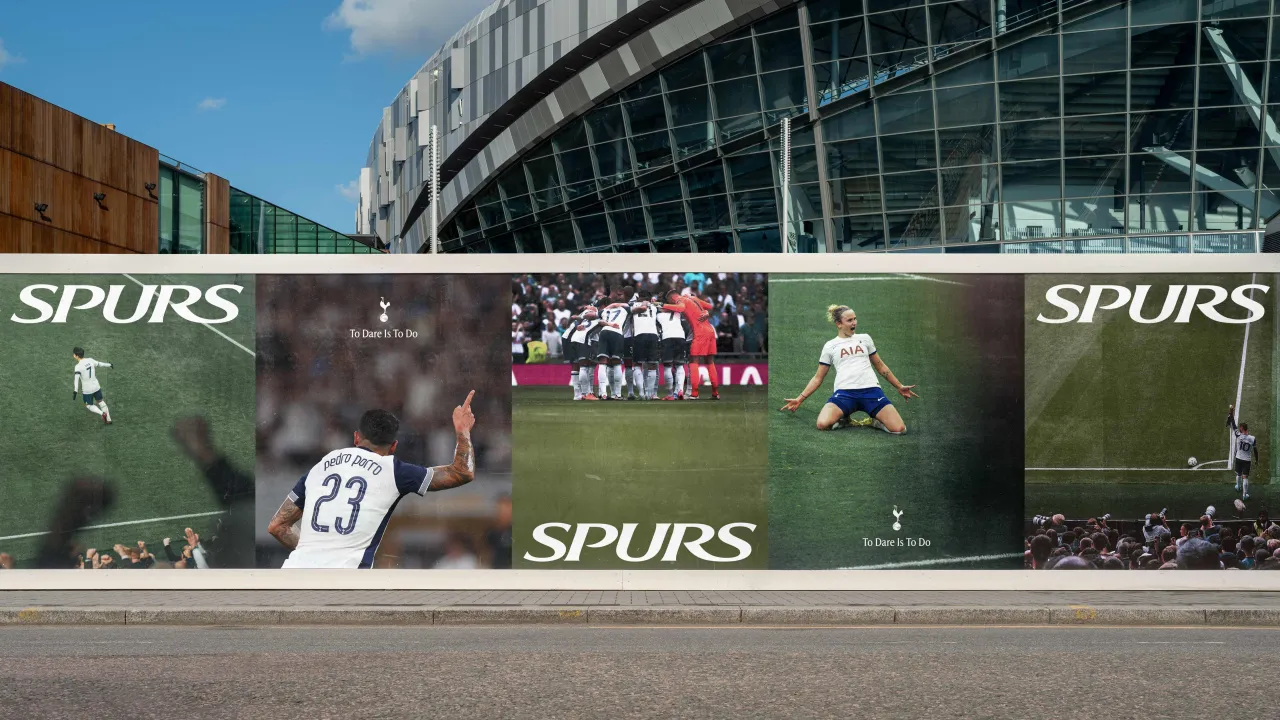
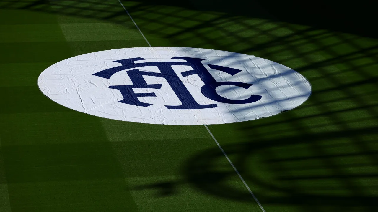
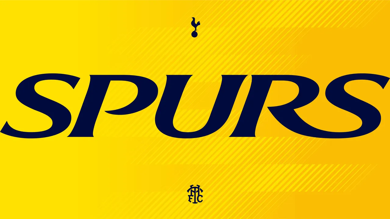
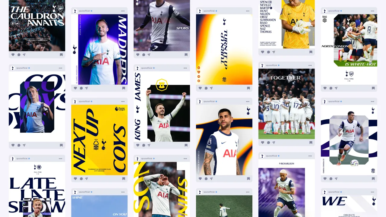
Alongside F37 Foundry, Nomad sought to breathe new life into the existing Spurs display face. That single display font has become a dynamic, variable superfamily of fonts in an unmistakable Spurs style.
Colours, patterns and hallmarks built from iconic elements of the club's past have also been introduced to celebrate key heritage features, including the Seven Sisters Trees, Bruce Castle and 1882 – the club's founding year.
"The refreshed assets enable a more playful, daring approach for the club's brand across the multitude of platforms on which it now features, with a particular focus on clarity in digital environments," says Nomad co-founder Terry Stephens.
Stephens believes that Spurs has "set a benchmark for how modern football clubs are run, which in turn places new demands on its brand".
"Working closely with the club, we helped define a clear North Star and a visual and verbal identity that ties everything they do on and off the pitch together," he adds.
The club's men's head coach, Ange Postecoglou, says: "We want to be a certain type of football club - we want success like everyone else, but we want to arrive there doing it our way.
"The brand represents consistently challenging what you do and looking for an edge – when you do get it right, you create something special. It encapsulates values that are ingrained in what this football club is – we want our people to dream, and we want to stand out from the rest and do things a little bit differently."
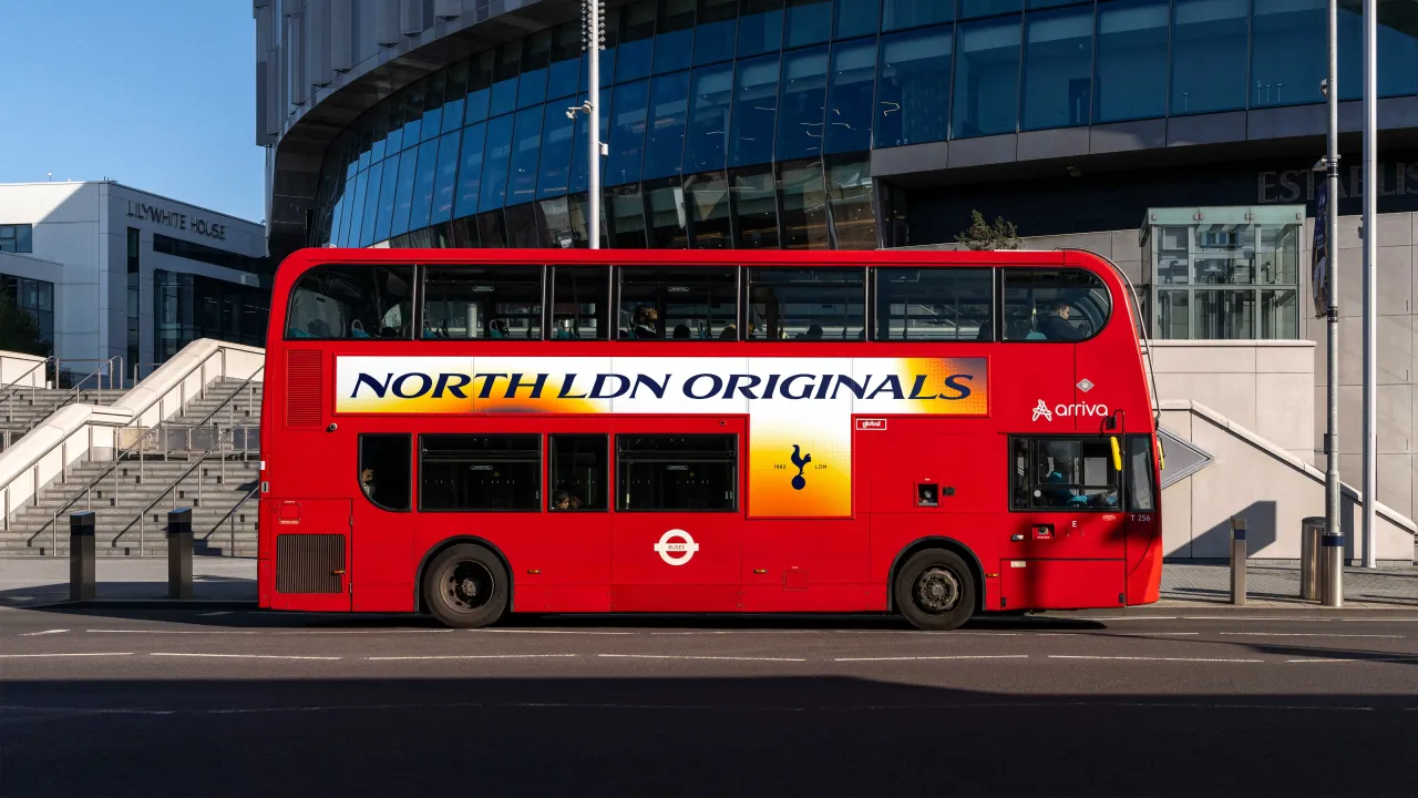
Tottenham Hotspur's new brand is rolling out across all the club's physical and digital touchpoints. It will be seen throughout the stadium and along Tottenham High Road at our upcoming home matches, starting with AS Roma on Thursday 28 November.
Editor's Picks





Trending





Latest Jobs
Principal Software Engineer at BBC Media Tech
Full-time·Glasgow·Up to £83,790
Senior Designer at Definition
Contract·London·£45k–£50k
Head of design at Cog Design
Full-time·London·£55K
Senior 3D Motion Designer at Art&Graft
Full-time·London·£50k-£65k
Midweight Graphic Designer at We Are Your Friends
Full-time·London·£36k–£44k
Agent & Producer at The Jacky Winter Group
Full-time·London·£35k–£40k