Alphabet brings out the personality behind Football Beyond Borders in an identity refresh
Manchester branding agency Alphabet has given Football Beyond Borders an identity overhaul to reveal some of the personality and culture behind the charity.
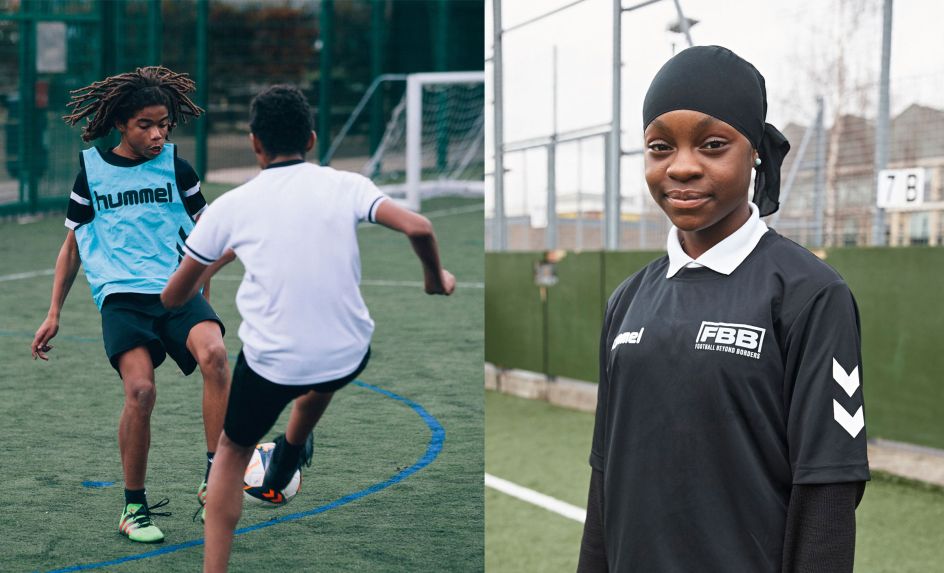
The cause supports young people from disadvantaged backgrounds who are passionate about football but disengaged at school, to help them finish school with the skills and grades to make a successful transition into adulthood.
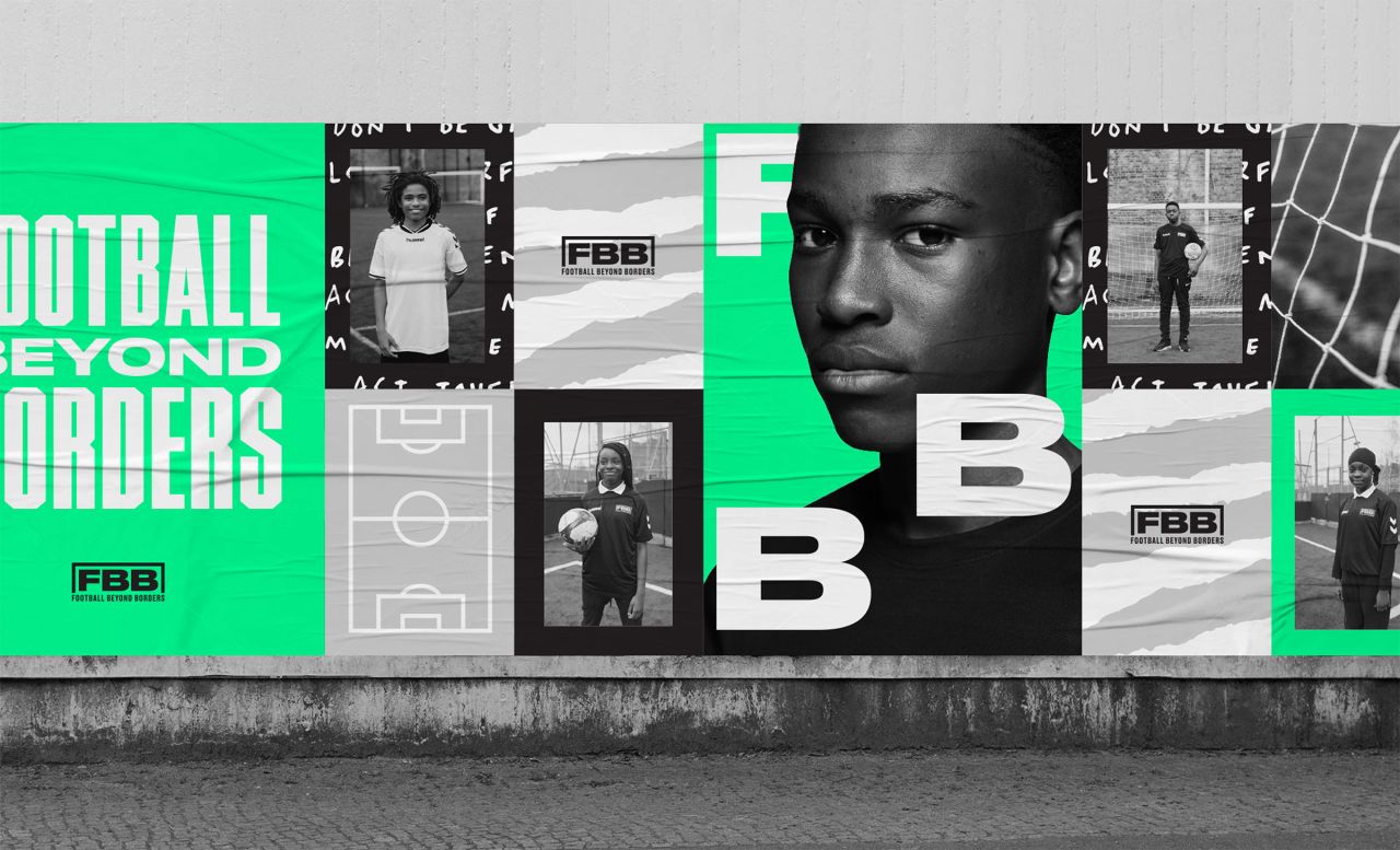
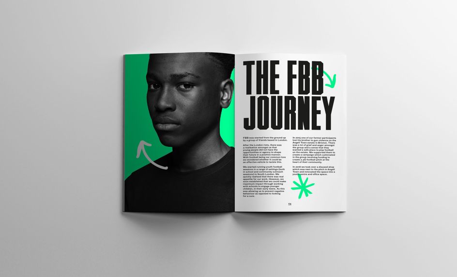
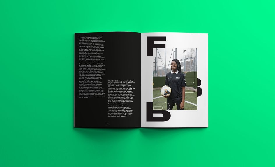
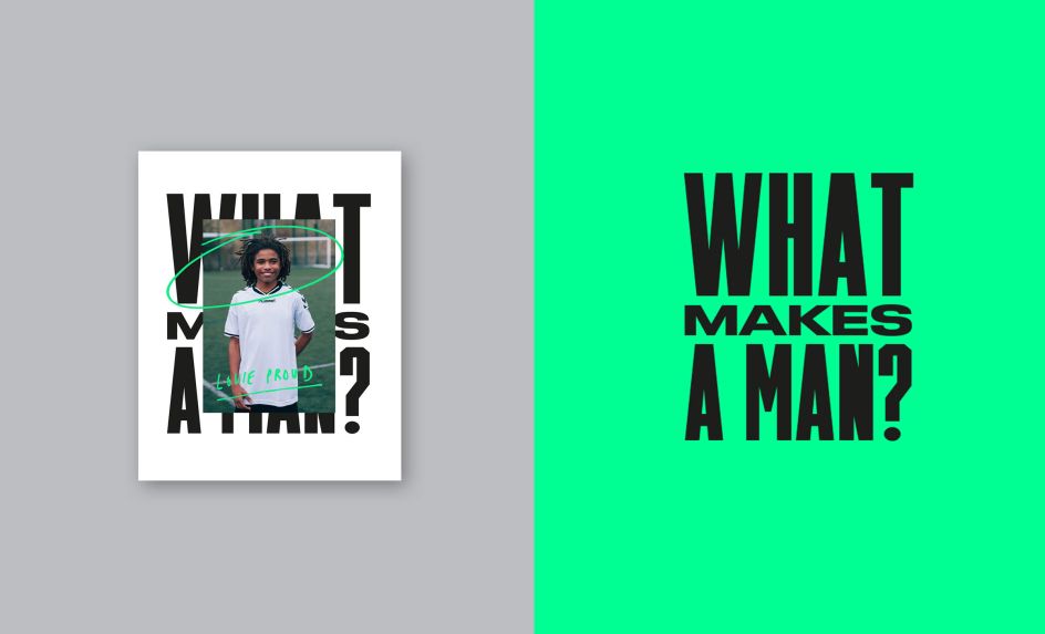
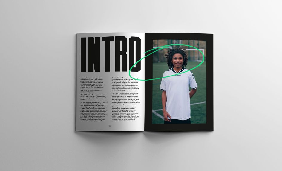
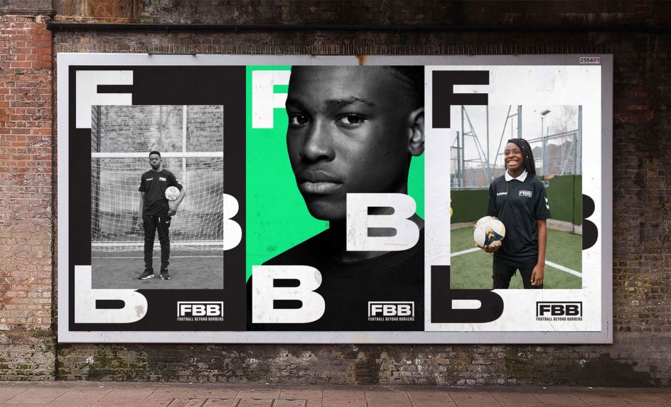
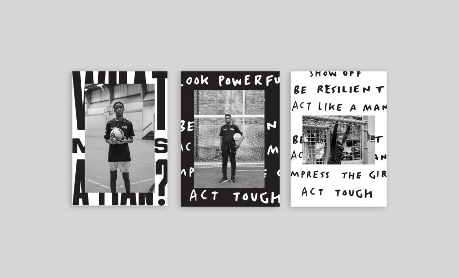
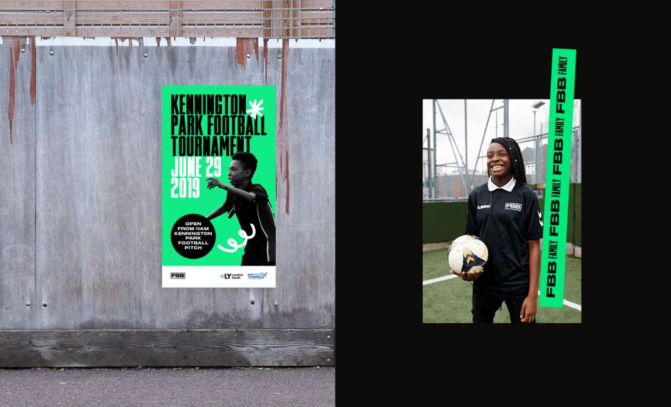
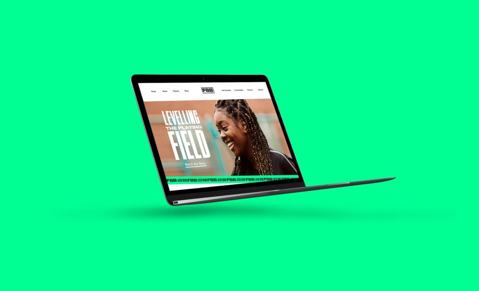
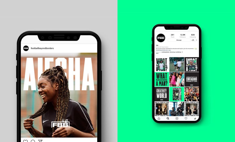
Alphabet updated its existing logo to help create a more cohesive identity which included a fresh colour palette, photography, typography and a variety of graphical treatments. A completely bespoke hand-rendered iconography pack was also created, inspired by the young people involved in the charity. "The icons bring real versatility to the brand and can be combined with typography or imagery to create interesting and unique compositions," says Sam Lane, co-founder and creative at Alphabet.
Deliverables use a combination of imagery treatments, typography and hand-written lettering. The result is a bold and vibrant identity to celebrate strength and confidence.
"We built an identity framework that could deliver the message of the charity across every channel and touchpoint, on and offline. An identity that could carry Football Beyond Borders on their journey from two people to a hundred, and even further," adds Sam.

Editor's Picks


Trending


Podcasts


Editor's Picks
Further Reading