DixonBaxi's new identity for streaming platform Max looks to the future
DixonBaxi has partnered with Warner Bros. Discovery to create the brand identity for streaming service Max. The rebrand is said to signal a new era for the company's digital ambitions and looks to help the platform draw in larger audiences.
DixonBaxi worked with Warner Bros. Discovery over the course of a year, collaborating with the company's marketing, product and brand teams to create a "unique" identity for the entertainment destination.
"Max is not just another entertainment brand; it is a strategic partnership with some of the biggest names in the entertainment industry, including HBO, Warner Bros., Discovery, DC, and Wizarding World," says DixonBaxi.
"Together, these global superbrands offer a diverse and critically acclaimed range of stories and characters that capture the imagination of audiences worldwide… From the drama of Succession to the dark allure of Batman, the gripping intensity of The Last of Us, to the magic of Harry Potter, Max brings together a stunning array of content that appeals to every moment, every feeling, every you."
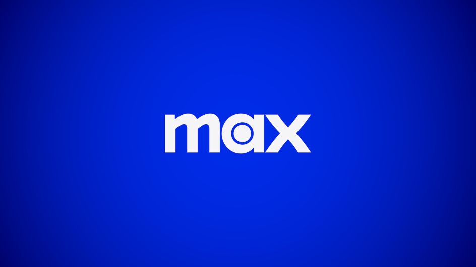
The new Max logo looks to pay homage to the brand's roots by fusing the HBO bullseye icon with the curves of the Warner Bros. shield. The Max mark looks to be both modern and timeless while underscoring its hundred years of baked-in entertainment history.
The use of lowercase letterforms aims to "convey warmth and approachability" airside the logo's "presence and confidence", says DixonBaxi. The agency adds that each character in the typography was "meticulously crafted for unity".
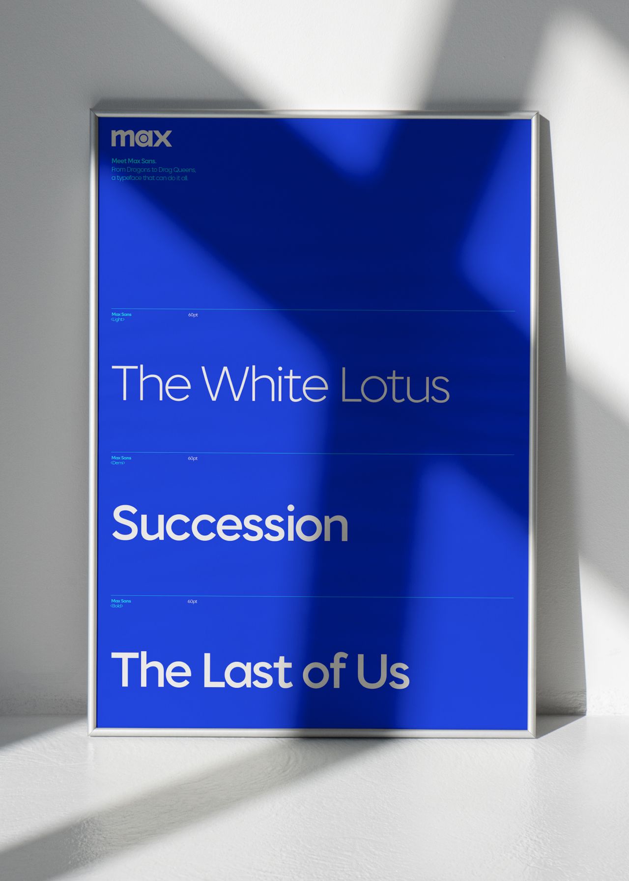
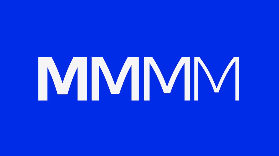
The new bespoke typeface further communicates Max's "fearless attitude and maverick spirit" while giving it a distinct visual voice. The typeface, Max Sans, was developed in partnership with type foundry F37 and used pure geometric forms and "elegant curves" that reference the curves in the Max logo. The typeface was created in a series of different weights that allows it to pack more of a punch where needed, adapt to different genres, and stretch from "premium and cinematic to loud and expressive," says DixonBaxi. It also offers extensive language support to make the brand accessible across different screens and for different audiences.
As the central element of the brand identity, the logo had to be instantly recognisable across a wide range of sizes and applications, from huge billboards to tiny app icons. It was "designed to make a lasting impression," DixonBaxi continues. "This signature serves as a clear indication of the brand's purpose and dedication to exceptional storytelling."
DixonBaxi also crafted the Max Original logo and updated the HBO Original logos to be part of the new design system.
The Max logo comes alive as a mnemonic that looks to signal "the start of a journey that draws us dramatically and dynamically through space" through a singular bold movement with flashes of light against a "rich, illuminated Max blue – transporting viewers into a realm where their favourite stories come to life," says DixonBaxi.
The sound design was created in partnership with Zelig and "envelops" the viewer using three "anticipatory beats" as well as subtle sounds like audience whispers, a clapperboard, and a director's cue. The three "heartbeats" represent the three-lettered brand name while "hinting at the human connection in every story," according to DixonBaxi.
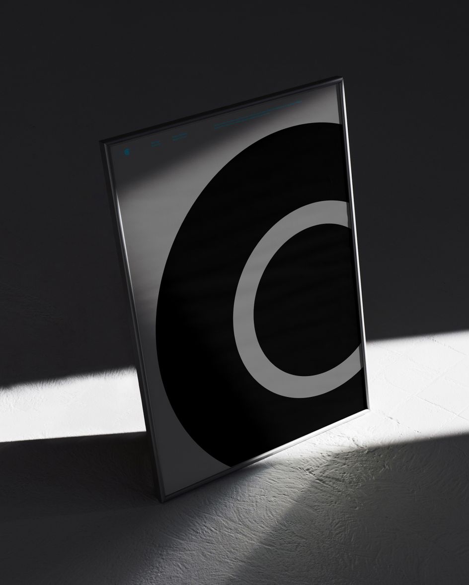
A graphic signature dubbed 'The Spotlight' is a key part of the branding that evolved from the Max logo – specifically the curvature of the bullseye inside the 'a'. The device highlights various stories or characters but in a way that's deliberately discreet and pared-back to let the individual shows stand out. The Spotlight is used across everything from billboards to social media, trailers, and various digital experiences.
As with the other elements that make up the new brand identity, the Max colour palette unites a modern feel with a nod to the platform's past. The vibrant blue nods to the Warner Brothers blue used in Hollywood's 'golden era', while the more pared-back tones that make up the secondary palette reference the "tactile qualities of HBO Max's gradient". Various accent colours are used to make certain users feel more energetic and help "draw the eye across the digital experience and marketing". In contrast, the graduated blue is used when the branding needs to immerse people "in the most compelling stories, characters and entertainment," says DixonBaxi.
Karun Agimal, design director at DixonBaxi, says, "Creating the Max brand was a huge undertaking and opportunity to seamlessly blend the rich legacies of storytelling giants to ignite a new era of entertainment."
Max is set to launch across the US on 23 May.
Editor's Picks


Trending


Podcasts


Editor's Picks
Further Reading