Badger Brewery broadens its appeal with nostalgic, character-led rebrand
Design agency Robot Food has collaborated with Badger Brewery to create an illustration-led rebrand that balances tradition and character. Paired with bold colours and updated typography, the new look aims to help Badger appeal to a wider demographic.
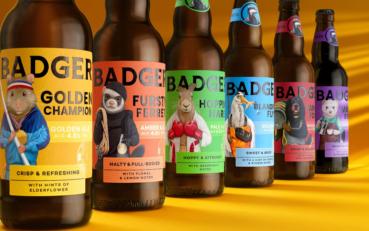
Founded in 1777, Badger is a fiercely independent, Dorset-based brewery best known for its refreshing beers like Fursty Ferret and Hopping Hare. However, as with any heritage brand, it needed to change to keep up with the times. Enter Robot Food, who have unified Badger's offerings, brought it up to date, and made it stand out in a competitive market with one incredible rebrand.
To do this, Robot Food bucked the trend of conventional beer branding. Instead of creating a stuffy, calligraphic look that would only appeal to existing customers, the studio went the other way and produced something more vibrant and charming.
Boasting a roster of characters related to each flavour and "toned-down" lettering, the new Badger identity closes the gap between traditional and craft beer to make its drinks more accessible.
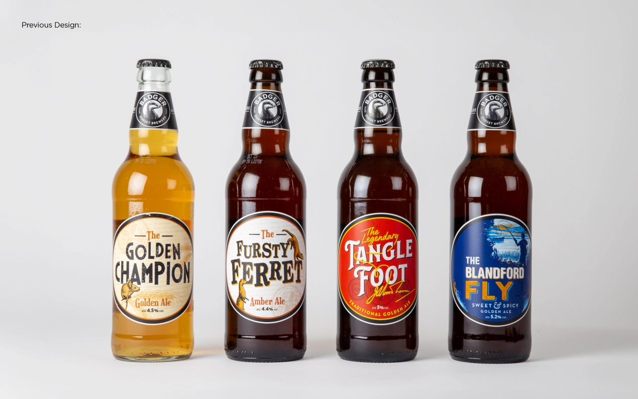
As is often the case with rebrands, the starting point for the identity was to look at who exactly the company is and what it stands for. Badger Brewery marketing manager Giles Mountford says that by doing this, the company could take steps towards becoming the favourite beer brand in the eyes of consumers.
"Badger is strongly positioned to lead the charge within the premium ale category but to do so, we needed a bolder approach", he explains. "Our time-honoured, traditional values appeal to all, but our visual identity kept us from attracting a younger audience. Robot Food has helped us to adopt an exciting, contemporary approach whilst amplifying everything we stand for."
Robot Food senior designer Rich Robinson agrees, saying that the basis of their rebrand was to create a clearly defined reason for Badger to exist. Summed up rather nicely, he adds that the Robot Food team wanted to create a "smile in the mind" whenever people thought of Badger.
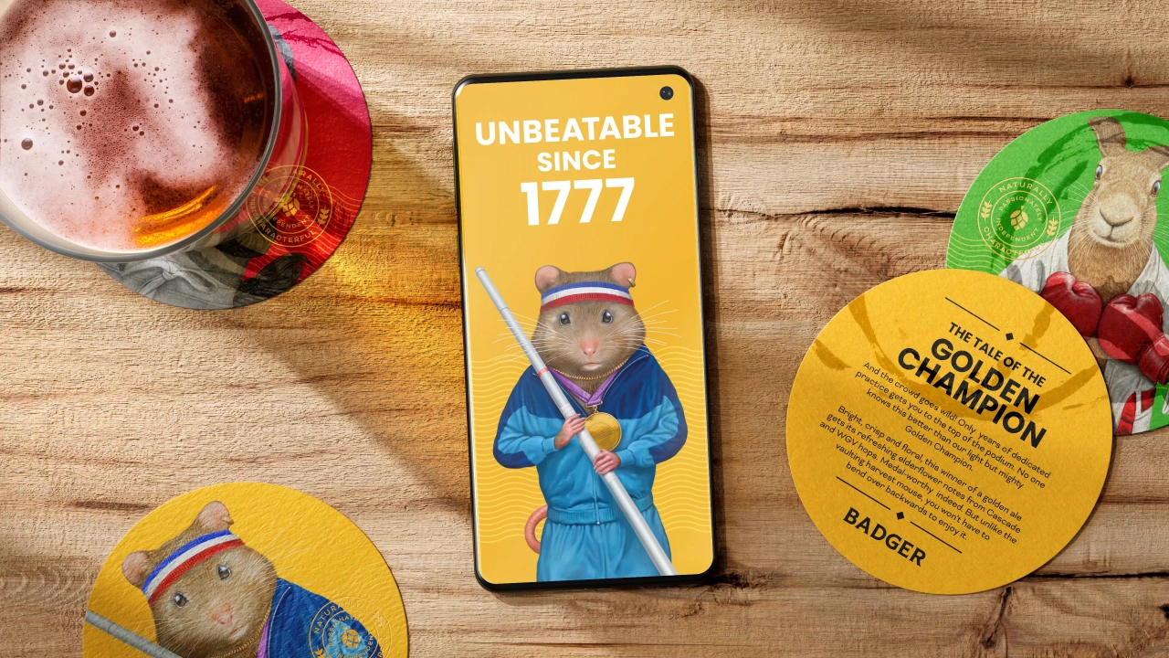
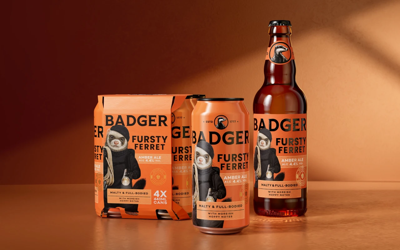
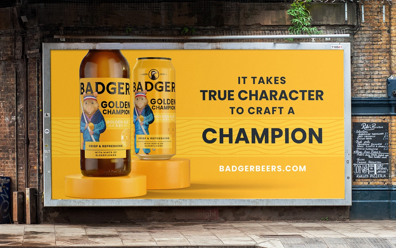
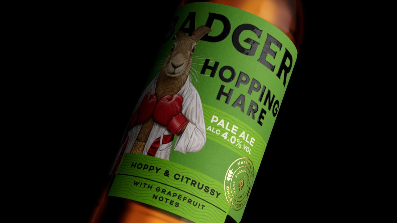
Characters related to the brand's rich history were the way to do this. "Nostalgia is a great tool to harness, but you need to maintain relevancy when working in a category traditionally shopped by an older audience," he adds.
'Nostalgia' and 'relevance' might sound like two terms at odds with one another. Still, by positioning what people know in a fresh way, brands can create hooks in the current moment that engage contemporary audiences. In fact, as Robot Food creative director Ben Brears argues, this approach is crucial for a brand's survival.
"We had to rise above the stereotypes of who Badger is for and how it's perceived by communicating its unique definitions," he says. "We couldn't just follow what everyone else does: it's Badger, not a sheep."
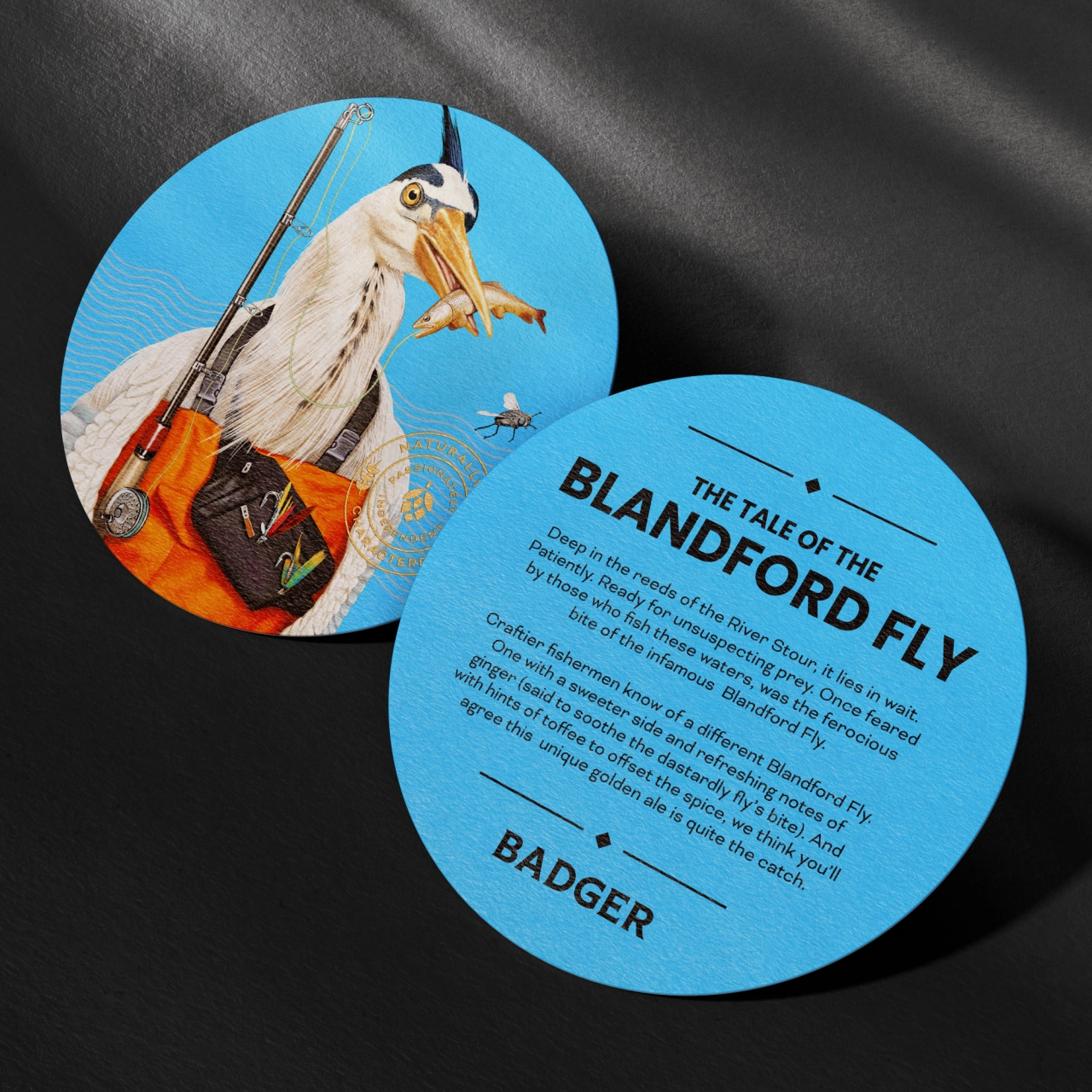
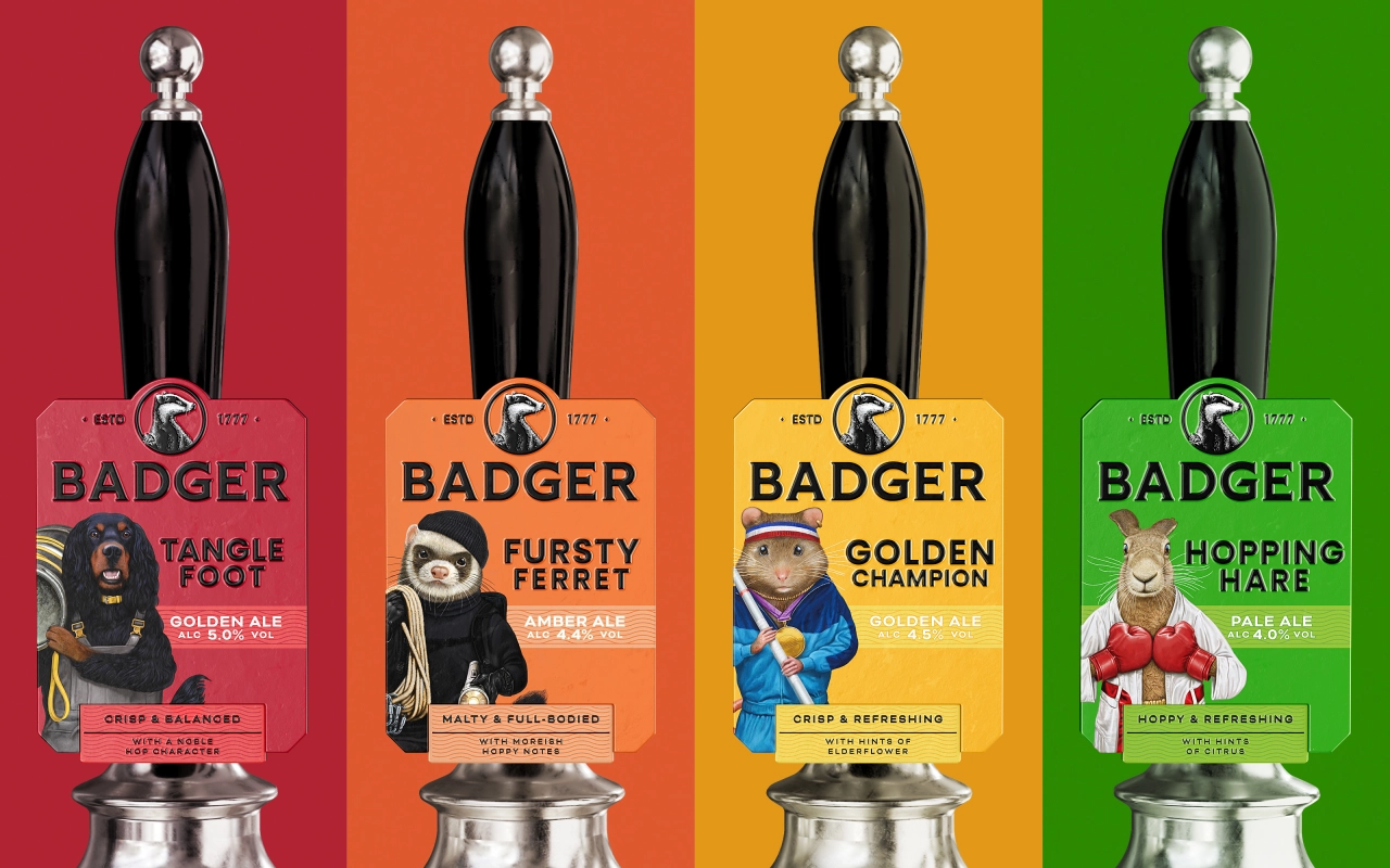
Even a quick glance at Badger's new identity reveals how it does things differently. A palette of bold colours creates the sense of a cohesive family of flavours while also communicating their taste. Tidier fonts – including a headline Poppin, Bicyclette and Bernino Sans in support – tie the brand together with a sense of clarity. And underpinning these design choices are the endearing illustrations by Bob Venables.
Acting as a shorthand for the balance between tradition and modernity that Robot Food was aiming for, these illustrations see animals like ferrets, hares and badgers reimagined with unique personalities. The result is a playful menagerie of characters that sit somewhere between Beatrix Potter and Bojack Horseman.
"These changes pack a punch when it comes to the central aim of bringing the Badger brand proudly to the fore," says Rich Robinson. "They instantly create a more premium feel that better reflects the taste, richness and quality of the beer, bringing out the tasting notes as a nod to the craft category and making the brand feel more accessible, cool, and current."
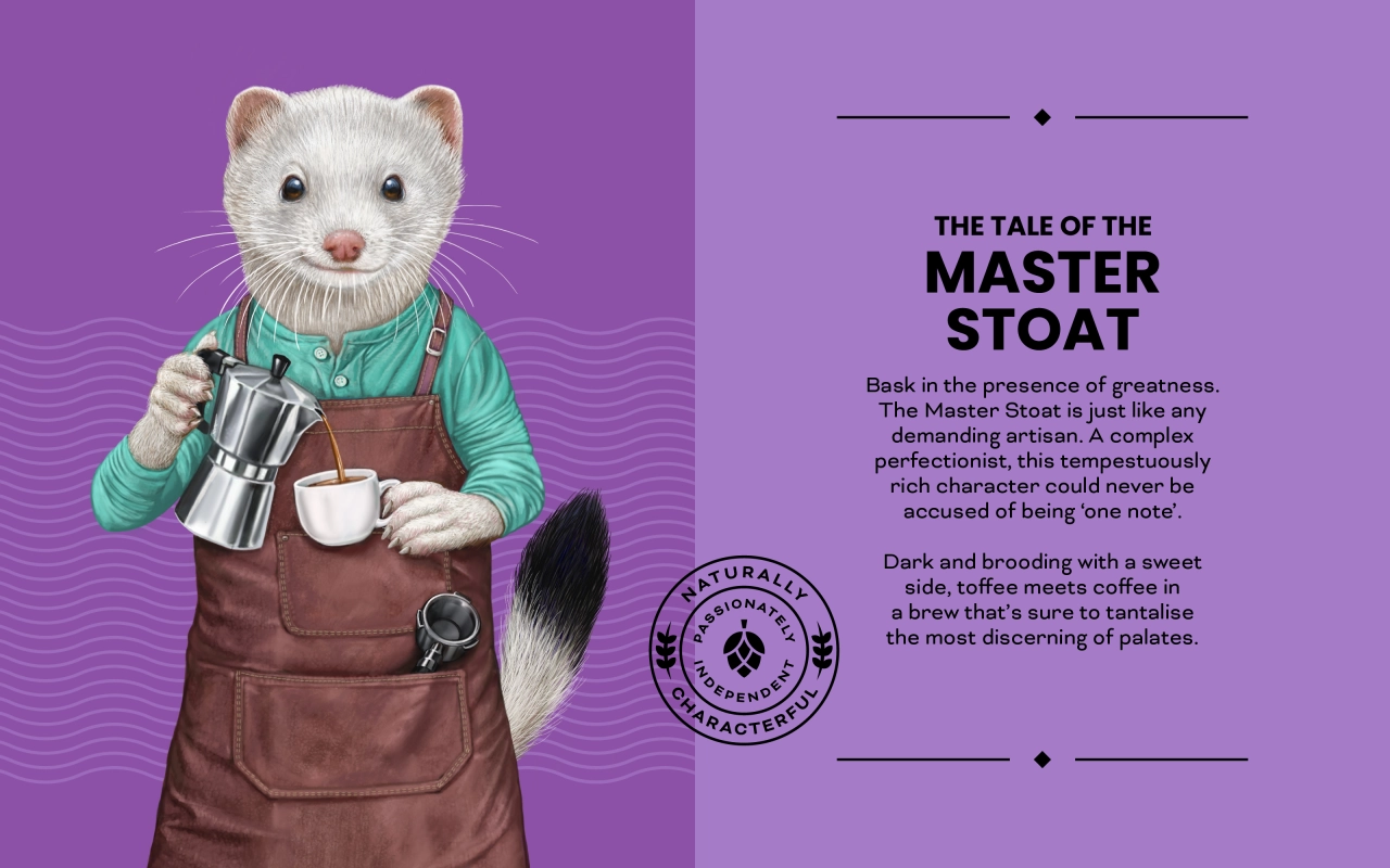
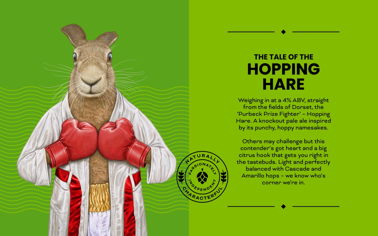
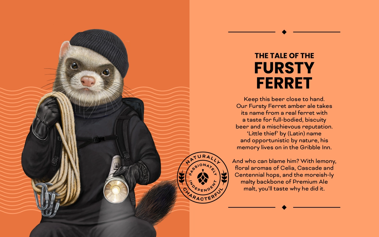
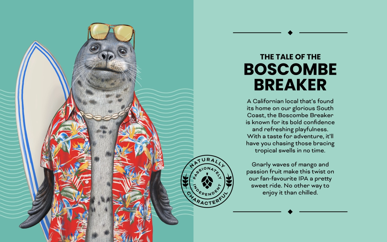
He adds that the rebrand's success can also be attributed to how Robot Food listened to its audience. "Proper beer fans are 'repertoire' drinkers – they don't want to be put in a box," he concludes. "There's no reason these 'traditional' beers couldn't be more appealing to a demographic that just wants a high-quality beer.
"Craft beer brands can feel quite full-on, but this was about the feeling of enjoying a nice beer without all the noise."
Editor's Picks





Trending




Latest Jobs
Senior Designer, Children's at Penguin Random House UK
Full-time·London·£37,650 – £40,000
Broadcast Producer at David&Goliath
Full-time·Los Angeles·$80,000 – $95,000
Design Developer, Opinion at The New York Times
Full-time·New York·$113,946 – $136,000
Account Director at David&Goliath
Full-time·Los Angeles·Up to $160,000
GTA VI Social Lead at Future
Full-time·Bath·£29,000 – £40,000
Director, Brand at KQED
Full-time·San Francisco·$125,547 – $165,000