We Speak Plant: Design Bridge unveils its rebrand for the RHS, tapping into the power of gardening
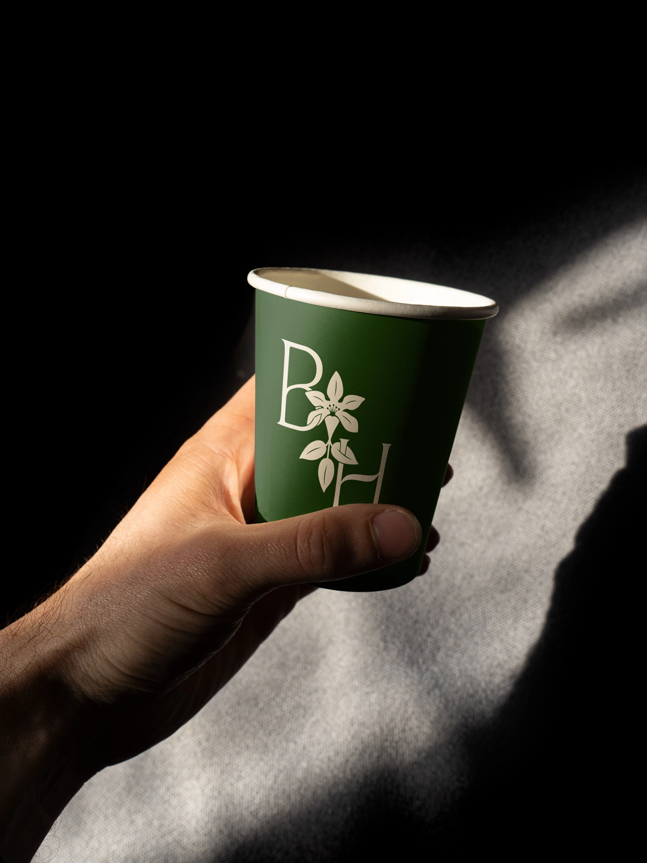
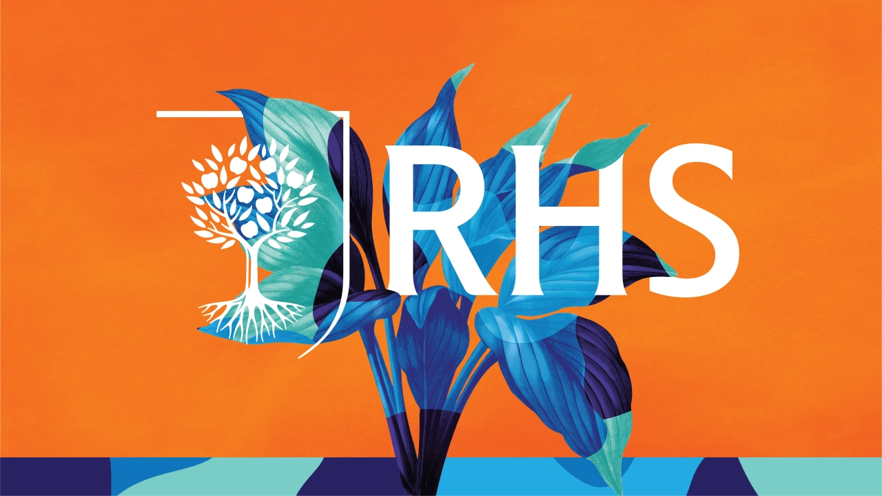
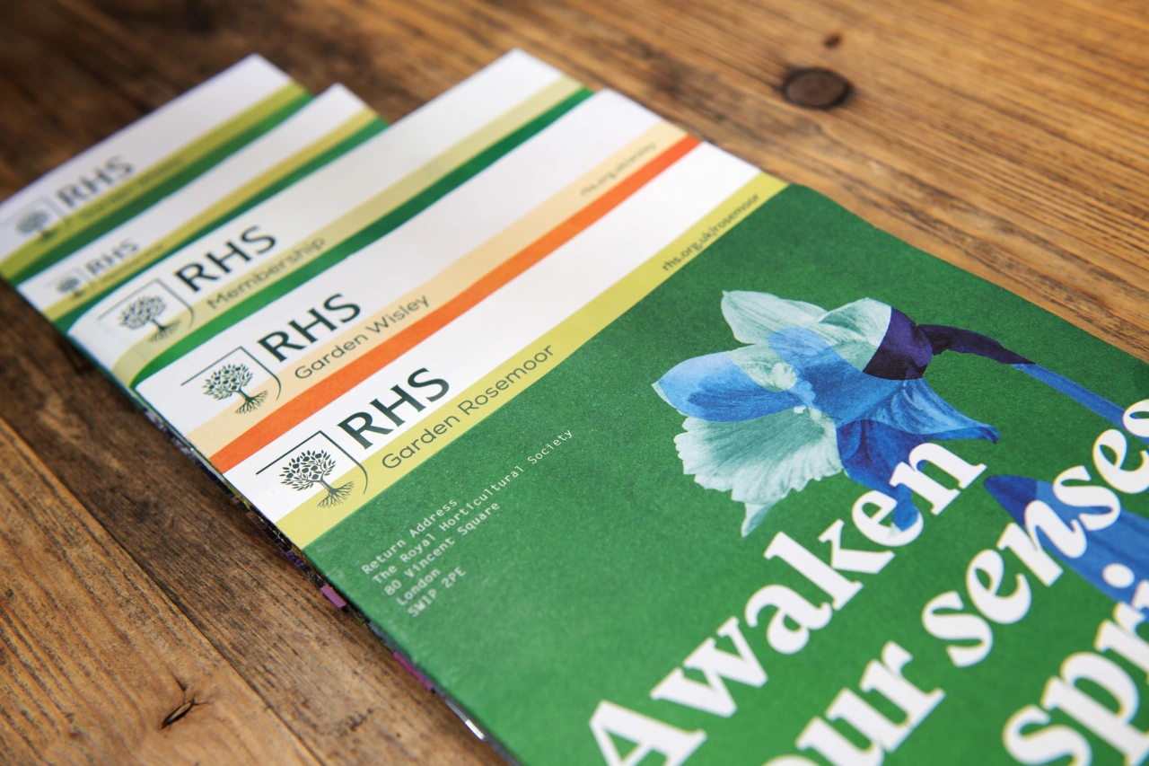
Design Bridge has today launched its full rebrand for the leading gardening charity, the RHS. With logo illustration by Paul 'Dessy' Desmond and lettering by Rob Clarke, inspired by the labelling of garden plants, it's a visual identity that celebrates the transformative power of gardening in all its forms.
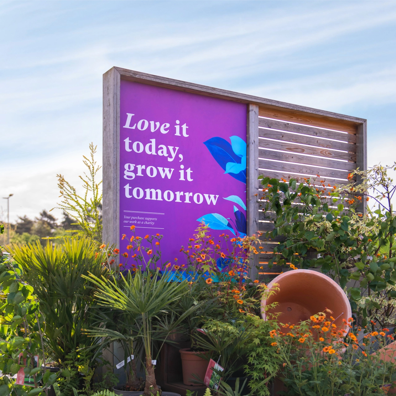
The London-based design agency was tasked with revitalising what was described as "previously inconsistent and overlooked branding" of the RHS. "Despite the important and lasting impact of the work of the RHS, their branding visually lacked pride and presence amongst other UK heritage organisations and needed to feel more inclusive to a broader audience," explains Design Bridge.
To combat this, the agency worked with the concept of 'The limitless wonder of growth', taking this positive sentiment as the inspiration for the entire brand refresh. "We wanted to enable the charity to tell its story clearly and compellingly, help it stand out amongst the crowd, and raise awareness of its work," Design Bridge adds.
The agency admits the project was a "true collaboration" from the off, working with the team at the RHS and alongside fellow WPP agency and partner, Wunderman-Thompson, whose focus was on the brand strategy and a disruptive brand campaign, 'We Speak Plant'.
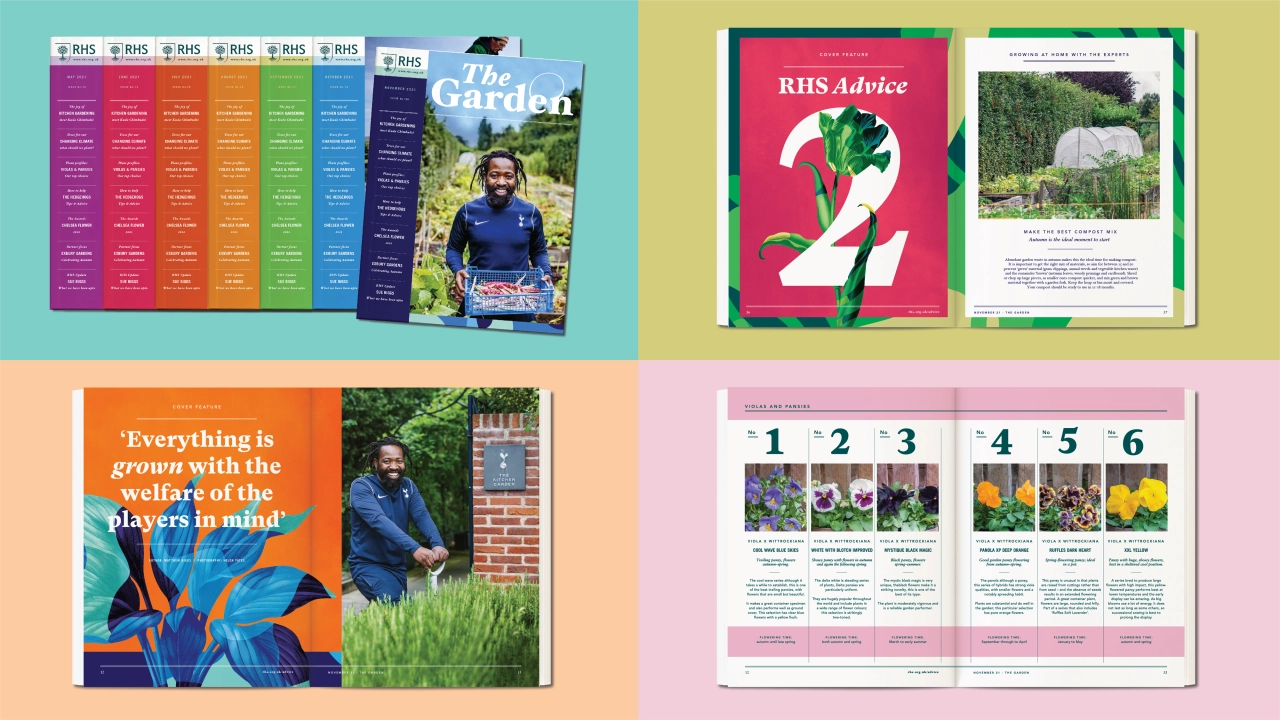
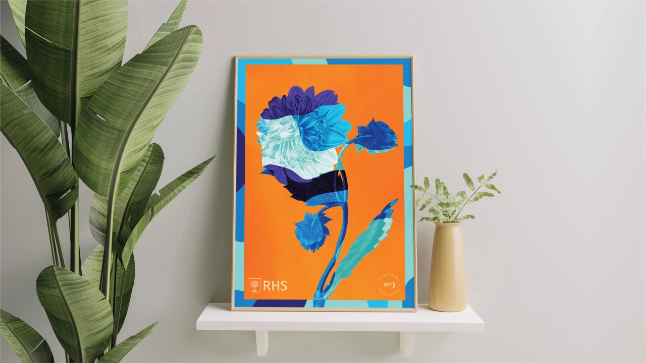
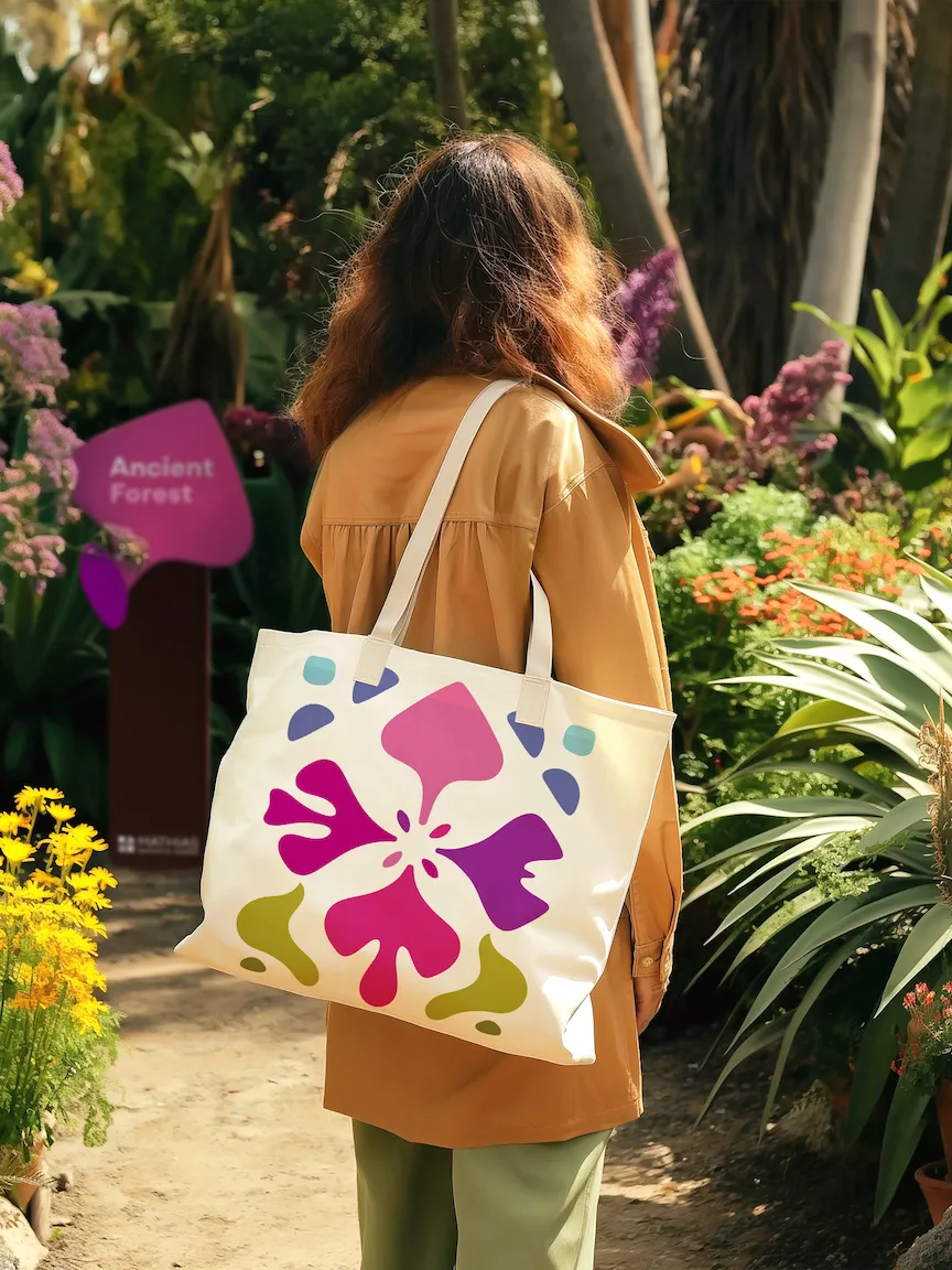
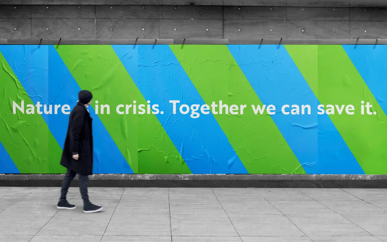
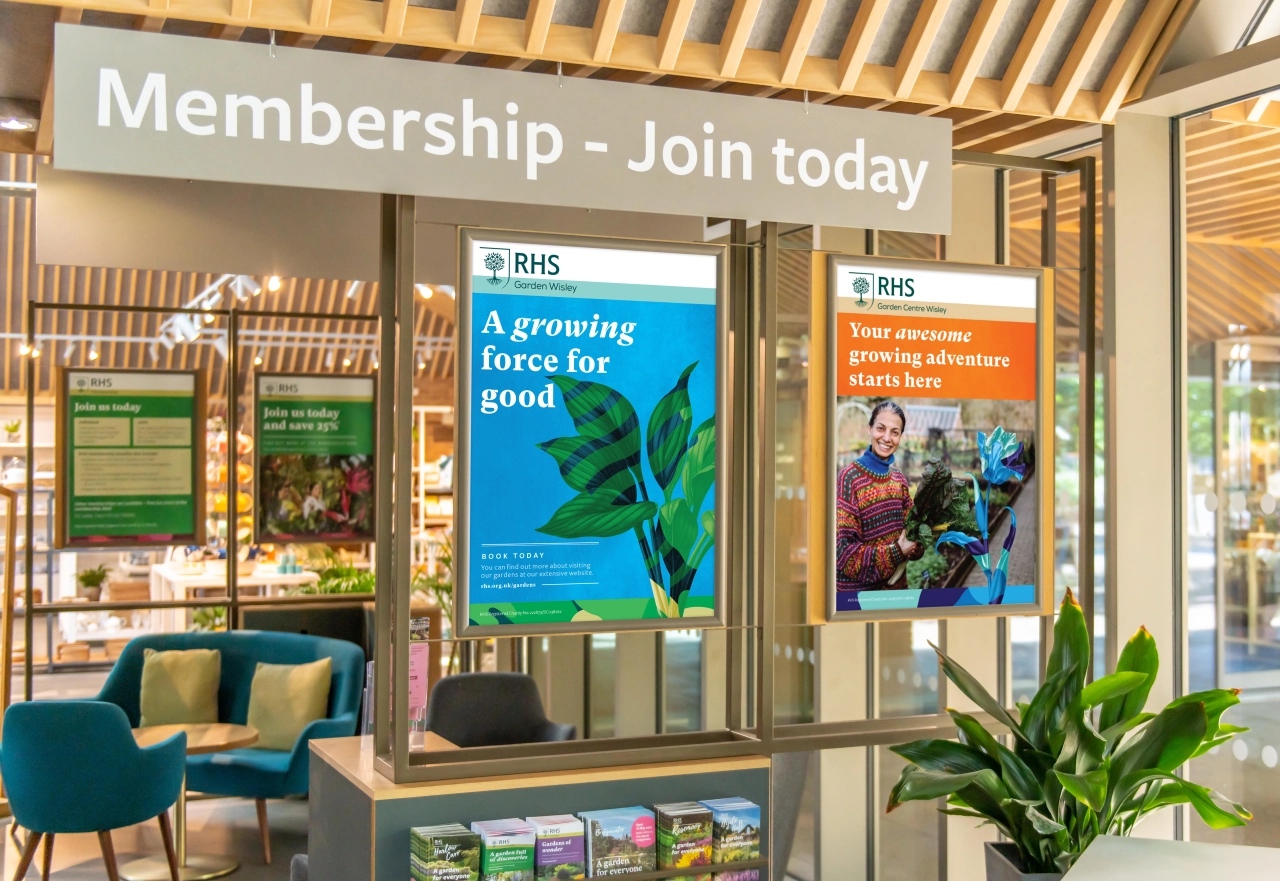
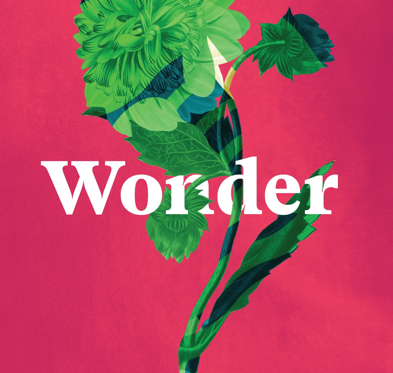
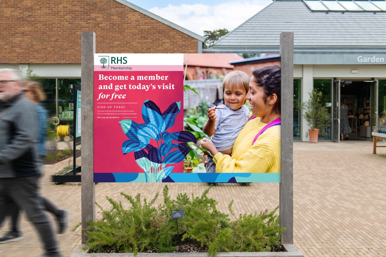
Over 12 months, the agency developed a new visual identity with a rich palette that reflects the various seasons and their different tones. Motion design also plays a big part, helping capture the idea of 'growth' and the fact that nature is never static. A distinctive illustration style was introduced, reflecting the life and vibrancy of gardening. Created by Chris Algar, a senior designer and illustrator at Design Bridge, the artworks reinterpret the beauty of botanical illustrations from the RHS archive, layered with vibrant patterns. While the logo illustrations were handled by Paul 'Dessy' Desmond. Finally, the accompanying typographic style by Rob Clarke adds a sense of trust and expertise yet is modern and distinctive through mixed fonts, inspired by the labelling of garden plants.
"We created a cohesive design system that reflects the organisation's vast history whilst simultaneously making the brand more appealing to contemporary audiences," says Tim Vary, creative director at Design Bridge. "Using the design idea of the transformative power of growth, we designed consistently evolving and transforming visuals. By layering textures, vibrant seasonal colour palettes, and a mix of historical botanical illustrations and typefaces alongside new moving imagery, we formed a design system reflective of the organisation's past, present and future."
Editor's Picks





Trending






Latest Jobs
Mid-Senior Designer at Something Familiar
Full-time·Bristol·£32k–£40k
Senior 3D Motion Designer at Art&Graft
Full-time·London·£50k-£65k
Senior Designer at Jubba
Full-time·London·£50k-£60k
Paid Media Executive at Munro Agency
Full-time·Glasgow·From £27,000
Senior Brand Designer at Analogue
Full-time·Leeds·£38k-£45k
Account Director at How&How
Full-time·London·£73k-£79k