The Plant creates unusually editorial-leaning identity and site design for new online art auction platform The Stand
London-based agency The Plant has created the identity and website for the new online art auction platform The Stand. The platform is the brainchild of Sotheby's former CEO (who was also once David Bowie's art curator), Robin Woodhead.
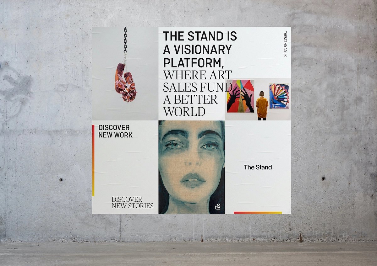
The Stand both responds to the art market in pre-pandemic times and draws on the post-Covid developments in the ways all of us live and work in relation to technology. Woodhead is said to have created The Stand to support artists' incomes and charitable organisations, as well as giving art collectors access to rising talents.
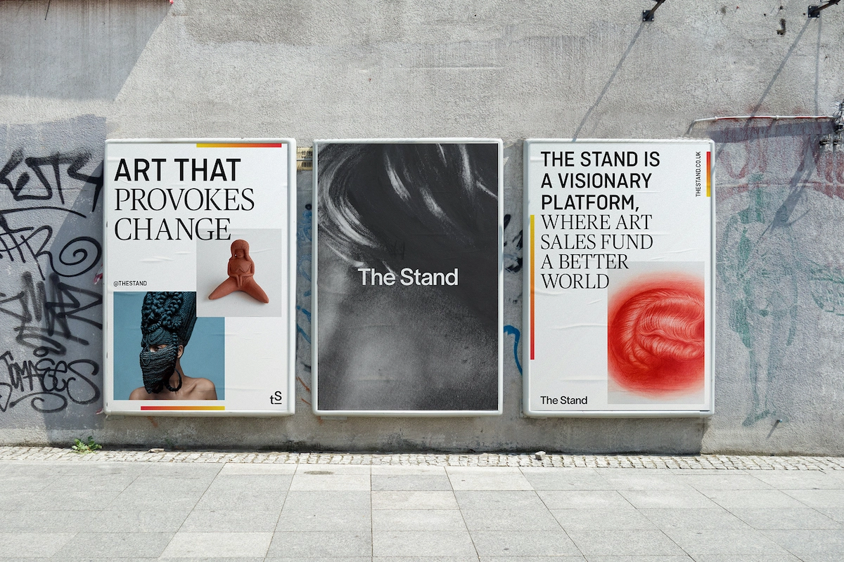
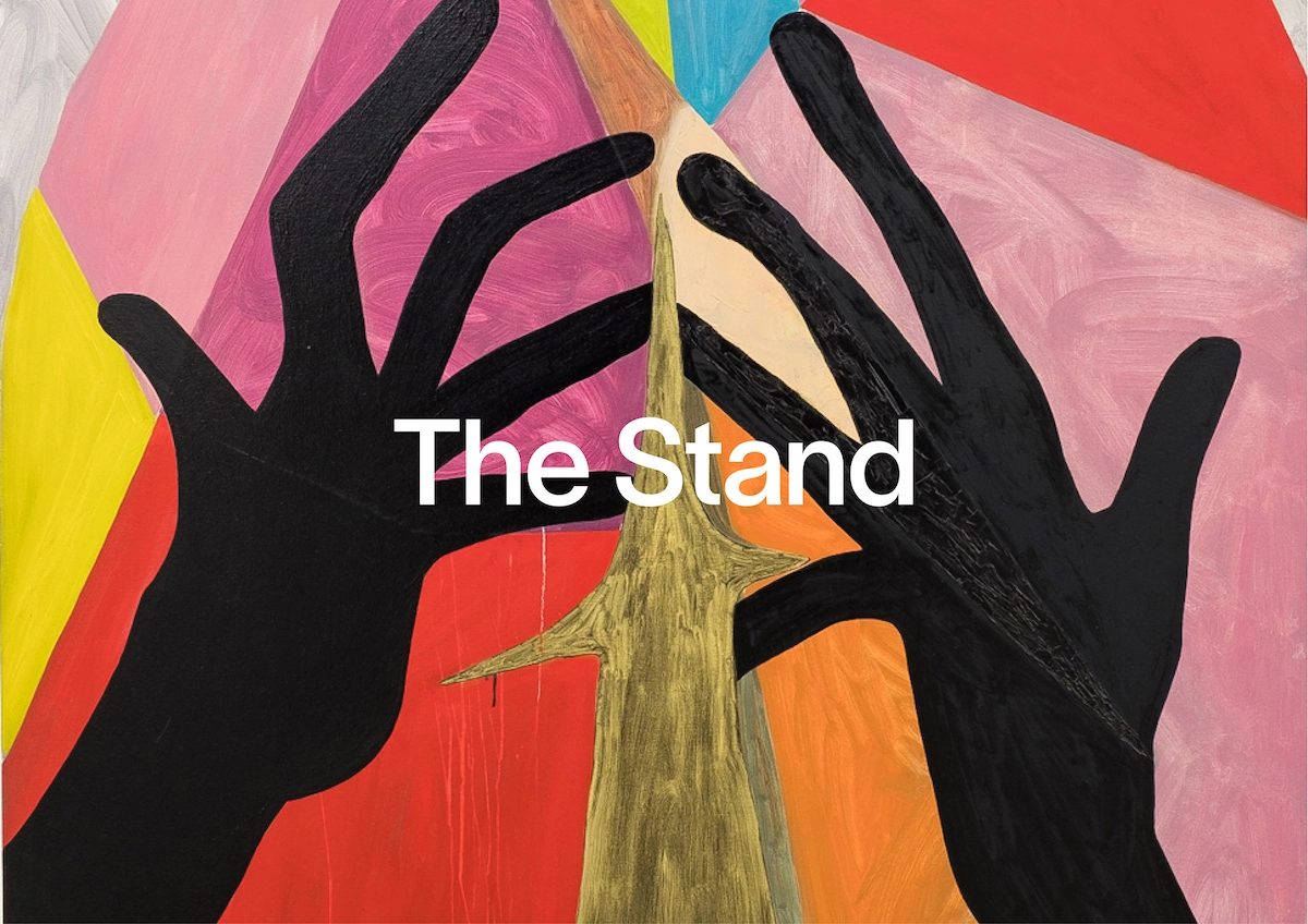
The Plant worked with The Stand team right from the start of the project, creating an identity that needed to work seamlessly across all touchpoints. According to The Plant founder Matt Utber, The Stand's identity has been designed to "communicate its status as a provocative and empowering platform for artists."
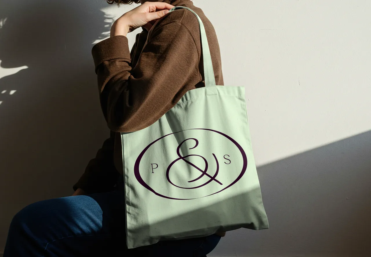
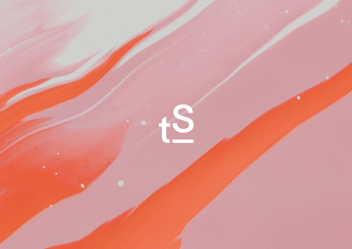
It uses a simple wordmark and a logo "that elevates the 'S' with a plinth bar, suggesting the support that artists and their causes can expect," he adds.
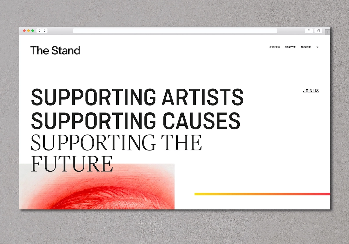
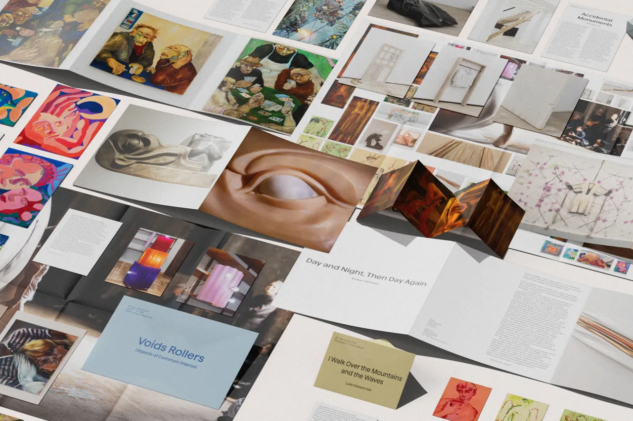
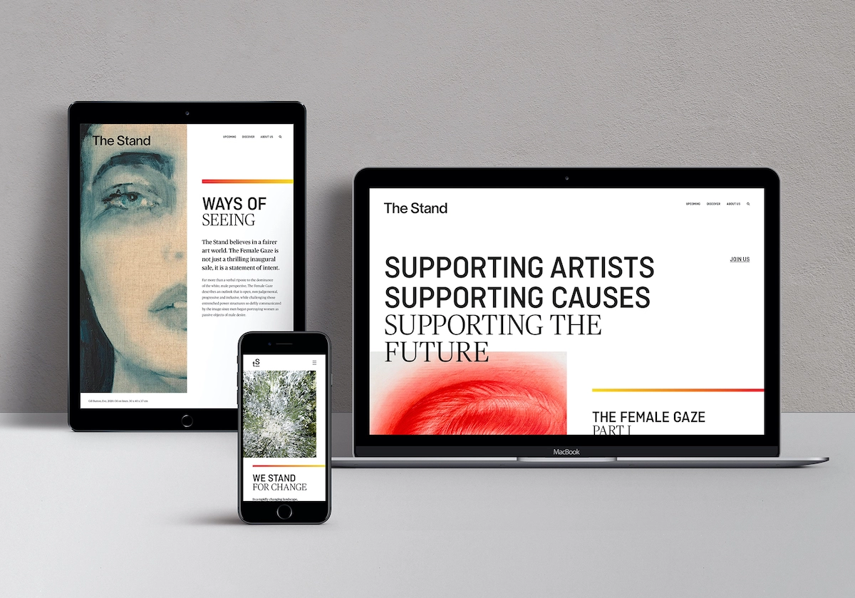
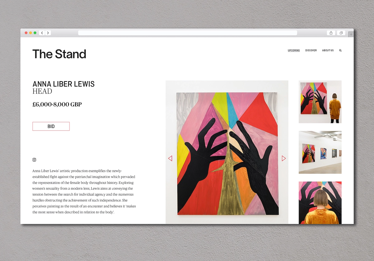
The site design looks to eschew the feel of traditional online auction sites by prioritising openness and transparency to create a "more editorial mood," says Utber. "This invites users to explore more, building a deeper relationship between artist, curator and collector."
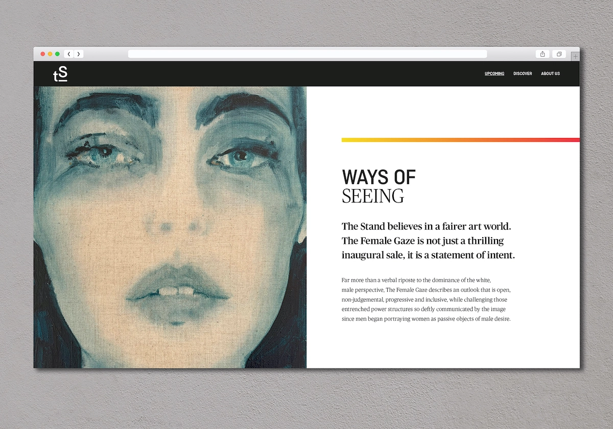
A variety of typography styles are used across the identity, with Ciutadella by Emtype Foundry and Romana by Linotype in different weights and cases to create a sense of texture and a magazine-like layout, since the different styles can be applied to headlines, pull quotes and bylines.
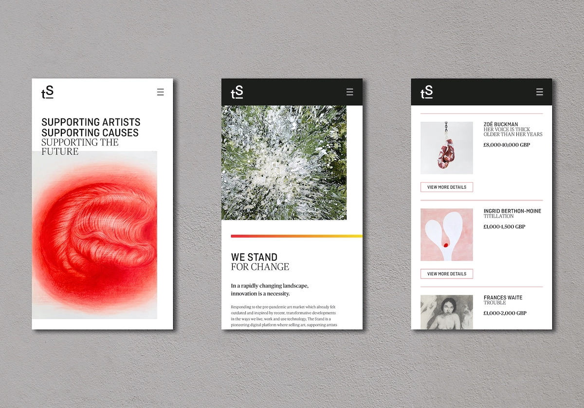
The site uses a mixture of bold text and punchy images, which are often overlapped to reflect the idea that conceptual and visual elements work together to give artworks meaning.
Through its online marketplace, Invaluable, The Stand will produce themed, curated auctions of works by emerging and mid-career artists. The platform describes itself as "a form of social impact investing" (artists and their galleries or agents receive 70% of the sale price; 20% goes to partner charities, and 10% to The Stand to cover costs.) "By properly rewarding artists and enabling them to donate to social causes, their best work is submitted for auction," says The Stand.
The first auction, The Female Gaze, opened on 18 May and celebrates artists who identify as "female, non-binary or genderless and specifically artists that explore the female form, a subject traditionally colonised by men," the platform adds.
Editor's Picks





Trending





Latest Jobs
Client Success & Growth Director at Revolution Growth
Full-time·Manchester·£60k-£70k
Digital Marketing Executive at Arise
Full-time·Sheffield·From £23,750
Senior Brand Designer at Analogue
Full-time·Leeds·£38k-£45k
Client Partner at Halo
Full-time·Bristol·£30k–£36k
Graphic & Motion Designer at The SHARP Agency
Full-time·Leeds·£26k–£33k
Senior Designer at Jubba
Full-time·London·£50k-£60k