I Shot the Serif: NaN's remarkable new release NaN Jaune challenges the legibility and personality of commercial typefaces
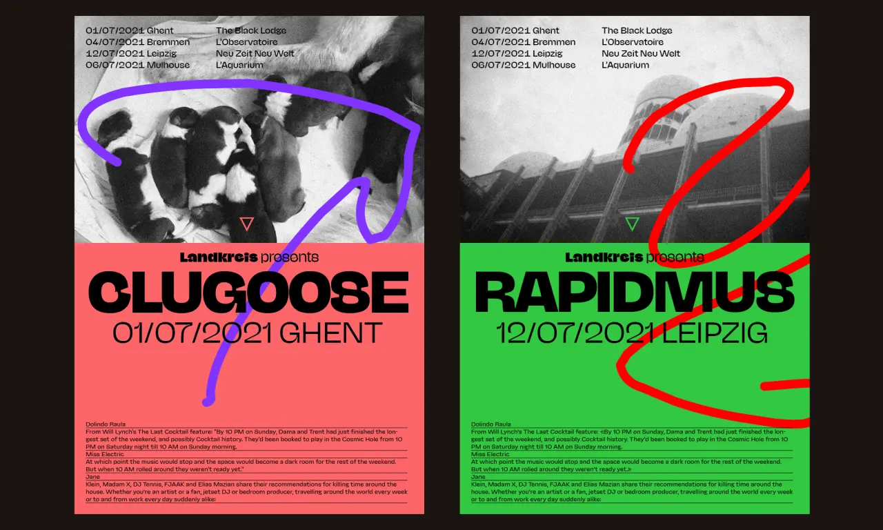
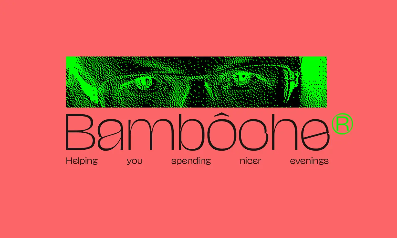
Lively, characterful and brazen, NaN Jaune – the latest release from Berlin-and-Sydney-based type foundry NaN and the mind of Berlin-based type designer Jérémy Landes – not only packs a punch but has the masterful engineering to deliver that punch any way you'd seem fit.
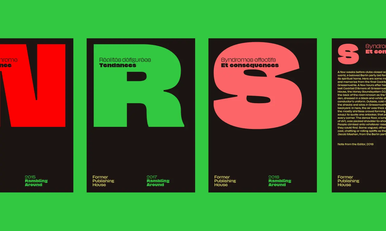
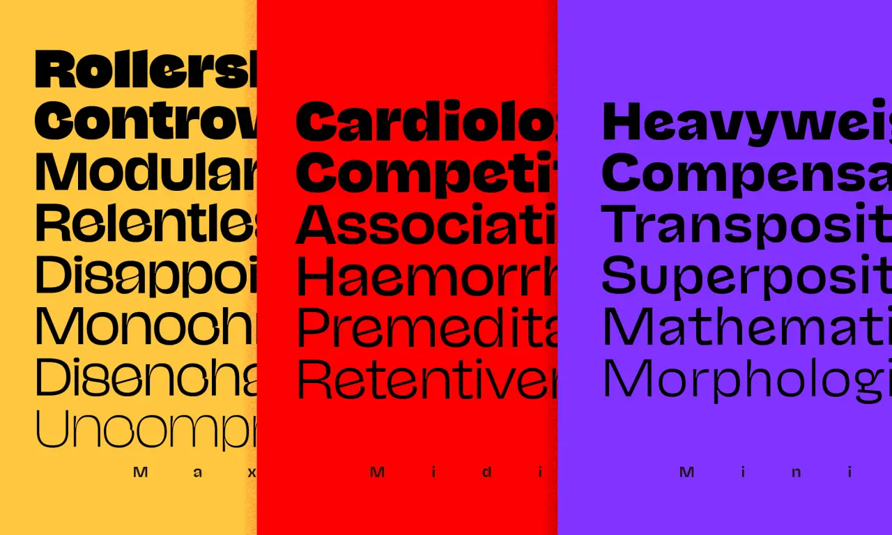
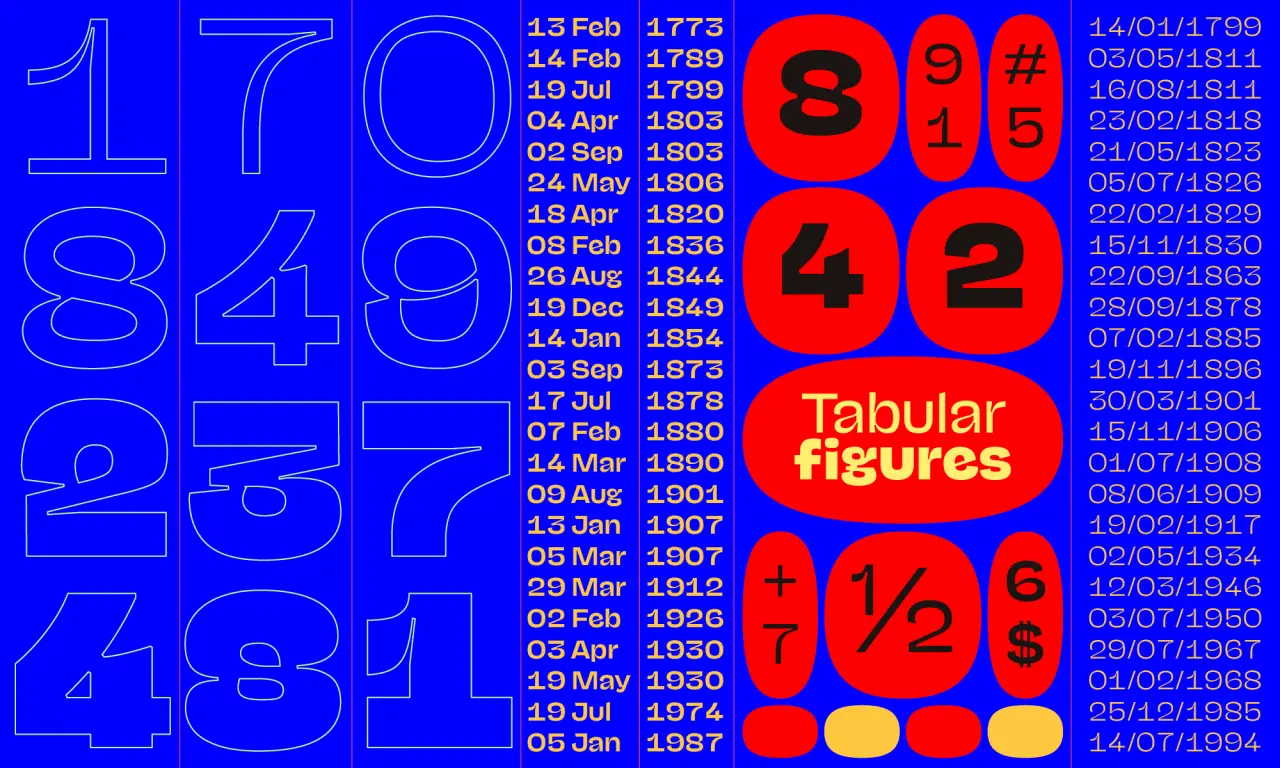
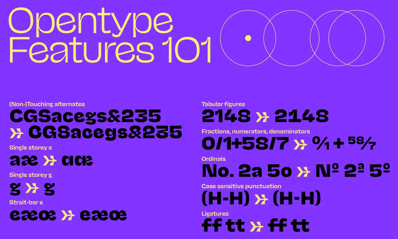
With Maxi, Midi and Mini subfamilies, NaN Jaune is crafted to suit any application or scale – from display type to long texts – working successfully and effortlessly every step of the way.
Fundamentally comfortable, both in its technical rigour and the warming collision of forms within the typeface itself, Jérémy tells us "I wanted to bring something a bit new and fresh to the genre," noting his drive to "bring creations that have some kind of novelty to the world" within his own practice.
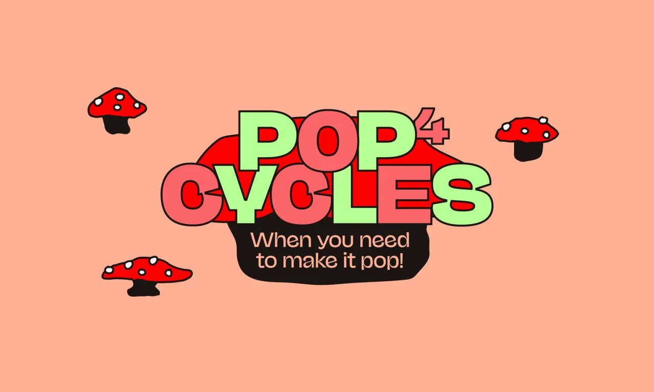
It takes inspiration from the Nord and Compact styles of Roger Excoffon's 1960 Antique Olive from Fonderie Olive, as Jérémy explains: "NaN Jaune tries to reproduce the charming warmth of these pioneering typefaces by keeping a healthy amount of inconsistencies," something innate to the organic way in which Jérémy originally draws his typefaces. "Jaune continues what I'm trying with most of my designs," Jérémy adds, whereby he keeps a crucial human touch and the purposefully obvious personal involvement to "a crude collection of B&W digital outlines."
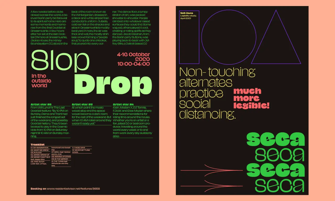
The sense of imperfection and humanity present in NaN Jaune doesn't just denote the animated character of the typeface. Still, it also challenges the expectations of commercial typefaces – bringing into question the necessity of legibility and the prevalence of fun!
With NaN Jaune beginning with Jérémy's take on avoiding the legibility of bolder characters, he tells us "by closing all apertures, I made this typeface illegible on purpose," adding, "or at least I was trying to see if I could still design a font legible enough with this idea." From here, and not wanting to disregard the utility of the typeface, Jérémy began to differentiate the characters between the families and his journey to NaN Jaune, as we see it now, began.
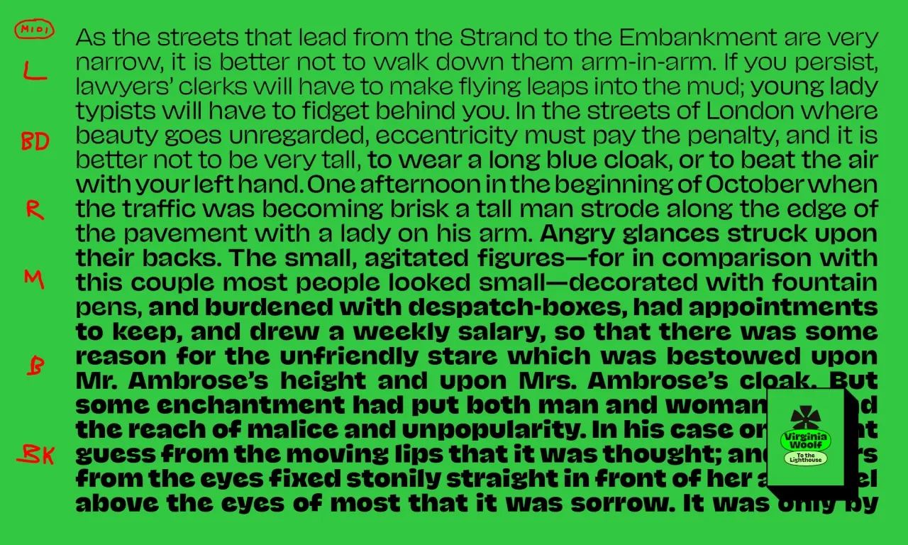
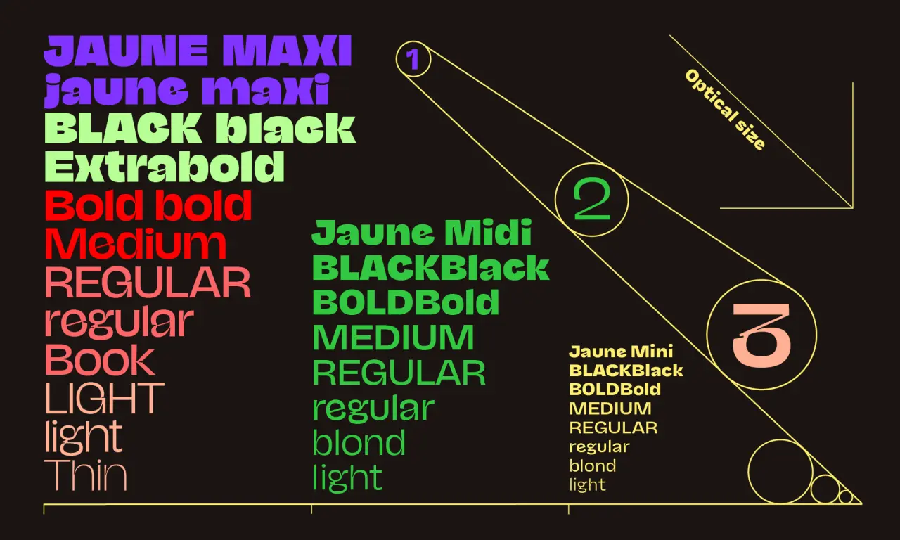
A process of refinement, replacement and renewal, Jérémy recalls, "I kept telling myself that this typeface had too much potential to only be reduced to an ultra titling face," adding, "it felt sacrilegious, but I tried to see what it would look like if I would just open everything wide again." With Mini and Midi forming, as a result, Jérémy began the rigorous task of simplification, enhancing the details of the subfamilies only to remove them soon after. "At the end of the day," Jérémy retails, "drawing Jaune's different styles was some kind of self-referential caricature exercise in which every style relates and tries to express the same idea," doing so as boldly and sincerely as possible.
Requiring an equally as characterful, punchy and entertaining release, NaN has created a remarkable microsite to celebrate NaN Jaune's launch – a platform game where you navigate a font sheriff on a perilous journey, collecting independent type foundries on the way and avoiding the evil commercial foundries in the process. Sans Sheriff, the game in question, is a brightly coloured, incredibly fun and potentially highly-rewarding bonanza; with a leaderboard in place that allows winning players the chance to win type licenses.
"Humour and play is a big part of NaN," NaN's founder Luke Prowse tells us, discussing NaN Jaune's release, "and Jeremy and Jaune are a perfect fit." Wanting to send the typeface out into the world in a way that is equally as "cheeky, off-beat, playful and definitely… weird" as NaN Jaune itself, Luke remarks, "it's such a joyful typeface that I wanted to do something in the spirit of the font itself."
Alongside the immediately addictive game, NaN Jaune's site is a host of wonderful and equally engaging interactive elements that showcase the power of the typeface. Asking whether this interactivity sets a precedent for future type releases, Luke explains "they have their obvious benefit, especially around variable font technology," adding, "it's right there, the user can adjust sliders, edit text and get a feel for the offering," with no need to download, install or boot up any additional software. "It's at your fingertips the moment you're engaged with it," Luke explains, concluding, "it's a working prototype for how the typeface performs in a digital environment."
NaN Jaune is available now. Visit sanssheriff.wtf to play the game for the chance to win some goodies.
Editor's Picks





Trending






Latest Jobs
Head of Technical & Facilities at Midlands Arts Centre
Full-time·Birmingham·£40,210
Art Director at The New York Times
Full-time·New York·$120k–$130k
Marketing Copywriter at ustwo
Full-time·London·£40k-£50k
Senior Front End Developer at Crown Creative
Full-time·Belfast·£50k–£60k
Design Director at Koto
Full-time·London·£72k-£90k
Digital and Marketing Manager at Manchester Art Gallery
Contract·Manchester·£38,126 pro rata