A smart, confident but artisanal approach to the tricky task of property branding design
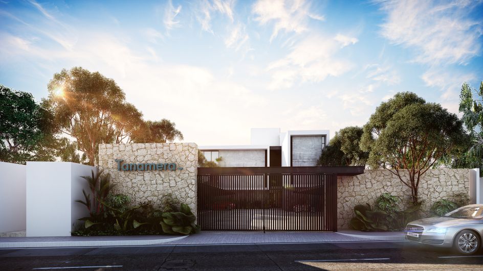
Pure Design, a studio based out of Mérida in Yucatán, Mexico, has recently created the confident, pared-back branding for Tanamera Apartments.
The team was brought in to create the visual identity for the apartment block, which the agency describes as "a place in which its inhabitants will become part of their environment through spaces that will meet each of their needs".
As such, the complex aims to cater to people's exact individual needs by focusing on the wellbeing and unique lifestyles of those who move in and "fulfilling their dreams," says Pure Design.
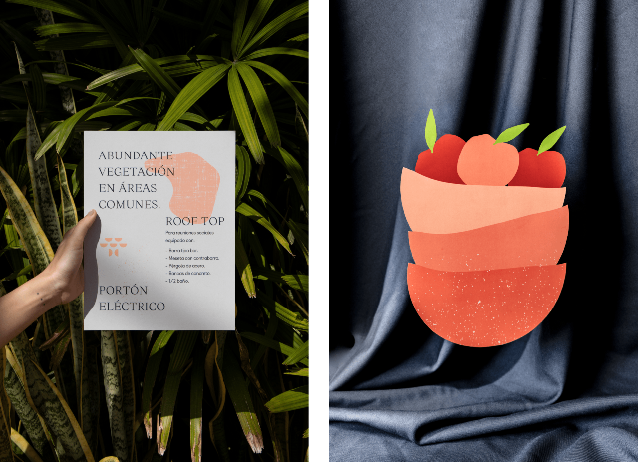
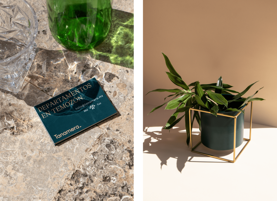
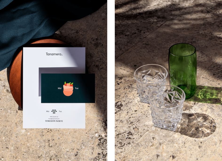
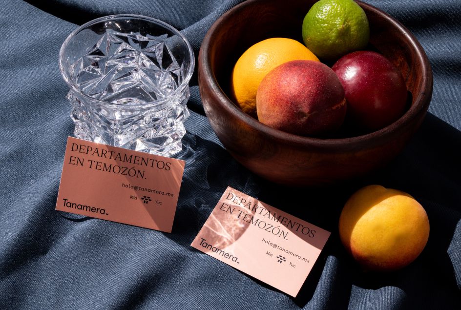
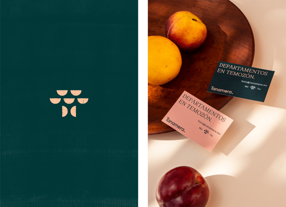
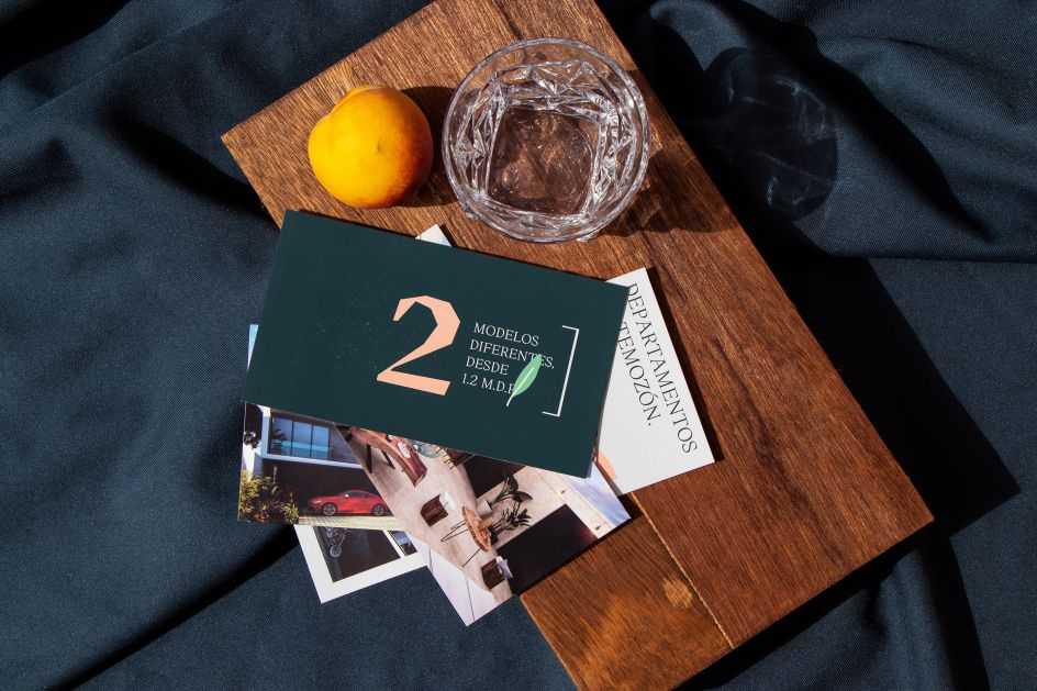
The designs use a colour palette that mixes a sophisticated-looking shade of deep green with a more playful baby pink and terracotta. This is used alongside cute illustrations formed of simplified natural shapes or abstractions of still-life setups, such as leaves or a bowl of fruit.
The leading brand font which forms the Tanamera wordmark is a gentle sans serif, which works alongside a beautiful jagged, modern-looking serif font across applications such as business cards, branded paper, promotional leaflets and other collateral.
The overall aesthetic is one that feels both artisanal and confidently direct. "Combining the warmth of the colours and elements found in a house, with nature and organic designs that allude to a home that is in a unique environment, Tanamera gives life to a space that becomes a home," says Pure Design.
The agency works across design, branding and communication; creating everything from naming to logo designs, slogans, packaging, editorial, advertising campaigns, digital design and photography. Pure Design describes its "main objective" as communicating "graphically and functionally." It adds that its inspiration comes from "shapes, colours, textures and trends; always focusing on the details, since we believe they are the essence of every design we create."


Editor's Picks


Trending


Podcasts


Editor's Picks
Further Reading