SocioDesign creates squeaky clean branding for London-based Soap Industries
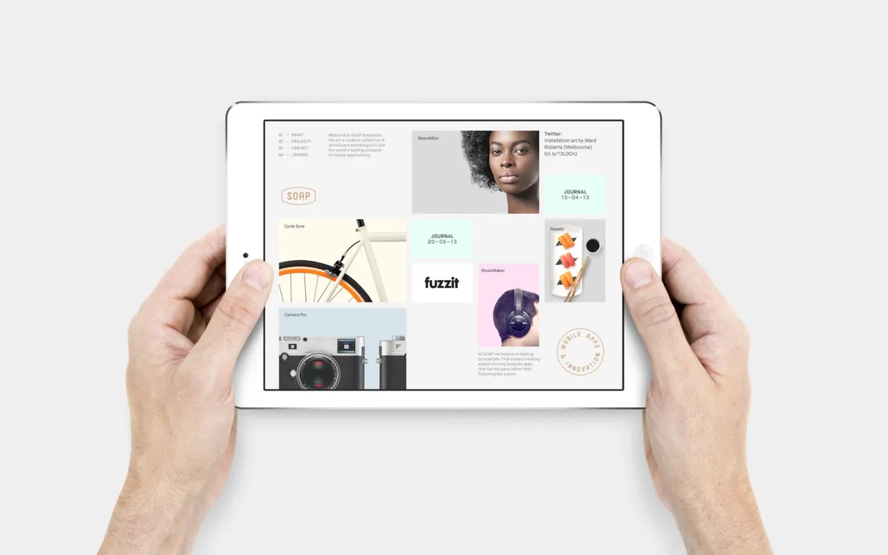
London-based design agency SocioDesign was appointed by Soap Industries – a new digital and mobile development agency, also located in London – to create its brand identity.
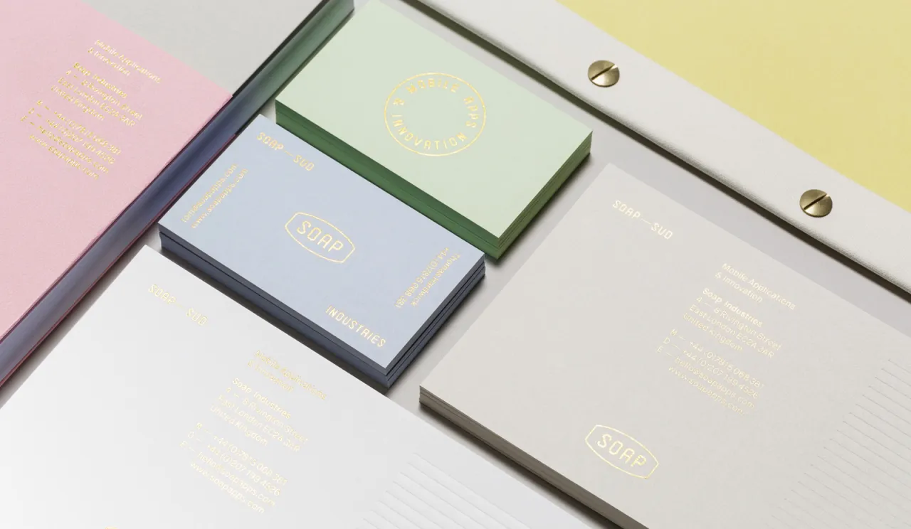
The aim was to help the company to differentiate itself from its competitors, through the craft and detail that comes part and parcel with the team's service.
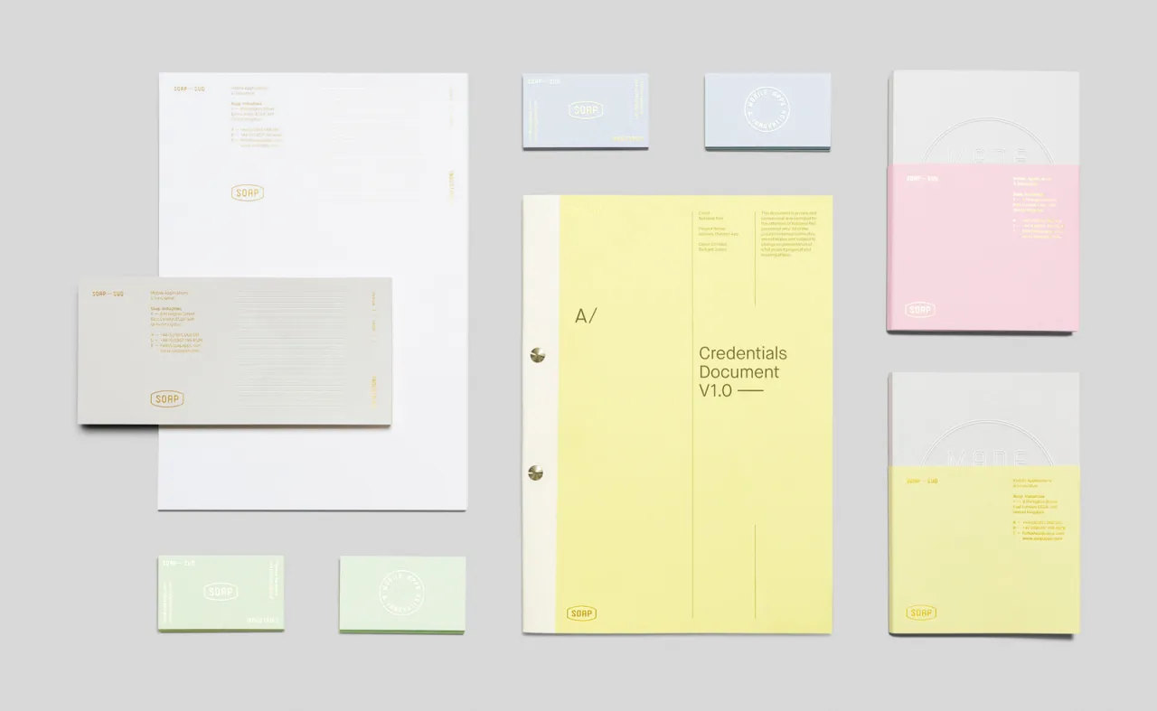
Of the project, SocioDesign said: "We created a brand story and identity system that represented Soap’s distinct perspective and applied it to both print and digital collateral.
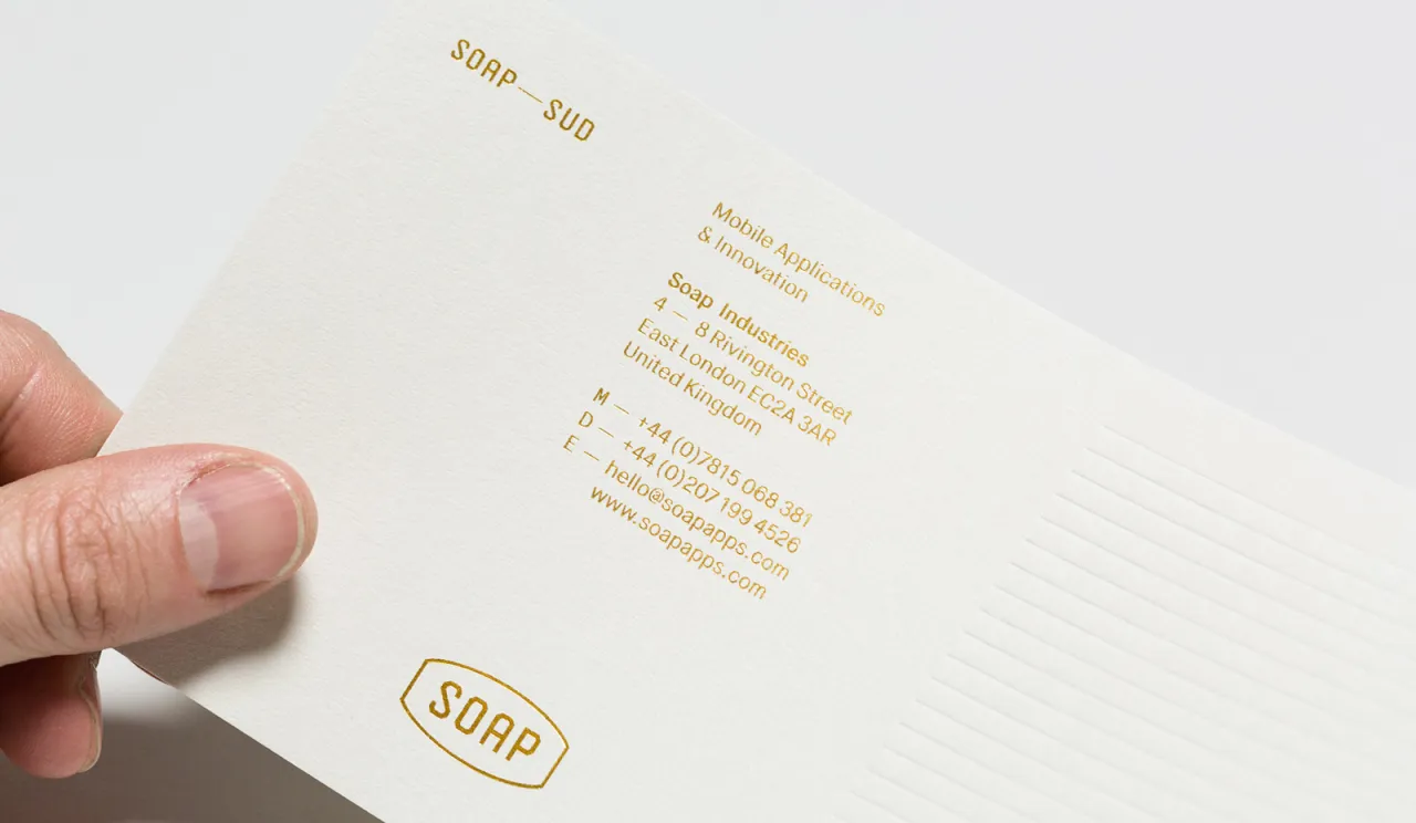
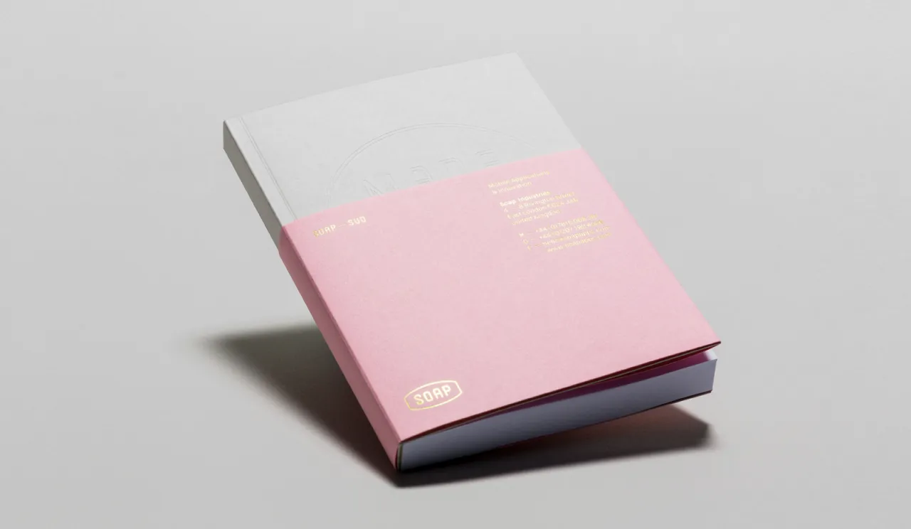
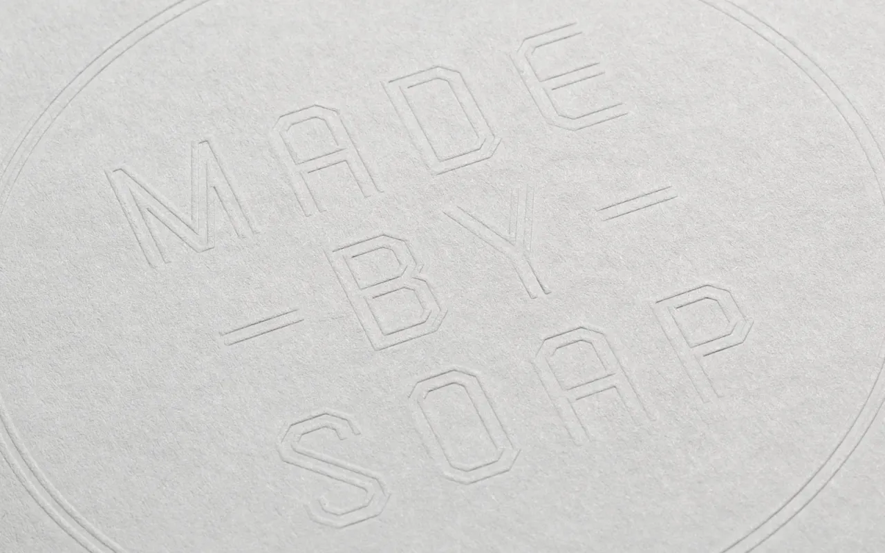
"The result was a paradoxical brand that reflected Soap’s craftsmanship and tactile work ethic through 1930s industrial insignia, pastel colours and metallic foils.
"This unusual combination helped to define a distinct brand style that communicated the core values at the heart of the business, and set Soap apart from their competitors."
The printed material was provided by Avenue Litho.
Editor's Picks





Trending





Latest Jobs
Graphic & Motion Designer at The SHARP Agency
Full-time·Leeds·£26k–£33k
Brand Designer at Adfin
Full-time·London·£30k–£50k
Account Director at How&How
Full-time·London·£73k-£79k
Agent & Producer at The Jacky Winter Group
Full-time·London·£35k–£40k
Brand Copywriter at Origin
Full-time·Porthleven, Cornwall·£35k–£40k
Senior Front End Developer at Crown Creative
Full-time·Belfast·£50k–£60k