Design of distinction: high-end identity for male grooming line by BrandOpus
The 2010s have been the decade when the male grooming industry finally got its act together. For years, this huge market remained untapped, but now companies seem to have found the right mix of product, messaging and visuals to appeal to the average male, not just the metrosexual elite.
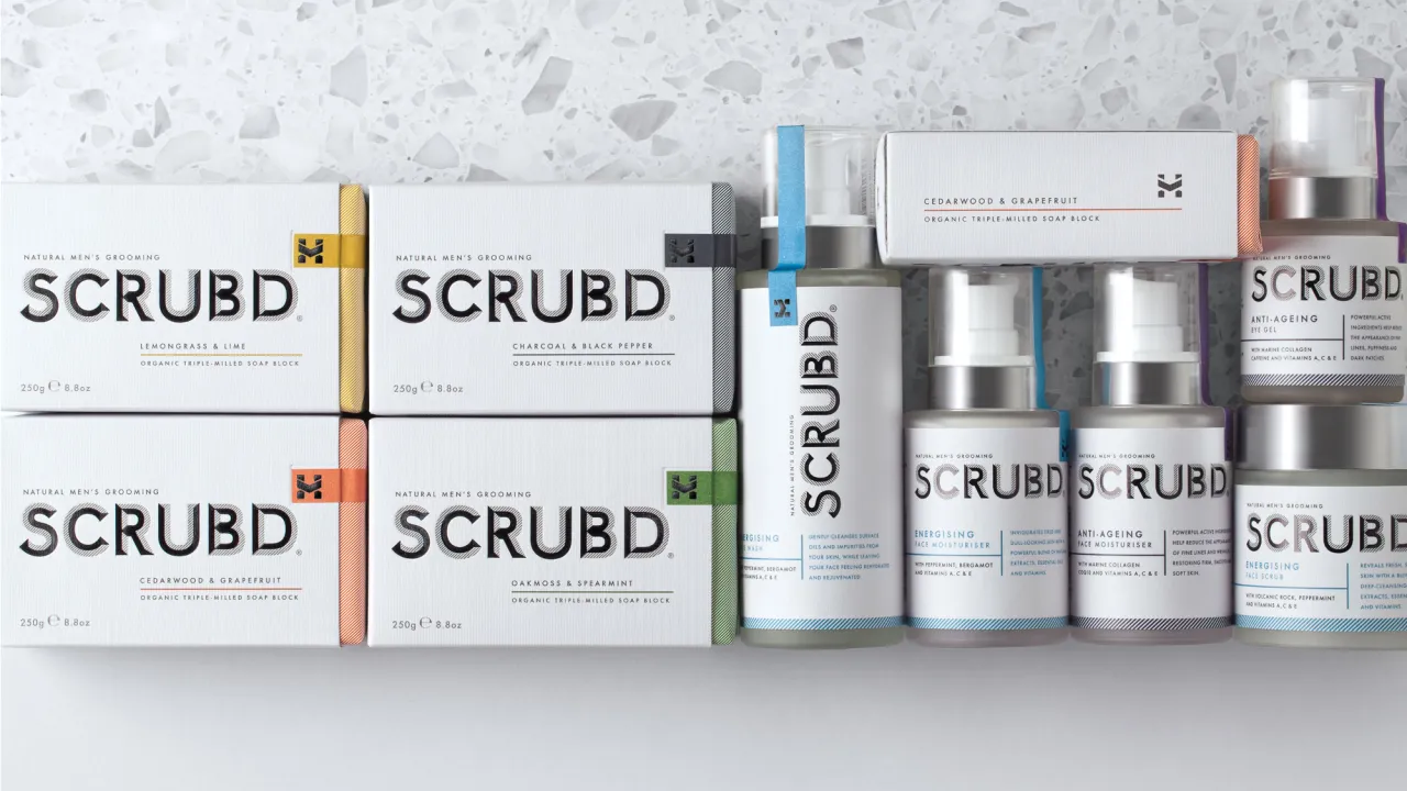
Now, though, with hipster-style grooming products appearing in Boots and Superdrug, a gap has now opened in the high-end of the market, and the prize for anyone who succeeds is a big one.
With that in mind, global brand design agency BrandOpus were recently tasked with creating an identity and packaging for SCRUBD, a new and exclusive UK-based men’s grooming range based on organic triple-milled soap blocks and available exclusively in Harvey Nichols.
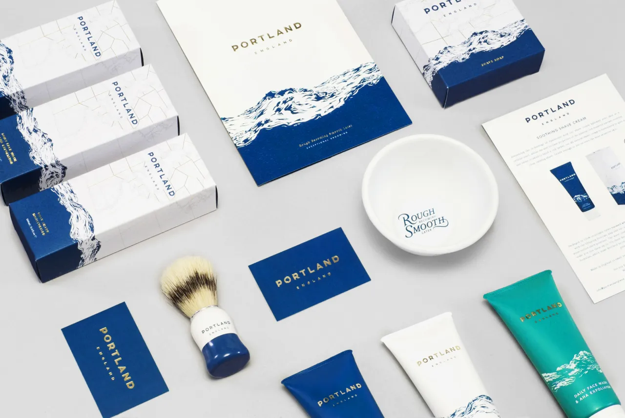
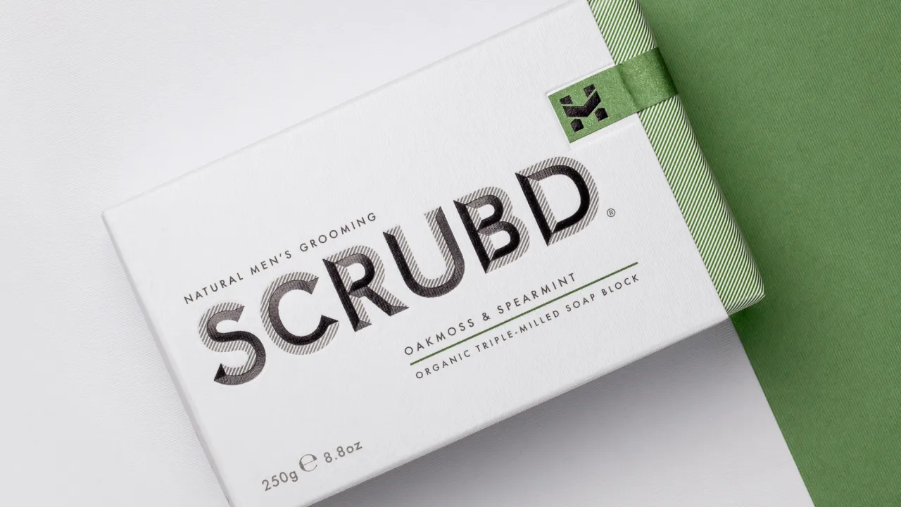
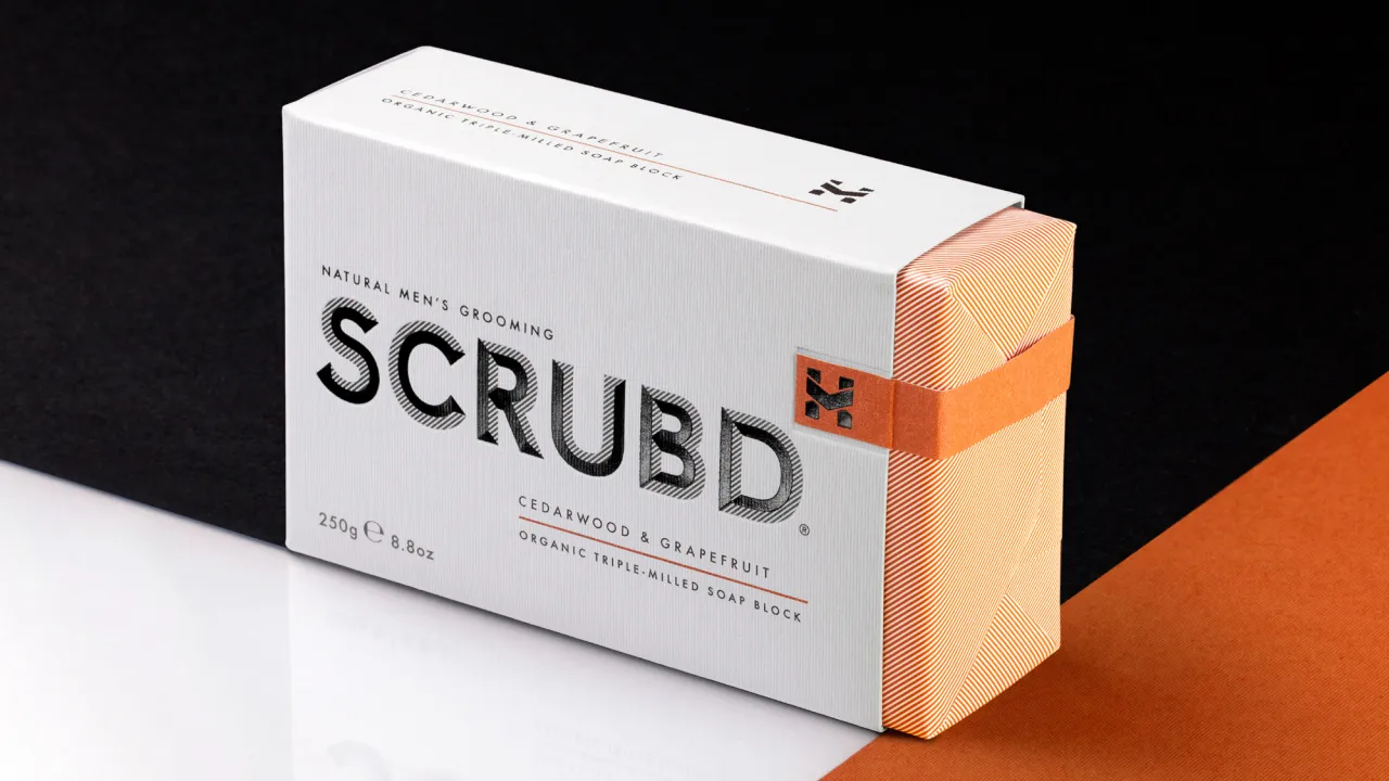
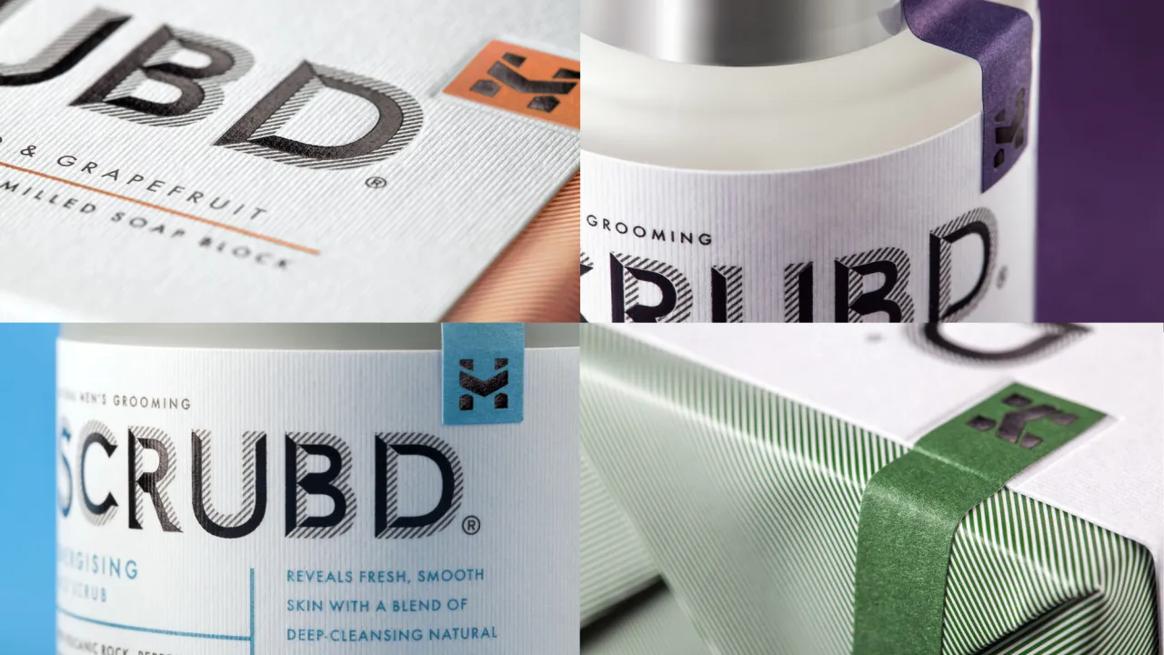
The graphic solution BrandOpus has come up with mimics a stonemason’s signature, traditionally a symbol of the creator’s finest work. It's a smart way to signal that this is not just a me-too generic brand but a product of distinction. And it's also a subtle nod to raw masculinity in a business still a little nervous of appearing overly "feminine" to heterosexual men.
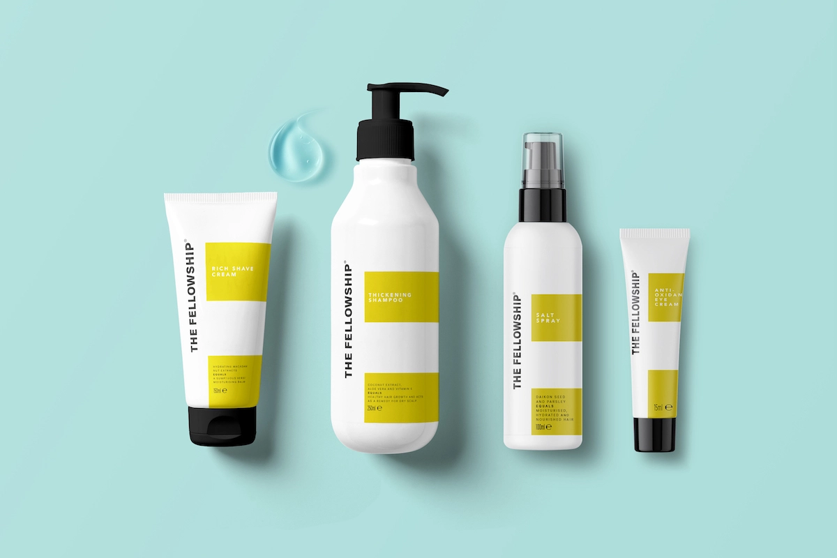
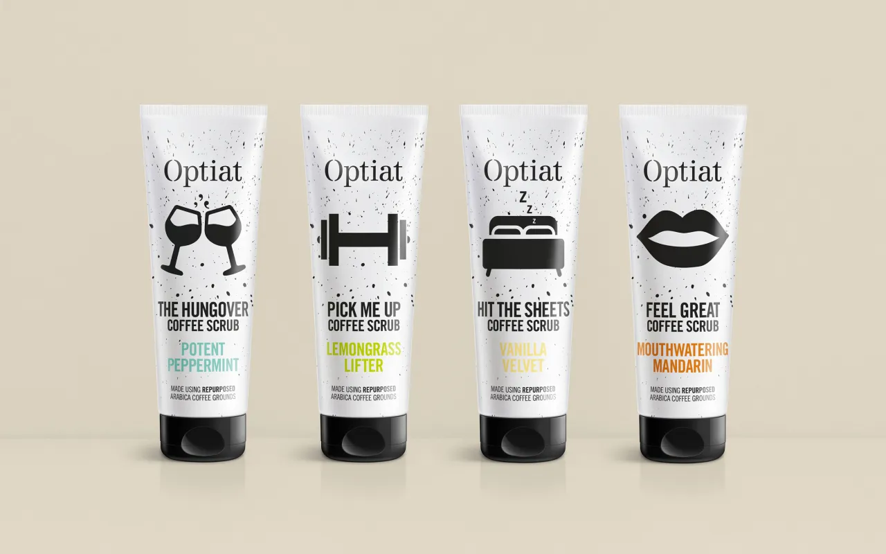
With a mixture of bevelled embossing, evocative textures and quality finishes, it all adds up to a packaging design that successfully sells itself as a discerning, luxurious, lifestyle choice.
Editor's Picks





Trending






Latest Jobs
Brand Strategist at DNCO
Full-time·London·£45k-£60k
Frontend Developer at Northern Artillery
Full-time·Leeds·£35k–£45k
Art Director at SPOKE
Full-time·London·£55k-65k
Designer at New Genre
Full-time·London·£36k–£48k
Midweight Graphic Designer at We Are Your Friends
Full-time·London·£36k–£44k
Growth Strategist (Ecommerce) at Tribe
Full-time·Exeter / London·£50k + Bonuses