Sibling Rivalry lets its diverse personality shine in playful new visual system
Brand studio and production company Sibling Rivalry has put the differences in its departments aside to create a new, holistic identity reflecting its dual services.
Creating a brand for one business is difficult enough. But what do you do if you need to boil down various products or services into a single, coherent identity? For New York and Santa Monica-based company Sibling Rivalry, the solution was to embrace these internal multitudes and reflect them in the design system.
Launched earlier this month, Sibling Rivalry's rebrand uses geometric shapes, bold colours and modular elements to bring together both the brand studio and production company arms of its business. The result is a playful identity that can be combined and assembled in endless ways, equipping the company with the tools and creative structure to express itself freely.
For Sibling Rivalry, which was founded in New York in 2011 and has created award-winning work for HBO Max, Google and Audible, the need to communicate the variety of services they provide was paramount. And rather than adopt an umbrella brand - which has successfully worked in the past for companies like Firefox - they decided to lean into their split personality.
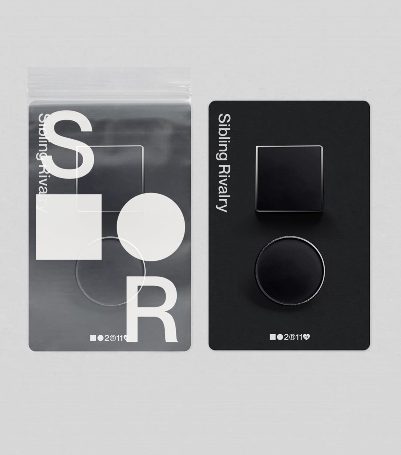
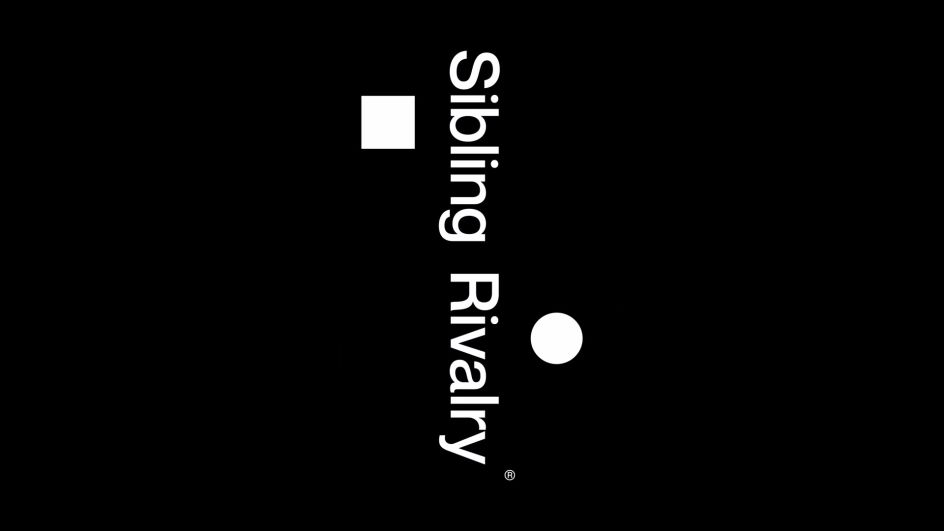
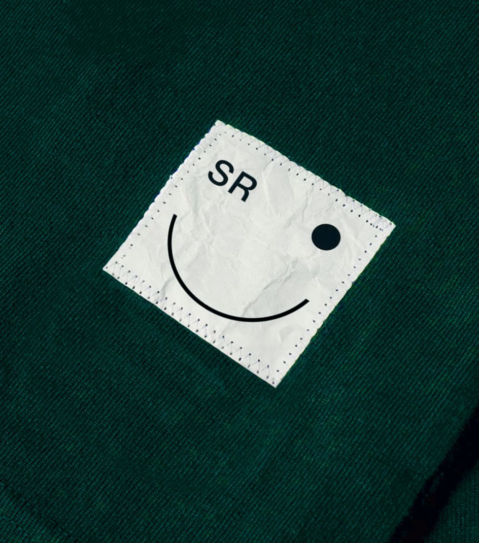
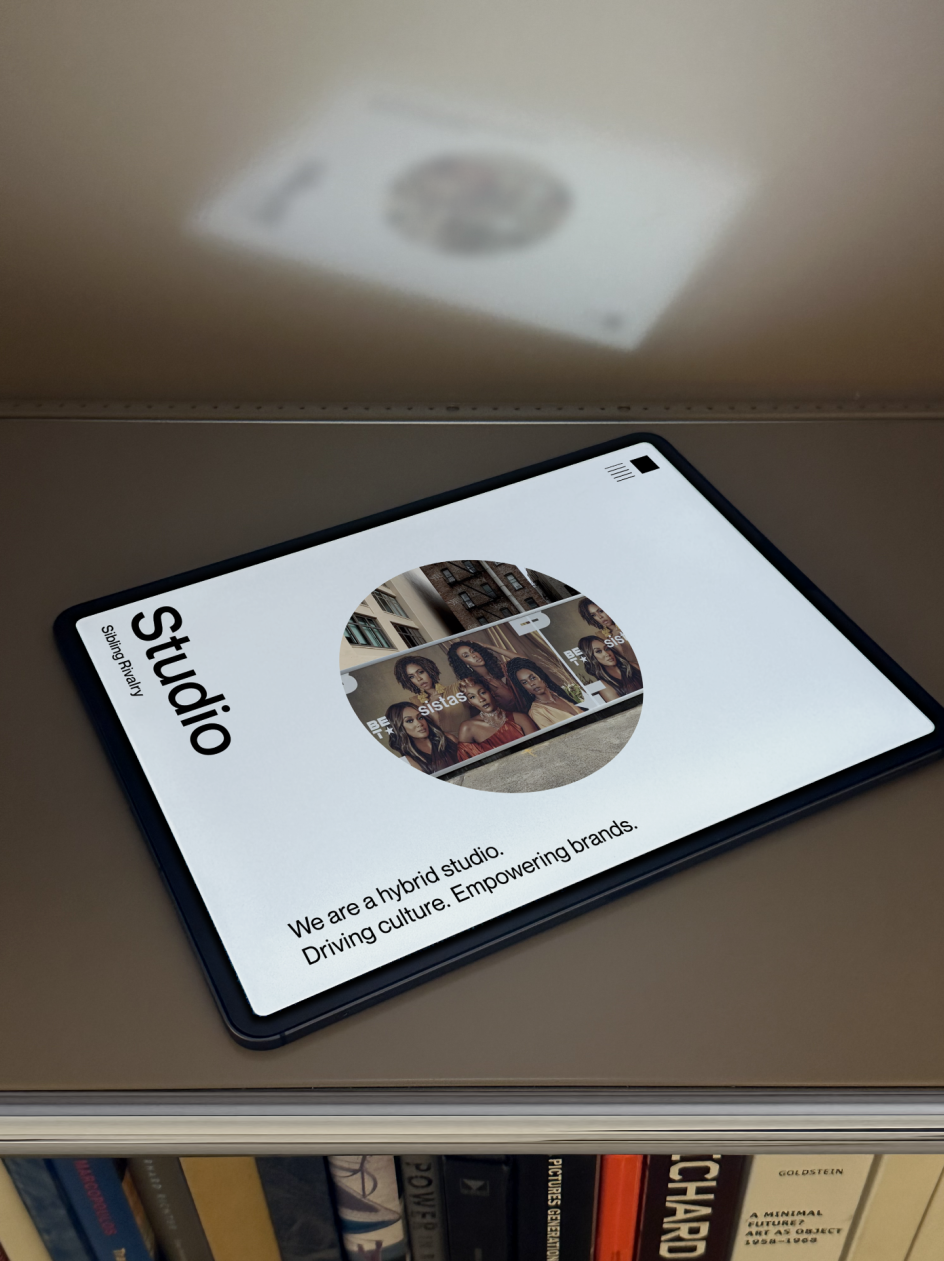
Nowhere is this more immediately obvious than the logo, which uses a simple square and a straightforward circle. Cleverly positioned on either side of a product or digital display, these contrasting shapes do an effective job of subtly communicating that there are different facets to Sibling Rivalry's identity. But by realising them with a matching block colour or outline, this also suggests that the two elements are one and the same.
The meaning behind these shapes goes further, though. Sibling Rivalry's film production wing is represented by the square – possibly an allusion to the square frames found in old celluloid film frames – while the circle represents the branding studio because the shape echoes the 360-degree working concepts that they apply to client work.
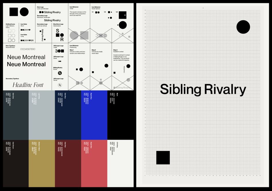

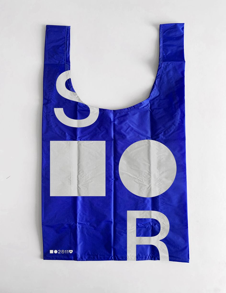
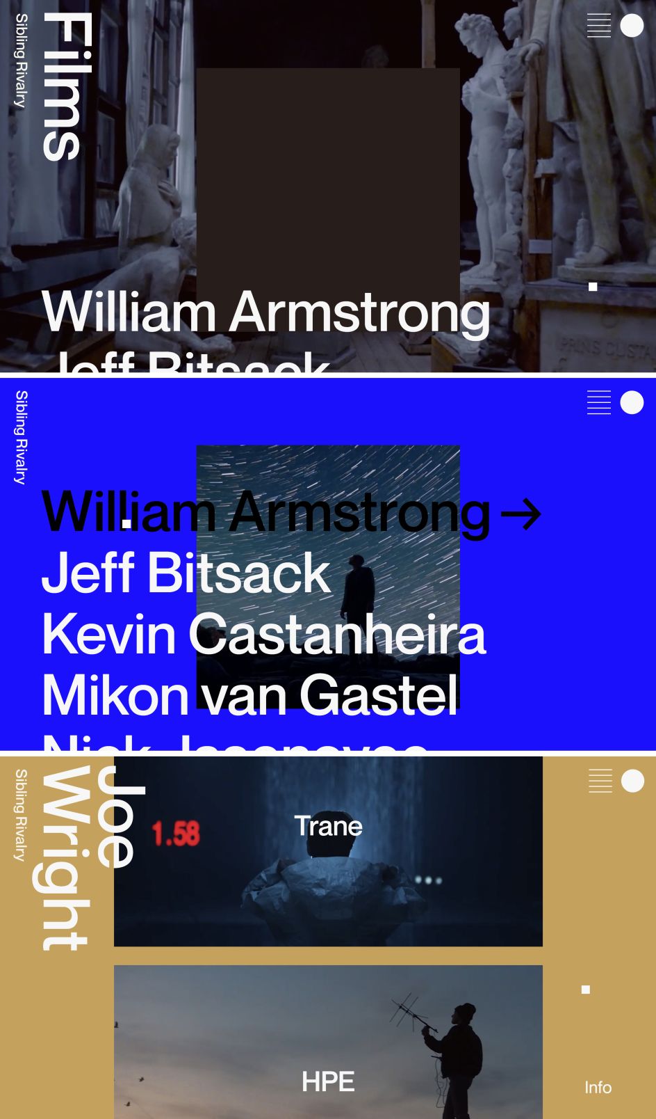
As for the modular elements, these allow Sibling Rivalry to shapeshift and adapt to every media platform, including a new visual system specially designed for Instagram. These combinations allow Sibling Rivalry to appear reserved or playful, literal or abstract; basically, they need to present themselves to audiences or clients.
Speaking of the creative approach to the identity, Co-Founder and Chief Creative Officer at Sibling Rivalry, Joe Wright, said: We needed a new brand to reflect who we are as an inclusive, talent-driven company. It had to represent the diversity of skill sets and voices across the business while being a holistic brand that could live and breathe freely in its own right."
Meanwhile, Mikon van Gastel, co-founder and chief creative officer at Sibling Rivalry, adds: "The new system is timeless but incredibly flexible. We're excited to embrace all the ways our team can use the brand on both sides of the company."


](https://www.creativeboom.com/upload/articles/90/908fdb6378db1e95d12595416f54e6336d5e80b8_732.jpg)