Beautifully designed mailer celebrates the residents of Sheffield's iconic Park Hill estate
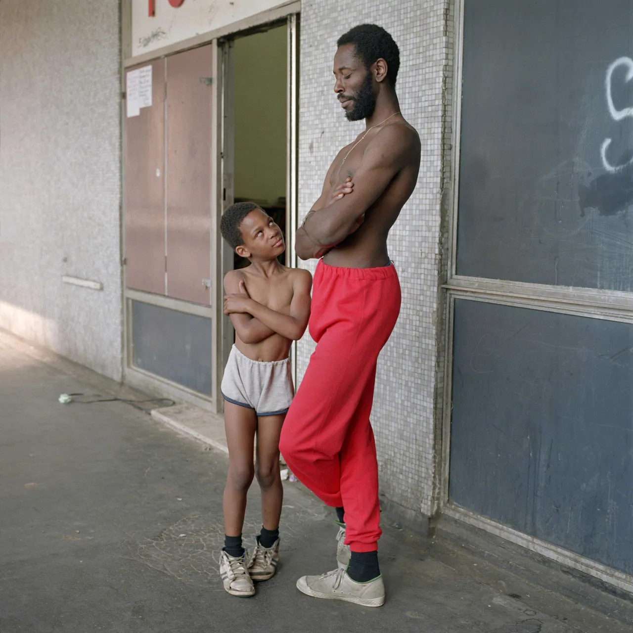
Photography by Anderson has paid tribute to a landmark of Brutalist architecture and the people who live in it with People of Park Hill – a beautifully-designed mailer that contains portraits of residents of the famous Sheffield estate.

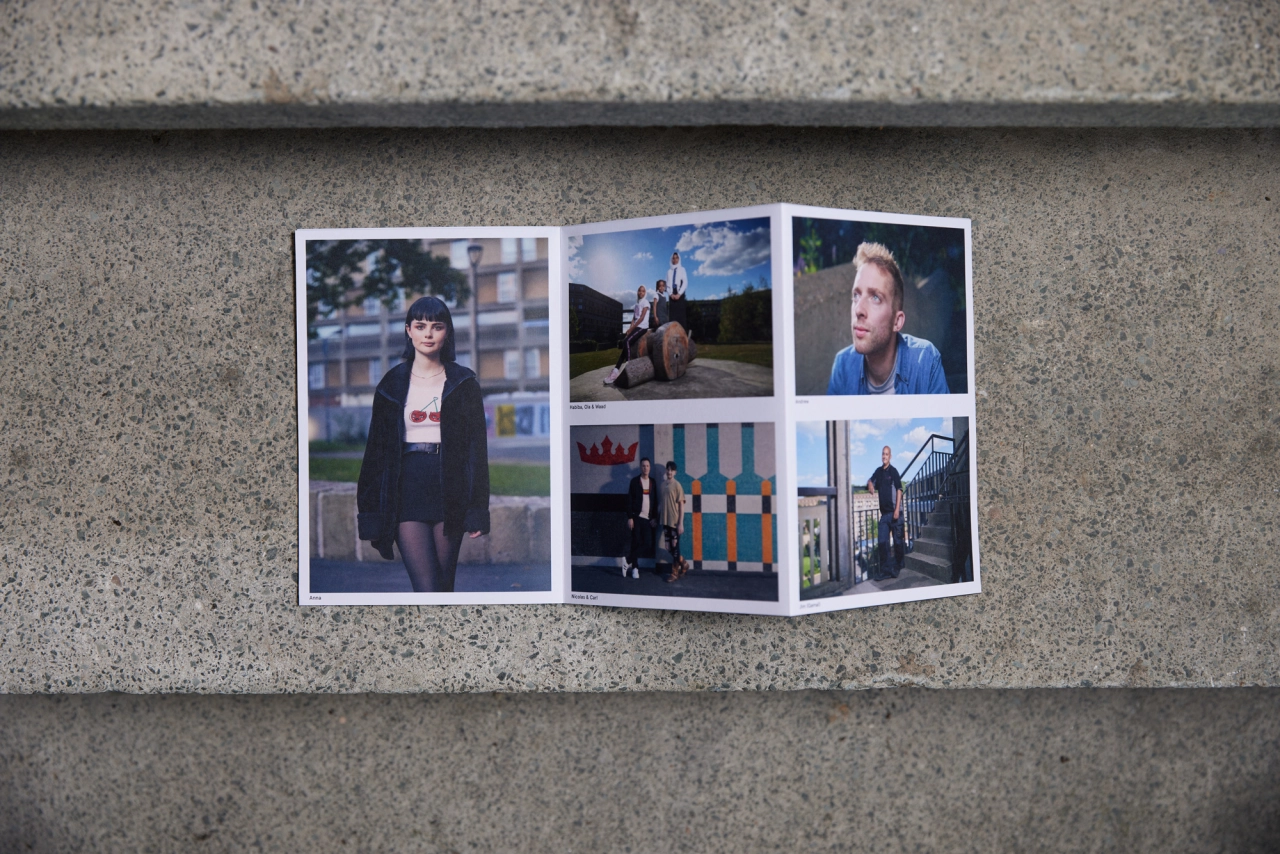
Described as a love letter to the instantly-recognisable Northern housing estate, People of Park Hill is the latest creation by creative duo Isy and Leigh Anderson, collectively known as Photography by Anderson. Released as a print mailer, People of Park Hill echoes the look of the estate in its design and celebrates the rich and diverse community that calls it home.
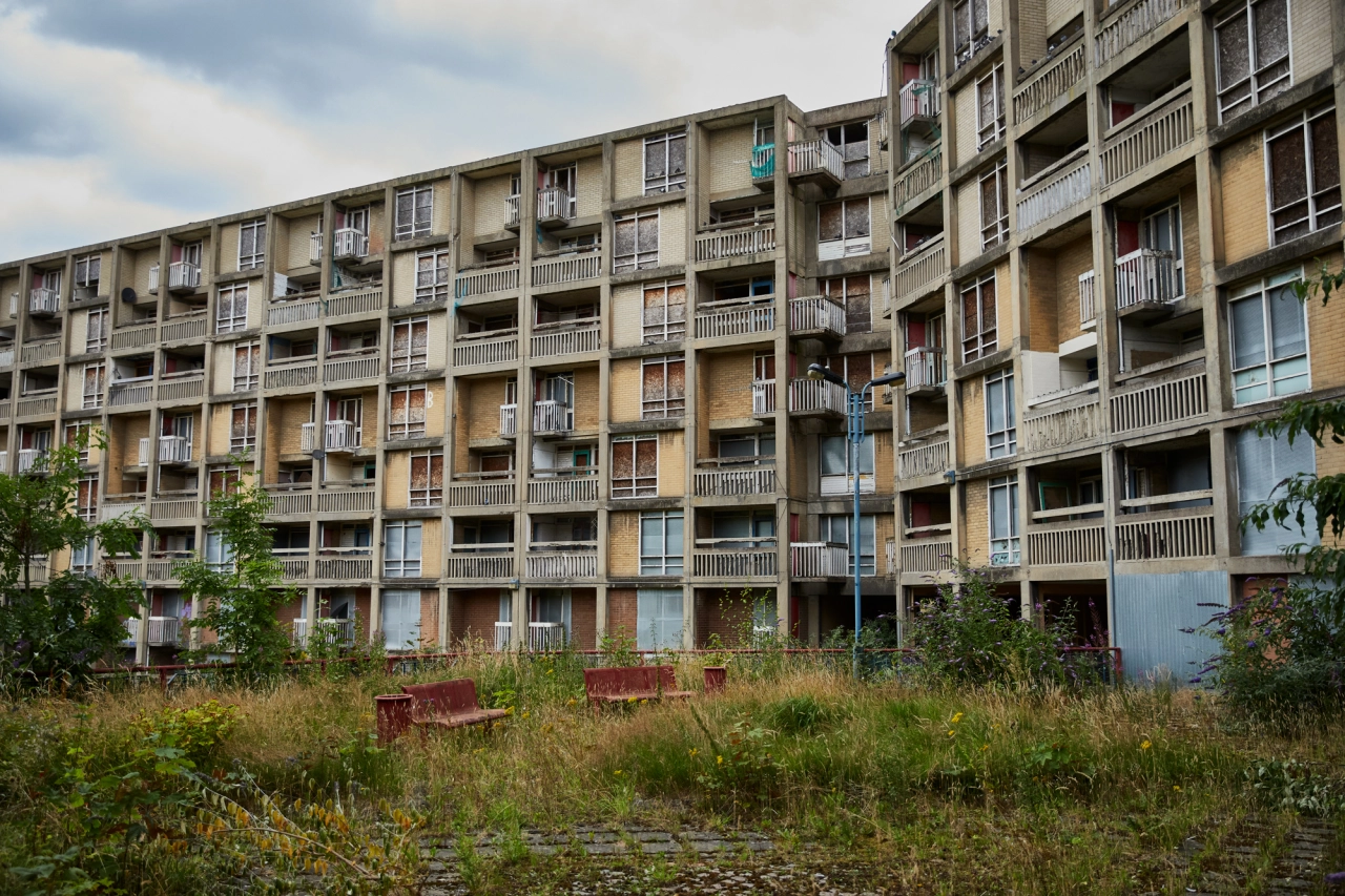
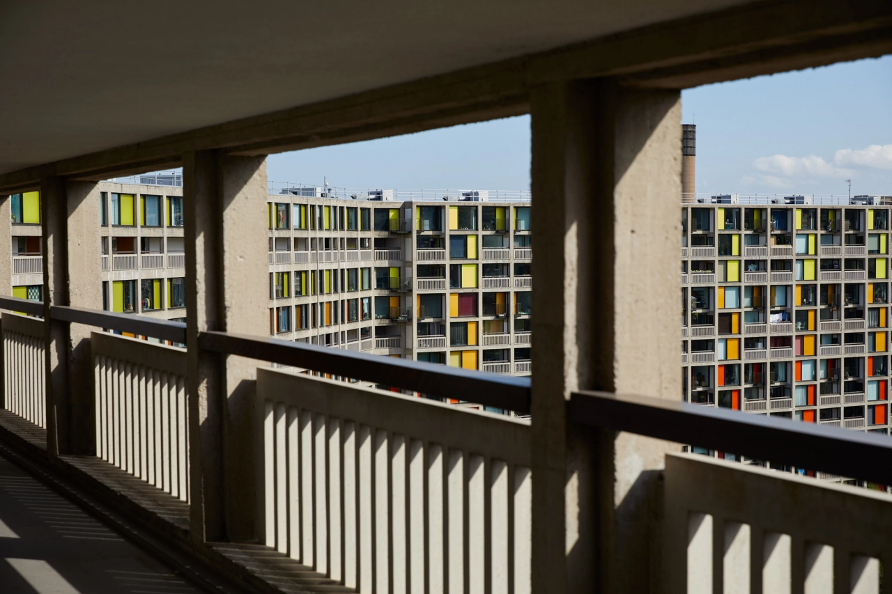
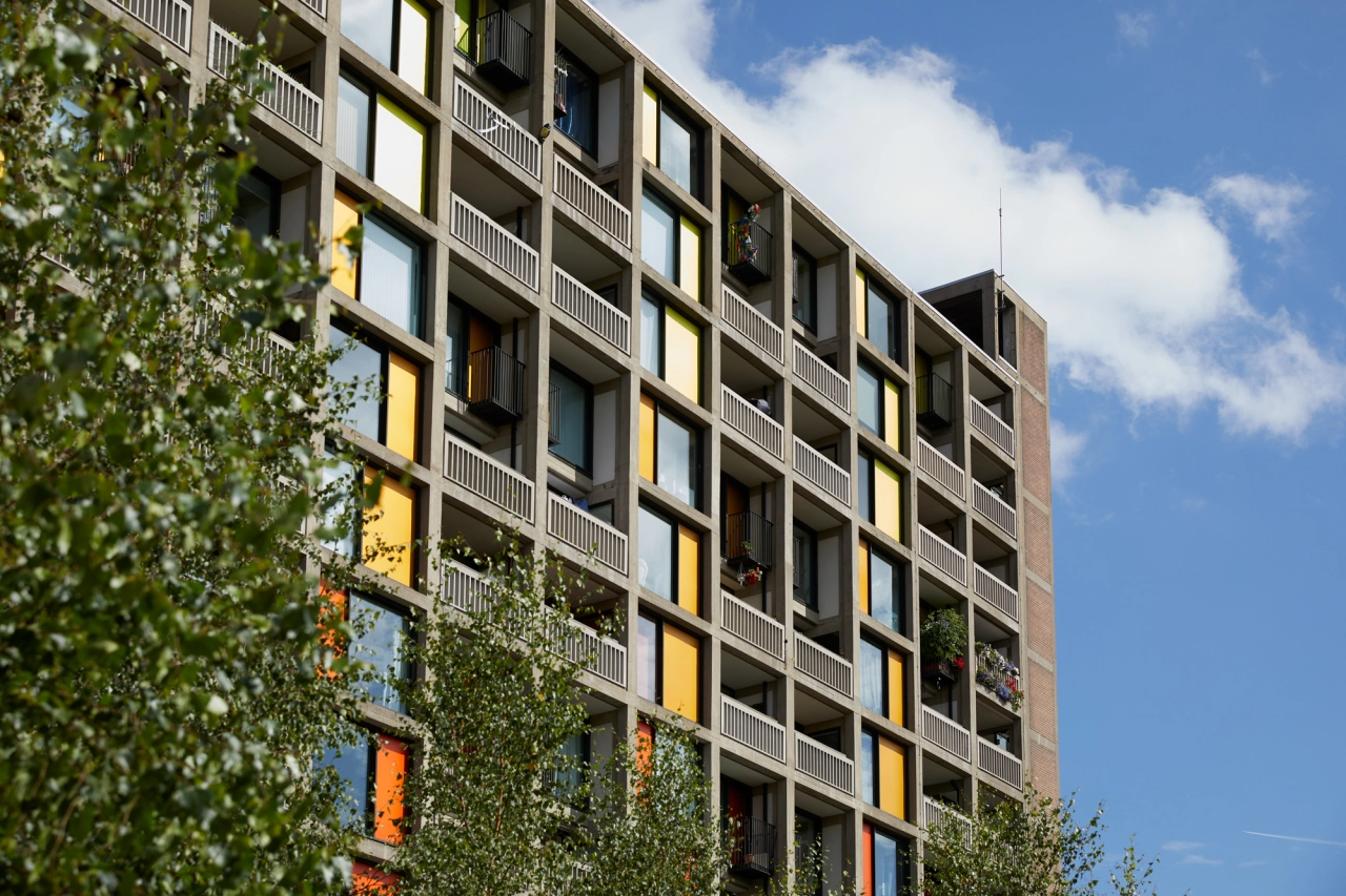
Built between 1957 and 1961, the Park Hill estate has looked over the city of Sheffield for over 60 years. Notable for being one of the largest surviving examples of Brutalist architecture in the UK, its imposing appearance and longevity have turned the estate into one of the city's most-defining landmarks and an integral part of the community.
Following a period of decline and neglect, Park Hill is currently on the up thanks to support from regeneration company Urban Splash. So what better time for Photography by Anderson to document this concrete colossus and the people who live there?
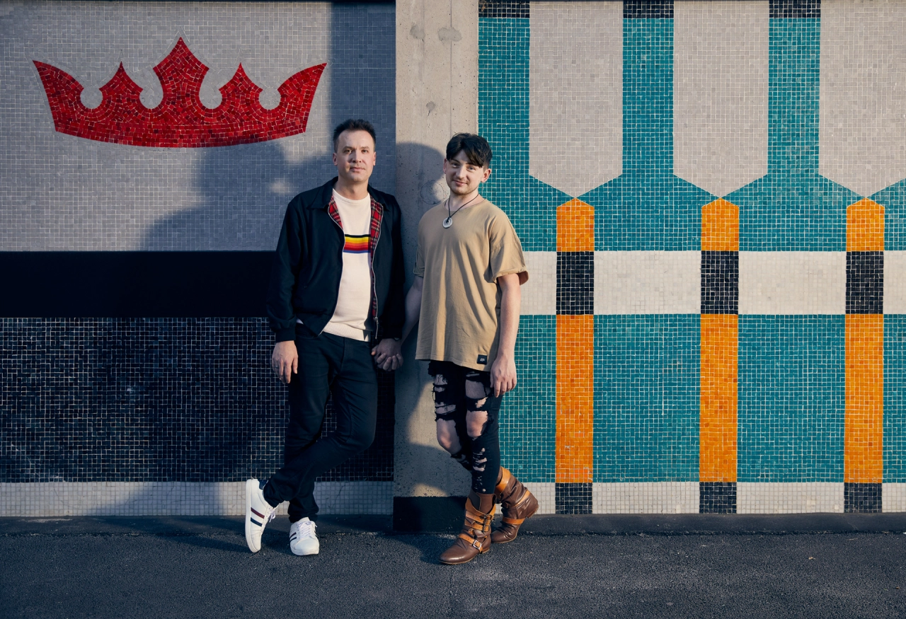
Designed by Emily Macaulay of Stanley James Press, People of Park Hill saw BJP Portrait Of Britain winners Isy and Leigh Anderson get their boots on the ground to snap their subject. "We spent an amazing couple of weeks shooting the project," says Leigh Anderson. "And we were really moved by the strong community spirit that the place has.
"Obviously, there has been a lot of regeneration which has attracted a new community of people to the estate. But we loved that at its heart, Park Hill still has some of its original residents, people who had grown up and lived there during its earlier years."
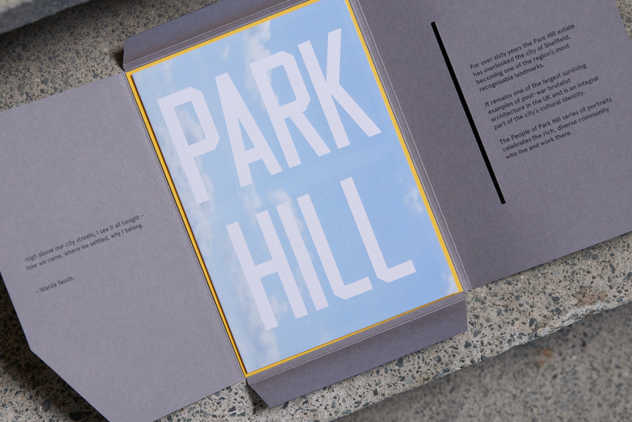
Indeed the history appears to have been just as much of a draw for the team as the architecture. "It's just amazing that there are still people there who can connect to its past and share their stories, passing on that heritage to the newer residents," they add.
People of Park Hill already appears to have struck all the right notes. Two of the portraits from the series, those of Joanne and Anna, have already been recognised and featured in Portrait of Britain Vol4 by Hoxton Mini Press. The mailer's distinctive and colourful design is also a crucial component of its success.
"We commissioned the very talented Emily Macaulay of Stanley James Press to produce the People of Park Hill mailer," says Isy. "We have been massive fans of SJP's zines and beautifully, conceptually designed photobooks for a long time now, so bringing this idea to Emily and seeing where she would go with it was very exciting."
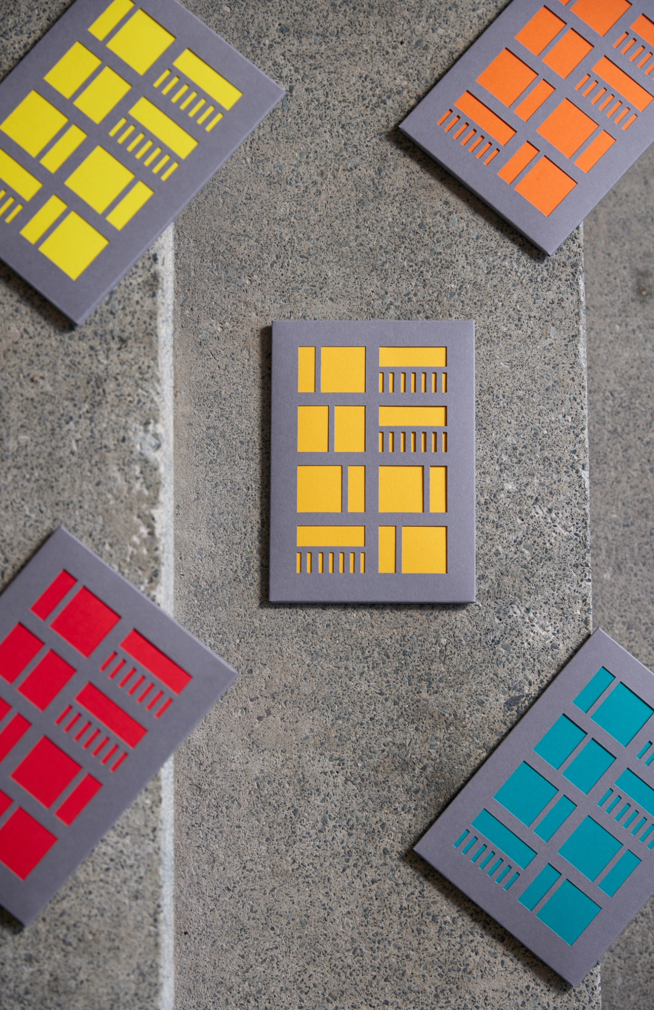
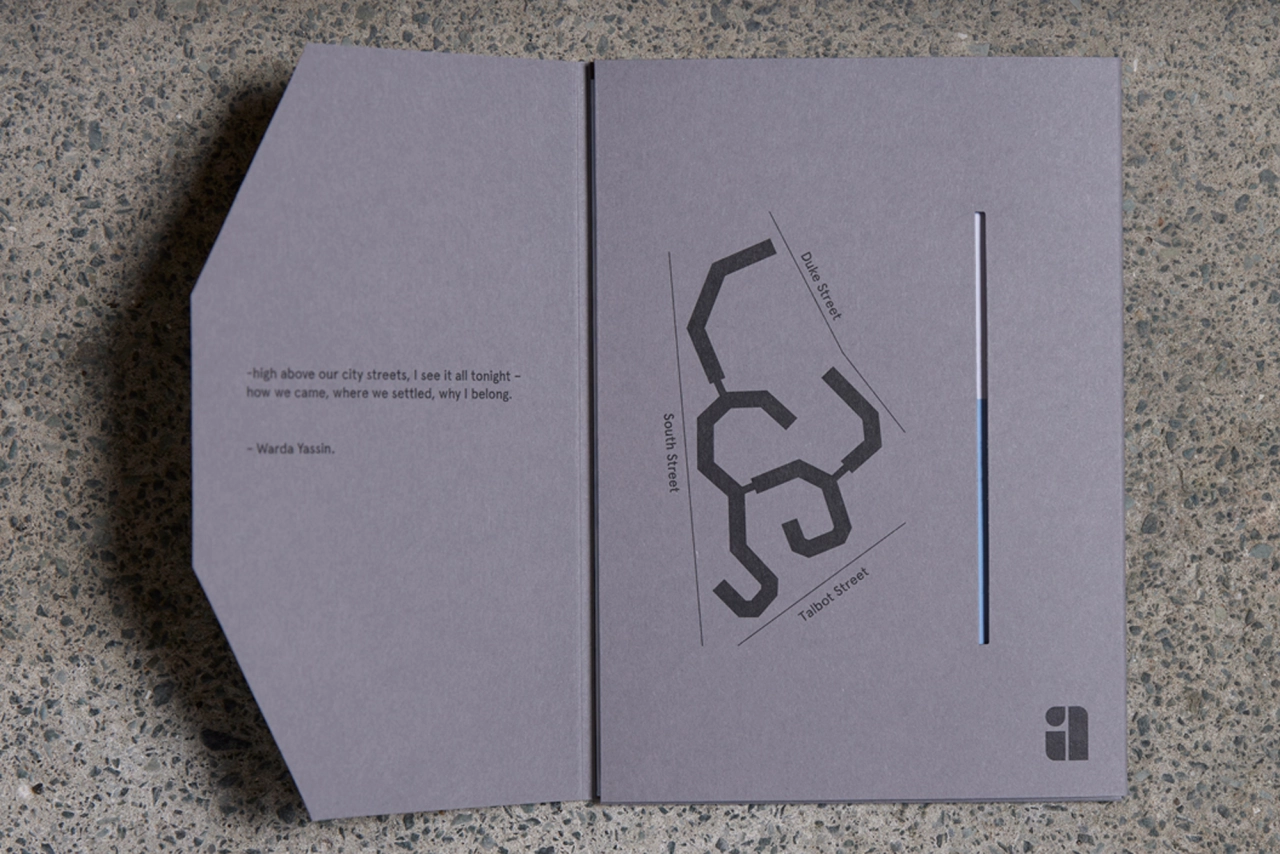
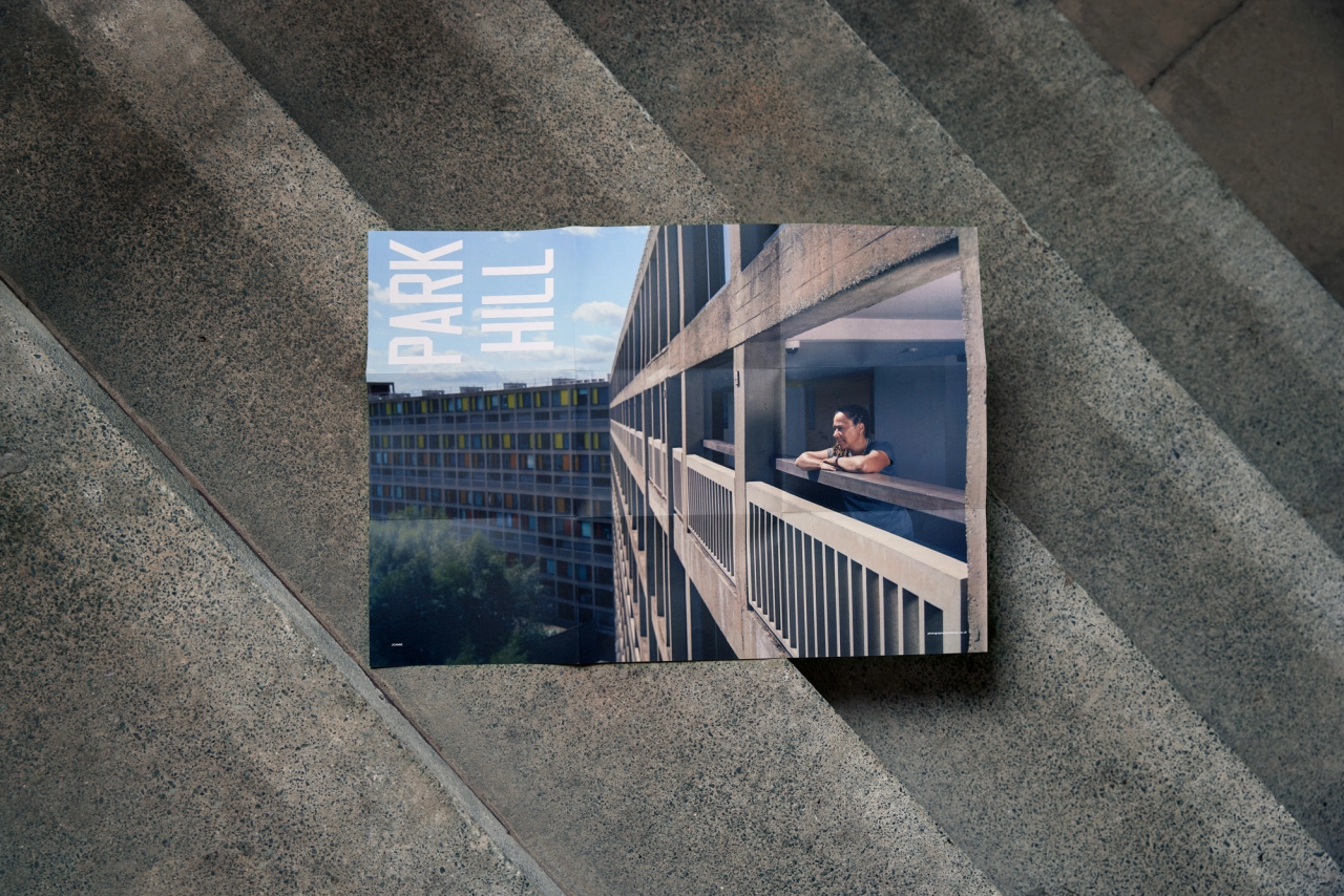
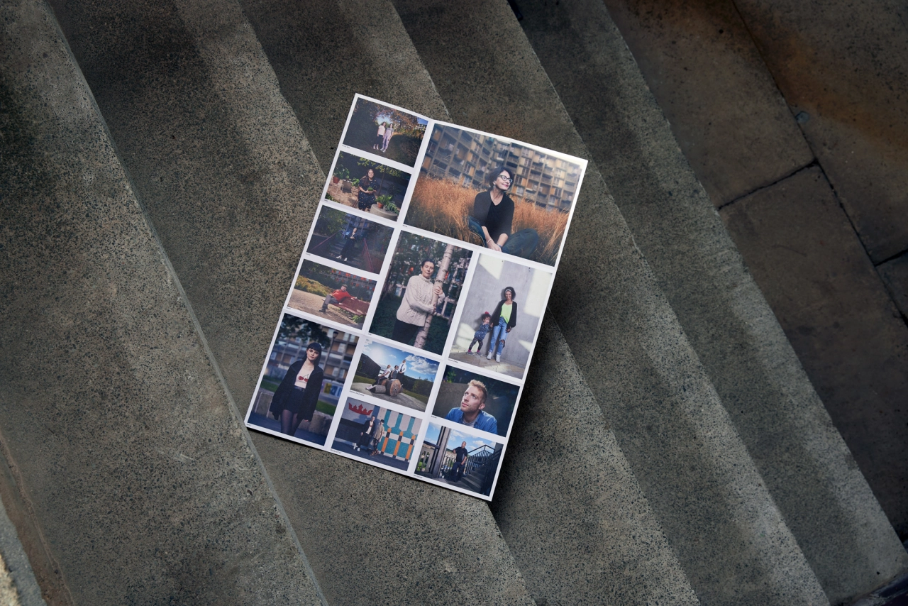
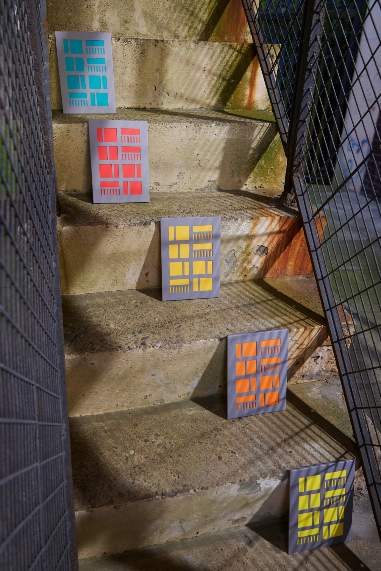
Emily's attention to detail saw the Brutalist estate reflected in the materials used to create the mailer. The layout also channelled the huge concrete structure, as the double-sided concertina printed insert is unfolded horizontally and vertically, extending like a block of flats into the sky. One side features the portraits stacked on top of one another, while the reverse folds out to reveal an epic landscape poster image of Joanne, one of Park Hill's original residents.
Meanwhile, the die-cut design of the envelope is taken directly from the famous facade of the building. Coloured inserts help to realise this look, as well as connect to the theme of Park Hill's regeneration. They also neatly tie back to Photography by Anderson's brand colour.
"We've included a few small details referencing the history of the estate, including a simple map of the configuration of the building, directly referencing an old archive map," the pair conclude. "We also got permission to use a beautiful excerpt from the poem Sheffield by the poet laureate Warda Yassin that perfectly conjures the feeling of being at Park Hill. Even the typeface, designed by Founded, is inspired by the footprint and construction of the building."

Editor's Picks





Trending






Latest Jobs
Senior Brand Designer at Analogue
Full-time·Leeds·£38k-£45k
Brand Designer, Product Launches at Figma
Full-time·New York·$127k–$269k
Midweight Editor at Earworm
Full-time·Bristol·£28k-£32k
Mid-Senior Designer at Something Familiar
Full-time·Bristol·£32k–£40k
Brand Designer at Adfin
Full-time·London·£30k–£50k
Design Director, Opinion at The New York Times
Full-time·New York·$160k–$180k