Among Equals' rebrand for MyCoach doesn't phone it in
Among Equals has rebranded the personal training app, MyCoach with a design directly inspired by the tool that connects users to fitness coaches: a mobile phone.
Credit: MyCoach / Among Equals
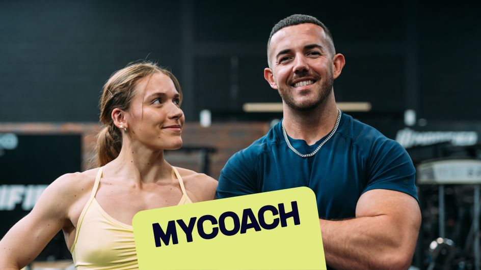
MyCoach, a personal training app launched last year, is the brainchild of founders Lucy Davis and Ben Haldon, fitness coaches, influencers, and hosts of the The Not So Fit Couple Poidcast.
Among Equals founder Emily Jeffrey-Barrett told Creative Boom that Haldon and David were impressive: "They had the UK's #1 fitness podcast, the training was exceptional, their community adored them, but their brand wasn't living up to all that. They needed a new identity to communicate their proposition clearly, and position them as the ultimate friendly, positive, personal training app."
Credit: MyCoach / Among Equals
Jeffrey-Barrett and her team came on board to help Davis and Haldon do exactly that. The result is a cheerful, friendly that shows off MyCoach's accessible service and supportive attitude.
Fee Walter, who led creative on the project for Among Equals, added that one of the core challenges in designing a meaningful rebrand for MyCoach was bringing personality through via the identity. Walter told Creative Boom: "Other PT brands or fitness apps can feel quite soulless – some are macho, some are intimidating, some are cold and digital. The MyCoach founders had so much passion – they were warm, friendly, positive and community-focused. We needed to find a way to fight fitness conventions without breaking away completely from the cues in the category."
Credit: MyCoach / Among Equals
Credit: MyCoach / Among Equals
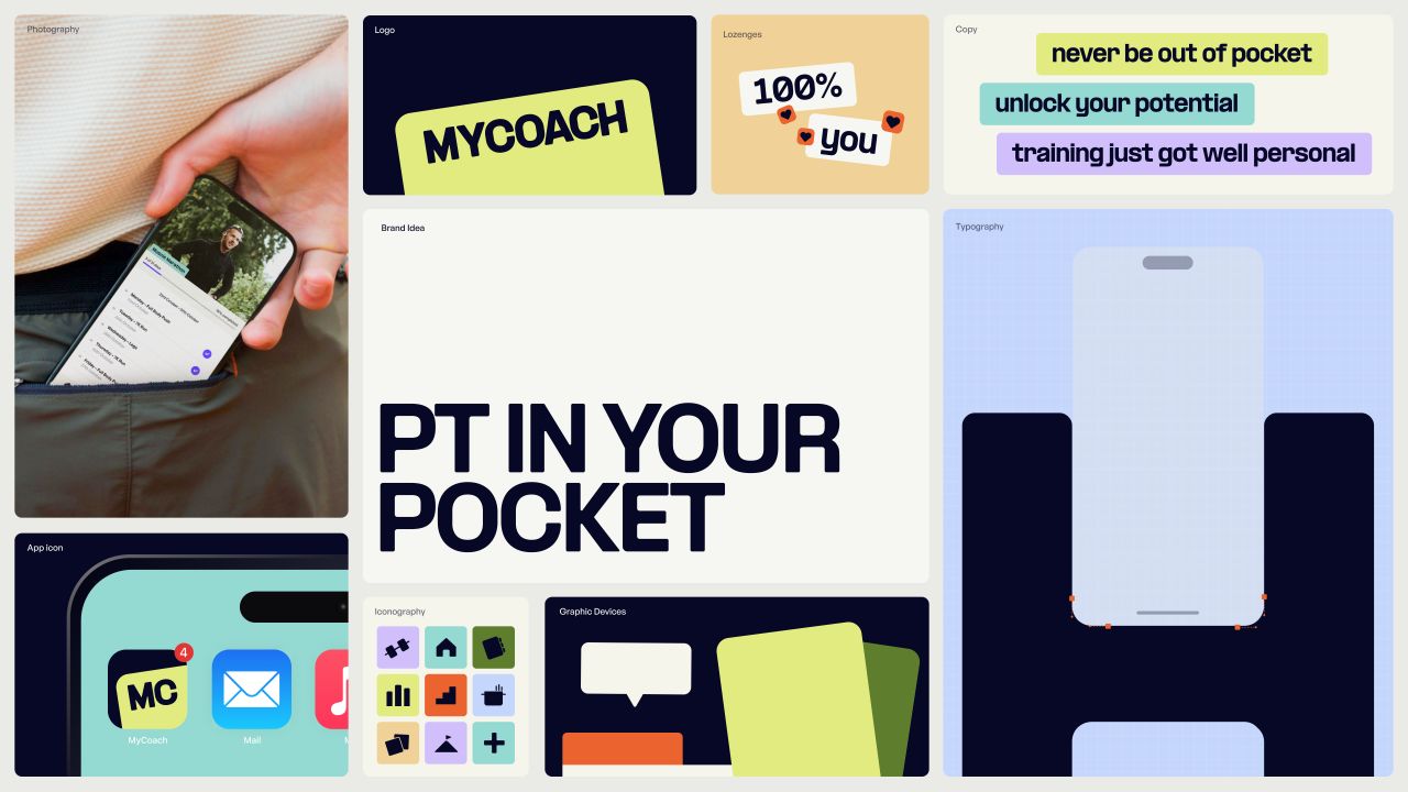
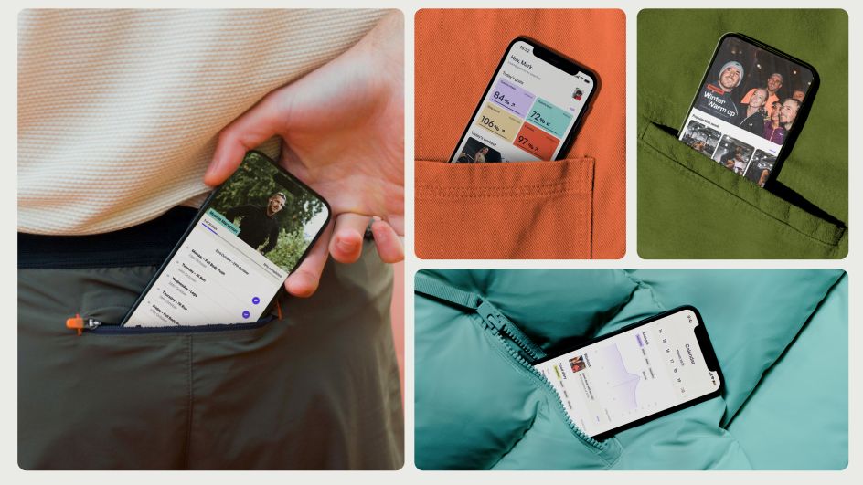
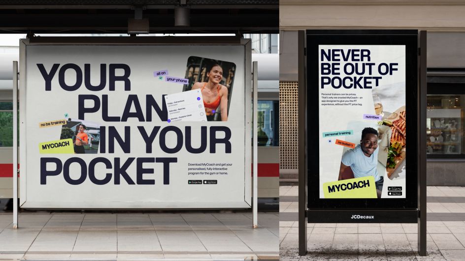
To capture the warmth, simplicity, and connection inherent in MyCoach's offer, Among Equals developed a brand idea that centres around a simple but essential fact: MyCoach is a PT in your pocket. "We wanted an idea that could also function as a tagline, giving MyCoach a super easy way to communicate their new app offer," Jeffrey-Barrett told Creative Boom. She continued: "And critically, we needed to highlight that they're not just a fitness app – they're a full-blown, high-quality PT offer. 'PT in your pocket' gave us a really concise way to bring everything they offer together (from recipes to workouts to advice to their podcast). It communicates that, with MyCoach, the PT experience doesn't have to end when you leave the gym – it's always with you. And it doesn't hurt that it sounds nice too – energetic and alliterative."
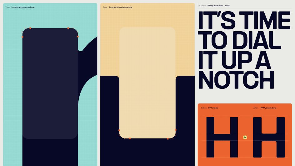
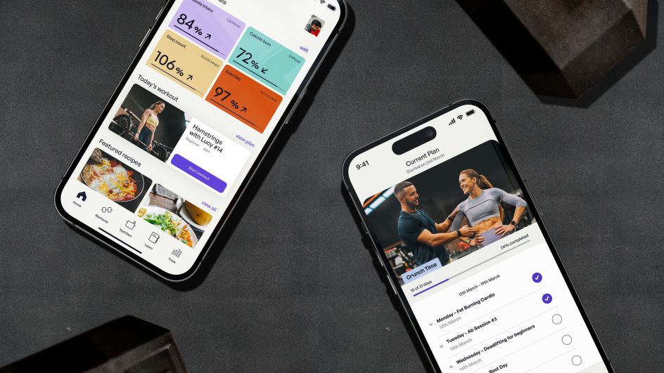
To drive home just how accessible the training offered by MyCoach is, the AmongEquals team used visual cues inspired by a phone shape.
Jeffrey-Barrett said: "We used one of the world's most recognisable shapes, and the object that literally enables you to have a PT in your pocket – as the basis for the identity: a phone."
Credit: MyCoach / Among Equals
Credit: MyCoach / Among Equals
Credit: MyCoach / Among Equals
Credit: MyCoach / Among Equals
Jeffrey-Barrett shared that as soon as the phone idea surfaced, she and her team knew it was the clear route to go down: "It's particularly powerful because everyone knows it – it's probably the most seen/used shape in society today. It's also a known digital shape, so it is a nice nod to the fact that the MyCoach offer is 100% online. And its curves and lines allowed us to create bespoke assets that still felt subtle and sophisticated, not really obvious or on-the-nose."
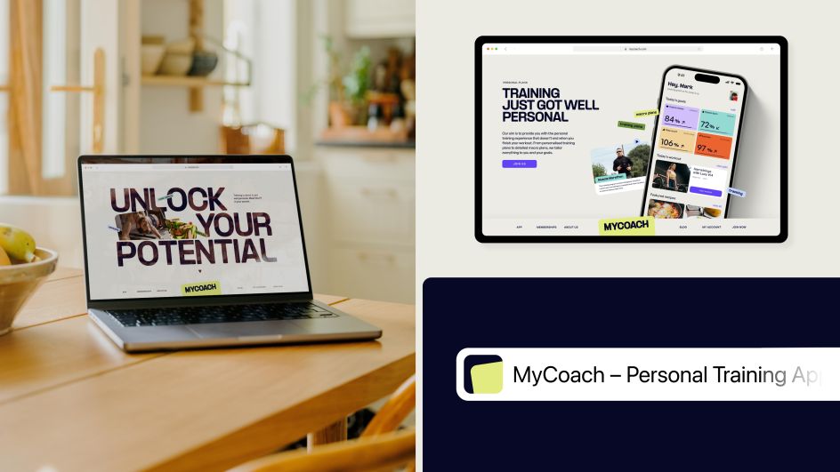
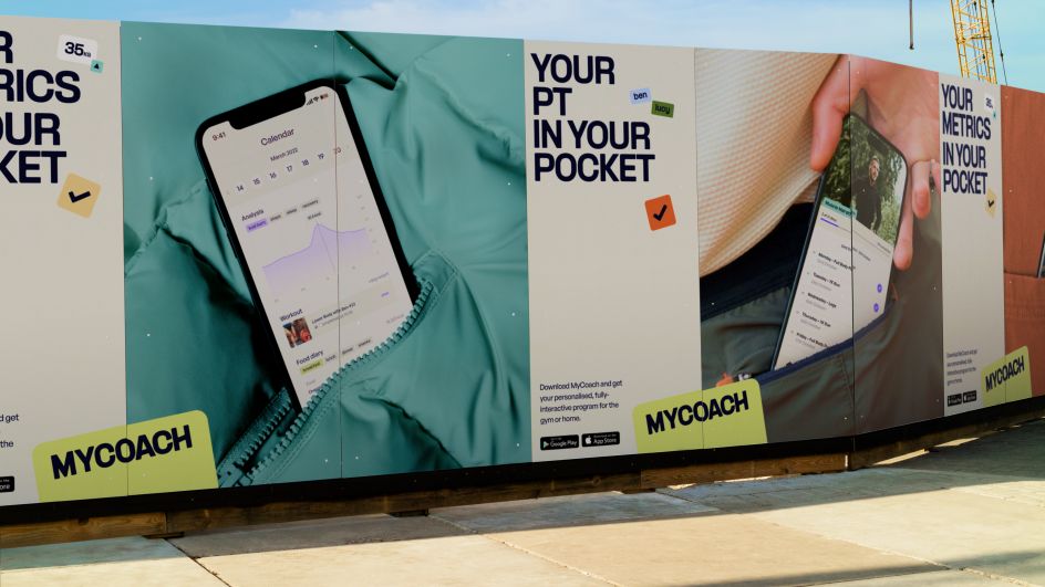
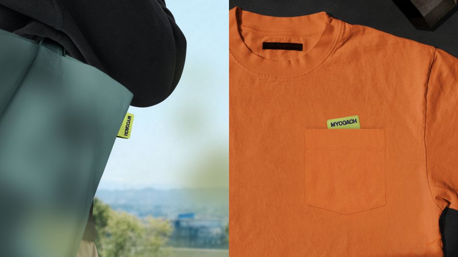
From a customised typeface and UI elements that incorporate a phone's rounded corners, to a logo that references a phone sticking out of a pocket, to photography showing the app in pockets in training situations, Among Equals developed a coherent, satisfying system that references the brand idea.
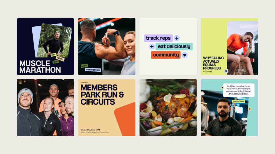
Aesthetically, the brand is designed to feel friendly, positive and authentic. Unlike most fitness apps, which feel high-octane and hyper-slick, this brand is designed for the MyCoach community – fitness enthusiasts of varying levels looking for a safe place to train. By eschewing the standard palettes (black and white with a zingy pop) and softening type and elements, we created a warm, welcoming brand that reflects the founders' approach to training.
Credit: MyCoach / Among Equals
To create the bespoke, phone-shape-inspired type, Among Equals partnered with Pangram Pangram. The type foundry's PP Formula serves as the base font for its sense of sportiness and energy. Still, the custom MyCoach version incorporates curves from a phone's shape to add sophistication and friendliness.
That combination of sporty energy, sophistication, and friendliness weaves together a golden thread apparent through the MyCoach rebrand – and the resulting cohesive system is a point of particular pride for Among Equals' Emily Jeffrey-Barrett.
She told Creative Boom: "For me, a great identity will always have a singular idea that feeds through everything from the logo to the type to the photography."


