Multitalented graphic designer Shrenik Ganatra's branding for his shoegaze project Minaxi
Like many graphic designers, Shrenik Ganatra's work (and play) is about a lot more than image-making.
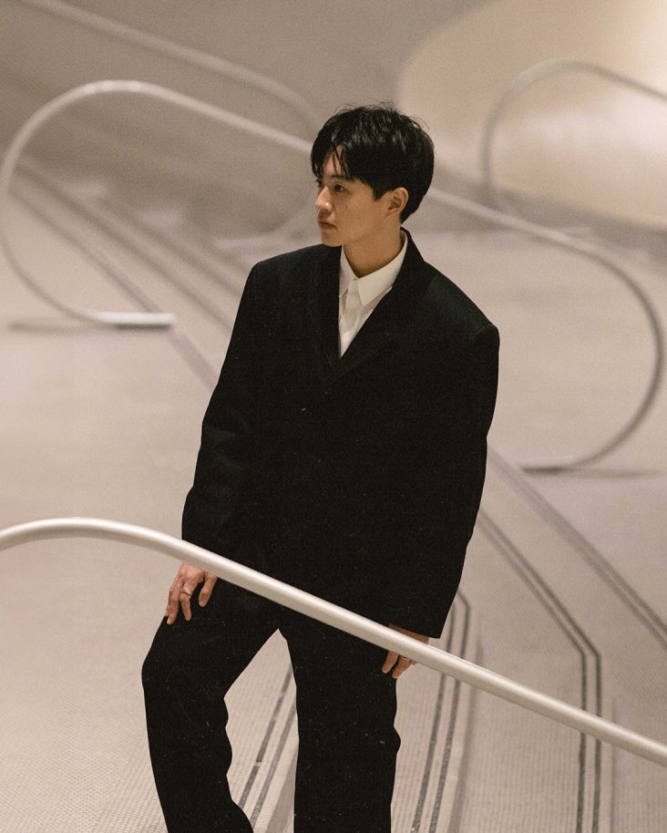
Born in Mumbai, India, and now based in Brooklyn, New York, when he’s not designing, he’s making music with his alternative rock band Minaxi (named after his mother, awe).
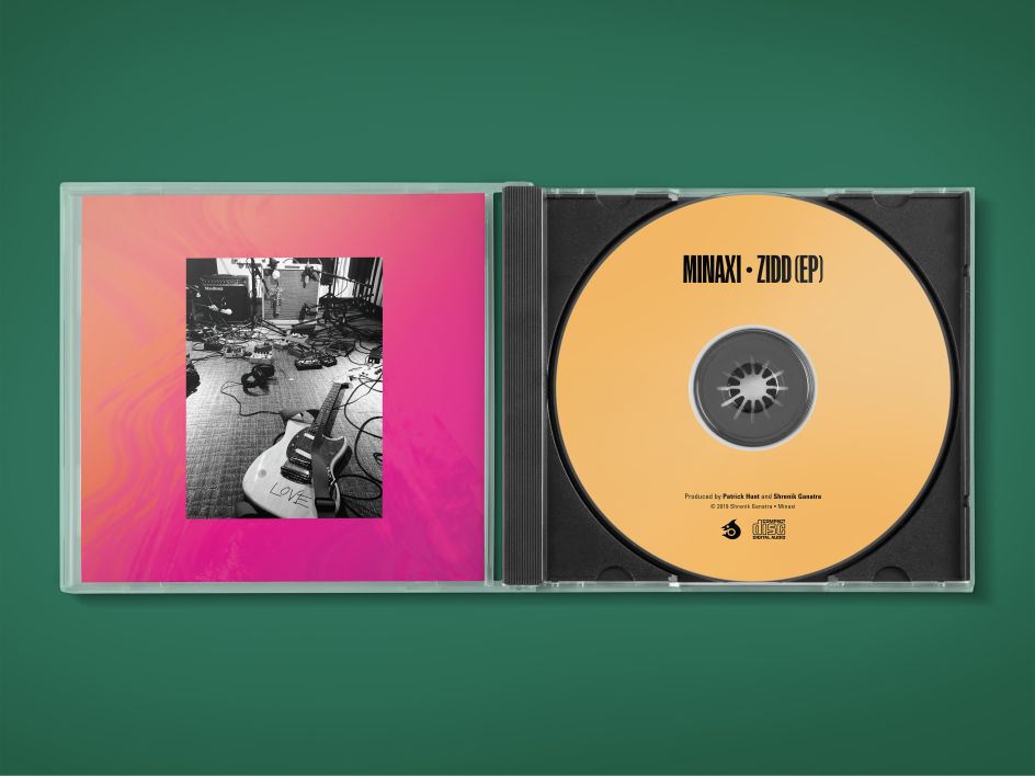
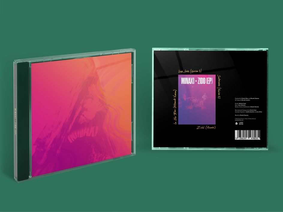
Minaxi, which formed in 2018, realised its debut EP, Zidd, on 12 July this year, which you can listen to on Spotify, showing off its blend of shoegaze, hard rock, surf and psychedelia, with lyrics in both English and Hindi. "I grew up listening to melodic Hindustani pop music and rock and Sufi music from Pakistan," says Ganatra, citing. Jal -The Band, A.R. Rahman, Lucky Ali, Strings and Junoon as some of his musical influences.
"Minaxi is a feminine name of Indian origin meaning ‘fish-eyed'," Ganatra explains—it’s derived from the Sanskrit terms mina (fish) and akshi (eyes).
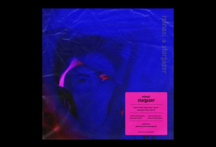
Naturally, Ganatra takes care of the design work for the band. "A majority of design decisions mimic the idea upon which Minaxi’s music is written–when it gets loud, it gets really dense but when it is quiet, it is super-minimal. However, between these extremes there are sonic nuances and textures that represent the band’s overall sound," says the designer. "Since the band’s name is trisyllabic, I wanted the logotype to scream the syllables in the reader’s eyes. From afar, the type appears to be of a simple, condensed nature but when you zoom into the shapes, you’ll observe the nuances intrinsic to each character."
For this release, Ganatra also created a short film to accompany the EP. The self-funded video was shot in LA and Mumbai and "revolves around the idea of how certain objects/things invoke certain memories and what remains once we let go of these objects," Ganatra explains. "The plot of the video for Saturnine revolves around the idea of memories tied to souvenir(s) and what remains once the memento is discarded."
He adds: "I called my friend Reese Siedlecki and said, ‘how do you feel about acting in a Minaxi music video?’ I ran the idea and references by her. The next thing I know, we’re in Los Angeles filming. My parts in the video were shot in Mumbai by my sister Harshana Ganatra."


The EP saw Ganatra create a bespoke typeface and a series of new show posters; while Ganatra’s friend, frequent collaborator and former Maryland Institute College of Art (MICA) classmate Ninad Kale also designed the Devanagari (a left-to-right Abugida writing system which is between syllabic and alphabetic script, based on the ancient Brāhmī script, used in the Indian subcontinent) version of the band’s logo. This exists since the songs are in both English and Hindi.
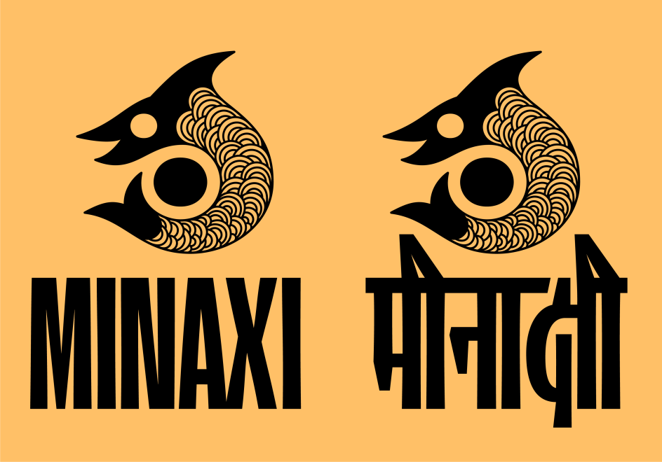

The logo for the band uses symbolism that references astrology, Chinese philosophy and Eastern spirituality (“the yin/ yang or the thought that seemingly opposite forces are actually one,” says Ganatra). The primary colours are gold, black, white and grey. Minaxi’s show posters double as typeface specimens for two typefaces designed by Ganatra – Minaxi Condensed and Chamberlin Ultra Condensed. Chamberlin is a typeface family of three fonts that share the same skeleton but have varying widths and contrasts, “named after Jimmy Chamberlin, a versatile, virtuoso (and my favourite) drummer,” says Ganatra.
Ganantra has long said that music inspires his design work; and for his graduate thesis at Maryland Institute College of Art (MICA) he worked with friend and MICA Graduate Lab Coordinator Patrick Hunt to record, track, engineer and mix music made by a rock band he was involved in; with his final piece taking the form of an exhibition showcasing the branding for the band.


The designer graduated from MICA in 2017, having previously started a degree in Information Technology in Mumbai, before realising that the course – or indeed, a career in IT, wasn’t really for him. He'd been working on his own design projects, both for himself and freelance clients. So after graduating from his MFA in Graphic Design, Ganatra moved from Maryland to New York to intern with karlssonwilker.
Among the projects he’s worked on in recent years include designing the Apollo Theater’s Annual Report 2017–18 and creating the guide for the 2018 Design Fabric Festival along with Ninad Kale.
He is most renowned for his 'ADAM.CG Pro' typeface which is used by over 625,000 people in 100 countries. His collaborative typeface design project 'Bird Grotesk' has won international awards and has been featured in Graphis Typography.

Credits: Produced by Patrick Hunt and Shrenik Ganatra
All Songs by Shrenik Ganatra
Drums: Andrew Coral
Bass: Liam Christian
Guitars, Vocals and Additional Instrumentation: Shrenik Ganatra
Recorded and Engineered by Patrick Hunt
Assistant Engineers: Camilla Gomide and Jenn Allen
Mixed by Shrenik Ganatra

Editor's Picks


Trending


Podcasts


Editor's Picks
Further Reading