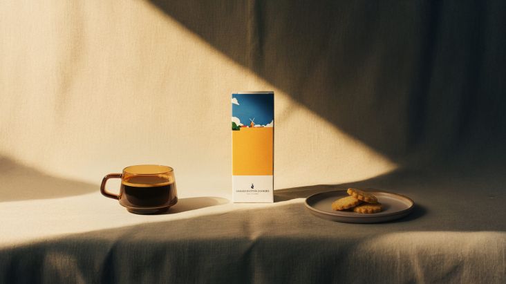
A LINE's identity for a Norwegian bakery is inspired by a delicious traditional pastry
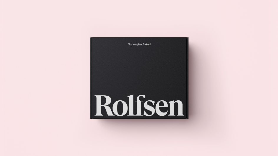
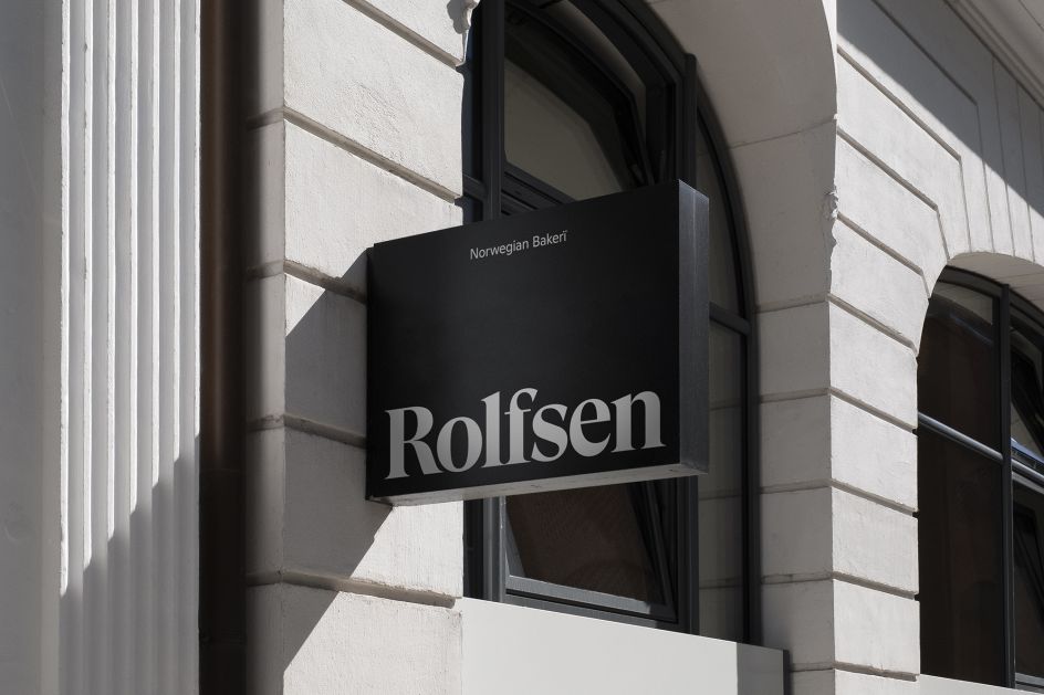
Rolfsen is a family-owned Norwegian bakery that hopes to bring a little more "hygge" to the United States. Using family recipes handed down over generations, it wanted to capture its nordic heritage, but execute it with a warm, modern twist. Step in global design studio A LINE, which took inspiration from a delicious Norwegian pastry to form the basis of its new brand identity.
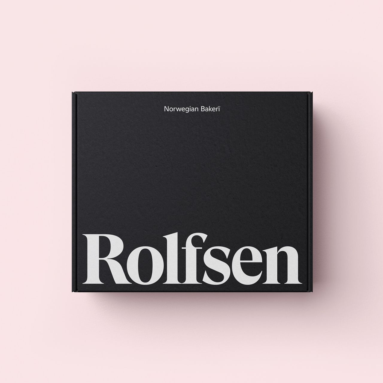
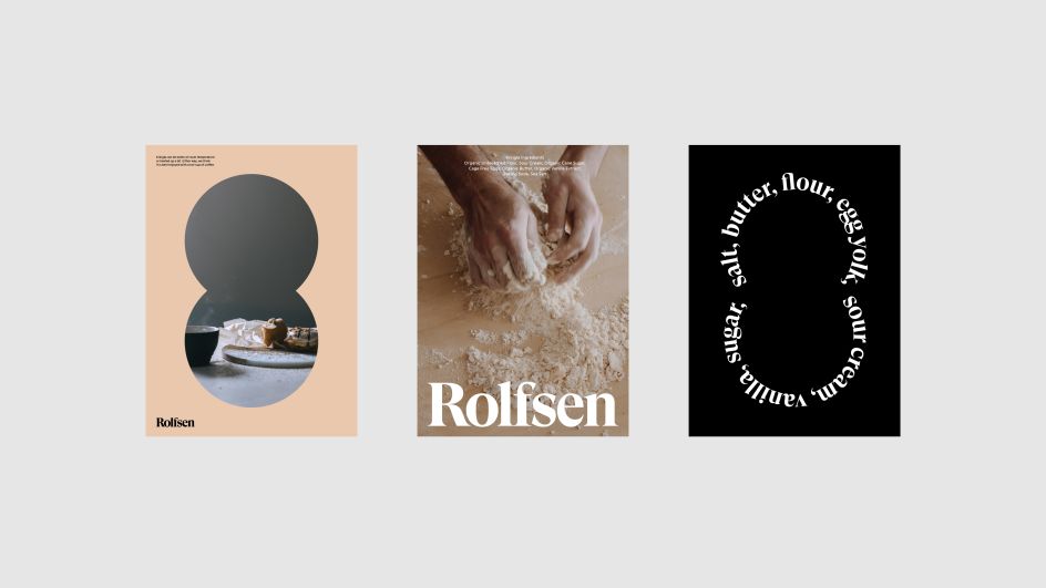
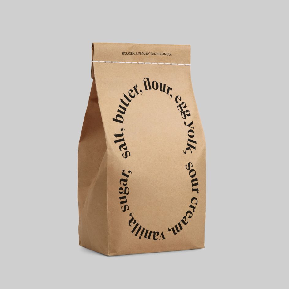
The wordmark, which spells out simple yet mouthwatering ingredients like butter and sugar, is based on the legendary Kringla, a delicacy that was first created back in the late 1800s. To keep things light and playful, A LINE animated the symbol to feel like the "all-important" kneading process that gives the Kringla its incredible flavour (apparently, best enjoyed on a cold morning with a strong, hot Norwegian coffee).
The rest is clean and fresh with as lean towards Scandinavian palettes that focus on neutral, muted tones of browns, creams and pinks. "These hues really complimented the product and ingredient shots but didn't overpower them," says James Trump from A LINE. "They also felt warm and contemporary, but also simple and classic, something the Rolfsen team was keen to convey."
It's certainly a nice balance of old and new with playful elements hinting at the bakery's heritage and minimalist packaging design giving it an updated look and feel. We also get a sense of where A LINE was going with the visual language when we hear that one written copy of the recipe for Kringla exists: "Transcribed by Grandma Adelaide, it's locked in a treasure chest guarded by enormous forest trolls," adds James. Remarkable.
Editor's Picks


Trending


Podcasts


Editor's Picks
Further Reading