Skep gets playful to help pension brand cut through
In the old days, most people worked for the same firm their whole lives, and they could be sure their company pension would be taken care of. Nowadays, pensions are anything but simple.
Many of us hop from employer to employer, often with periods of freelancing in between, and it's difficult to keep track of all the different pension pots we've paid into.
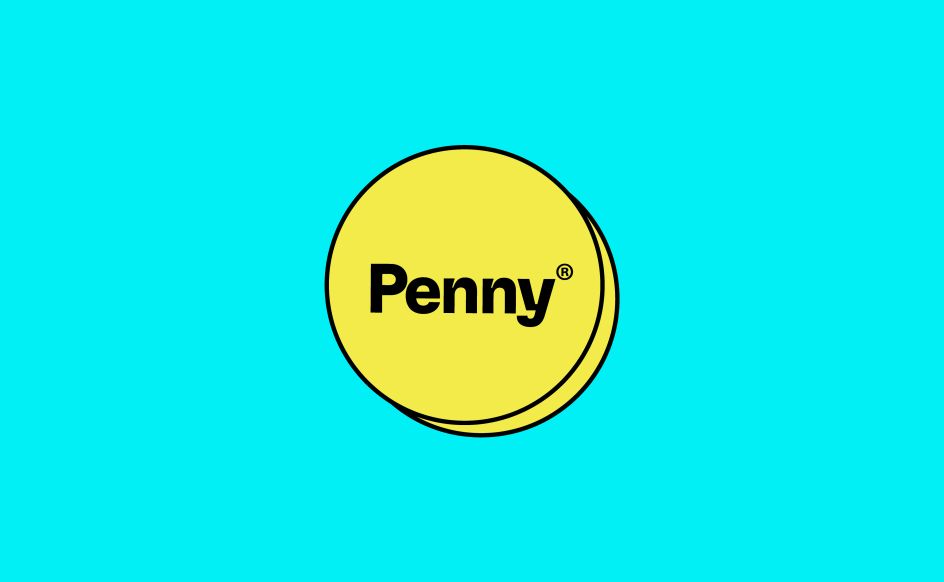
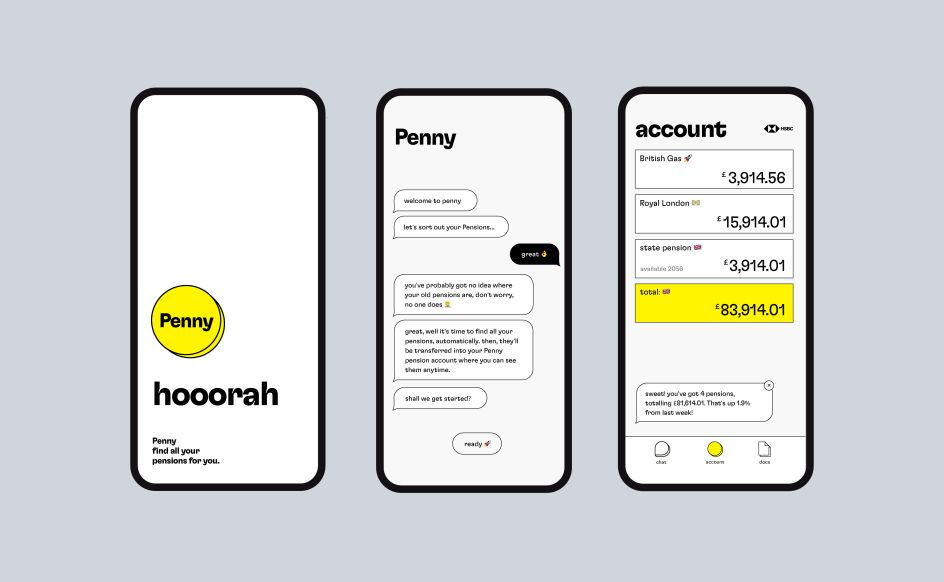
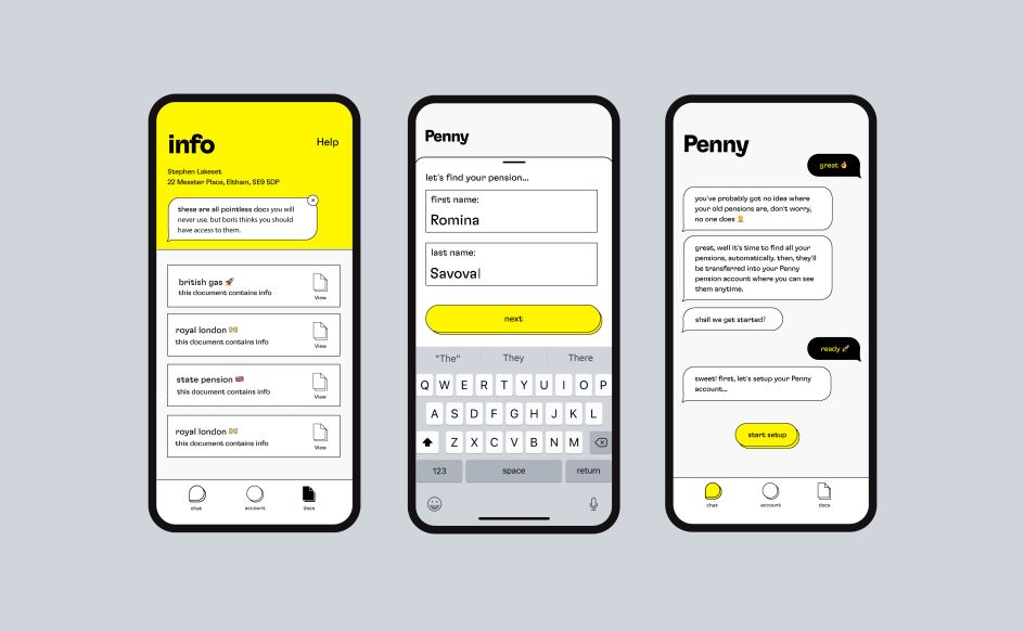
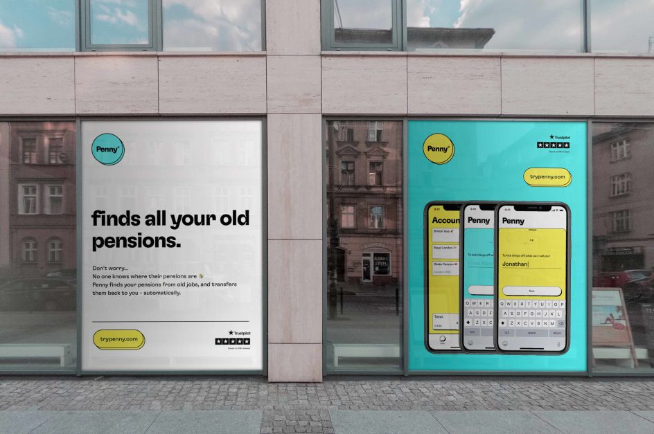
To help us out, Penny is a new pension company that can automatically find all your old misplaced pensions, and then collate them into one place. It's a great idea, but how could they reach Gen X-ers and Millennials, for whom pensions are often the last thing on their mind?
To create a brand identity that could effectively resonate with this audience, the brand turned to Skep, a London based design studio founded by creative directors Chris Smyth and Josh Hailes.
"Penny set us the challenge of creating an identity that would cut through the formal visual language common in the financial sector, and instead create a playful brand that would set them apart from the pack," explains Chris. "Our approach was to deliver an informal identity that balanced the tricky tension of being 'playful' whilst maintaining the necessary 'sturdiness' of the pensions industry. After all, they are dealing with your life savings!"
Chris continues: "For the typography, we used a stunning typeface from Grilli type, GT Flexa. This is a typeface with plenty of personality and versatility, resulting in a forward-thinking logotype full of fun and character, but which also feels established and safe. Along with the brand 'look and feel', we created layouts for their brand new app and mobile site."
If you're a freelance creative who hasn't sorted out your pension yet, then check out our article, The freelancers' guide to pensions.
Editor's Picks


Trending


](https://www.creativeboom.com/upload/articles/90/908fdb6378db1e95d12595416f54e6336d5e80b8_732.jpg)
Podcasts


Editor's Picks
Further Reading