PangPang Pusher: Sour beers for the 'non-bearded' reveal their delicious identity and packaging
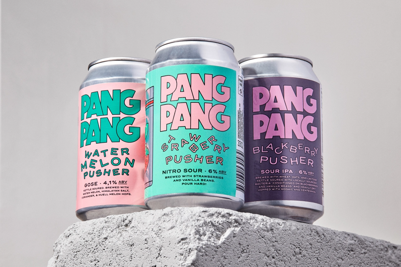
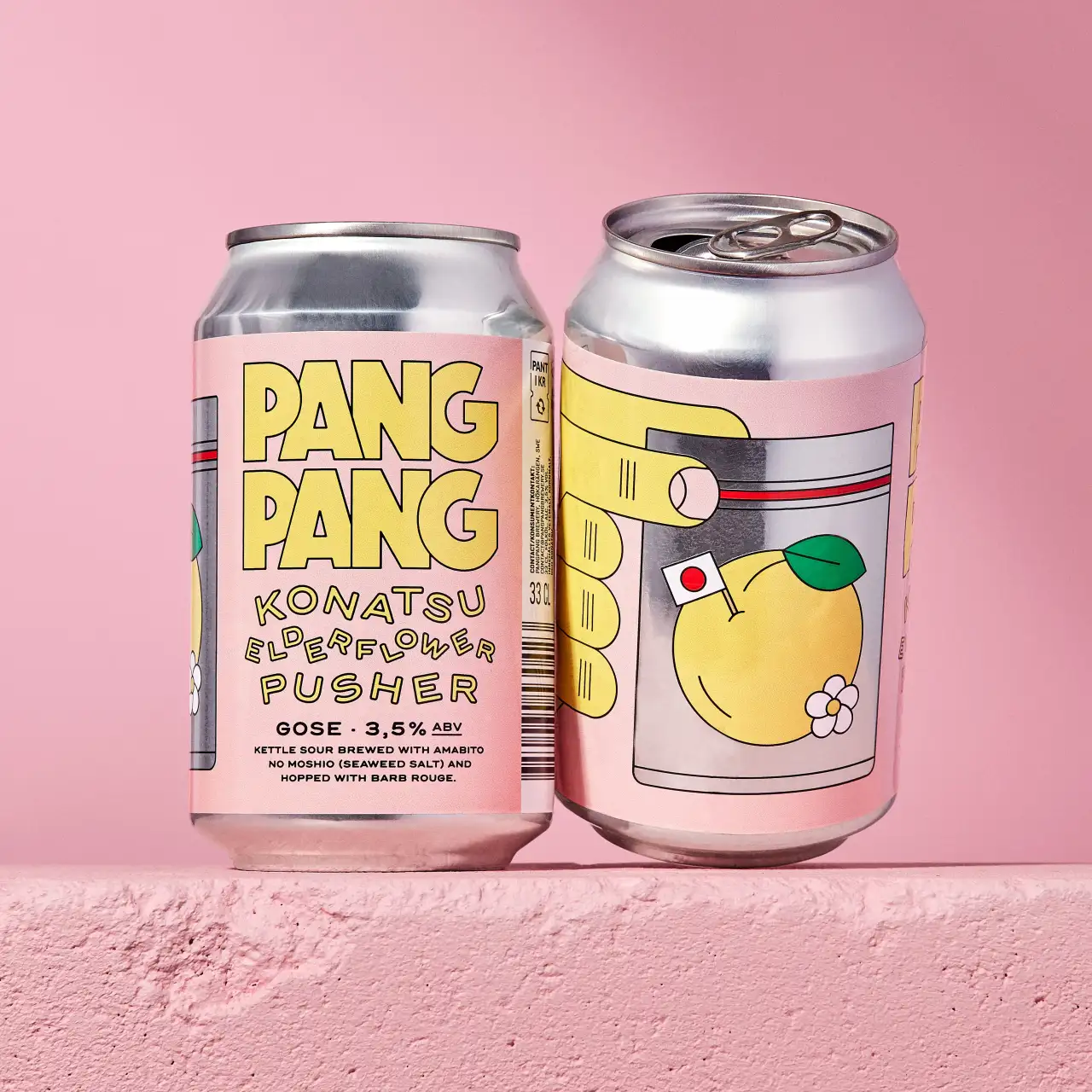
Can we all just take a moment to appreciate this seriously tasty packaging design for Swedish microbrewery PangPang and its new range of sour beers? Full of juicy type, bright colours, and fruity nods to the '90s and early noughties, it's the latest creative output from Swedish art director and designer Jens Nilsson.
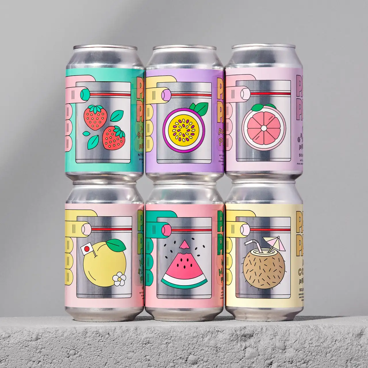
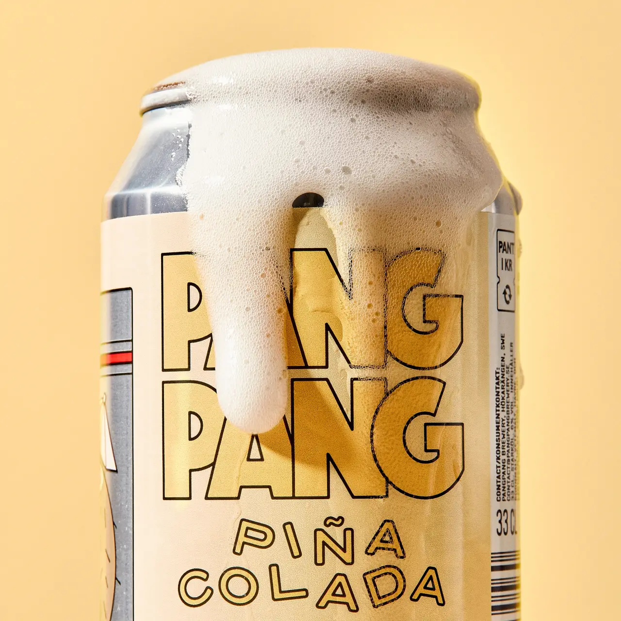
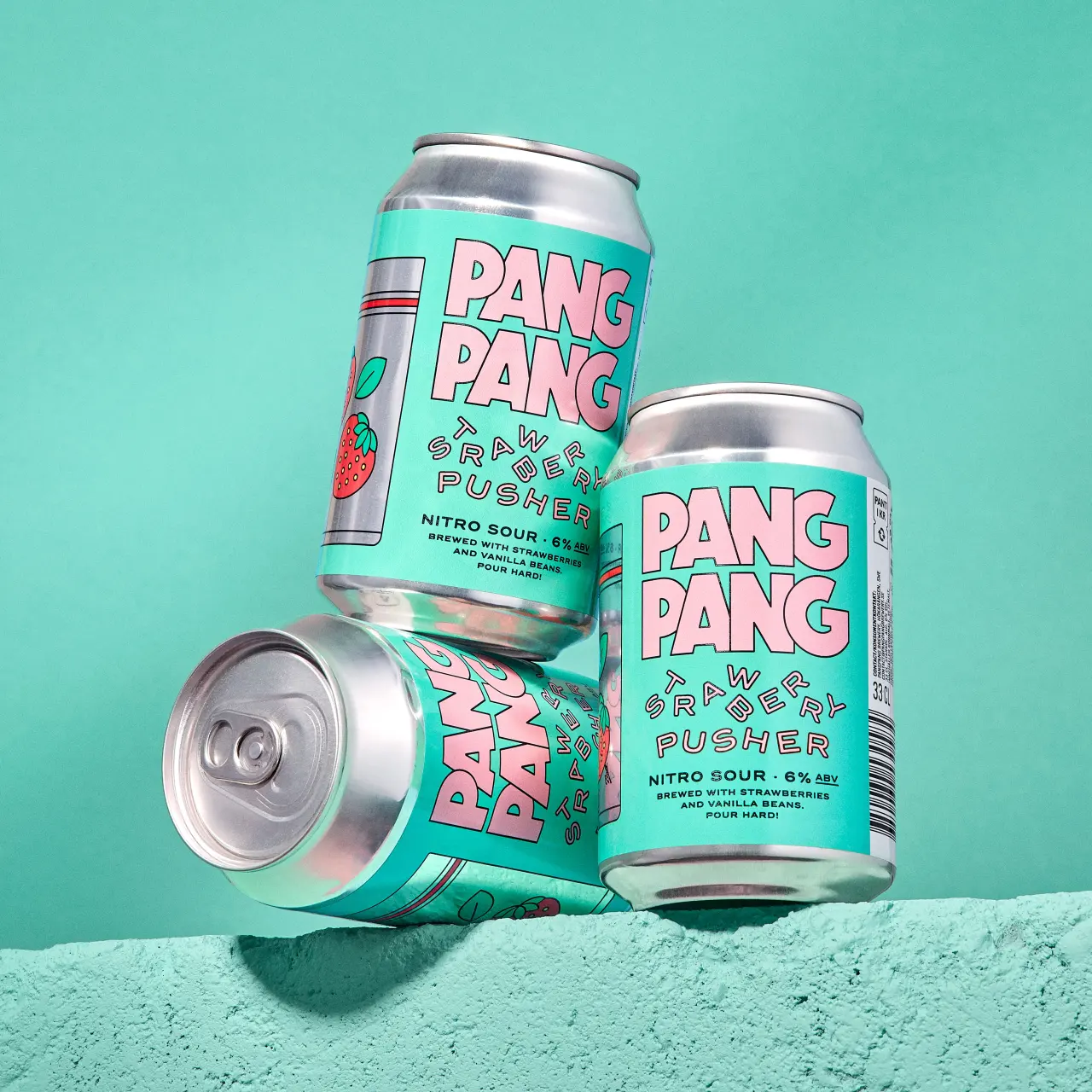
If you're longing for Friday, this branding for PangPang Pusher, a fruity sour beer series made for PangPang, will have you willing away the rest of the week. The first flavour, Peach Pusher, was released back in 2018. Since then, the people of Sweden (and other tastemakers around the world) have been able to enjoy a bunch of other 'pushers' like Strawberry, Pina Colada, Mango Habanero, Pink Grapefruit, Passion Fruit, Blackberry, Konatsu Elderflower and – Jens' personal favourite – Watermelon.
"I was recently asked about the idea behind the success of this particular design, and I'd like to highlight a few details and strategic choices that contributed to its appeal," Jens tells Creative Boom. "Firstly, the illustrations in the style of simple outlined objects allow us to experiment with a wide range of vibrant colours while maintaining readability, even when using similar colour tones. This thing is crucial in maintaining the functionality of the design."
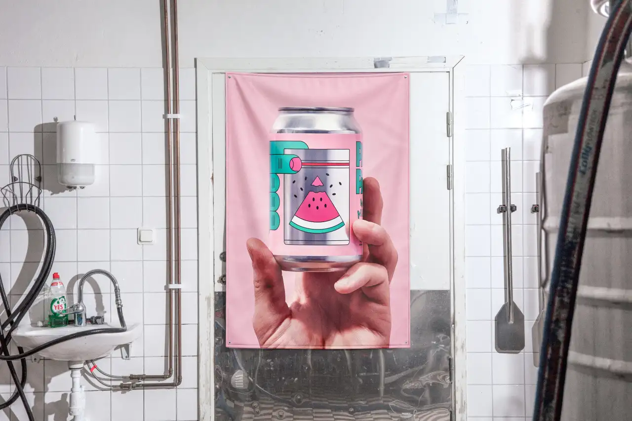

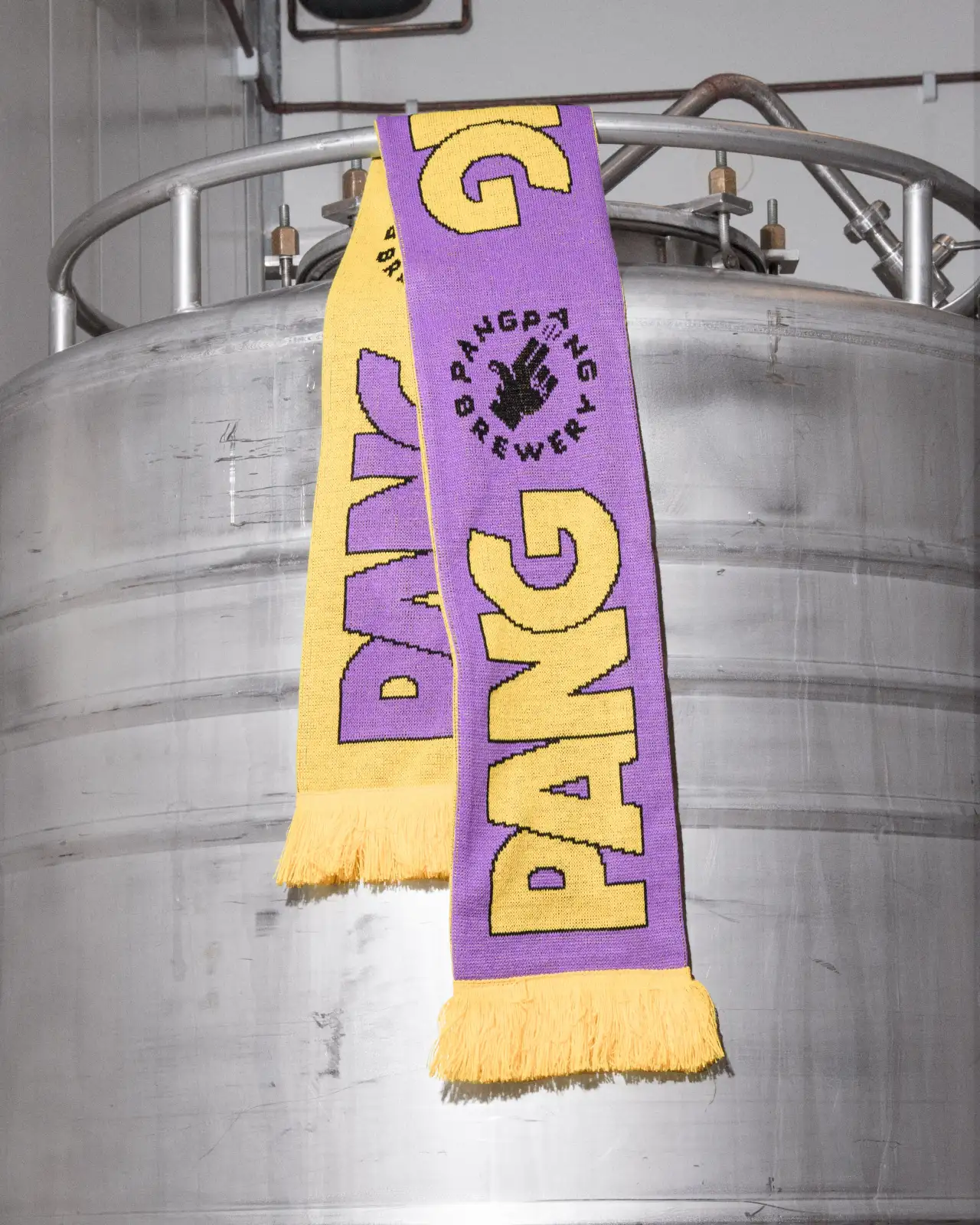
Secondly, compared to a classic "one front beer" look, this design and label have more of a "full covering" and "complex three-part appearance". As Jens explains: "It starts with the hand and the fingers holding a plastic bag and then extends to the golden ratio-esque text layout on the front side. This creates a more visually engaging composition."
Finally, there's a transparent section in the middle of each label – one that not only represents the illustrated plastic bag's see-through look but also adds depth and texture to the metallic can itself. It's this detail that Jens believes enhances the overall visual appeal and creates a better balance between the can and the label itself.
It certainly looks as though it has been a dream project for Jens Nilsson, as he was behind the art direction, illustration and design for PangPang, working in collaboration with Fredrik Tunedal from the brewery. He even sorted all the product photography, only bringing in Brikk Studios to help animate some of the imagery.
Other recent knockout projects for Jens include a fun rebrand for Kaibosh, a Norwegian eyewear brand that felt it had become boring as opposed to what it should be: trendy and bold (we love the cute eyelash symbols and the custom made type), and neon signage and fresh identity for Snask – his previous employer, and a leading branding and film agency based in Stockholm.
Based in the Swedish capital himself, the award-winning graphic designer and art director has over ten years of industry experience and says he strives to create "expressive and ambitious visual concepts" within the fields of branding, packaging, typography, still life photography, print design and digital environments for both small and big businesses. "I believe that fearless and distinct branding is the most honest and true way for any company, organisation or product to stand out from its competitors," he says.

Editor's Picks





Trending



Latest Jobs
Junior Motion Designer at Project Slingshot
Full-time·Remote·£30,000 – £35,000
Designer (Digital, Brand & Localisation) at Journey
Contract·London·£45,000 – £62,500
Associate Web Designer at Planhat
Full-time·London·£30,000 – £35,000
Copywriter & Content Strategist at Chapel
Full-time·London·£30,000 – £40,000
Senior Account Manager at Consider
Full-time·London·£42,500
Designers / Copywriters / Art Directors / Creatives at Hatched
Full-time·London·£25,000 – £55,000