Retro-inspired colour palette and clean, modern logo for brand identity by Kati Forner
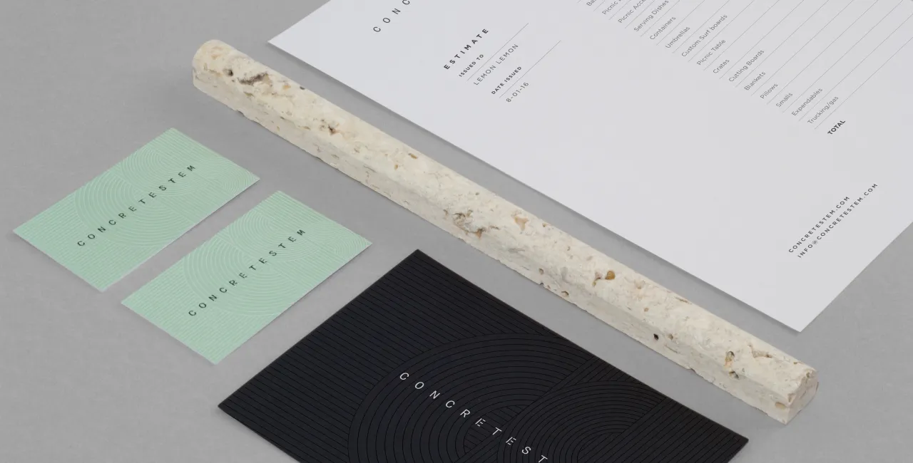
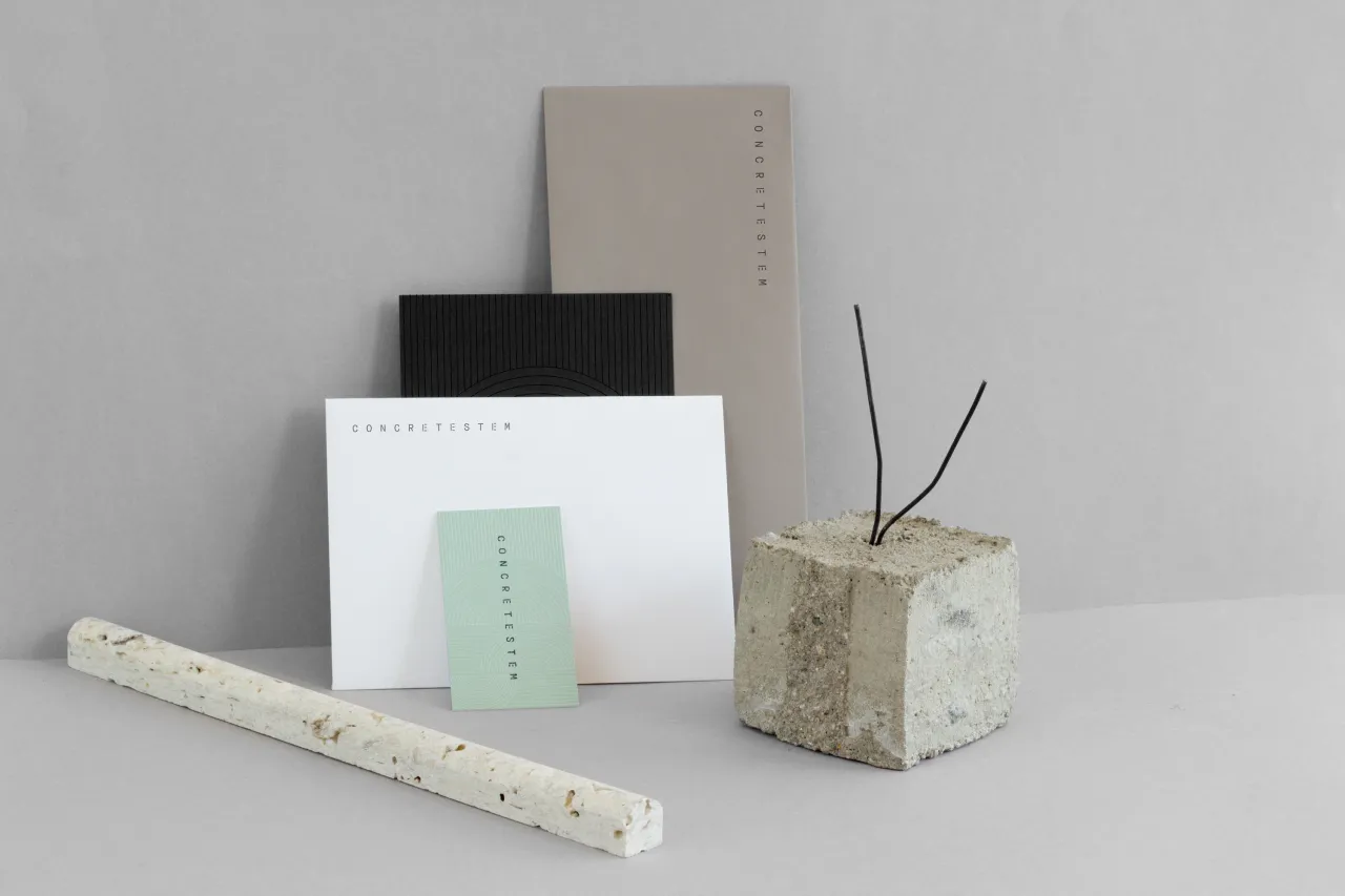
This pastel perfect brand identity for Concretestem is the latest project by Los Angeles-based graphic designer, Kati Forner. Having long been fans of her work, we couldn't resist sharing this fresh and confident colour palette and font combination.
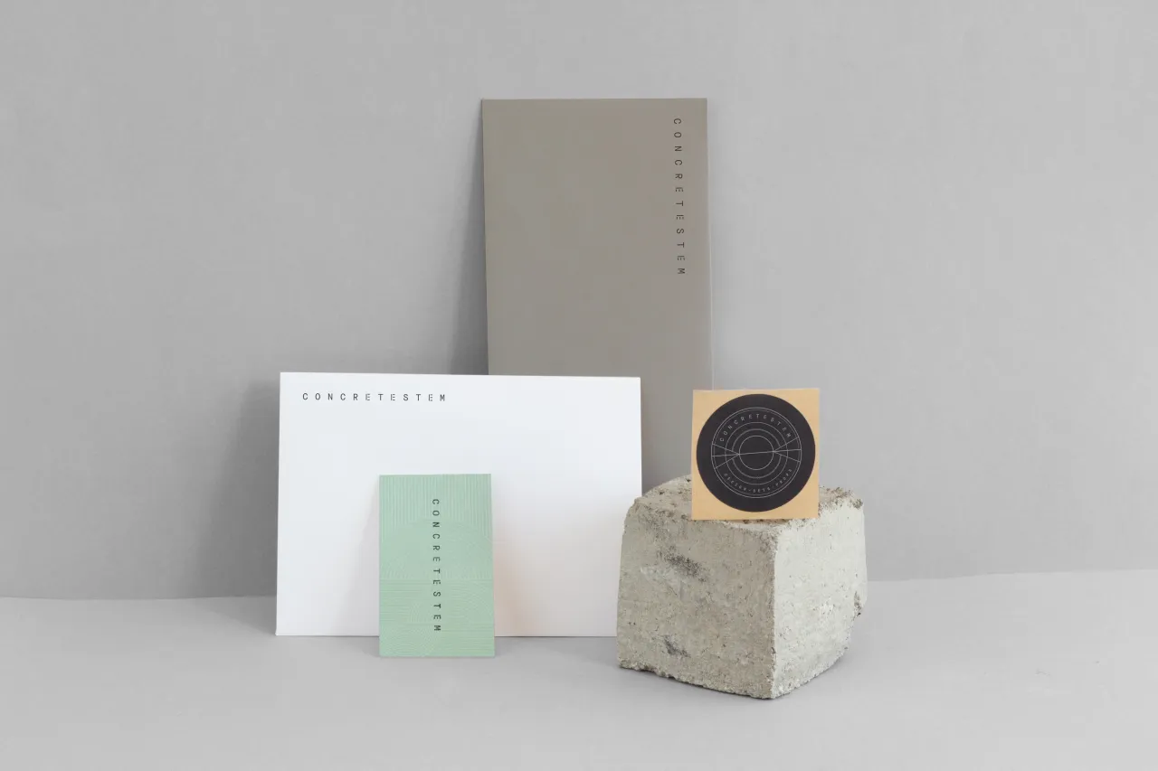
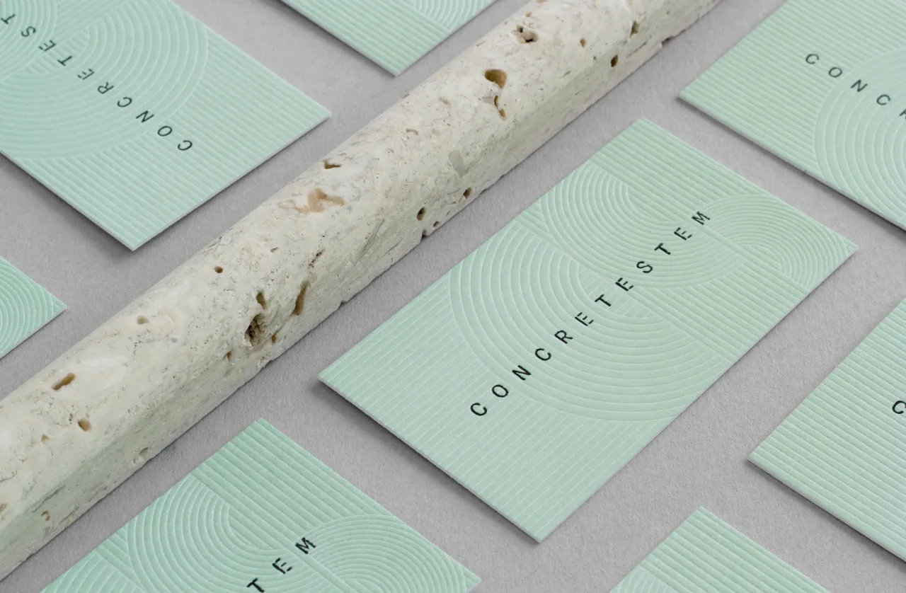
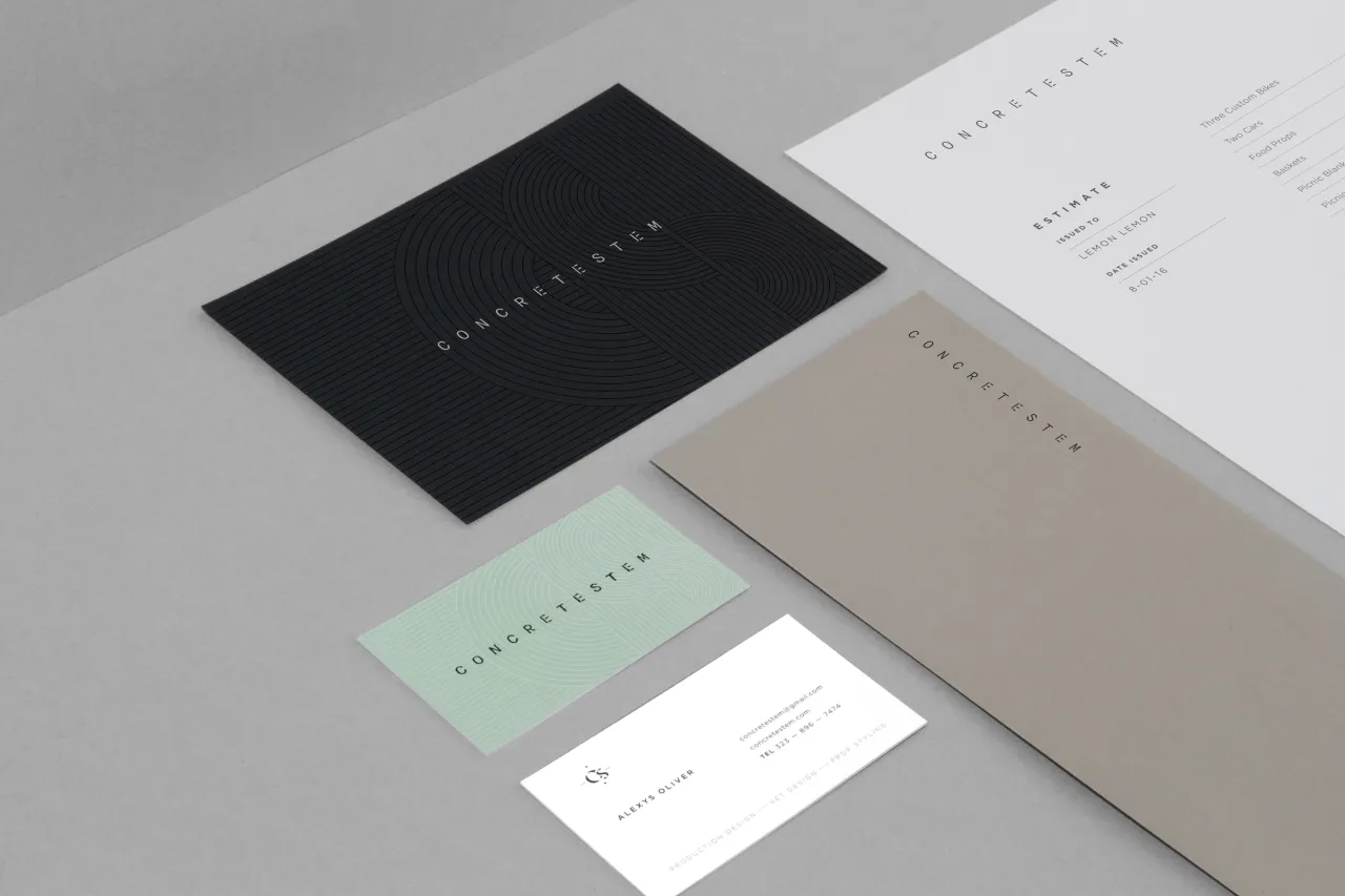
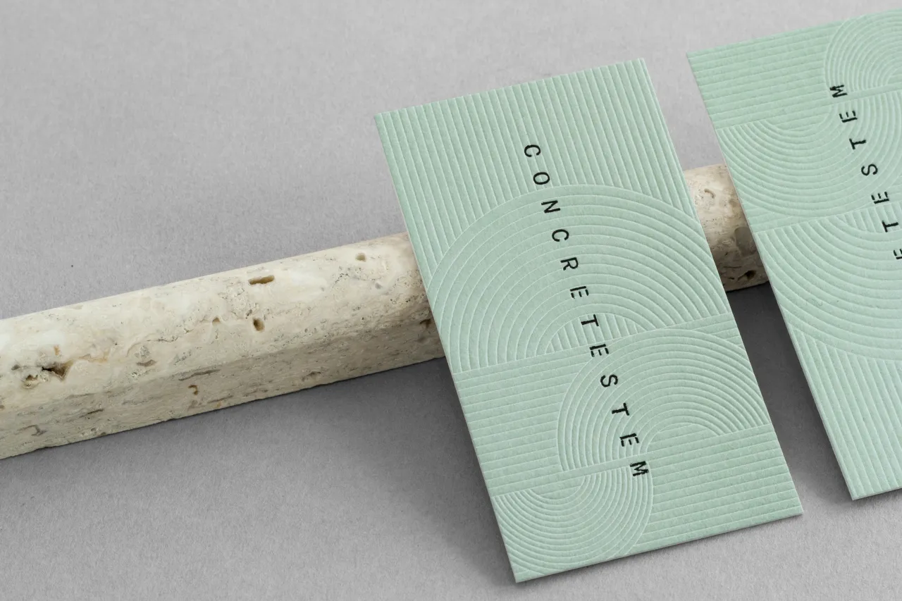
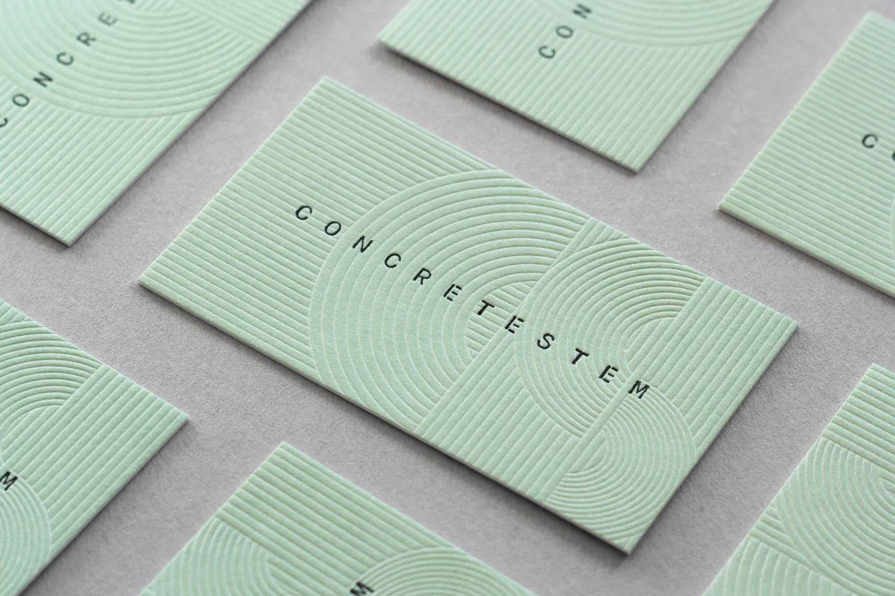
Kati explains: "Concretestem is a prop stylist husband and wife team based in Los Angeles, CA. We wanted the brand to have a retro-futuristic vibe, an aesthetic that played off their style and personalities.
"By incorporating a blind embossed retro-inspired line pattern mixed with a clean, modern logo we were able to accomplish this."
With over 10 years of experience in print, digital, and production, Kati crafts design solutions that transform brands and grow businesses. Discover more at katiforner.com.
All images courtesy of Kati Forner
Editor's Picks





Trending






Latest Jobs
Creative Content Executive at Cognition
Full-time·Birmingham·£28k–£35k
Senior Copywriter at Human After All
Full-time·London·£48k–£66k
Senior Graphic Designer at MoMA Retail
Full-time·New York·$72k-$80k
Senior 3D Motion Designer at Art&Graft
Full-time·London·£50k-£65k
Senior Brand Designer at Analogue
Full-time·Leeds·£38k-£45k
Art Director at SPOKE
Full-time·London·£55k-65k




](https://media.creativeboom.com/7a1e2857-b4fe-4532-b27a-44aad620d310/conversions/1534a8a570312292c43f74da9968eac42becfa65-medium.webp)