Ragged Edge gives smart supplement brand Heights a non-preachy, brain-stretching identity
Ragged Edge has created the strategy, name and identity for Heights, a new subscription service that pairs a monthly supplement delivery with regular brain-training and nutrition advice to help people to boost their brains.
The innovative brand thinks that improving cognitive health and brain function is a complex and relatively new subject area. So for the brand to succeed, it needed to persuade people to invest in their brains.
Ragged Edge's approach shows how a straight-talking yet aspirational brand can be used to change perceptions and behaviours, balancing the need to educate and inspire.
"Health is the new status symbol. And nothing in our bodies is more complex or important than the brain," says Dan Murray-Serter, co-founder of Heights. "But right now many brands are making false promises, saying you can pop a pill and suddenly your brain will function more effectively. That’s just not true – looking after your brain is a long-term commitment. We started Heights to change the conversation around our brains, and heighten the cognitive potential in everyone."
Following an analysis of the market, the audience and overarching cultural trends, Ragged Edge defined and created a new brand to get people thinking brain-first.
"The human brain remains 'plastic' even in adult life," says Max Ottignon from Ragged Edge. "While quick fixes don't work, with the right knowledge and nutrients, anyone can stretch their brain’s capacity for greatness. So we set out to inspire our audience with a brand that pushes you to stretch your brain, and yourself."
The name sets the tone, inviting us to go beyond what we thought possible, while the tone of voice aims to challenge us to reconsider our preconceptions. Playful headlines and the occasional brainteaser ensure that things never get preachy, or overly worthy.
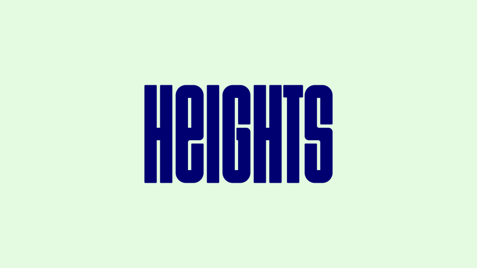
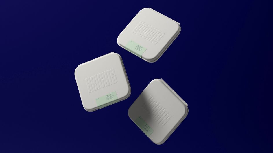
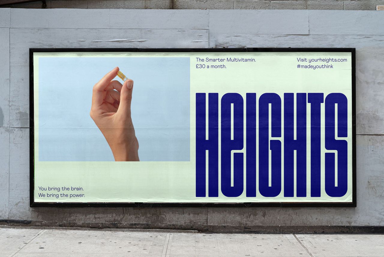
The centrepiece of the visual identity is a "stretchable" logotype that can expand into a flexible pattern – a simple, scalable system, designed to be as adaptable as our brains.
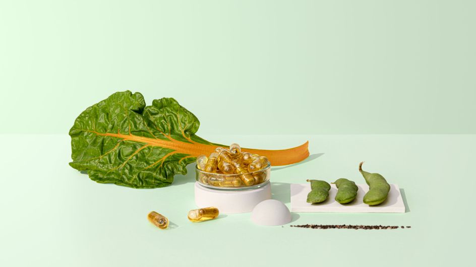
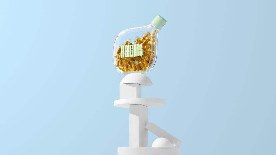
The colour palette borrows credibility from the healthcare category with blue and green hues, but the tonal variations are designed to evoke a lifestyle feel. And imagery, created in collaboration with photographer Kuba Wieczorek, combines a refined, high-end aesthetic with compositions that play on the idea of taking your brain... literally to new heights.