True North's playful identity for Blackpool's first-ever museum celebrates the 'joy and whimsey' of the seaside town
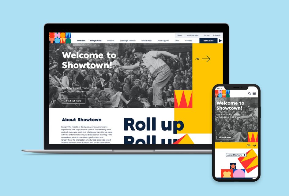
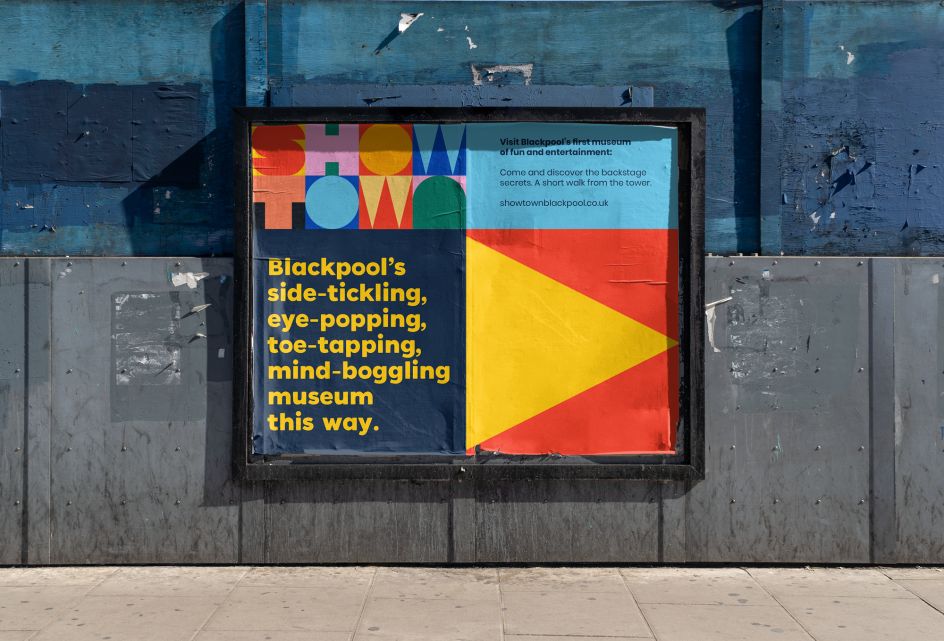
Manchester creative agency True North is behind this vibrant branding for Showtown – Blackpool's new museum of fun and entertainment, packed with all the joy and whimsey of the seaside town itself.
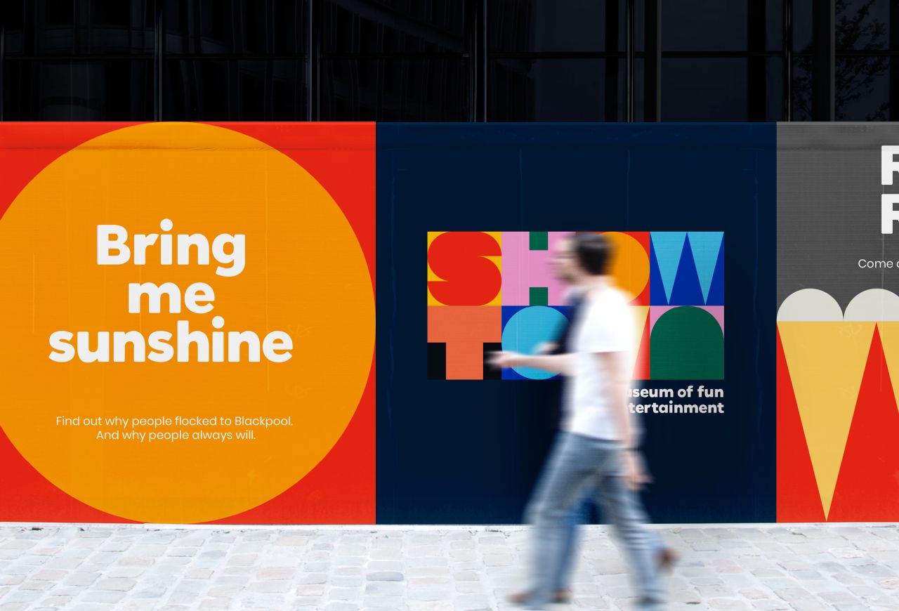
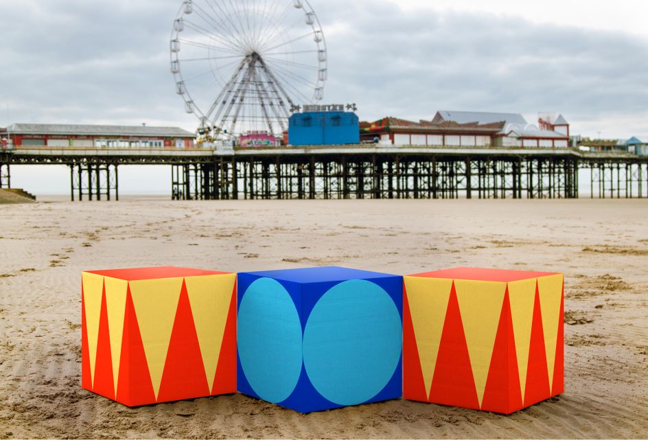
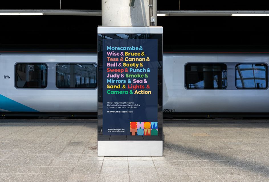
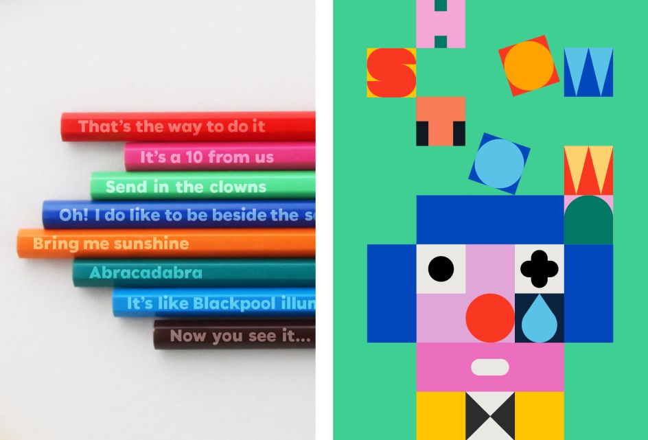
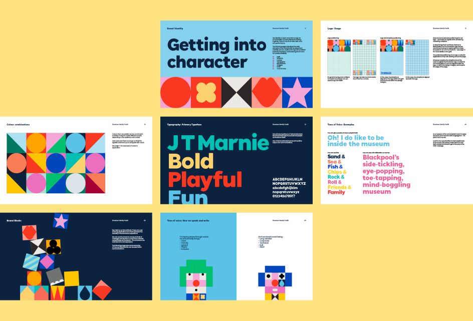
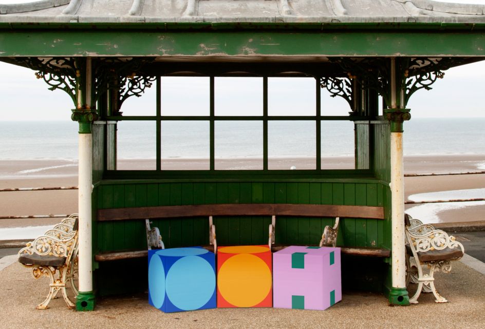
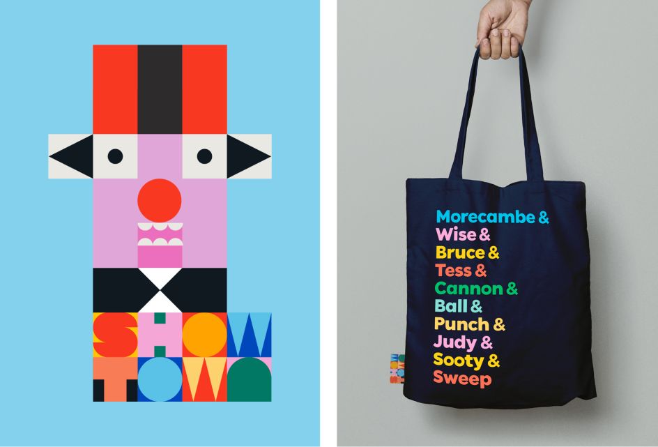
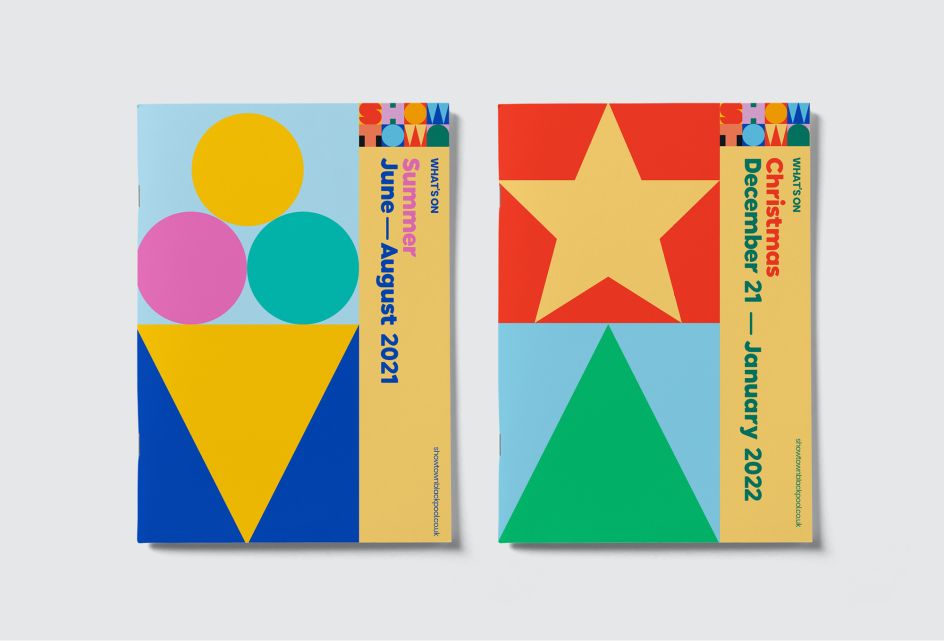
Based on a toolkit of 'brand blocks' – the identity is bold with simple graphic icons that represent the diverse experiences to be found inside the museum. Assembled in creative combinations, the blocks tell stories in playful and engaging ways. True North brought in copywriter Nick Asbury to craft a suitably upbeat and inclusive tone of voice to match.
Throughout the design process, True North wrestled with how to present this new addition to Blackpool's action-packed line-up. While technically a museum, Showtown must compete for the attention of the 18 million people who stroll the promenade each year with a plethora of other vibrant attractions.
The solution? Give the museum all the charm, appeal and entertainment value of a top-bill seaside attraction. This included positioning Showtown not simply as a museum about Blackpool, but a national celebration of fun and entertainment as an art-form – and Blackpool's pivotal role in shaping it.
Showtown immerses visitors in Blackpool's showbiz past, present and future, from the magic, wonder and spectacle of the illuminations, dance, circus, magic and variety, to getting up close and personal with the larger-than-life characters who helped turned a Lancashire seaside town into a top entertainment hub.
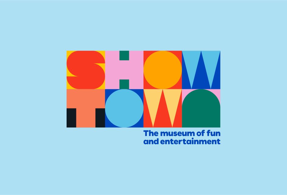
Speaking of the 'brand blocks', True North's Creative Director Steve Royle said: "They take their cues from the modular design of the Showtown logo, each is a square flat-colour icon, representing everything from ice cream on the beach to a balancing circus elephant. We've created them to be used as across all marketing communications, branded materials, digital applications and merchandise. The scheme isn't set in stone: it's as fluid and playful as the stories it helps tell."
Editor's Picks


Trending
Podcasts
Editor's Picks
Further Reading