Process Play crafts a fun, character-driven identity for 13th Floor Coffee Co
London isn't exactly short of specialist coffee shops, so making one stand out is a tall order. Kevin Summers of Process Play explains how they took 13th Floor Coffee Co to the next level with thoughtful use of typography and character design.
When you want to infuse a brand with personality, there's nothing like a bit of fun character design... as long as you get it right. Here's a great example from Process Play, an independent design and identity studio based in West Yorkshire working across the worlds of art, music, culture and craft.
As designer and founder Kevin Summers explains, "The studio focuses on creating expressive, meaningful visual narratives built on utility. As well as working closely with clients to help them discover and tell their unique stories, we also publish, exhibit and collaborate on various experimental projects."
Recently, Process Play created a playful new identity and visual direction for the speciality coffee bar 13th Floor Coffee Co, including coffee truck design, cups, merchandise and more. We chatted to Kevin to learn more about the project.
The brief
13th Floor Coffee Co. was started by the team behind the critically acclaimed Dorset music festival End of the Road. "Their friendly team can be found serving delicious coffee and treats from their delightful little trucks in Stoke Newington and Haggerston in London, as well as on the road at festivals," explains Kevin.
"The company source their outstanding coffee beans from the Roastery at Tate – housed in a WWII Nissen Hut within the historic grounds of Tate Britain," he adds. "It's a vibrant, community-led project championing a diverse range of coffee producers."
Process Play already had a relationship and strong track record with End of the Road, having created a new identity and visual direction for the festival in 2022, which included a fun but functional graphic language, a colour palette that matched the festival's Larmer Tree Gardens venue, and a cinematic, motion-driven layer to add pace and intrigue.
The studio had also crafted CD packaging design for End of the Road's ninth collaborative album with Rough Trade, featuring music from that year's festival.
The concept
Kevin explains how the founding concept of the designs evolved. "An important line of enquiry from the start of the project was the idea that the '13th floor' often doesn't actually exist," he recalls. "It's commonly omitted in hotels and multi-story buildings for superstitious reasons.
"This strangeness bled into the design thinking and the desire to represent 13th Floor as not only an exceptional coffee company but something altogether more psychedelic and mysterious."
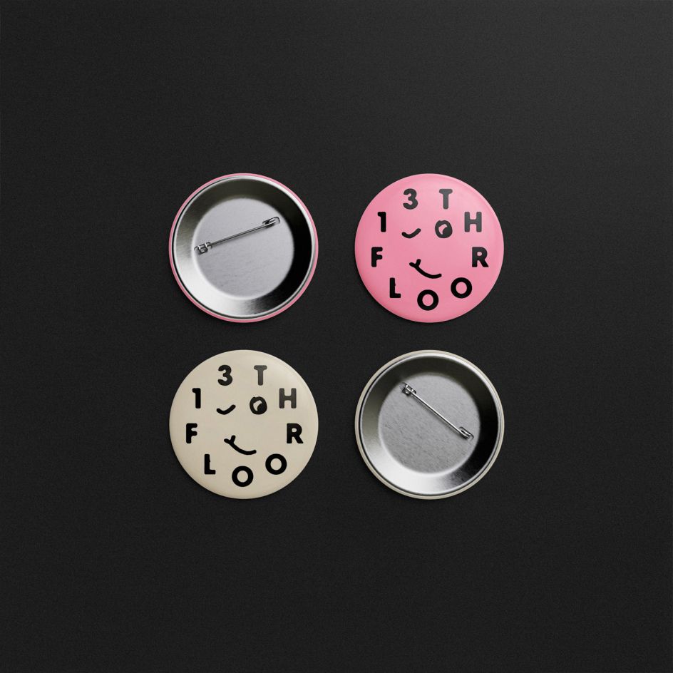
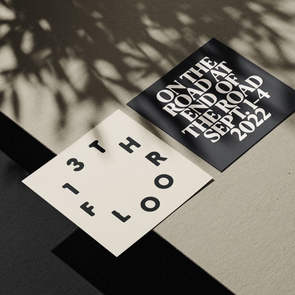
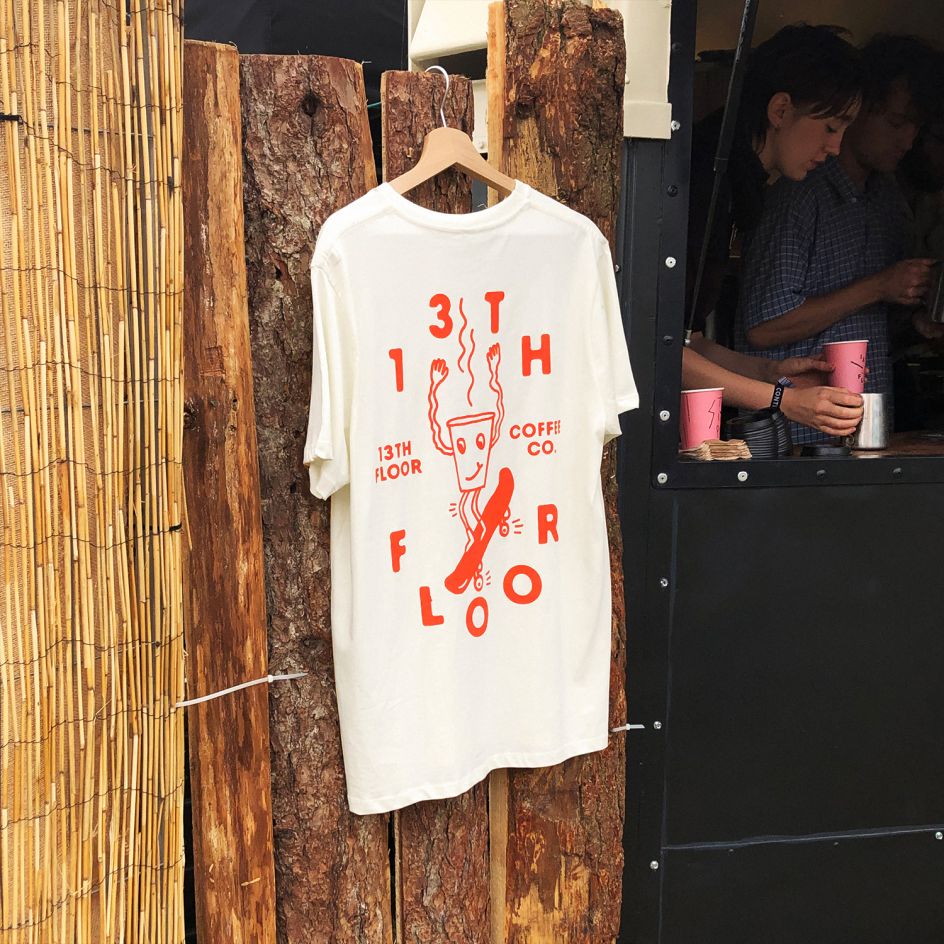
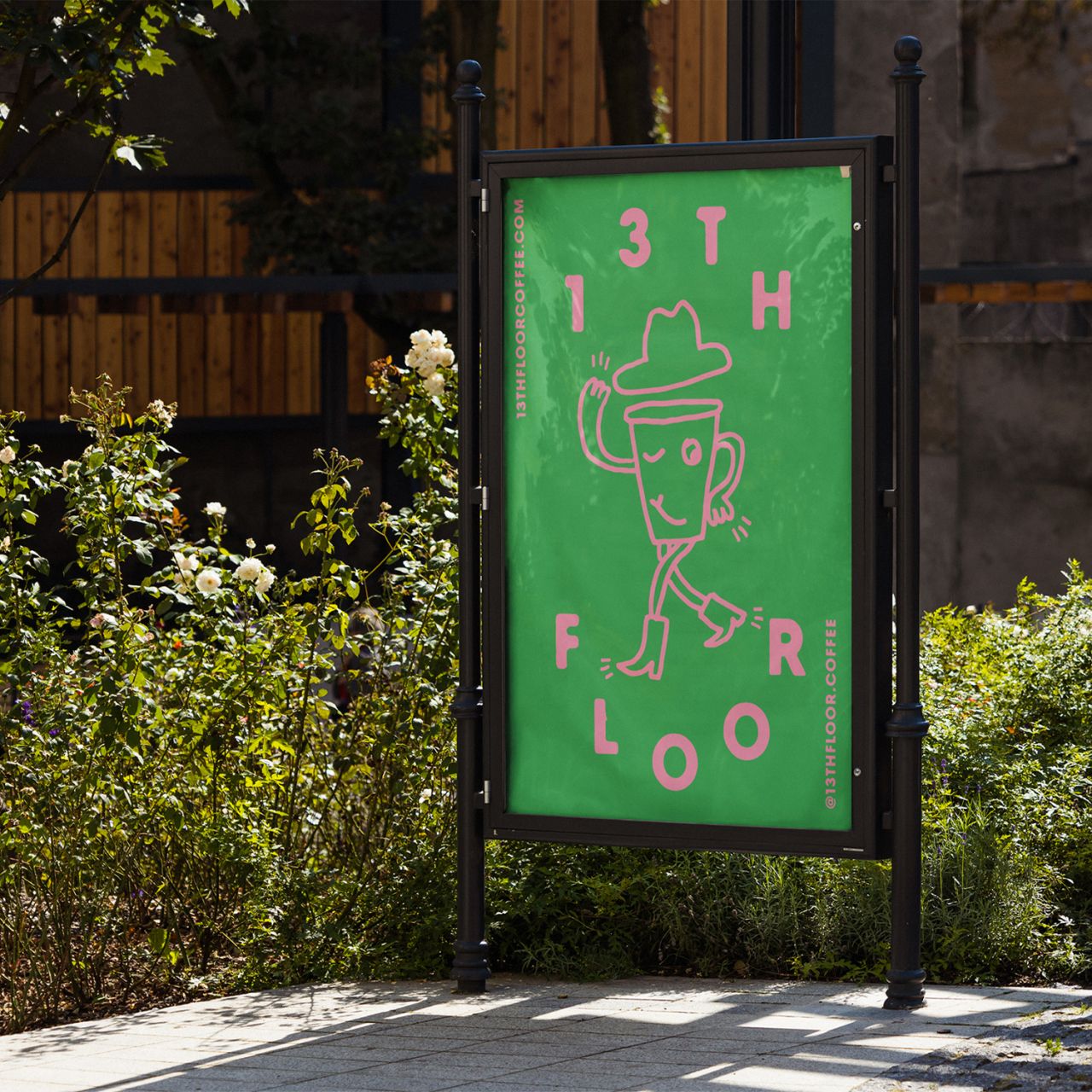
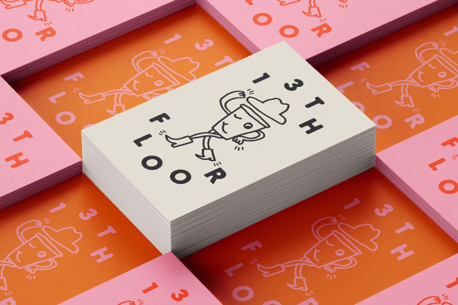
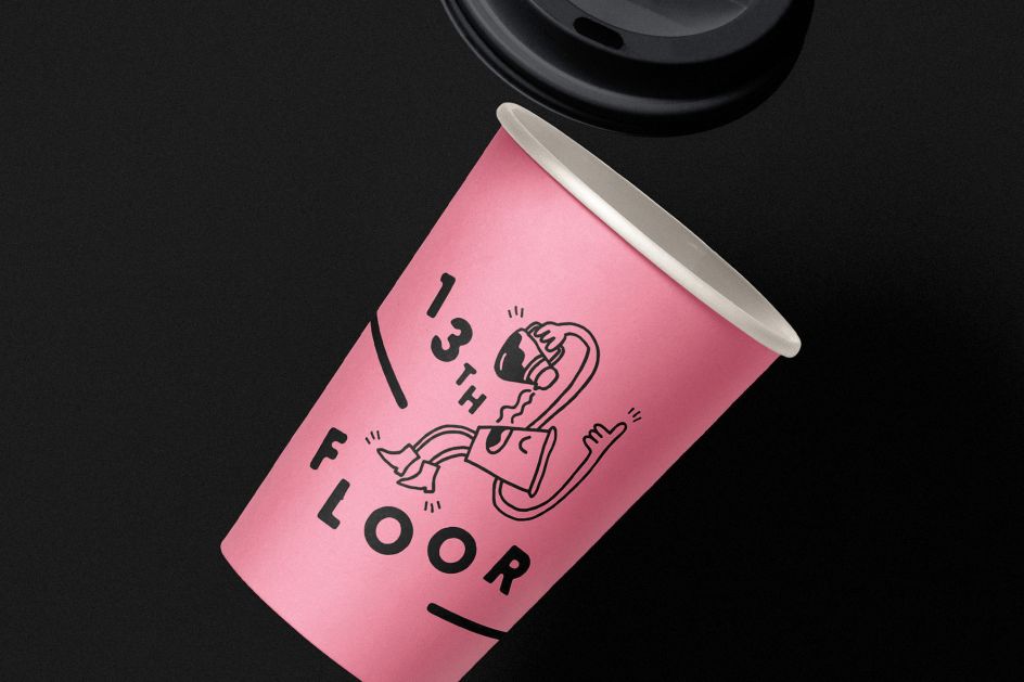
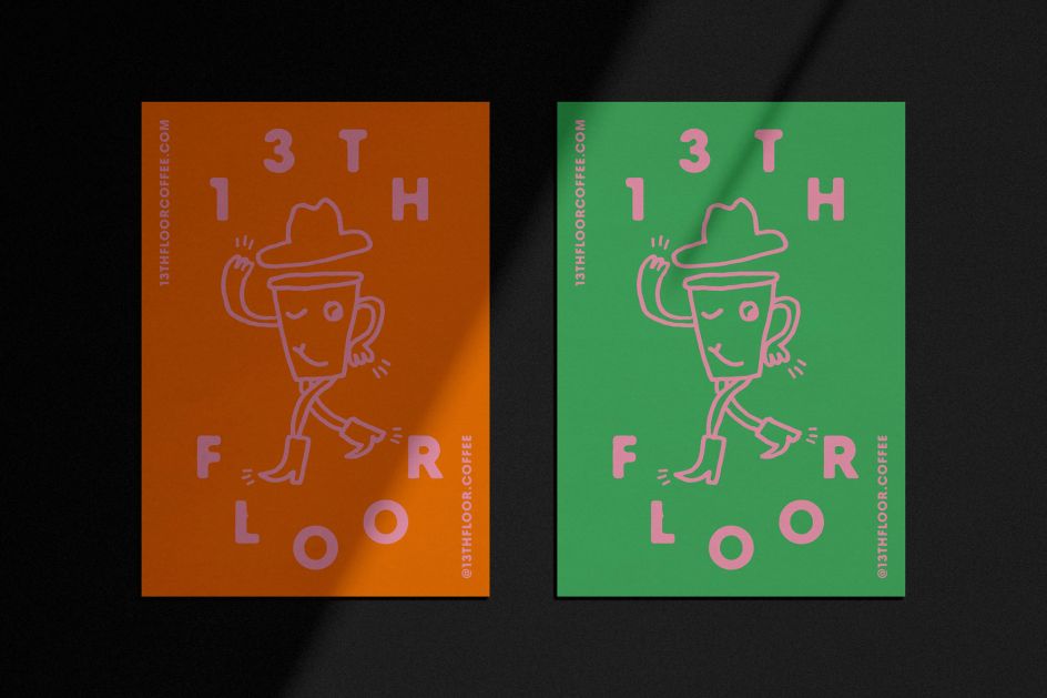
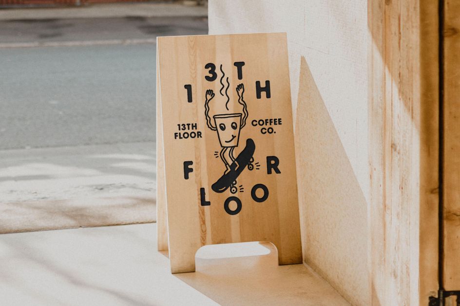
Central to the designs is a friendly coffee cup character, illustrated by Dan Jamieson. This cheeky character adds life to the brand and takes on different poses depending on the setting and media. He's paired with typography that feels cuddly and approachable, giving a fun and relaxed feel to the identity as a whole.
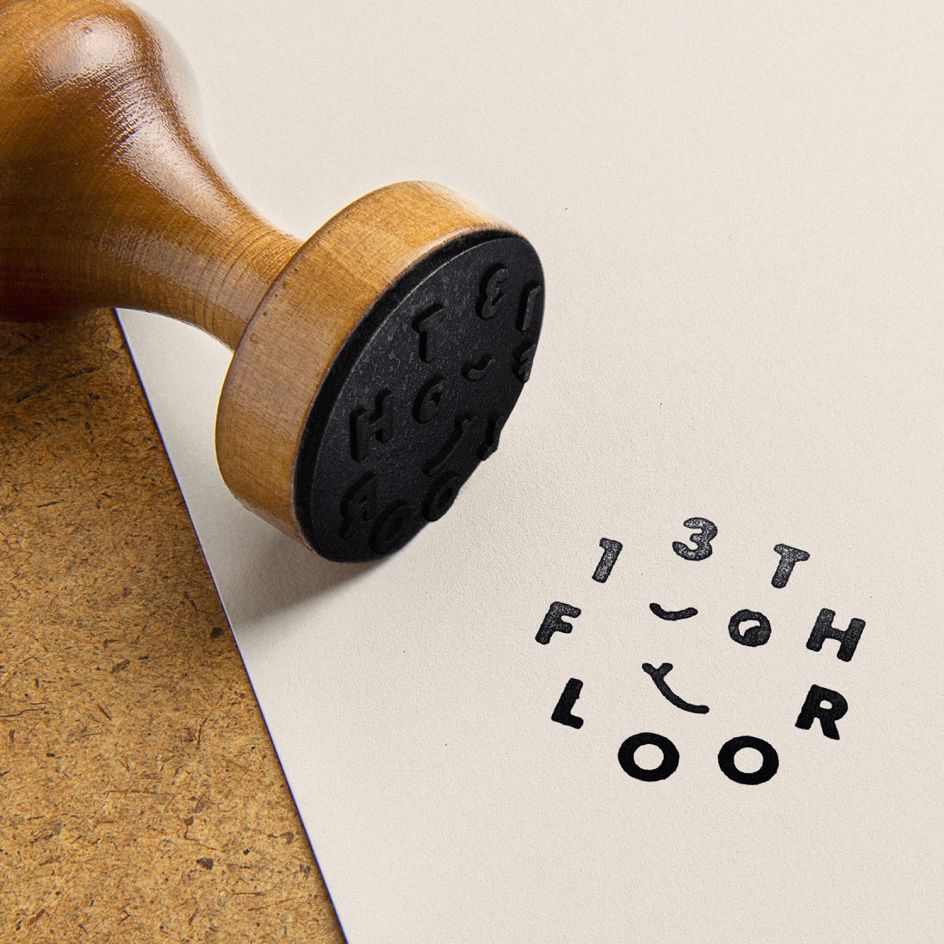
"The slightly distorted, rough-edged typography is intended to reflect the handmade, organic nature of coffee production and preparation – reinforcing the free-flowing style of Dan Jamieson's character illustrations," says Kevin. "There are several ways that the typography re-formats for versatility depending on the application – adding a certain bounce and energy throughout."
The playful graphic language hopes to connect with customers and invite them into the world of the coffee company. This is aided by vibrant colour combinations that lend a feel of modern psychedelia alongside the bounce and energy of the re-typography, as well as copywriting such as the line "See You Later Elevator", a playful nod to the coffee company's name.
The overall effect is to present the 13th Floor as an iconic, fun and versatile visual identity.

Editor's Picks


Trending


Podcasts


Editor's Picks
Further Reading
](https://www.creativeboom.com/upload/articles/90/908fdb6378db1e95d12595416f54e6336d5e80b8_732.jpg)