Pentagram designs new visual identity for Covariant
Pentagram partners Luke Powell and Jody Hudson-Powell have created the brand identity for Covariant (no, it's nothing to do with that) – a company creating artificial intelligence software for robots.
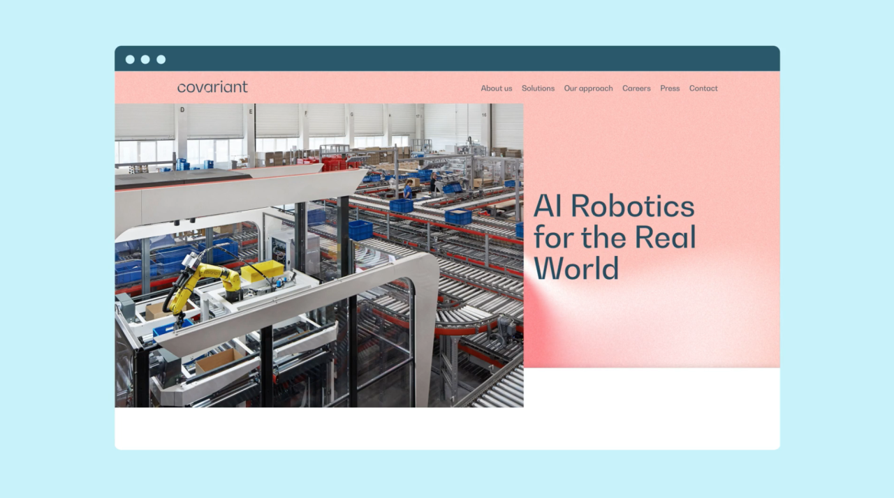
Berkeley-based AI company Covariant is behind building the Covariant Brain, a universal piece of AI software that allows robots to see, reason, and act on the world around them. The company now aims to bring this pioneering new technology to 'the industries that make, move and store things in the physical world,' says Pentagram, rather than robots' primary current uses in industrial applications such as carrying out repetitive movements in modern warehouses.
Covariant's engineers aimed to expand robots' reach beyond the robotic arm and into new realms, resulting in the creation of the universal AI robotics system, Covariant Brian. It's designed to work across numerous uses in various customer environments in areas such as logistics and online retail.


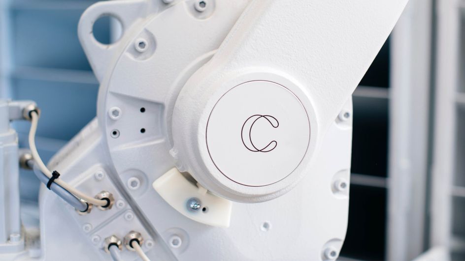
Image by Elena Zhukova
This new approach for the company meant it needed a new brand identity. Pentagram's approach was to centre the new look and feel about the 'Covariant Flow' – an abstract visualisation that represents the process of learning through the 'decision boundary', something which is central to the way AI neural networks learn.
"This intelligent layer always lives in the background, morphing and changing in response to external data," says Pentagram. The studio adds that both the Covariant wordmark and symbol mimic the curves, twists and flow of the decision boundary; and this relationship is echoed in the animated version of the symbol and in the brand typeface—a high contrast geometric grotesque font family which is typographically similar to the brand's custom wordmark.
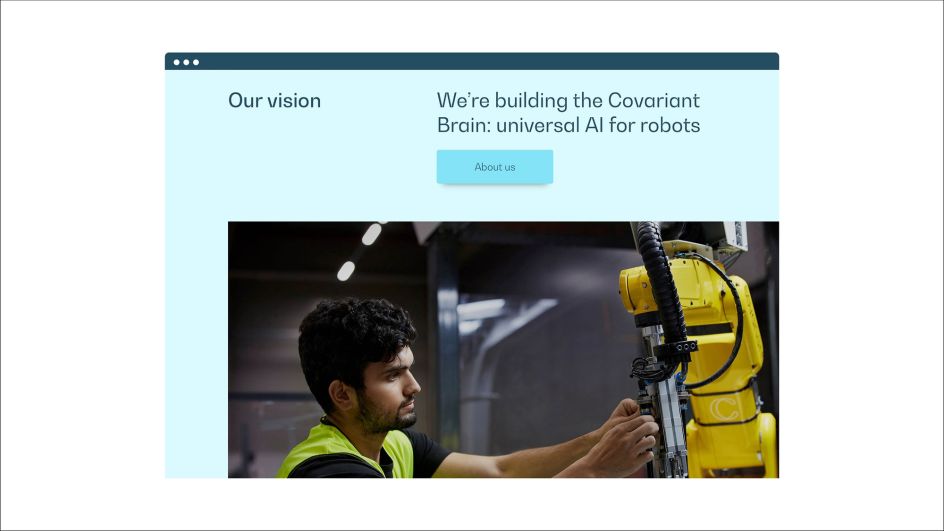

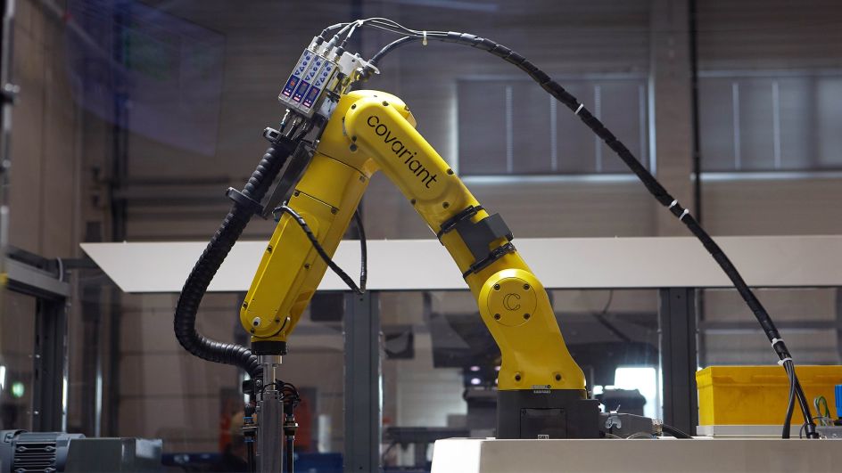
Image by Magnus Pettersson

Pentagram also created a series of icons that feature a loop or overlapping lines, again echoing the Covariant logos and the decision boundary curves. The designers chose a "friendly" colour palette consisting of four core colours, "a combination of human (red, pink, light blue), with a more serious and industrial feel conveyed by the petrol blue," says the studio.
This palette extends into a suite of looping animations created by Geoffroy de Crécy, who Pentagram chose thanks to his realistic illustration style, which would be able to represent Covariant three primary uses accurately.
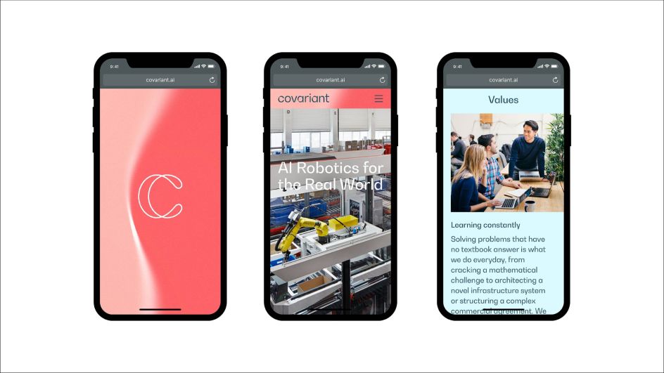


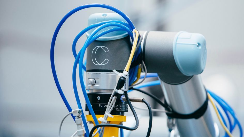
Image by Elena Zhukova.
The new identity is used across all touchpoints, including the new website, which uses the "Covariant Flow decision boundary as an intelligent layer that sits behind all content," Pentagram explains. "Together with the elements of the brand identity, this layer expresses the complexity of the work that Covariant does in a clean, clear, but expressive way – representing the intelligence that is sitting at the heart of Covariant technology."
The team also designed an app for Covariant, enabling users to manually alter the form, speed, complexity and colour of the decision boundary to create unique static and moving image assets. The graphics can then be exported in whatever size, length and format are needed for each platform.
Editor's Picks


Trending


Podcasts


Editor's Picks
Further Reading