Paul Belford's fresh identity for Thai restaurant group Busaba takes inspiration from Buddhist philosophy
London design agency Paul Belford is behind the fresh identity for Busaba, a Thai restaurant group that is celebrating its 20th anniversary this year.

With a brief to "re-energise the brand while celebrating its past", the new identity had to be "rich in meaning", reflecting Busaba’s founding Buddhist philosophy. And it had to feel confident.
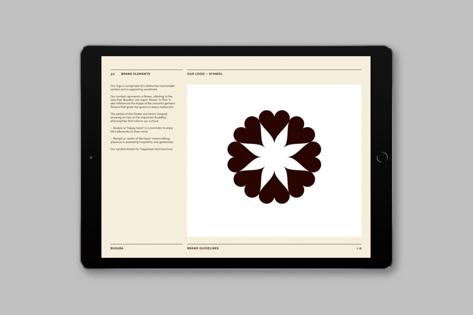
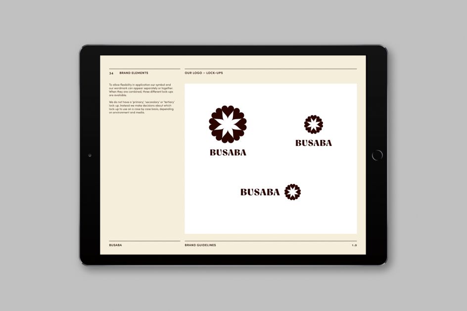
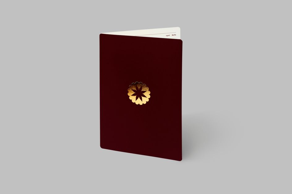
The updated logo represents a flower, alluding to the fact that Busaba can mean 'flower' in Thai. It also references the shape of the gerbera flowers that greet guests in every restaurant. In Buddhist teaching, these symbolise impermanence and serve as a reminder to live in the present moment.
The petals of the flower logo are heart-shaped, drawing on two of the essential philosophies that inform Busaba’s culture: 'Sookjai' and 'Namjai'. The former meaning 'happy heart' has similarities to the Western idea of mindfulness. The latter, 'Namjai' – or 'water of the heart' – encourages taking pleasure in acts of hospitality.
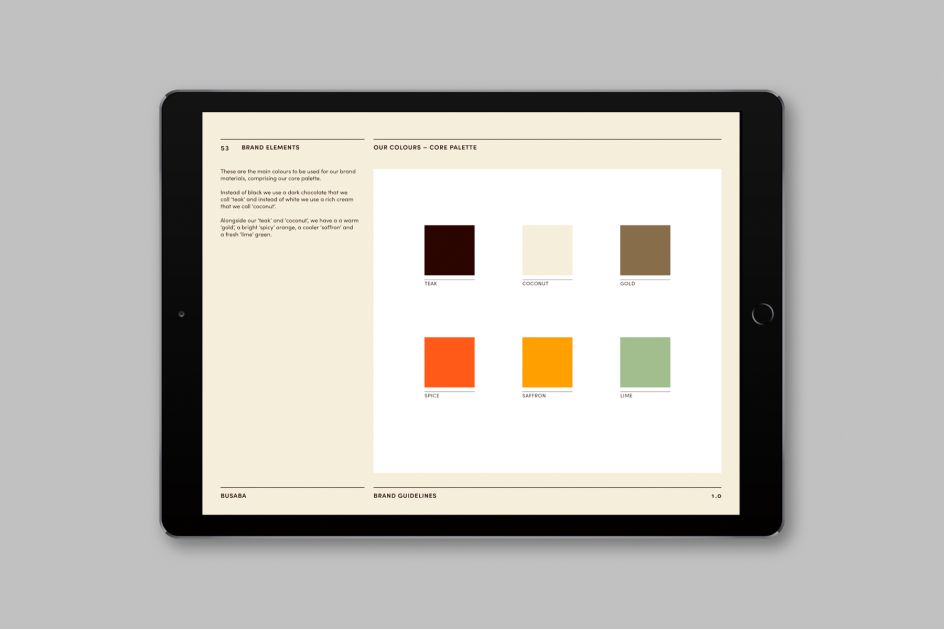
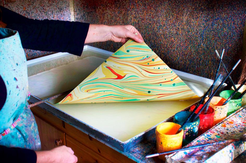
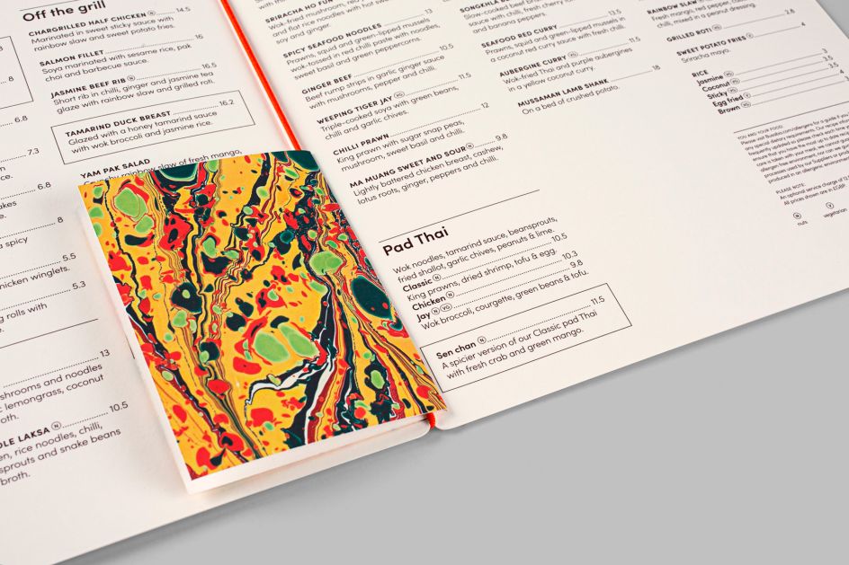
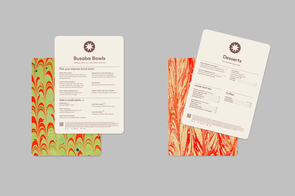
Alongside a new colour palette, Paul Belford introduced a library of patterns that draw inspiration from Busaba’s range of vibrant sauces, visualising the harmonious mix of flavours in Thai cuisine. These feature excerpts from bespoke marbled papers, produced by artist Rachel Maiden.
The new identity includes extensive brand guidelines, as well as a suite of menus and a team uniform. Discover more at www.paulbelford.com.

Editor's Picks


Trending


Podcasts


Editor's Picks
Further Reading
](https://www.creativeboom.com/upload/articles/90/908fdb6378db1e95d12595416f54e6336d5e80b8_732.jpg)