Farm to face: Otherway crafts an inventive identity for new skincare brand Baz & Co
London creative agency Otherway explains how it devised a new skincare identity that would stand out in a crowded market.
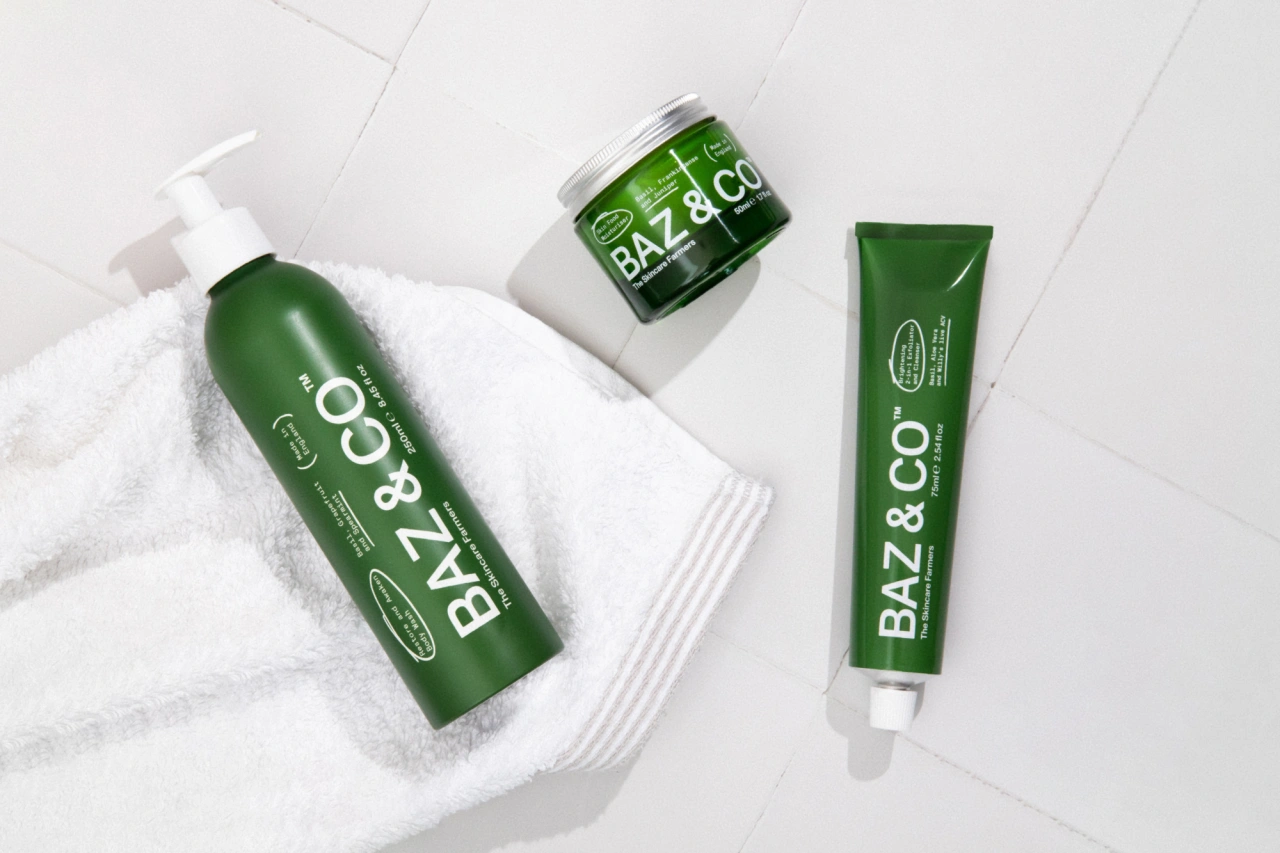
You've heard of 'farm to table'. But what about 'farm to face'? That's the clever, alliterative concept behind a new skincare brand called Baz & Co, devised by London-based creative agency Otherway.
The concept
The agency's head of design, Tom Rowe, explains the thinking behind it. "Unlike your average skincare brand, Baz & Co was created by a farmer. And if there's one thing farmers know better than anyone else, it's knowing how to grow the right ingredients."

He points out that "when it comes to your skin, a healthy diet is just as important as the one you eat. So when it comes to skincare, there's nothing more important than the quality and integrity of the ingredients you use. We partnered with the founder to position, brand and launch a completely new approach to skincare, from farm to face."
Brand elements
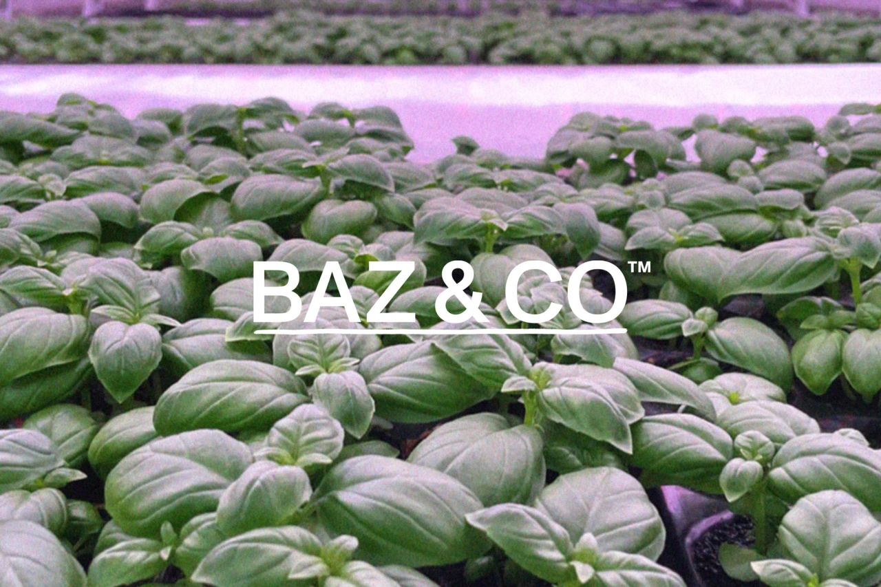
Baz & Co is named after the hero ingredient, basil, which is known for its antibacterial and anti-inflammatory properties. "It's grown in innovative vertical farms, using 95% less land and 95% less water than traditional farming," explains Tom. "And because they're indoor farms, it can be grown all year round."
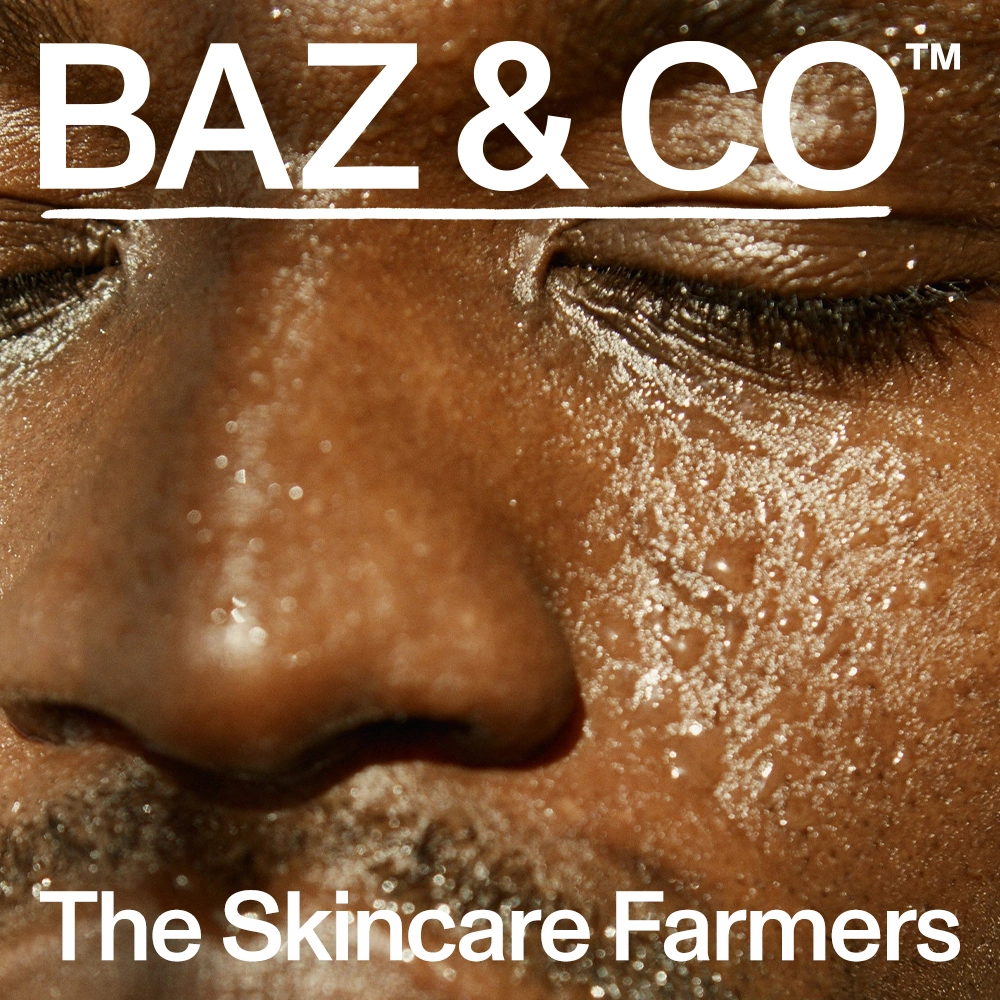
Otherway's typographic approach was inspired by referencing instruction manuals, signage and farm vernacular, with one foot in the country and the other in the lab. "The image treatment reflects a traditional way of doing things," says Tom. "The halftone process was originally created to print cost-effectively by reducing ink wastage. It's a reference to traditional processes reimagined into modern innovations."
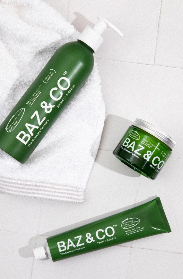
The packaging, meanwhile, is both beautiful and sustainable. "Driven by the need to use easily recyclable materials, inks and processes, it reflects the need for simplicity through a very transparent design language and fully recyclable packaging made of aluminium and glass," explains Tom.
The team also recognised that, as with any new brand, adaptability is key when it comes to online. "So we built a highly flexible site that can adapt and develop as the brand and product collection grows," says Tom. "Bringing information to the forefront at every opportunity, this site celebrates the depth of expertise and innovation that goes into every product."
Editor's Picks





Trending






Latest Jobs
Art Director at The New York Times
Full-time·New York·$120k–$130k
Junior Project Coordinator at Colorido Studios
Full-time·Twickenham·£28k–£32k
Senior 3D Motion Designer at Art&Graft
Full-time·London·£50k-£65k
Graphic Designer at Crux Product Design
Full-time·Bristol·Up to £36k
Head of Technical & Facilities at Midlands Arts Centre
Full-time·Birmingham·£40,210
Marketing Copywriter at ustwo
Full-time·London·£40k-£50k