Angel & Anchor's identity for a Bristol coffee brand is a triple threat
Bristol-based speciality coffee roaster Triple Co. gets an inspired rebrand, thanks to Angel & Anchor.
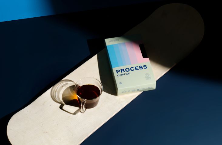
We're big fans of Belfast branding studio Angel & Anchor; back in March, we reported on their VHS-inspired identity for speciality coffee roaster Process. So we were excited to see what they'd come up with for their latest project.
Triple Co. is a Bristol-based speciality coffee roaster that launched in 2016. Recently, the company asked Angel & Anchor to take to the drawing board and deliver a rebrand that would represent a significant shift in personality.
The brief
Back in the day, Triple Co. founder Jo Thompson started in speciality coffee through the inspiration of Copenhagen laboratory-style brewing. Down the line, he found himself in Florida with King State Coffee, connecting with a more personable and vibrant approach to the coffee industry.
Triple Co. came to evolve through Jo's mixed influences and experiences. But its original branding wasn't up to scratch. Fundamentally, it was a collection of design elements that lacked connection with each other.
The approach
"Triple Co's existing branding was, at its core, reflective of the minimalist style of brewing that sparked the beginning of the roastery," explains Angel & Anchor founder Ben Connolly.
"Brand elements were a mix of clean lines, a sans-serif logo, a monotone colour palette, gritty illustrations and hand-drawn lettering. As a mismatched collection of elements, their personality felt compromised rather than unified."
In short, after six years in the industry, Triple Co's passion and experiences had evolved. More charismatic and confident than their younger selves, they outgrew their branding and sought an identity coherently true to themselves. With a new, secure sense of self, they wanted the new branding to reflect their story and values holistically.
"Triple Co. are a perfect example of professionalism and personality co-existing," notes Ben. "They are dedicated fixers of espresso machines, classic cars and greasy machinery in between. Their dedication to excellence hasn't dented their spunky attitude. This adventurous, down-to-earth bunch aren't afraid of getting their hands dirty as they make waves in Bristol and beyond."
Design elements
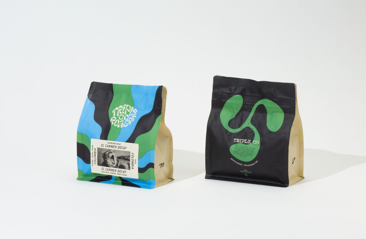
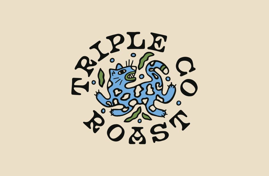
The hand-drawn serif logotype is beautifully quirky. As Ben explains: "It is grounded, human and complements the many other brand elements. An extended type lock-up collection allows an engaging but cohesive brand expression so that the logo best suits its placement. A secondary custom monogram logo features a spiral connecting its letters, reflecting the sense of motion in brewing coffee throughout the brand."
Angel & Anchor teamed it with a secondary, heading type: Santa Ana by Hoodzpah Design. "The primary use of italics extends the theme of motion through the brand," says Ben. "Its character feels like retro garage signage and American car ads. This typeface has a starring role, carrying a lot of the brand personality in packaging, website design and accompanying print material."
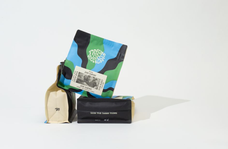
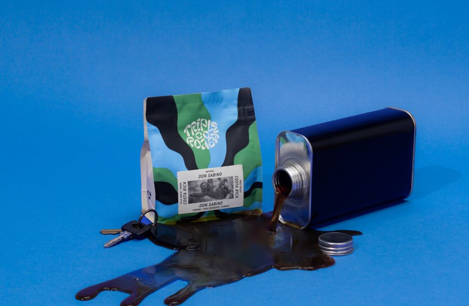
The core logomark is inspired by the three arms of a roaster machine, as well as Triple Co.'s three core values. "Hand-drawn and conveying motion through flowing curves, the mark also encapsulates the processes of flowing water and the energy of heat in roasting and brewing," says Ben.
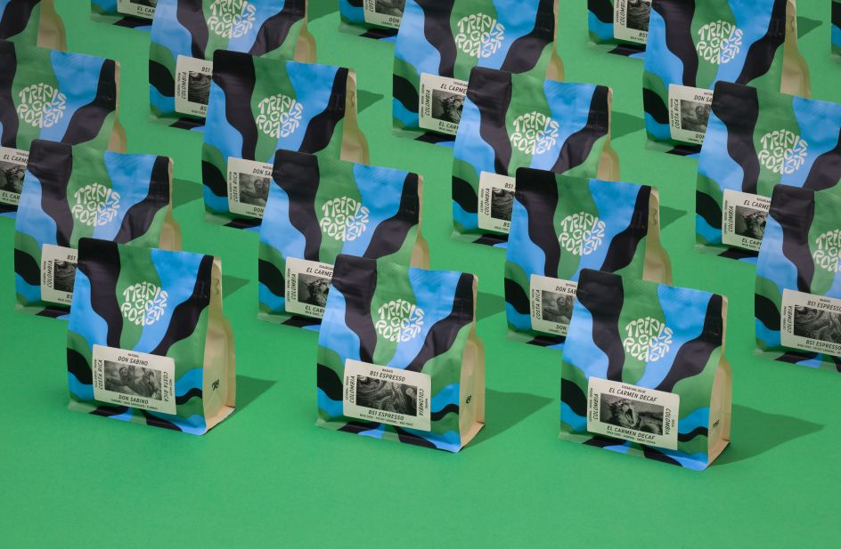
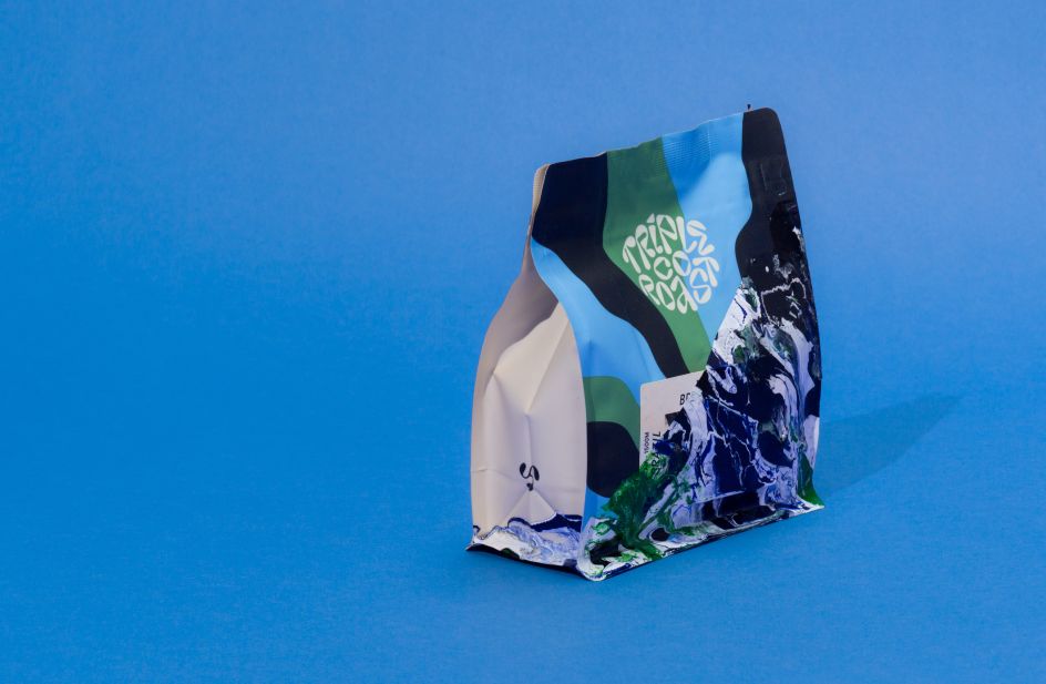
The brand colours further characterise Triple Co.'s ethos and personality. "A leafy green represents the source of the coffee plant, and blue reflects the water to brew the coffee. Black adds contrast to the palette and reflects the grease and grit of the hands-on approach to servicing espresso machines and cars."
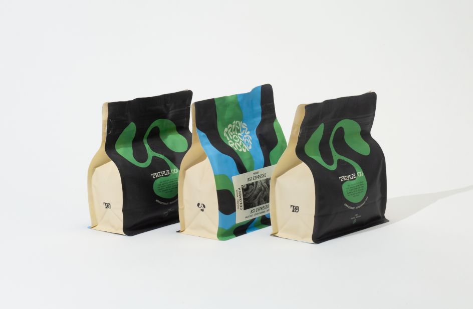
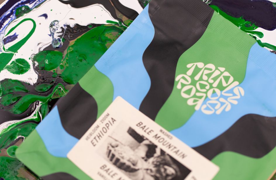
The main pattern on the packaging is influenced by oil spills and fluid motion and brings playfulness and vibrancy to the brand. Packaging labels feature a hint of tongue-in-cheek through photography, interpreting each roast's abstract flavour notes through food, a quirky object, animal or scene. The coffee details on the labels unconventionally use type to frame the photo, lightheartedly leading the reader's eye around the image.
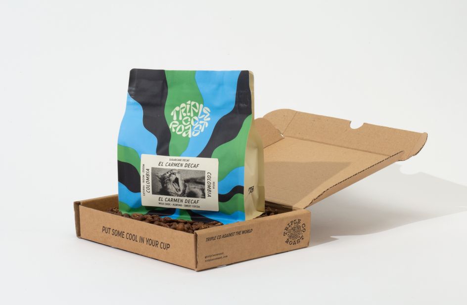
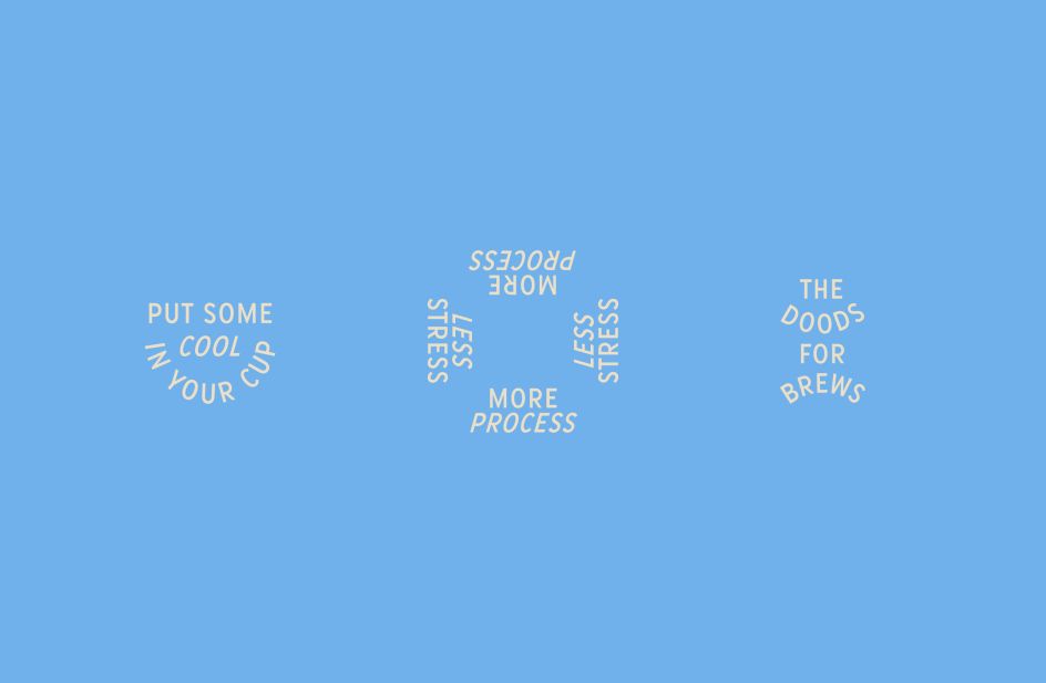
In messaging, slogans like "Keep It Funky" and "Cool Kids Drink Triple Co." tie together the brand's core values, spunky personality and visuals. The mailer packaging includes further lines that embody a chilled-out, friendly tone, such as "Get Your Sip On".
It all adds up to a feeling of chilled-out grittiness, reflecting the brand's down-to-earth values, energy and personal, adventurous approach to the coffee industry.
Editor's Picks


Trending


Podcasts


Editor's Picks
Further Reading