Balancing act: Studio More's measured redesign for low-alcohol brewery
Low- and no-alcohol beers are becoming hugely popular right now. But with so many competing brands on the shelves, everyone has to work hard to stand out visually. Nirvana, a brewery that specialises in beers, ales and lagers with either no or low alcohol, offers a great case study.
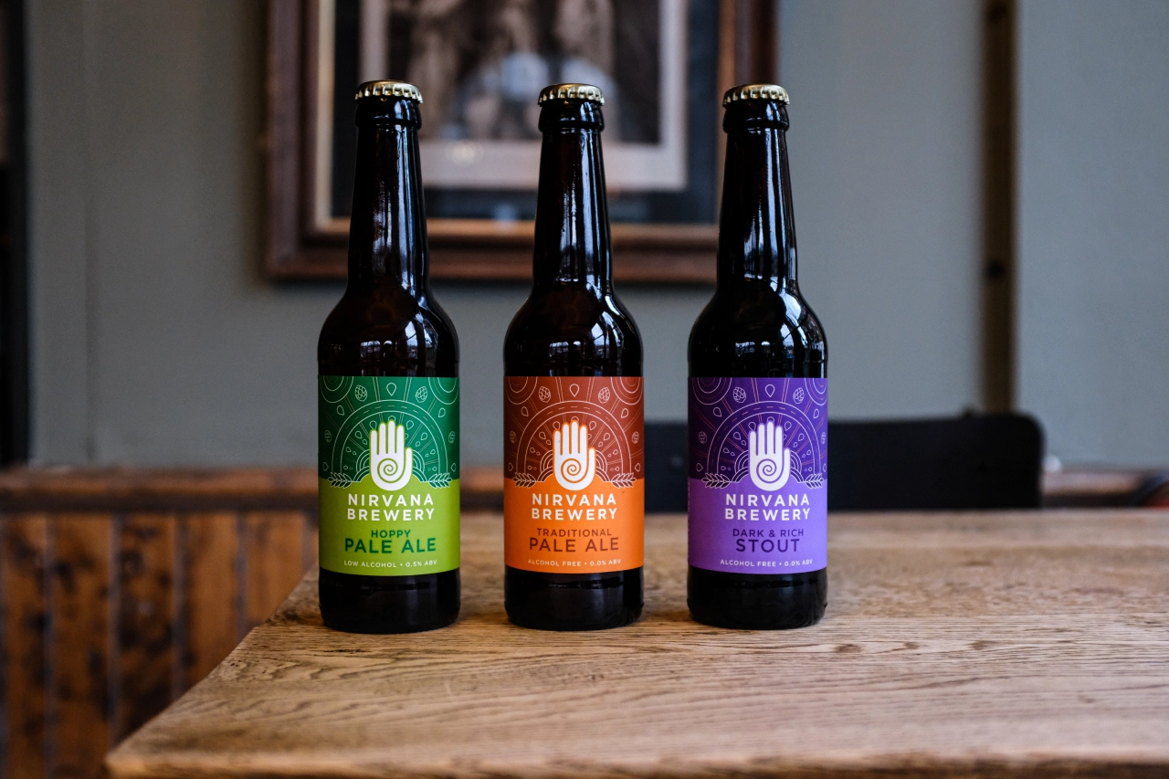
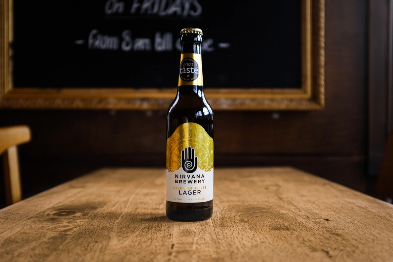
Nirvana needed a new master brand and new product range designs for their growing portfolio. The dilemma was that their existing bestselling lager was very well-known by the current branding. Should they make room for two brands and risk unclear brand architecture? Or align the bestseller's branding with the new master brand and risk recognition issues? They turned to London-based Studio More to find a way forward.
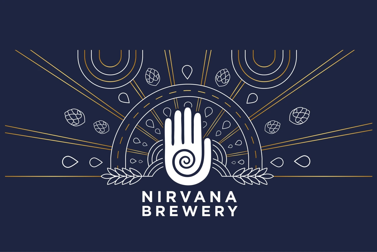
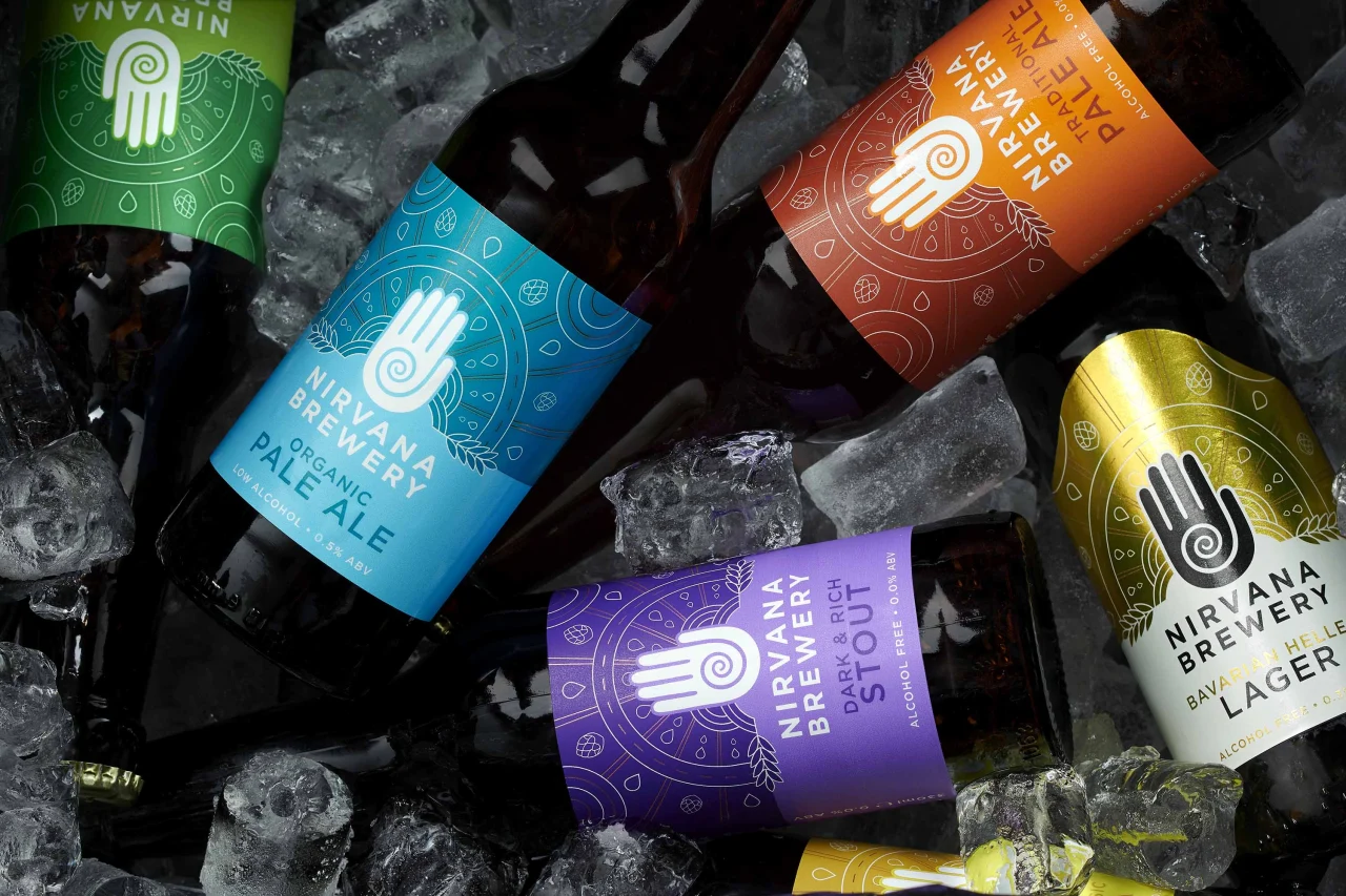
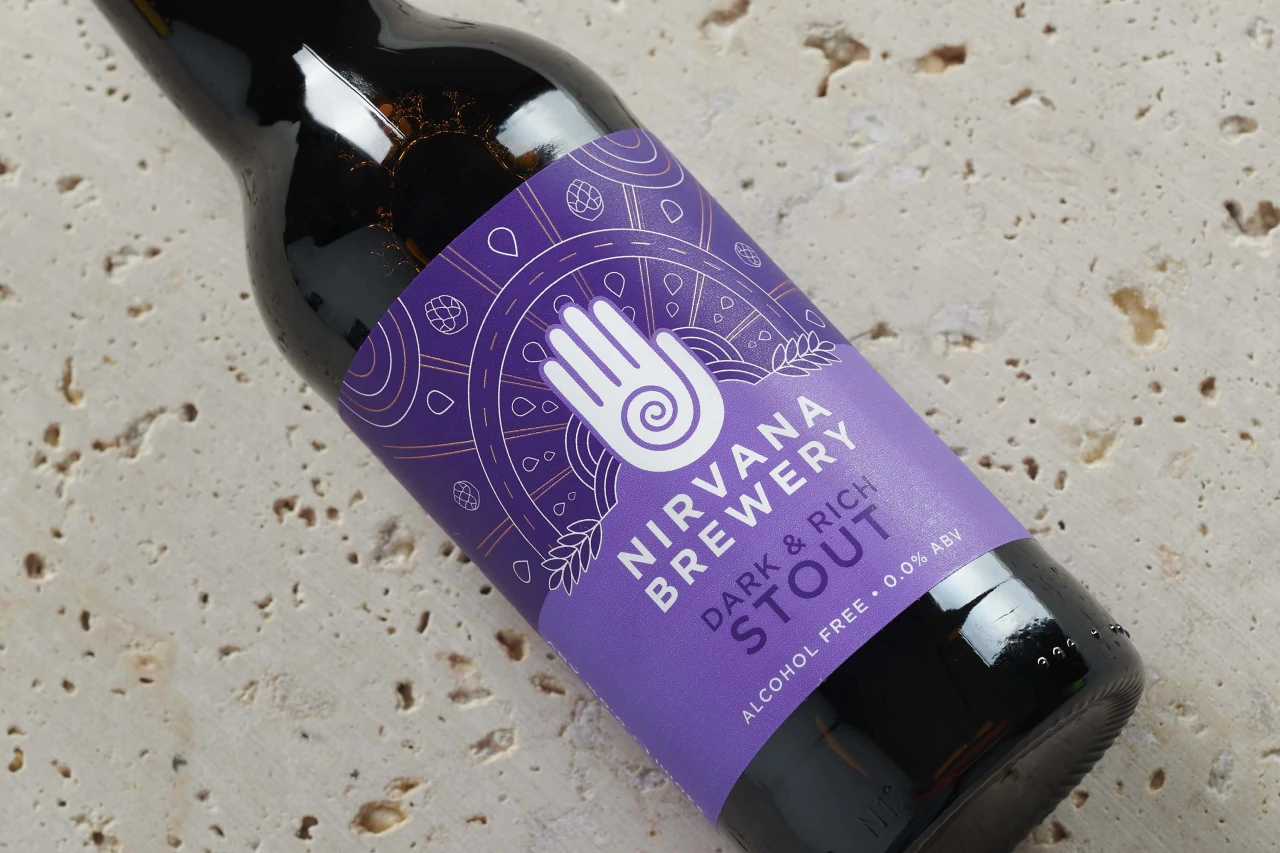
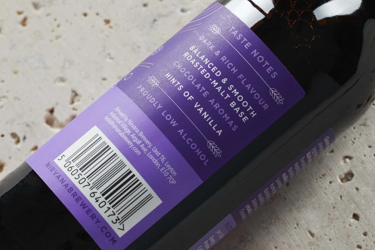
The studio's approach was to rebrand Nirvana's bestseller in line with the new master brand without throwing the baby out with the bathwater. By evolving the most recognisable equities – the 'transcendental' hand logo and striking colourways – they created a master brand with a new design toolkit. This rich, flexible visual language uses design elements and glyphs to tell the brand's story, the 'perfect beer' journey (inspired by the 'perfect state' of Nirvana), and the unique brewing process.
'Balance' was a key theme. The symmetrical, gender-neutral aesthetic represents balance and finding your perfect state, while the illustrative arrows and dotted lines convey the 'life is a journey' message. Rather than being just another no-alcohol brand in a growing market, Nirvana stands out as a celebratory lifestyle choice.
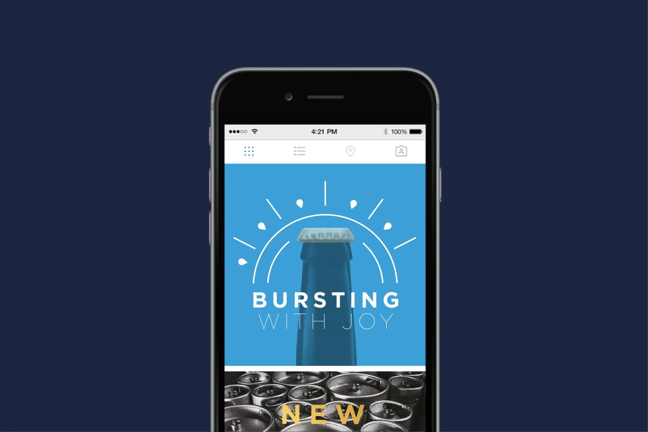
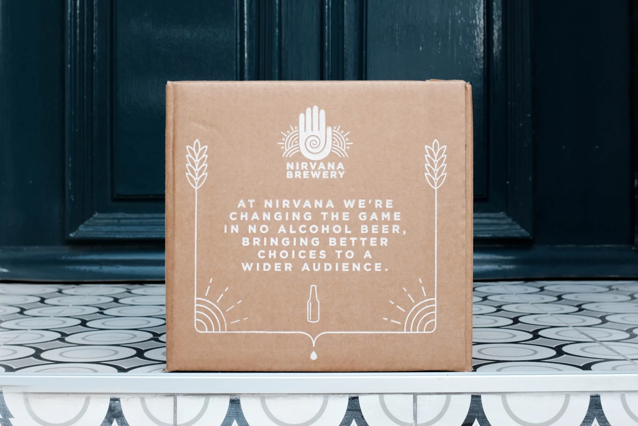
"Studio More united two brands to create one big Nirvana family, helped define our positioning, and gave our brand a better-looking, more commercial focus," says Nirvana co-founder Rebecca Surname. "The results were a single, beautiful look and feel with engaging lifestyle messaging. We now have an amazing brand presence with eye-catching collateral that can translate from the bottle across any media."
Editor's Picks





Trending






Latest Jobs
Senior Copywriter at Human After All
Full-time·London·£48k–£66k
Senior Designer at Creative Spark
Full-time·Manchester·£35k-£50k
Designer at New Genre
Full-time·London·£36k–£48k
Graphic & Motion Designer at The SHARP Agency
Full-time·Leeds·£26k–£33k
Midweight Designer at All Purpose
Full-time·London·£30k–38k
Principal Software Engineer at BBC Media Tech
Full-time·Glasgow·Up to £83,790