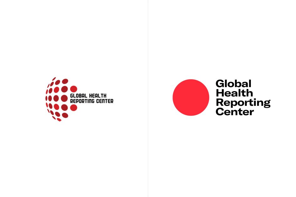
Mucho rebrands health newsroom for the Covid era
Based in New York City, the Global Health Reporting Center is a newly launched independent, nonprofit newsroom that that produces in-depth health journalism, something the world has been of increasing need of in 2020.
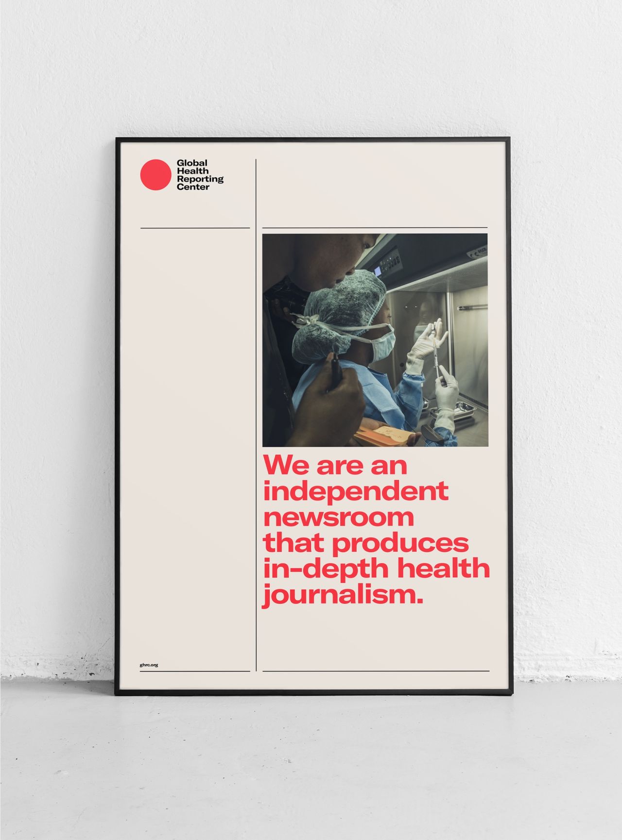
Global branding agency Mucho was asked to create new branding to help articulate its vision effectively and communicate it to a broader audience.
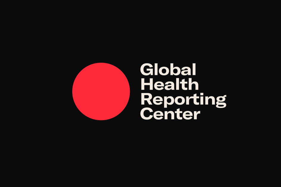
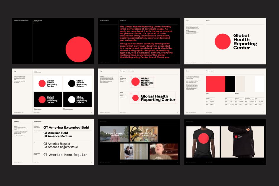
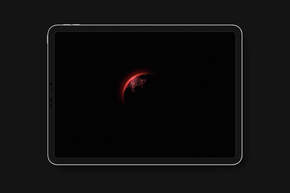
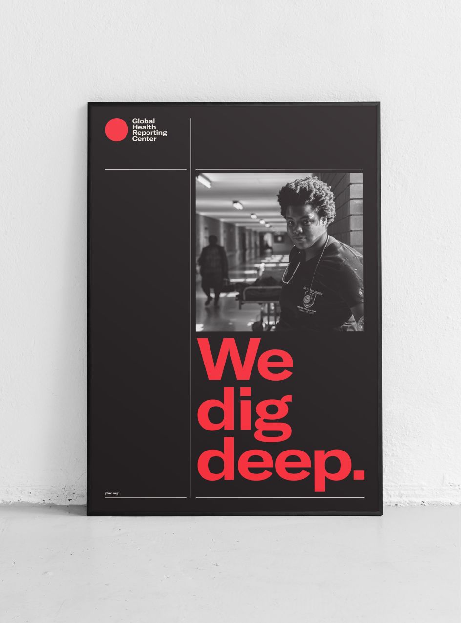
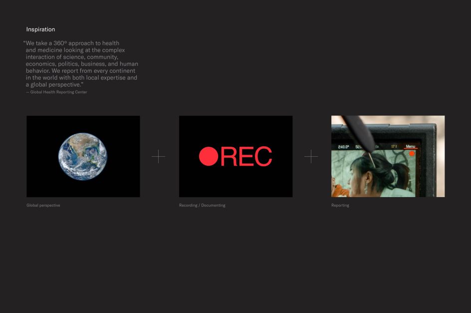
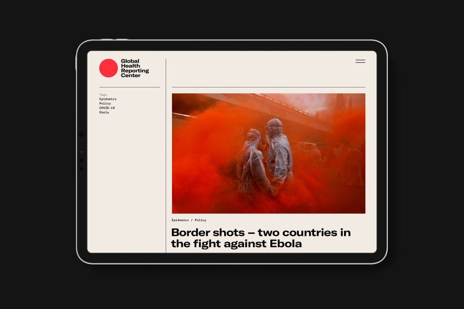
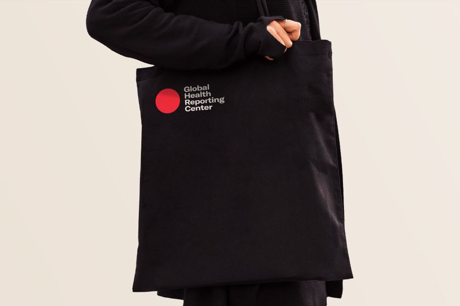
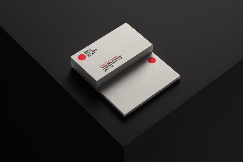
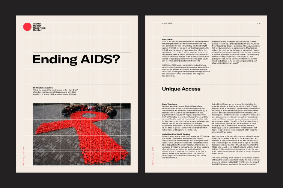
The Center takes a 360º approach to health and medicine, reporting from every continent in the world, and examining the complex interactions of science, community, economics, politics, business, and human behaviour. Central to Mucho's rebrand is a red dot, providing the visual impact this sort of reporting needs to cut through effectively. The simple symbol performs three tasks at once. As a whole, it represents the recording icon on a video camera. At the same time, the use of red indicates the urgency of the reporting, and the circular shape reflects the Center's global perspective.
Meanwhile, the limited and starkly contrasting colour palette of black, red, and white, conveys an austere yet approachable authority that speaks to the Center's commitment to accurate, relevant, and engaging reporting. The typeface is GT America.

Editor's Picks


Trending


Podcasts


Editor's Picks
Further Reading