Manual crafts a refreshing brand identity for Fort Point, San Francisco's latest brewery
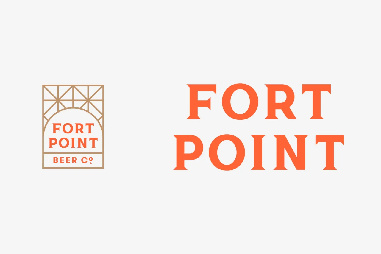
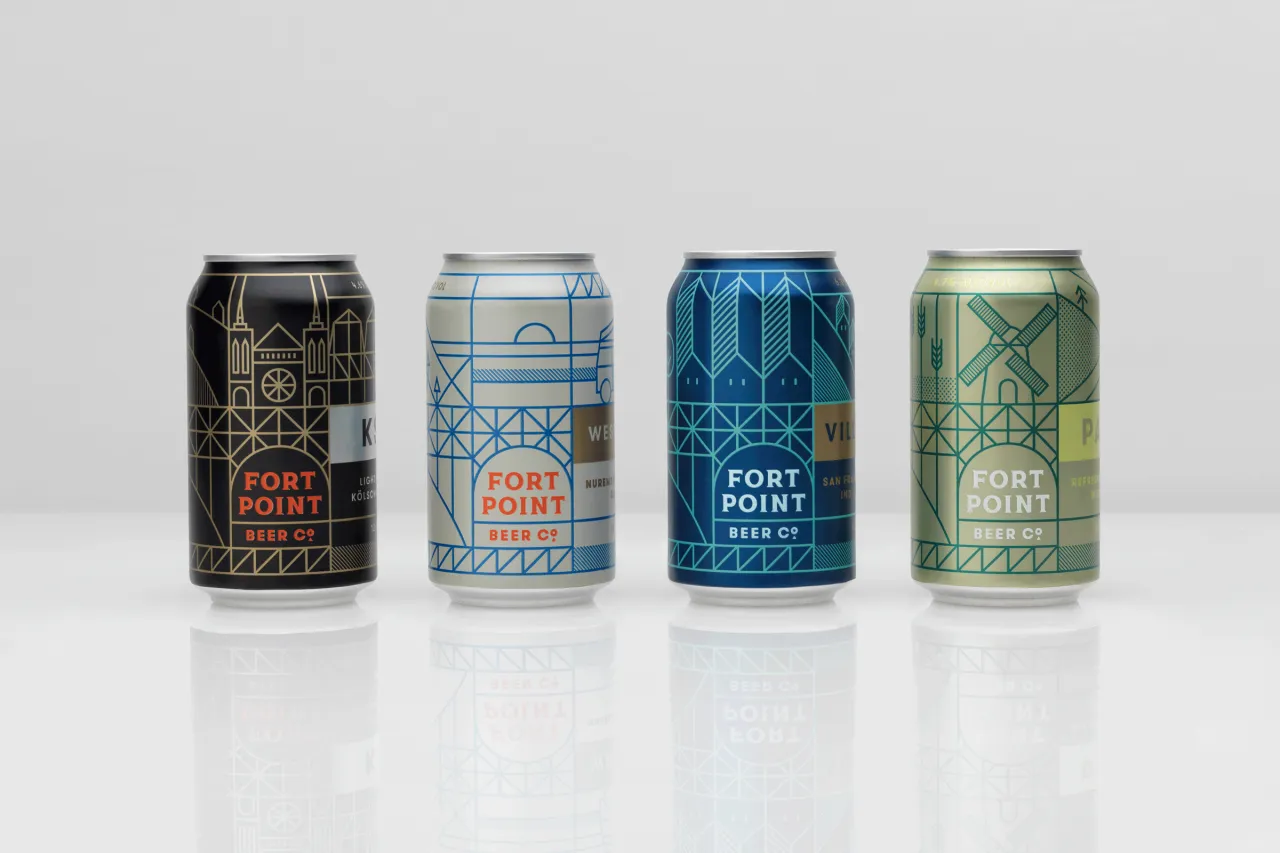
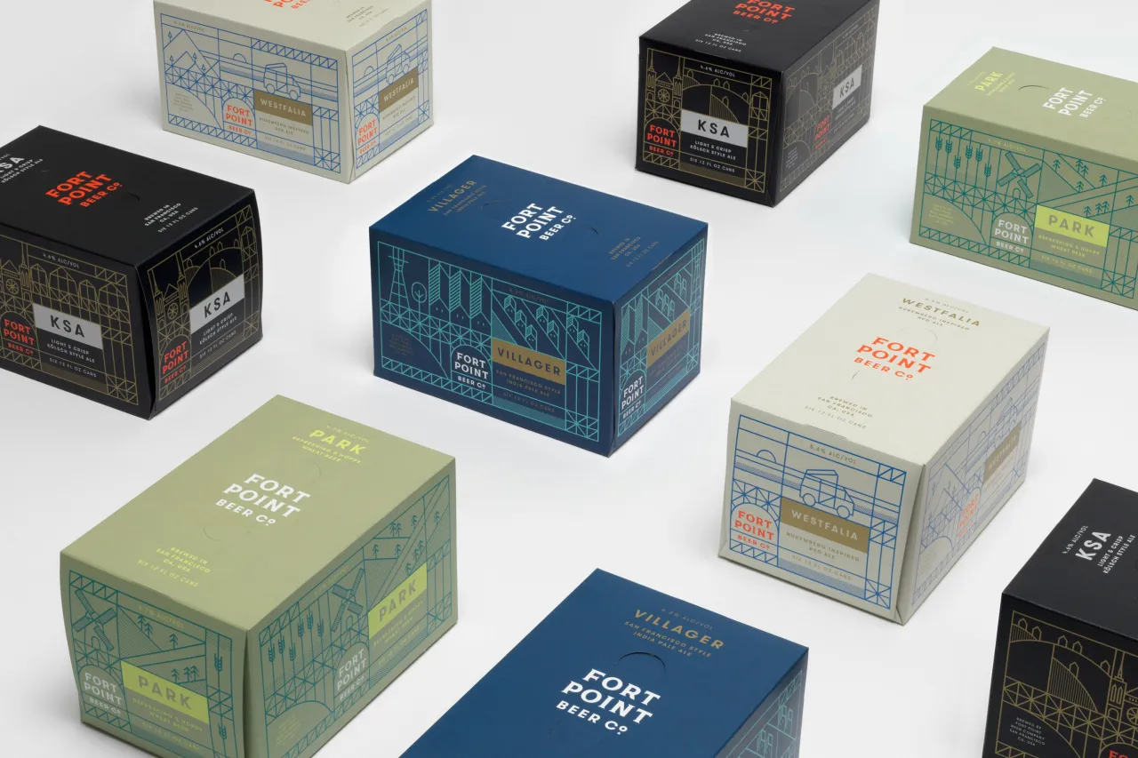
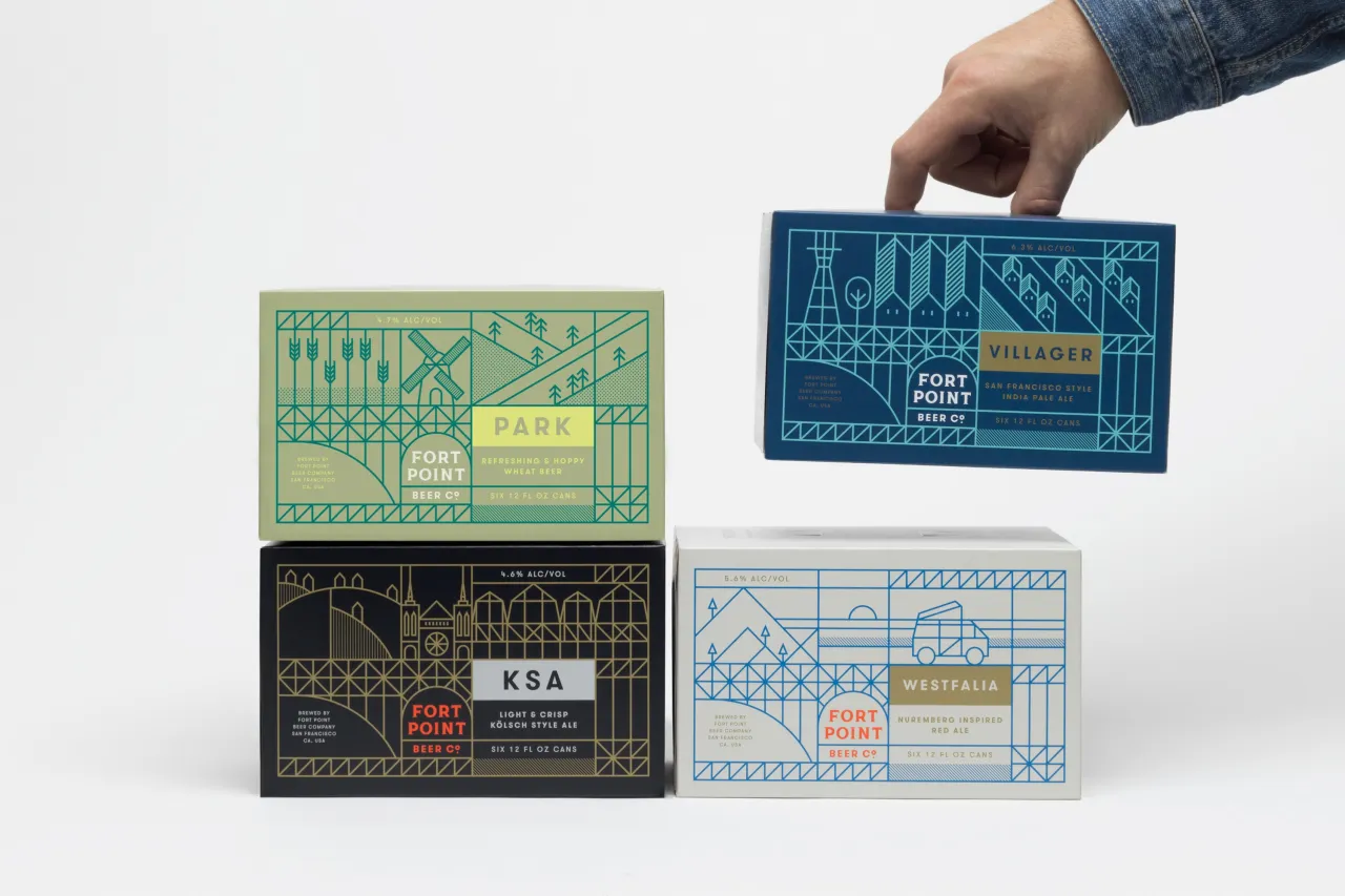
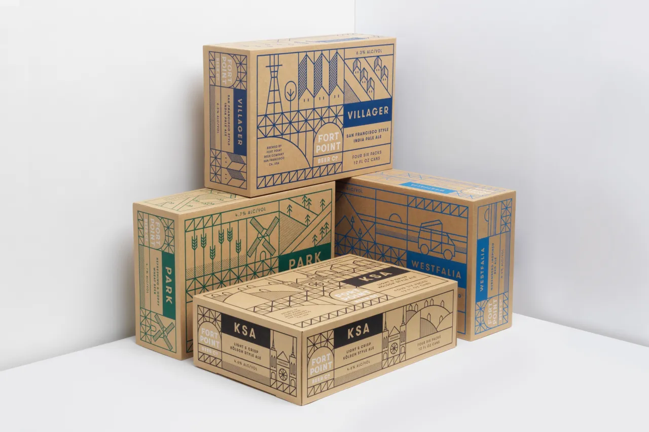
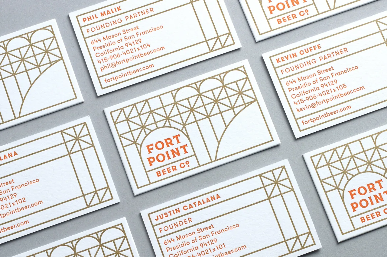
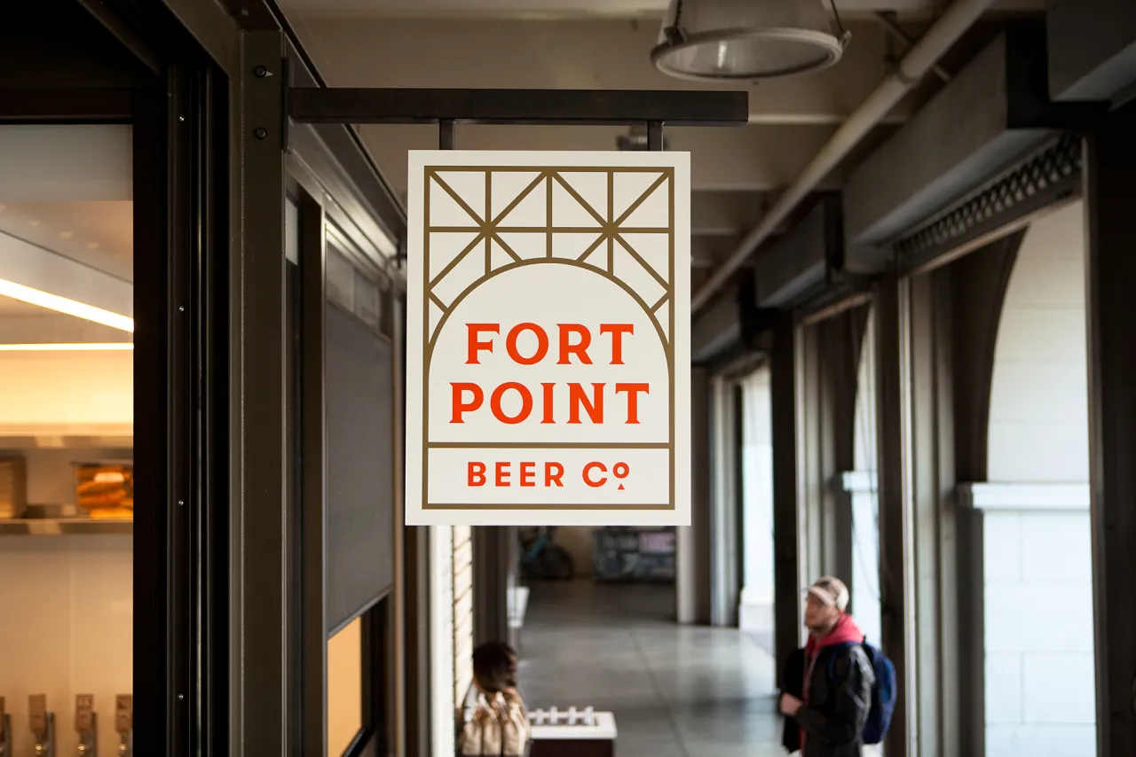
As San Francisco’s fastest growing craft brewery, Fort Point creates balanced, thoughtful beers that reference traditional styles, but are by no means bound to them. For its new brand identity, the company approached local design and branding studio Manual, who also provided illustration and packaging design.
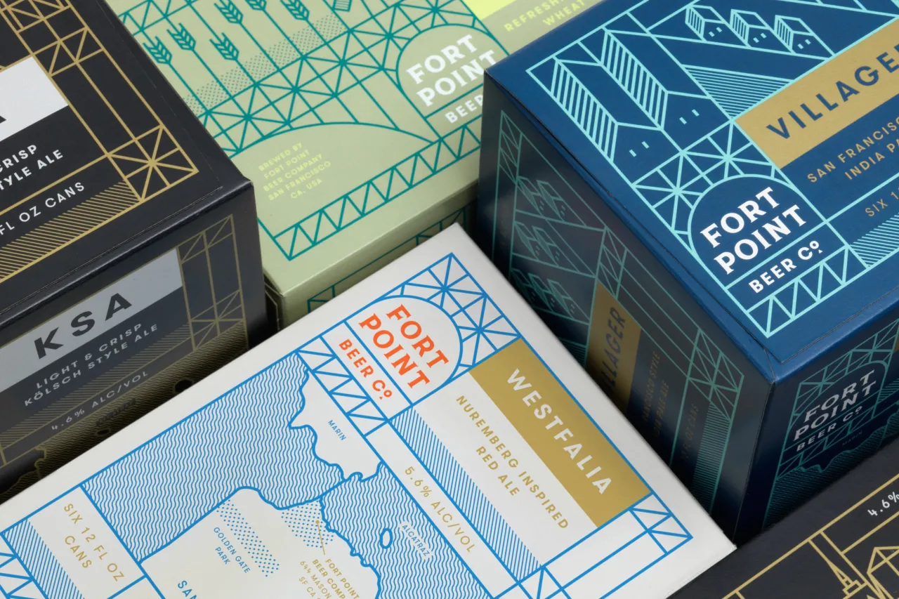
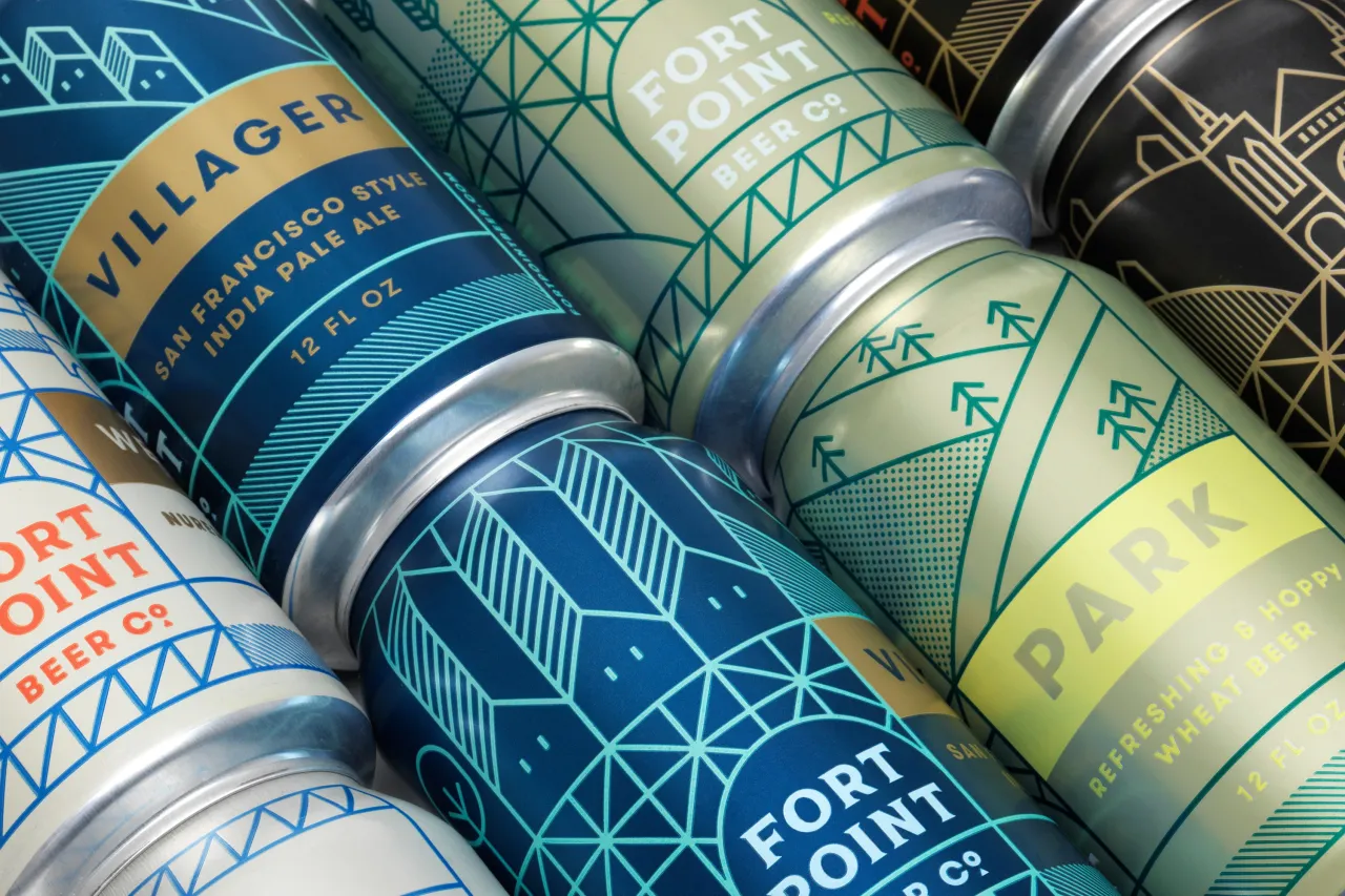
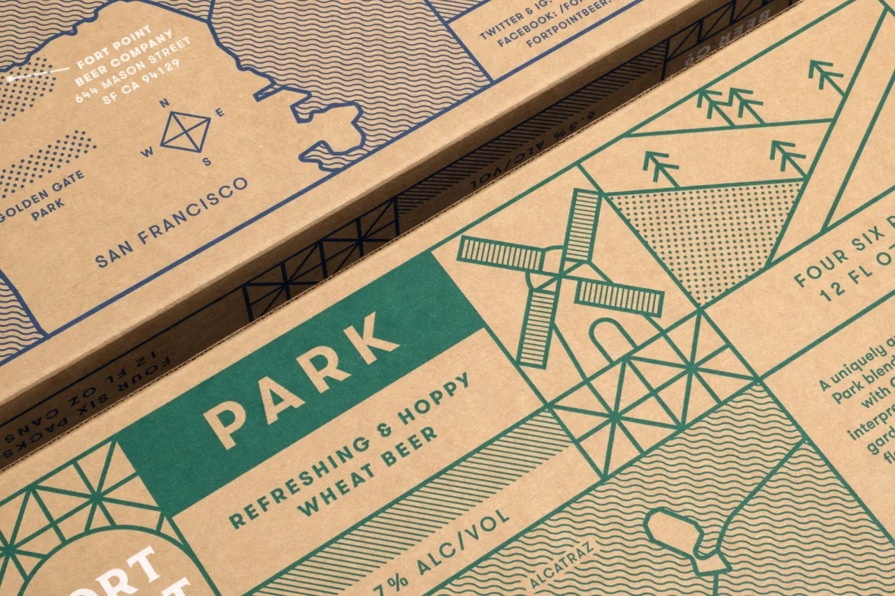
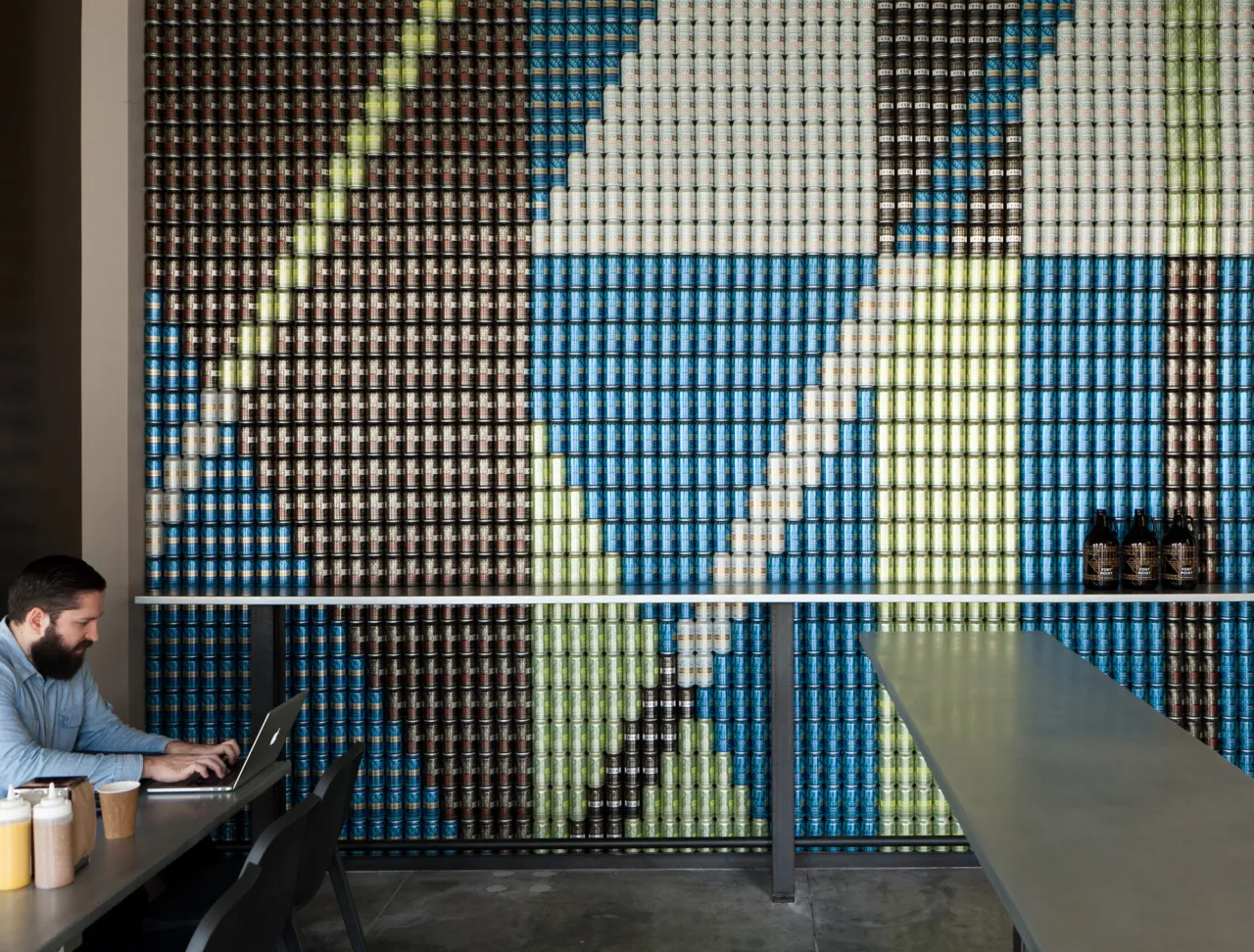
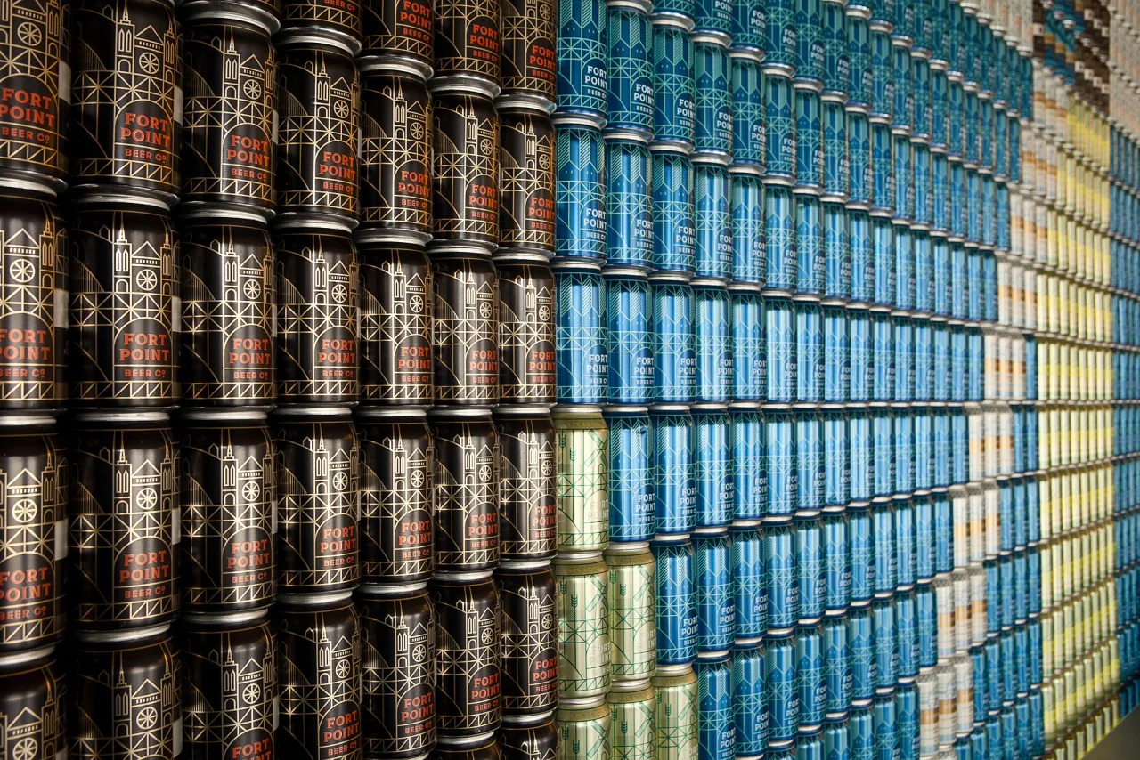
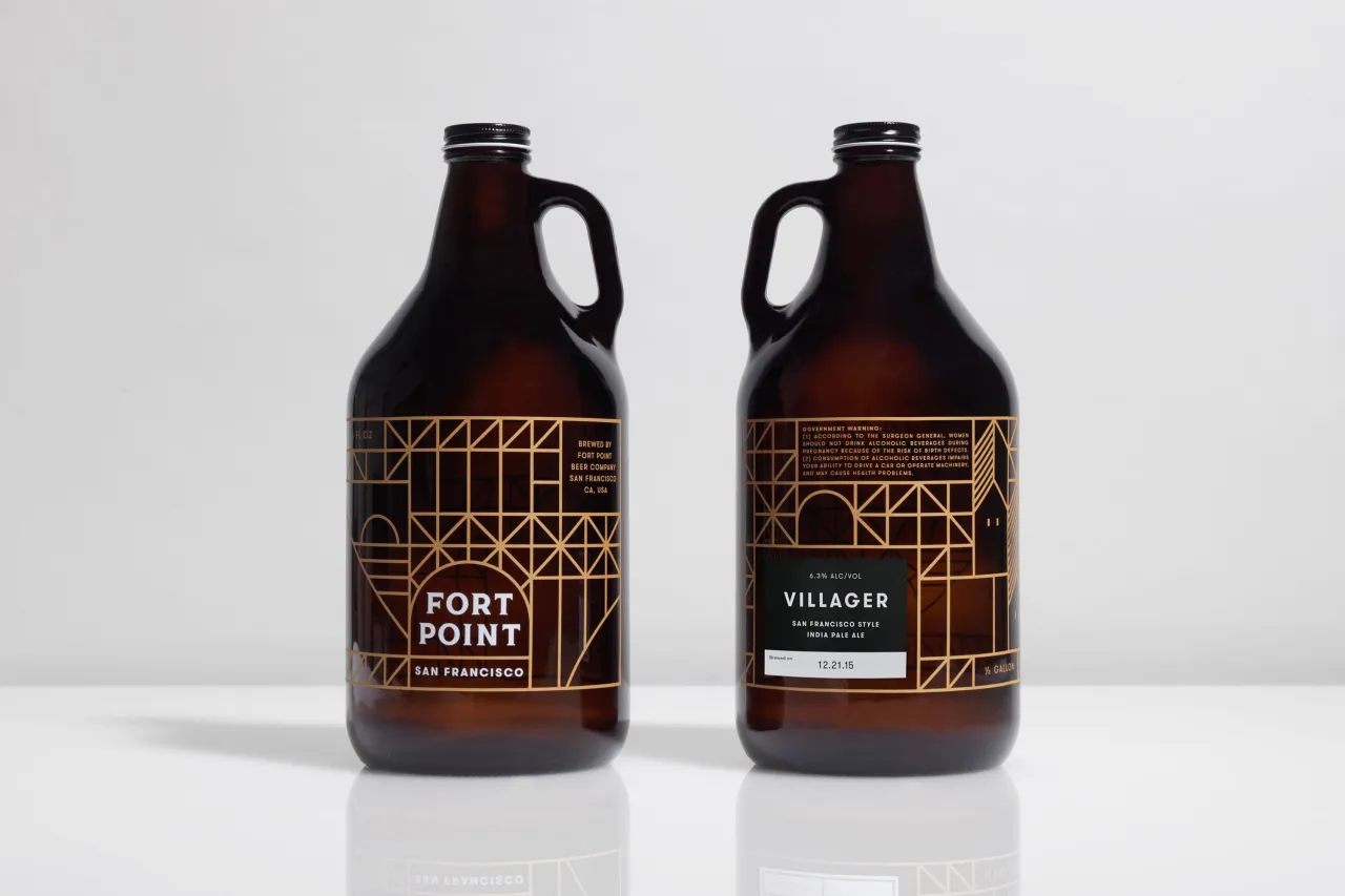
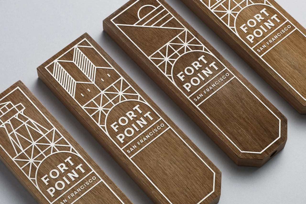
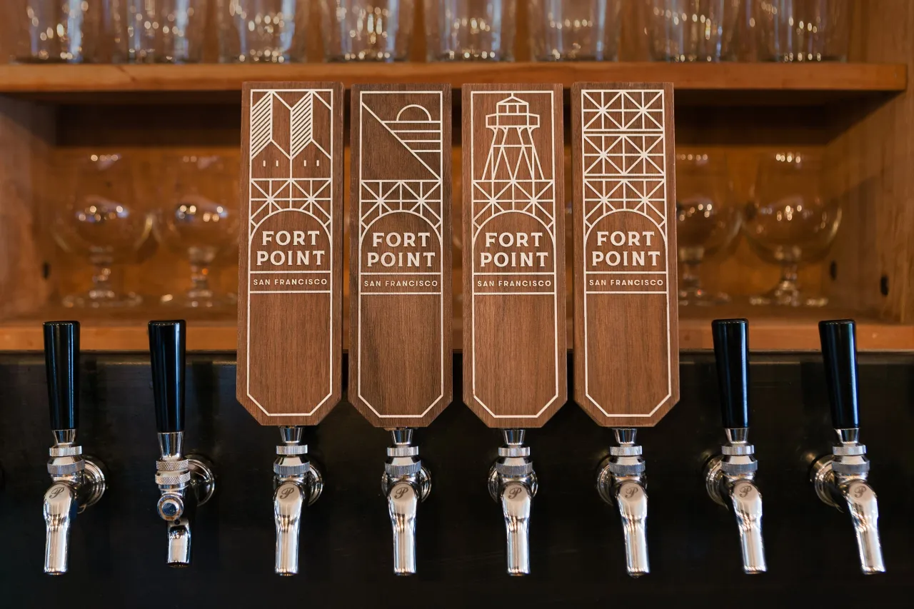
Based in an historic Presidio building that was formerly used as an army motor pool, the brewery's iconic location – close to both the Golden Gate Bridge and the Fort Point National Historic Site – provided inspiration for a modular, illustrative look and feel. In packaging, a little illustration incorporates elements of San Francisco's famous landmarks and Bay Area culture to create a unique and authentic sense of place.
The result is a brand that locals can identify with and, as Fort Point grows and becomes available throughout America, can be regarded as the new San Francisco craft beer. If you love this work, check out Manual's website at www.manualcreative.com. It's a studio founded by Tom Crabtree, a Yorkshire man who began his career working for leading design studios in London before relocating to San Francisco to join Apple's design team. Today, he runs Manual alongside MD and partner, Patricia Callaway.
Editor's Picks





Trending






Latest Jobs
Senior Designer at Jubba
Full-time·London·£50k-£60k
Brand Copywriter at Origin
Full-time·Porthleven, Cornwall·£35k–£40k
Senior Creative Lead at Random Studio
Full-time·Amsterdam / Paris·€90k-€110k
Principal Software Engineer at BBC Media Tech
Full-time·Glasgow·Up to £83,790
Client Success & Growth Director at Revolution Growth
Full-time·Manchester·£60k-£70k
Brand Strategist at DNCO
Full-time·London·£45k-£60k