dn&co's new brand identity for Pier 70 hopes to remind San Francisco of its soul
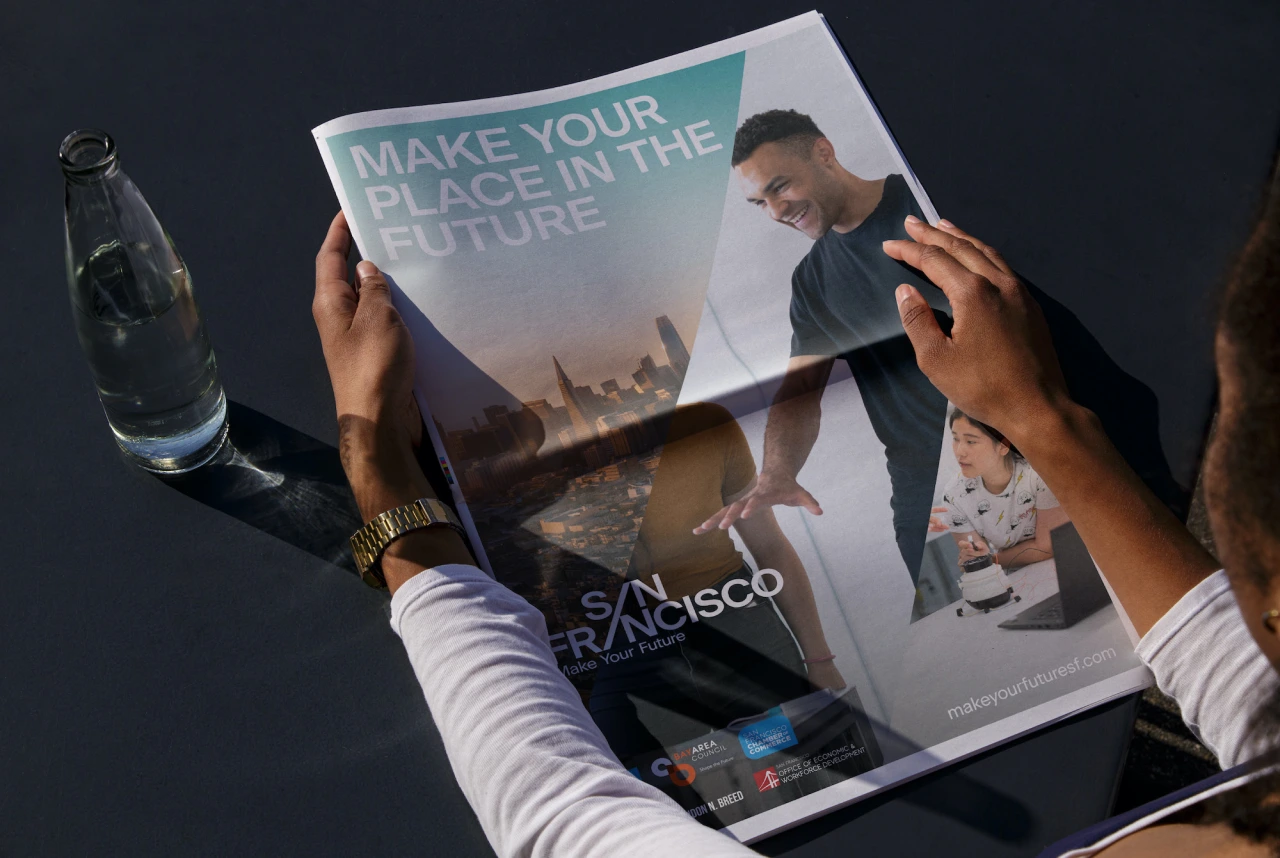
If you live in San Francisco and you've forgotten what or where Pier 70 was, then the former shipyard is about to become the talk of the town following a new identity by London agency dn&co and the launch of a $120 million, 15-year regeneration project.
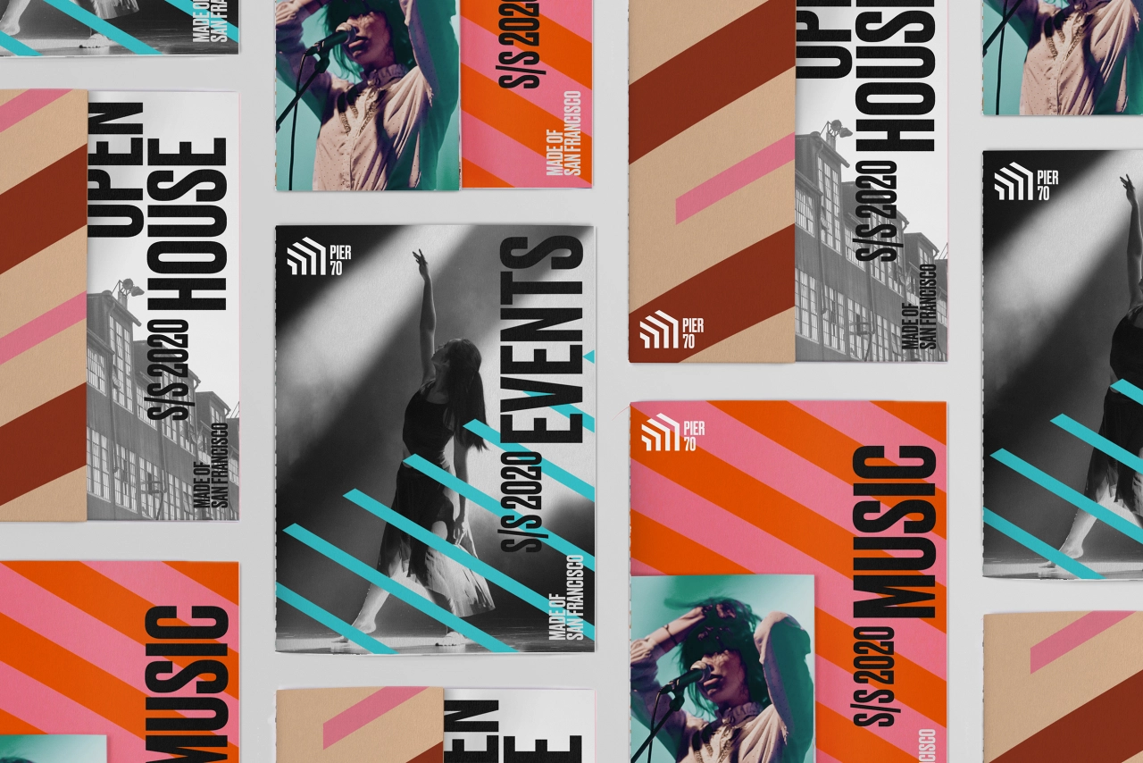
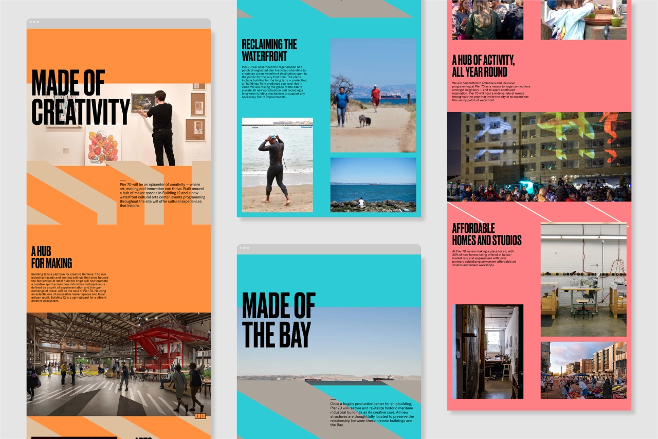
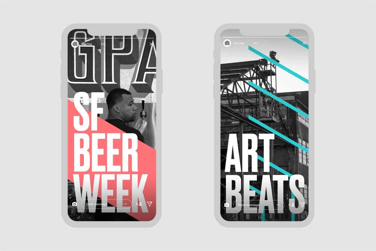
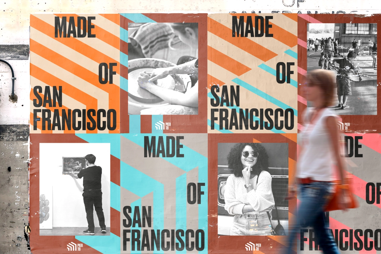
The brand signals a powerful renaissance of Pier 70's industrial roots with a bold and distinctive visual language that's a love letter to San Francisco. "In a city going through fierce debates about the loss of identity, we created a brand that looked instead at the key ingredients that have always made San Francisco great: its creativity, its openness and its relationship to the Bay," says dn&co.
Home to the Union Iron Works and later the Bethlehem Steel Company, Pier 70 was one of the most prominent industrial centres in America – a hub for shipbuilding innovation where war and cargo ships have been made since the late 19th century. But, as the shipbuilding industry waned, activity at the pier ceased completely in the 1970s. It was this history that inspired the research side of the project.
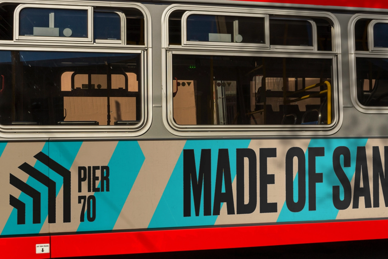
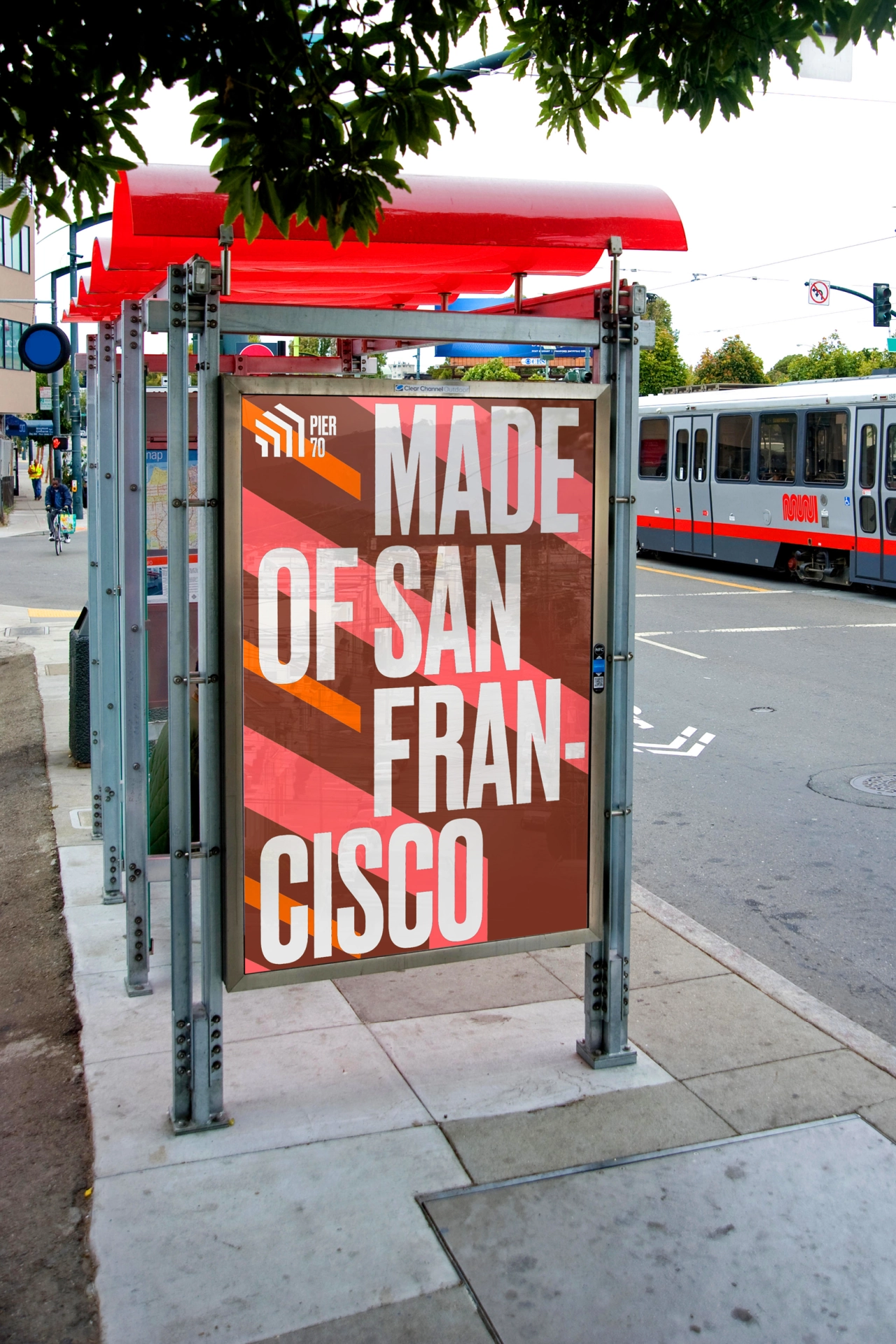
"We interviewed over 150 San Franciscans, who told us that the city is losing its soul," says dn&co. "Compelled to create a place to reclaim what San Francisco is all about, Pier 70's purpose is 'Made of San Francisco'."
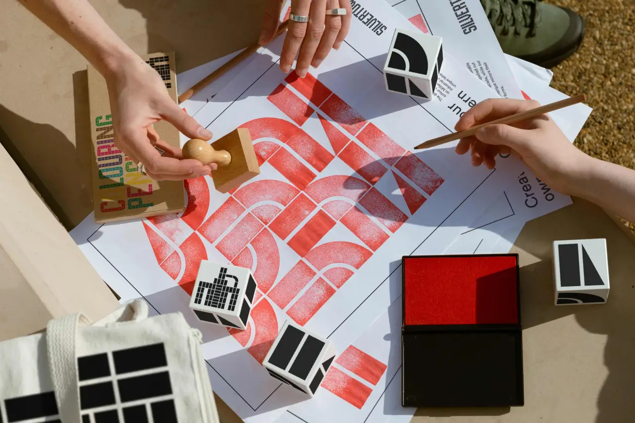
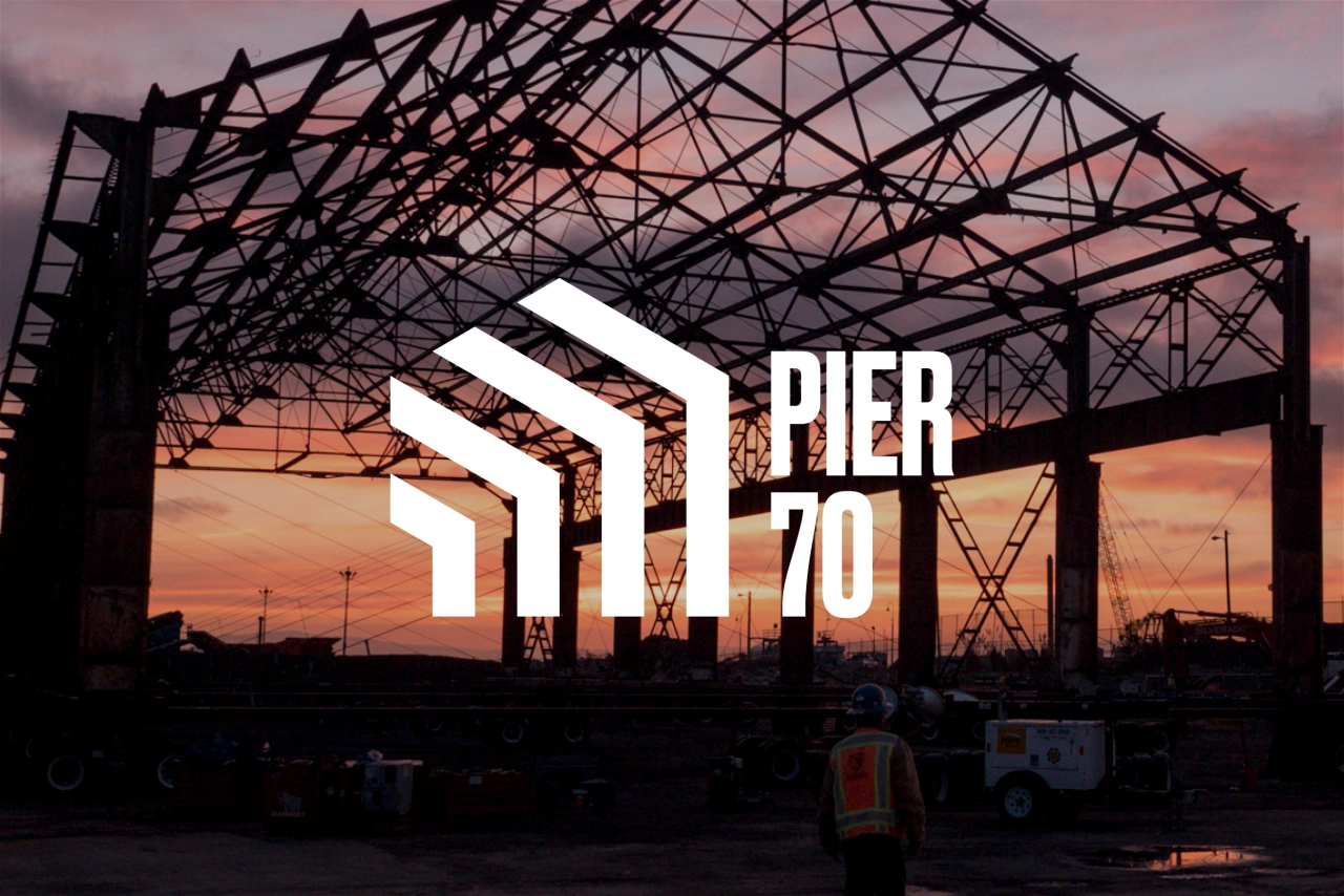
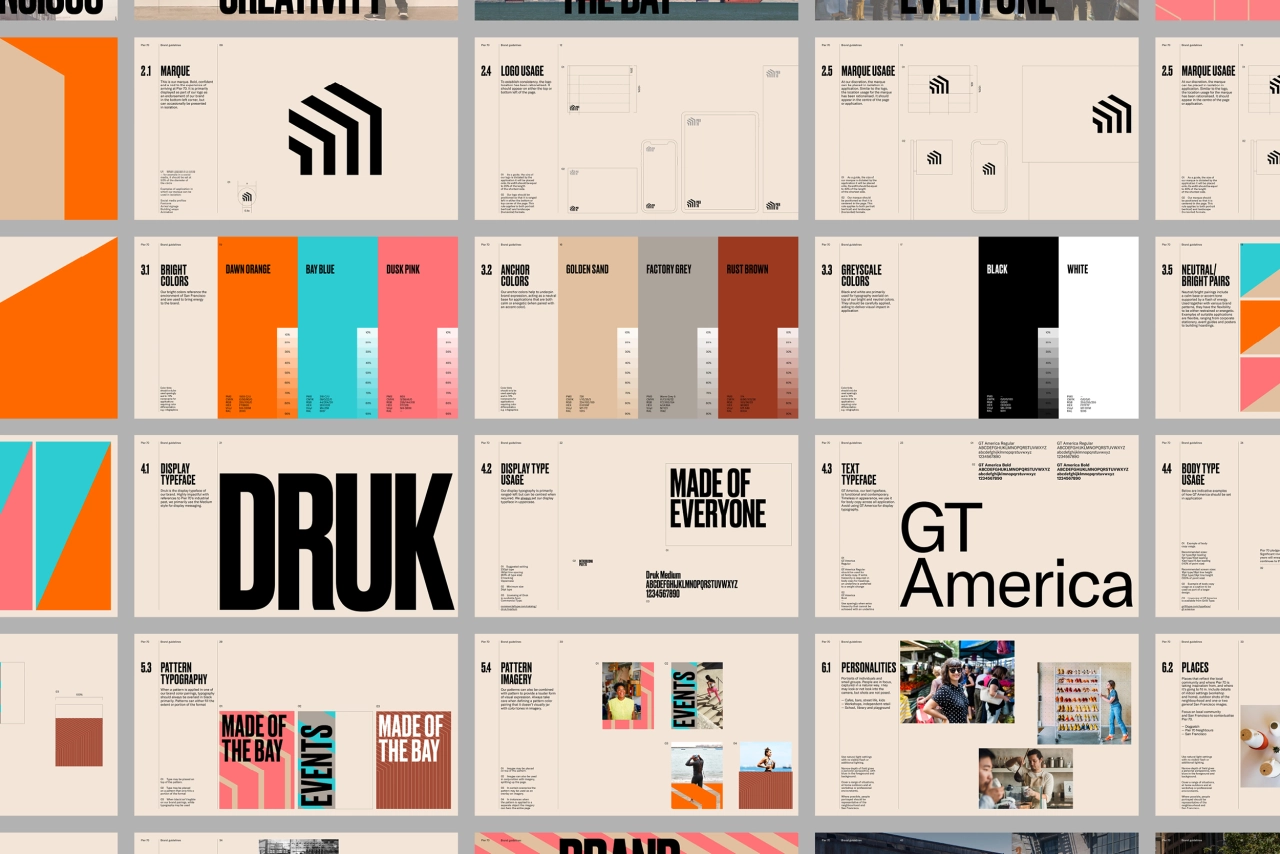
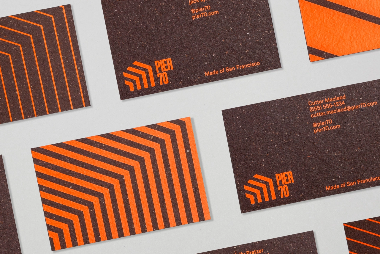
The revitalisation of Pier 70 also sees the restoration of its most iconic buildings. This includes Building 15 and its incredible 50-foot-high steel frame, which has been turned into a gateway that you drive through into the new pier. This piece of repurposed architecture was the inspiration for Pier 70's signature marque and graphic language.
Bold, bright and refreshing for this post-industrial landscape, Pier 70's powerful pattern language is expressed in colours that reference this unique city: rust orange, sea blue, steel-painted pink. Paired with a highly impactful typeface, it has echoes of the pier's working past.
Editor's Picks





Trending






Latest Jobs
Graphic & Motion Designer at The SHARP Agency
Full-time·Leeds·£26k–£33k
Designer at New Genre
Full-time·London·£36k–£48k
Midweight Graphic Designer at We Are Your Friends
Full-time·London·£36k–£44k
Senior Creative Lead at Random Studio
Full-time·Amsterdam / Paris·€90k-€110k
Senior Designer at Creative Spark
Full-time·Manchester·£35k-£50k
Senior Designer at Definition
Contract·London·£45k–£50k