Manchester agency Music talks us through its 'stripped back' graphics for London Fashion Week
When we checked in on the live stream of London Fashion Week earlier we were chuffed to bits to see it awash with multicoloured tie-dye-esque jumpsuits; as well as a skirt adorned with neon Post It notes. But as far as the branding and graphics for this season’s event go, there’s no such vibrancy or frivolity: instead, the designs were pared down to their most basic components, resulting in a fresh and minimal new look and feel.
For 2017, Manchester-based agency Music is behind the designs, and was briefed to create an identity that was “stripped right back”, according to Music designer Emma Benyon. The agency has worked with the British Fashion Council, which runs LFW and London Fashion Week Men’s for a seven years years, and created the branding for events including the 2012 and 2013 LFW iterations, collaborating with fashion designers Jonathan Saunders and Nicholas Kirkwood respectively.
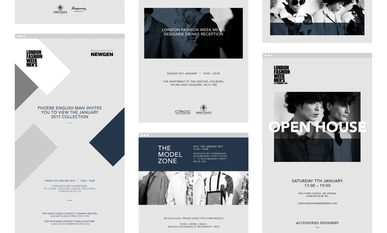
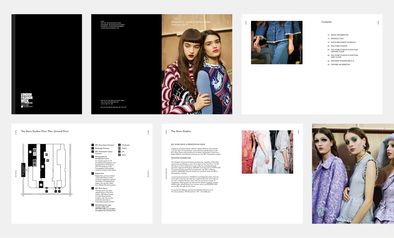
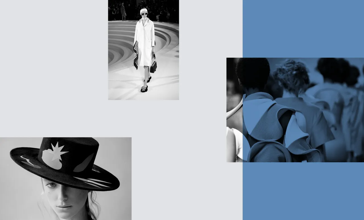
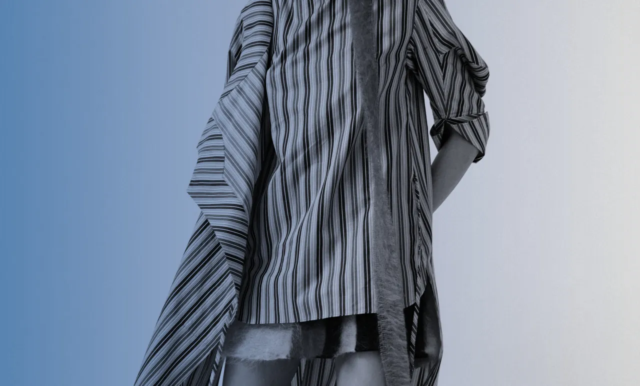
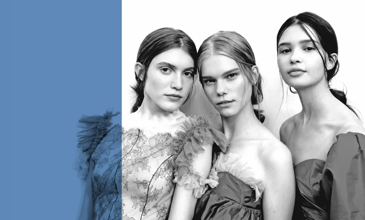
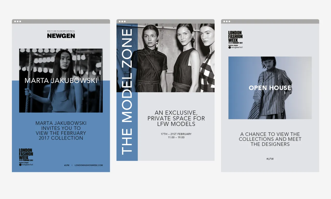
Music’s new designs are based around a grid system and sharp black and white imagery, with “seasonal colours” (this time it’s blue) that will change with each biannual event.
“Everything is super stripped back and super simple, and we used only one typeface, Avenir,” says Benyon. “[That typeface] is very contemporary and quite understated.” The blue is a lighter version of the darker shade used in London Fashion Week Men’s last month, also created by Music, and the designs aim to more firmly align the two showcases.
Benyon adds: “We’re trying to make the images consistent and not overtake all the creativity at the event itself, it’s about letting the designers bring it to life. The branding does its job in its own way, sitting at the back.”
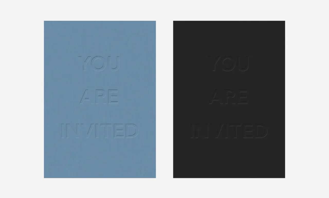
According to Music, a crucial part of the brief was to convey the idea of LFW as an industry showcase rather than a public event, make the branding more “luxe,” which it achieved through careful selection of paper stocks and through details such as embossing, gloss and foils on touchpoints such as show invites. “The whole thing is about really small flourishes, making it really modern and desirable but not overdoing it,” says Benyon.
Editor's Picks





Trending






Latest Jobs
Graphic Designer at Crux Product Design
Full-time·Bristol·Up to £36k
Senior Operations Manager at BIG Partnership
Full-time·Glasgow·£45k–£50k
Marketing Copywriter at ustwo
Full-time·London·£40k-£50k
Junior Project Coordinator at Colorido Studios
Full-time·Twickenham·£28k–£32k
Client Director at Koto
Full-time·Berlin·€70k-€85k
Brand Strategist at DNCO
Full-time·London·£45k-£60k