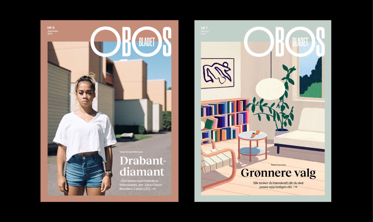
Magazine redesign by Bielke&Yang brings the past back to the future
Oslo studio Bielke&Yang has completed the redesign of one of Norway's biggest publications.
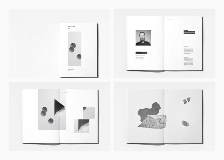
All images courtesy of Bielke&Yang/OBOS-bladet. Via Creative Boom submission.
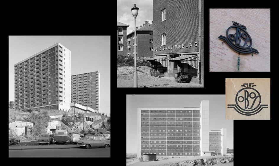
OBOS-bladet is a magazine distributed to all associated members of OBOS, the largest cooperative building association in the Nordics. Since its founding in 1929, OBOS has improved living conditions in Oslo by building affordable housing.
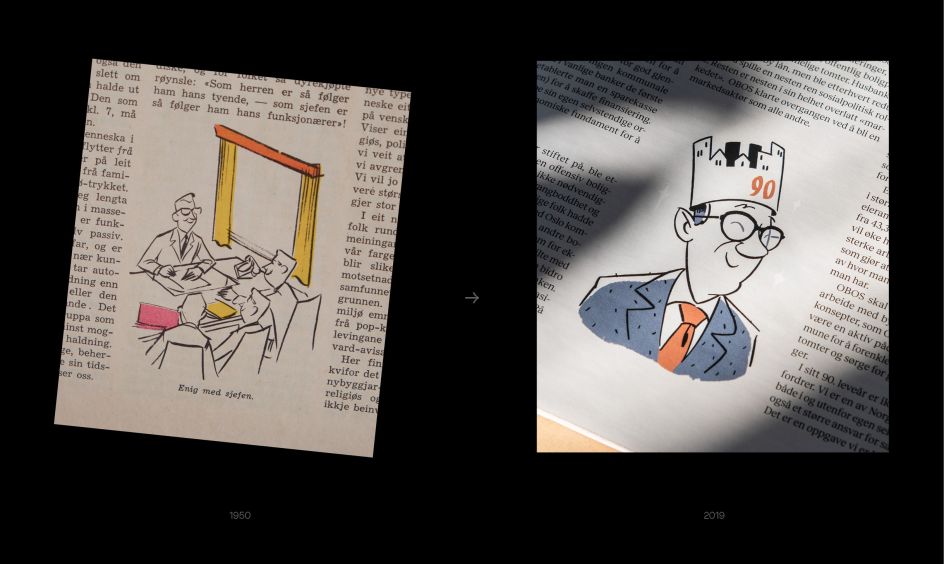
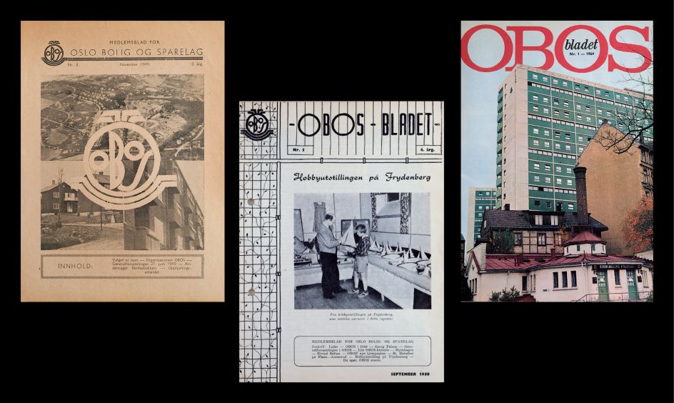
OBOS-bladet was first published in 1947, and has been redesigned several times since, most recently in 2012. The latest redesign launches at the same time as the organisation celebrates its 90th anniversary.
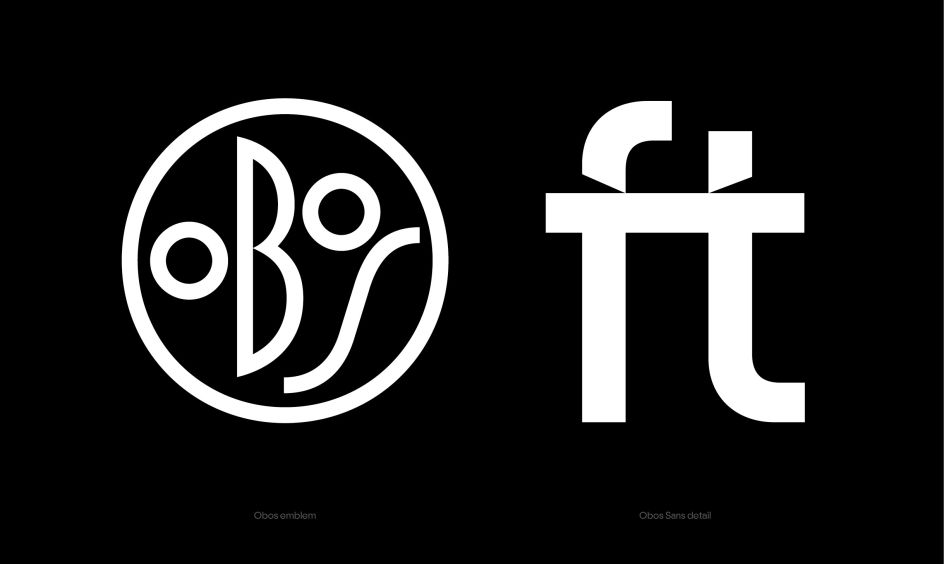
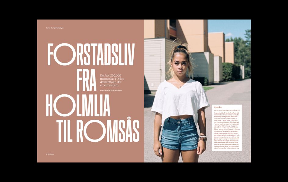
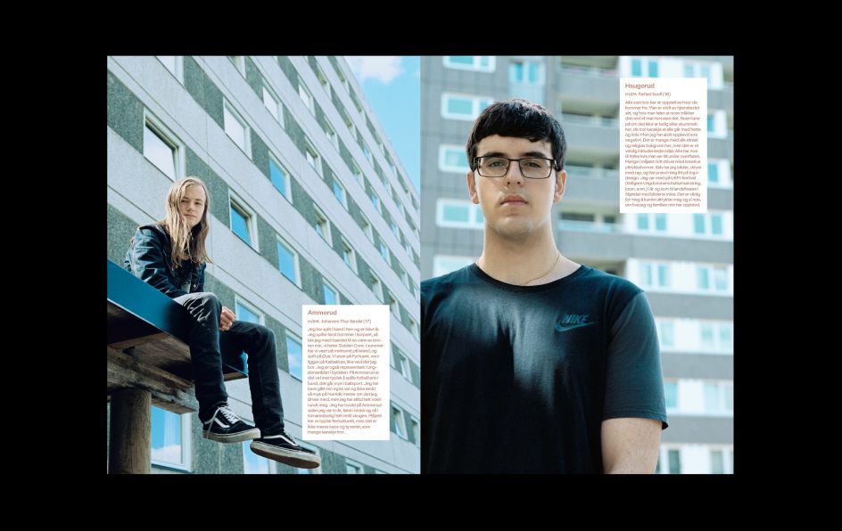
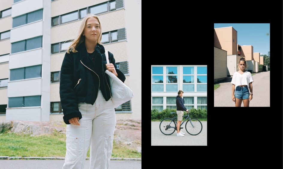
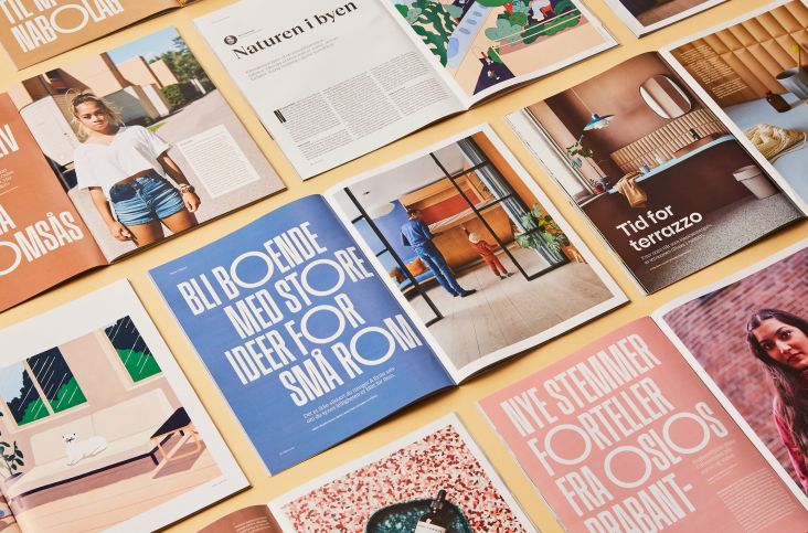
Bielke&Yang's design team explored the archives, looking through 72 years of past issues, and drew on many elements of this history, including the design, typography and style of illustration, for the new redesign.
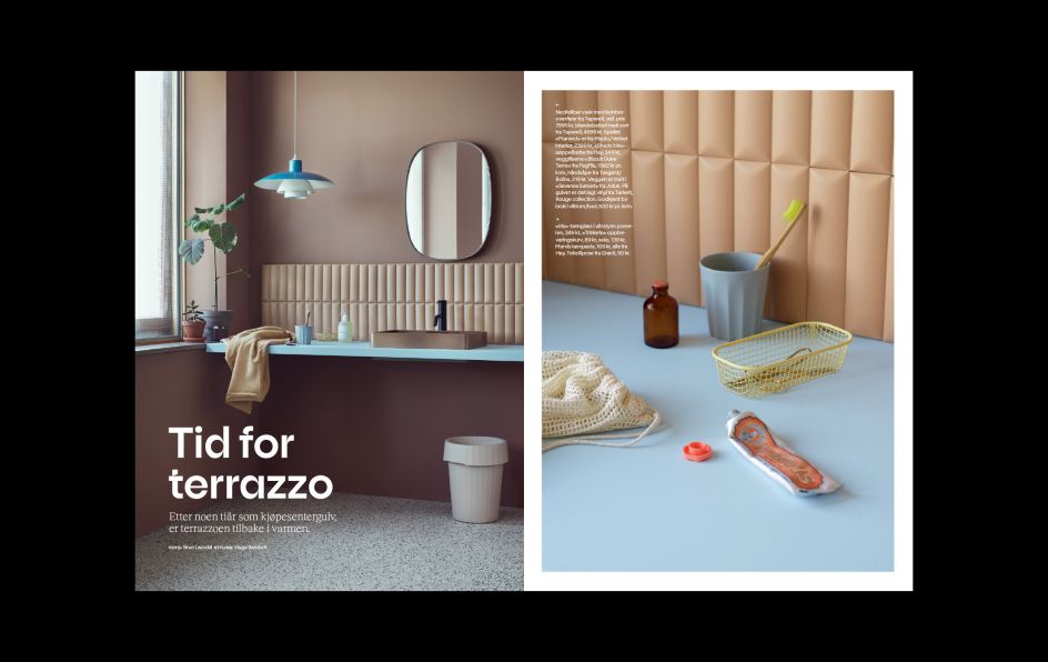
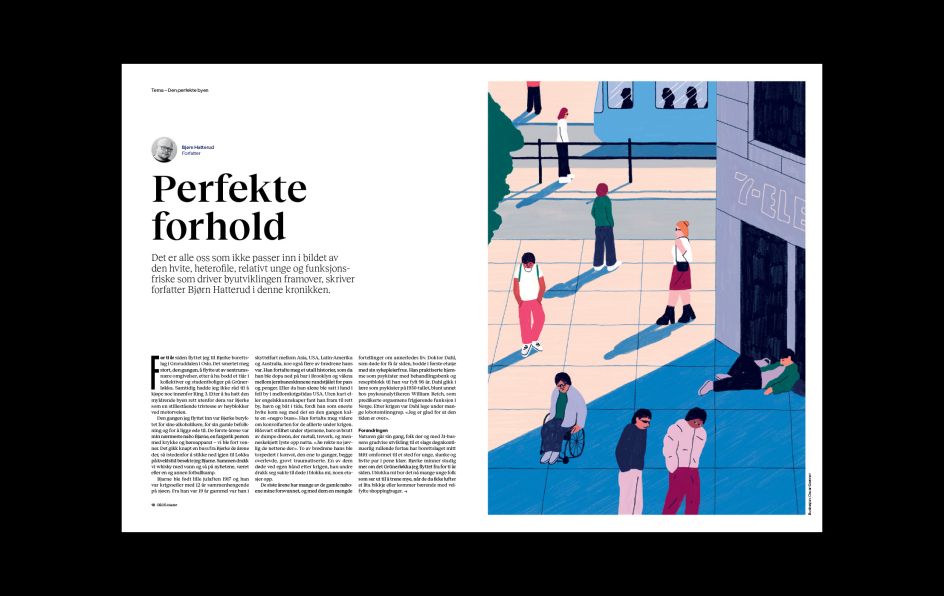
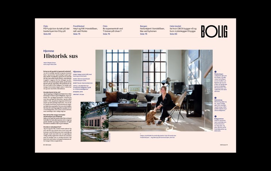
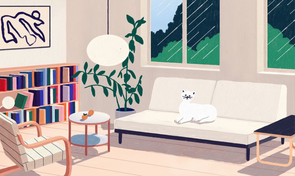
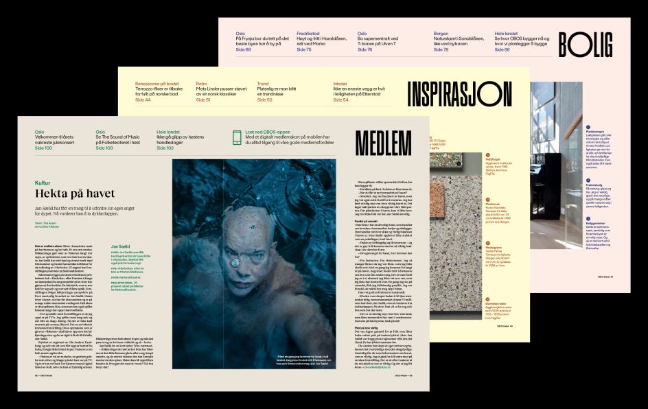
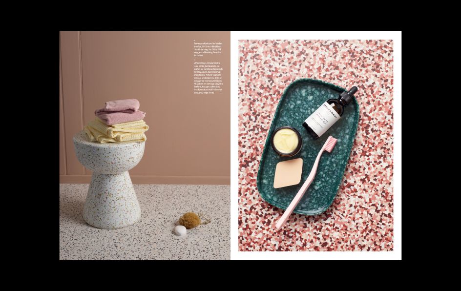
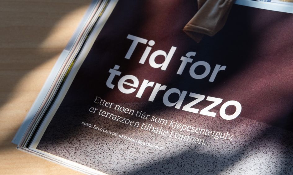
Everything from the format and the paper to the masthead, grid, layout, photography, illustrations, colour palette and typography has now been updated. There's also a new structure for the magazine, with more intuitive navigation and sectioning.
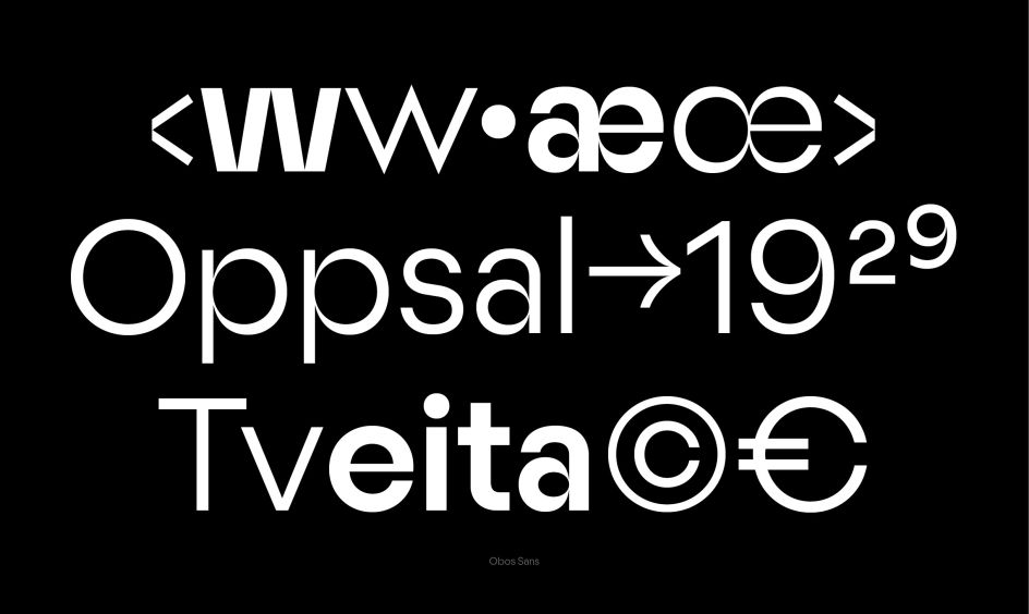
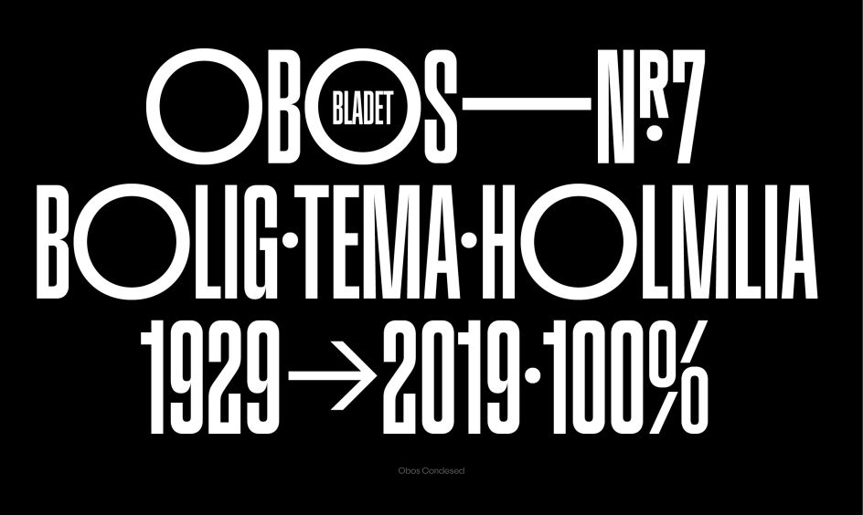
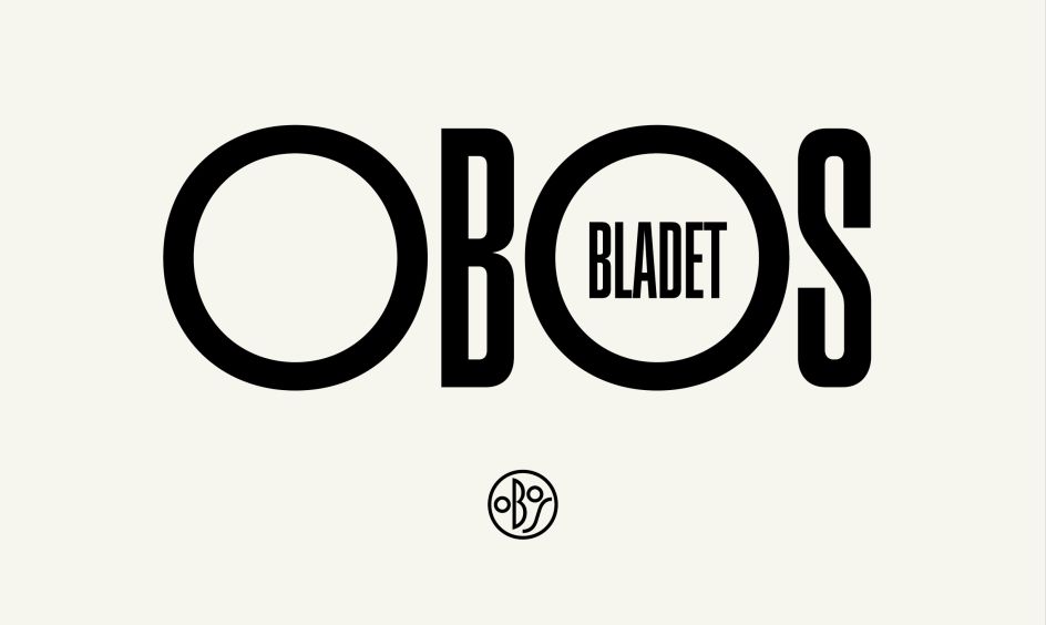
The new, custom sans-serif typeface OBOS Sans references Scandinavian functionalism, facade lettering and architectonic type in Oslo, but with a distinctly contemporary touch. For the grid, with its consistent image ratios, the team drew on architectural disciplines, referencing one of OBOS’ first housing projects in Oslo.
The design was carried out in collaboration with Jørgen Brynhildsvoll and Bobby Tannam, along with the editor Birgitte Dørum and editor-in-chief Åge Pettersen.
Editor's Picks


Trending


Podcasts


Editor's Picks
Further Reading
](https://www.creativeboom.com/upload/articles/88/88861049fd4a6b527e27aacc10e7c713c510a21c_732.jpg)