LaserAway for a beautiful brand
Since opening its first location in West Hollywood, LaserAway has been a leader in laser removal and aesthetics. Realising the company had begun to also focus on beauty related procedures, the team at LaserAway approached studio DIA to reposition and overhaul their entire brand.
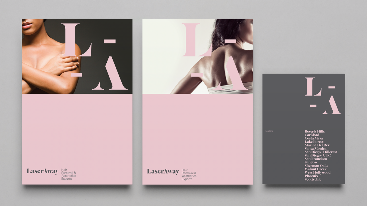
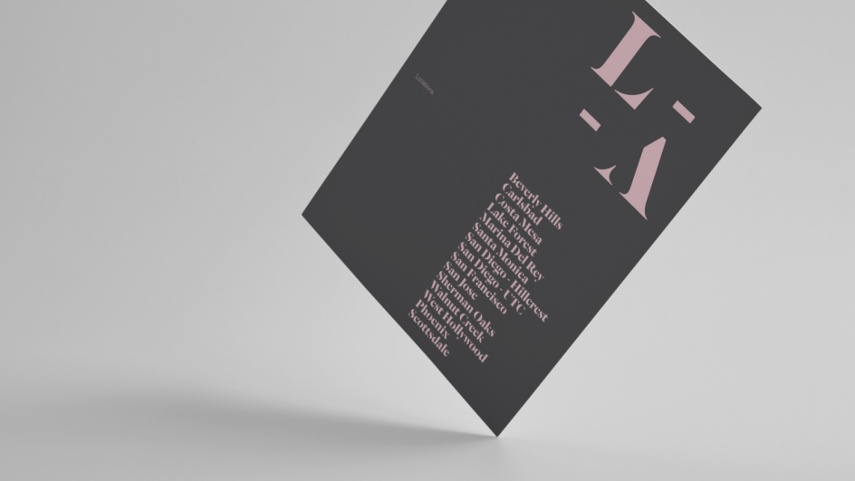
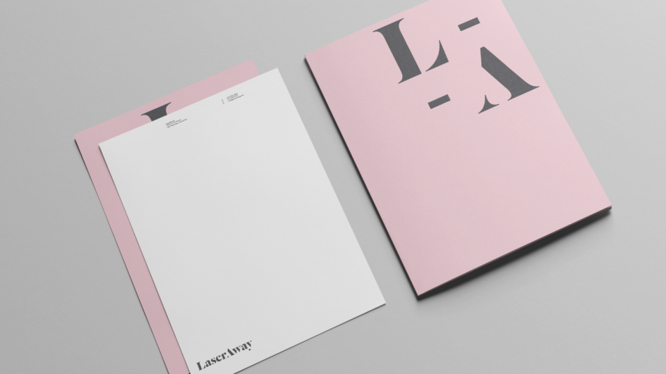
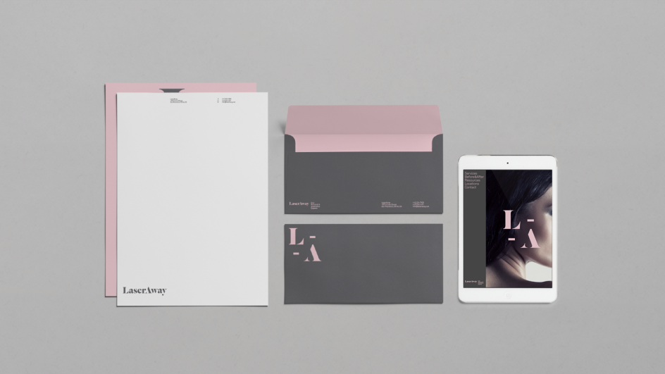
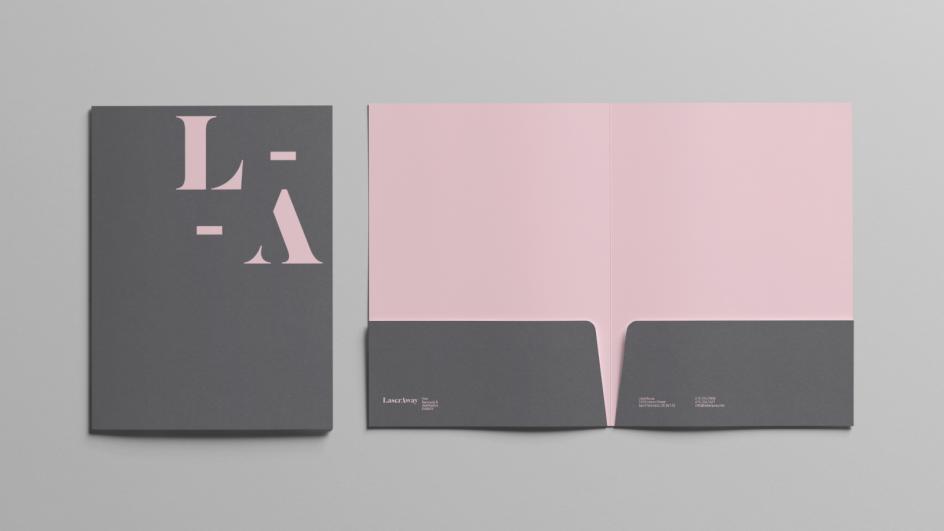
As DIA explained: "From our research we discovered the primary demographic is affluent tech-savvy women ranging from their mid-twenties into their forties. We created a clean design approach that spoke to their audience through simple typography and a modern feminine colour palette.
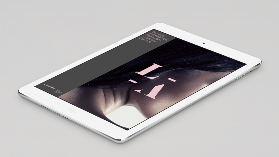
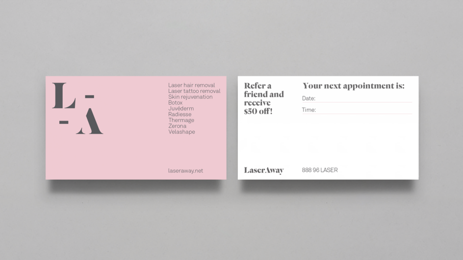
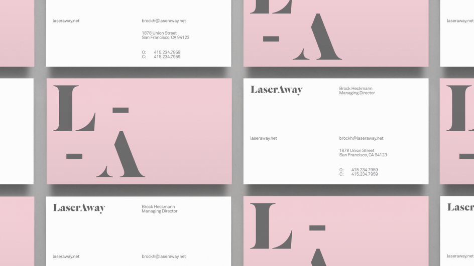
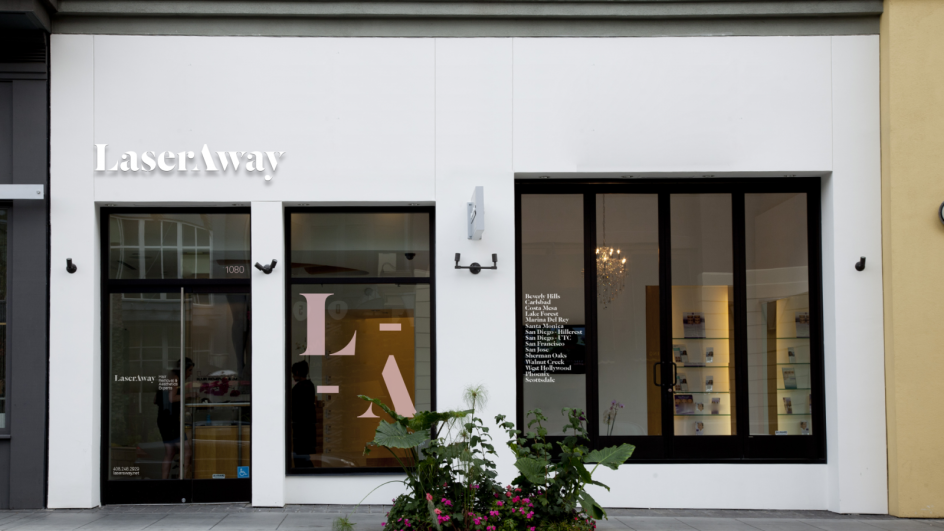
"Working with Commercial Type’s Dala Fioda typeface we created a customised knocked out A, which speaks to removal. It was important that the identity felt clean to embody the medical aspect of their service, but we also wanted it to feel premium and fashionable. Beyond the logo and brand identity we are consulting as a design partner reworking their interiors as well as their digital presence."
