Lantern reveals a new identity for National Children's Bureau promoting a 'united future'
London-based brand consultancy Lantern has developed a fresh identity for the National Children's Bureau (NCB), alongside a new logo, visual style and branded applications.
It's the first rebrand in 12 years for the children's charity, which coincides with the 50th anniversary of the Children Act, something it helped to shape. The organisation approached Lantern to help tell its story with renewed clarity.
"Due to years of austerity, NCB's role has never been more important," says Lantern's director, Ryan Tym. "Cuts to children's services and education have meant demand has increased while resources haven't. This meant the charity needed to refocus its funding away from direct donations and government support, to grants-based backing from trusts and foundations. But in this competitive market, the organisation was struggling to articulate its impact."
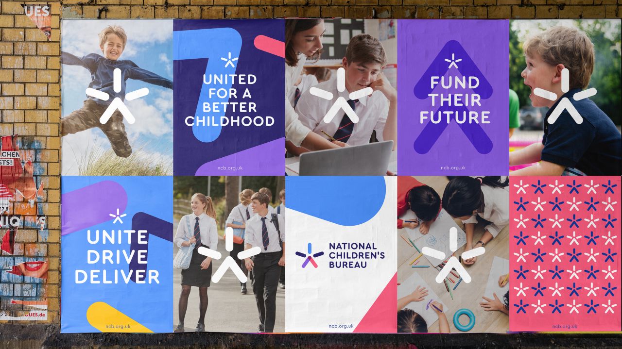
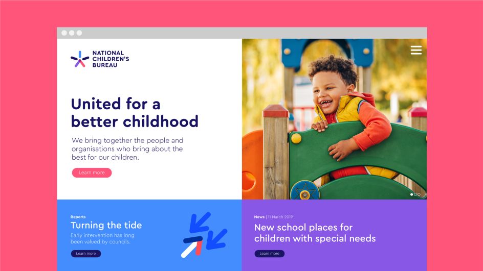
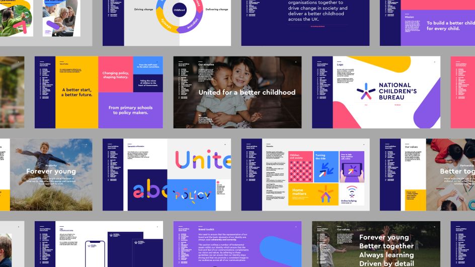
The charity's strapline 'United for a better childhood' formed the basis of the rebrand. "The charity was doing a great job talking about how it was united internally, across its family of brands, but not about how it unites external partners. From parents and children to the central government and even rival charities, NCB brings together the people and organisations who bring about the best for our children," adds Ryan.
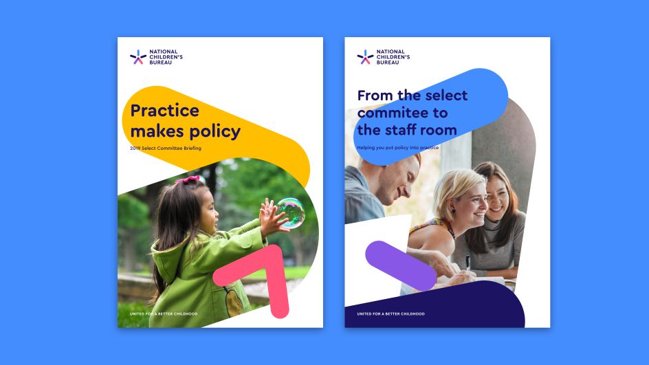
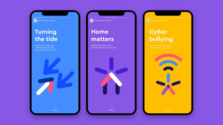
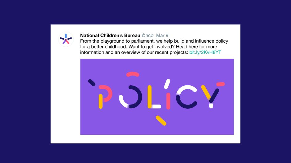
This truth informed a playful tone of voice, with headlines including 'From the playground to Parliament' and 'From the staff room to the select committee' capturing the breadth of NCB's impact and delivering a clearer message for funding sources.
"Visually, the challenge was to deliver a brand identity system that could flex for such a wide range of audiences – from a pre-schooler to the Prime Minister," says Senior Designer Henry Brown. "And also flexing from issues as sensitive as childhood bereavement, to celebrating successes in childhood and teaching."
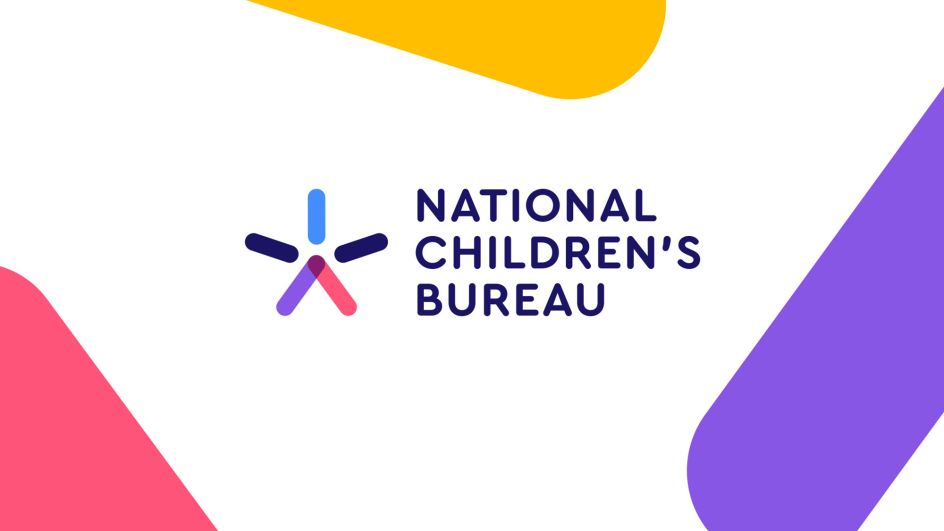
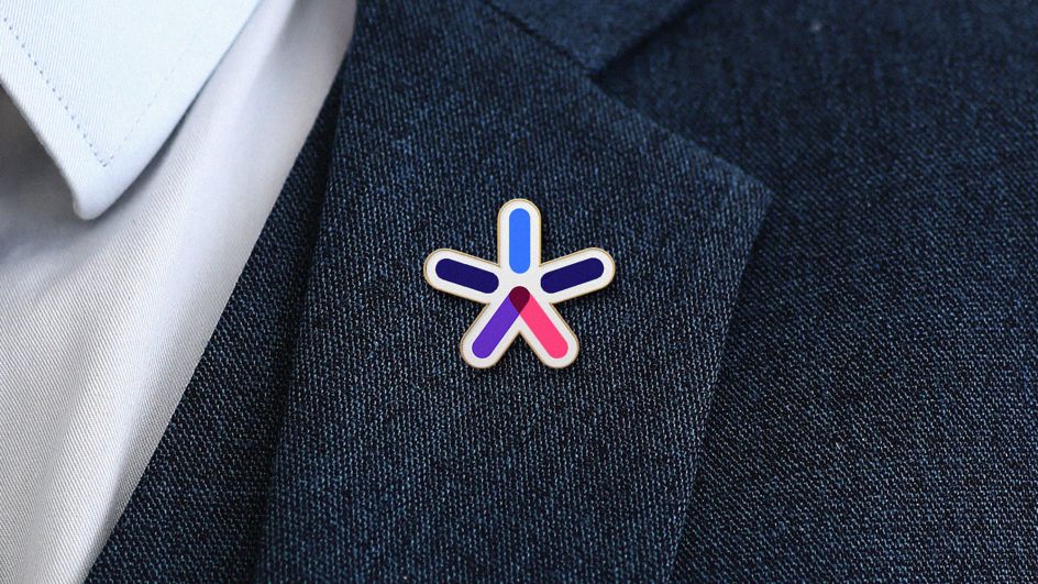
The logo is a star, a jumping figure and an upwards arrow. "The symbol provides a refreshed energy and sense of optimism," Henry adds.
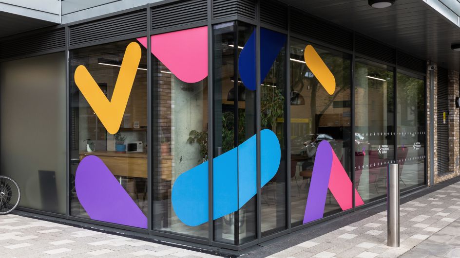
Colourful shapes used throughout the rest of the look and feel aim to reinforce the concept of working together and creating positive, long-lasting change. Lantern also created an illustrated typeface to enable the charity to communicate "complex issues in a simple and intelligent way".
Lantern worked with the charity's internal marketing team to help launch the identity across applications including brand guidelines, office graphics and a new website.
Editor's Picks


Trending


Podcasts


Editor's Picks
Further Reading