Kurppa Hosk's smart typographic designs for new awesome synthesiser Superlative
Iconic analogue synthesisers like Korgs or Rolands usually boast the kind of typography that would make most graphic design geeks salivate.
And a series of acronyms, buttons, knobs and sliders that could easily make those unfamiliar with such instruments develop an instant tension headache/obsession with irritatingly rambly YouTube tutorials.
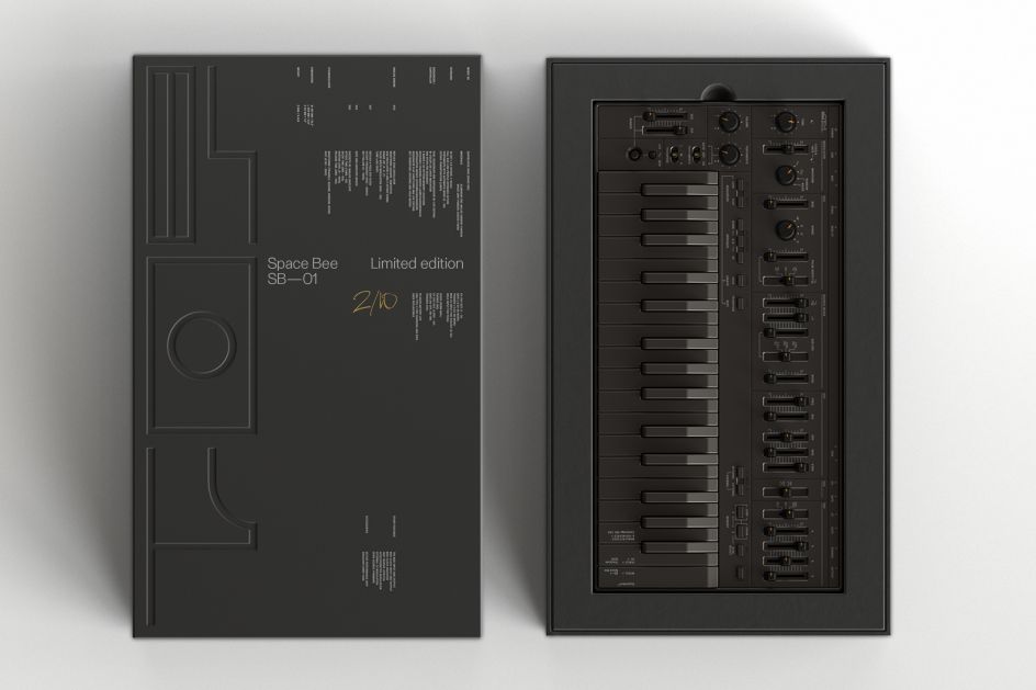
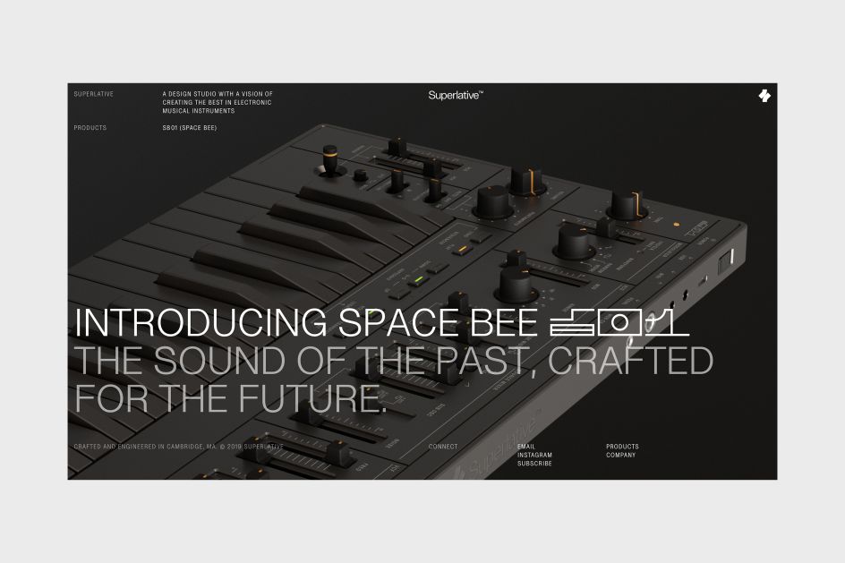
Creating a design system for a piece of hardware is a delicate balancing act between aesthetics and user-friendliness; tradition and modernity. It's something Stockholm-based studio Kurppa Hosk knows only too well, thanks to its beautiful recent work for new portable rechargeable synthesiser, Superlative, which mimics the sort of analogue synths so many people fawn over but with very modern capabilities.
The studio's creative director and co-founder Thomas Kurppa says that he and many of the designers in his studio are electronic music nerds. And like so many graphic designers, were introduced to their craft through music by working on flyer designers, posters or record sleeves. His design heroes growing up were Factory Records designer Peter Saville and The Designers Republic—the studio probably is best known for its work with Warp Records.
Kurppa sees techno music as analogous to Swiss Modernism in graphic design in its use of grid systems and an industrial aesthetic. His work on the project also harnessed his love of iconic equipment like the Roland 303 synthesiser, which defined the acid house sound of the late 1980s.
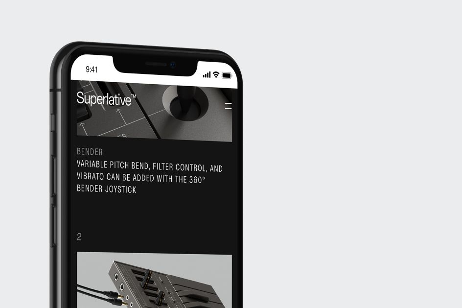
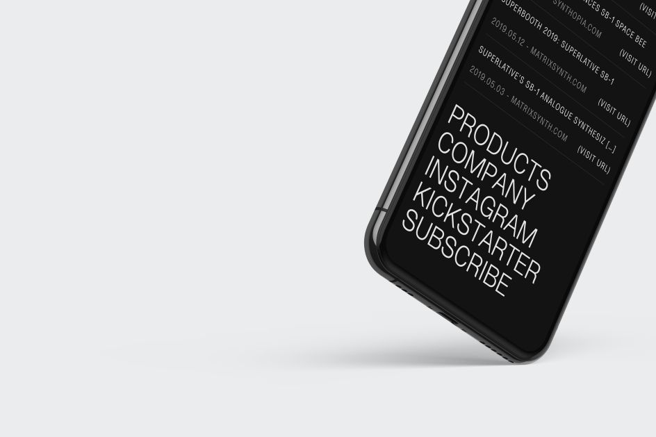
Kurppa says that most people in the studio were just as obsessed as him with such tools, with many owning newer versions of the older synths. As such, the design system was inspired by their simplicity–and crucially; this meant the branding could work just as seamlessly displayed as controls on hardware as it could in its online applications.
A key concern in the designs for the Superlative was that its creators ultimate aim is to design more tools within the range, so the Kurppa Hosk team aimed for a look and feel that focused on the product itself while beating an identity that acted as a framework or "visual platform" that meant the graphic identity never overshone the synth itself.
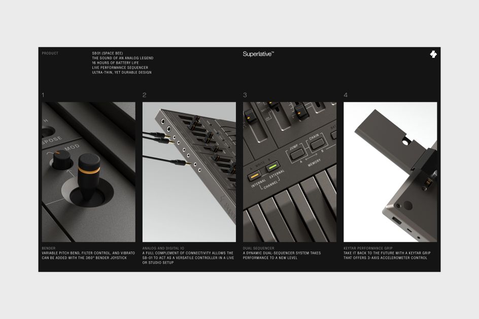
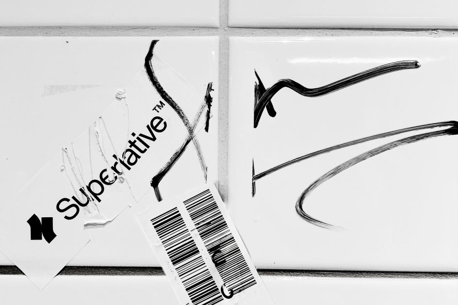
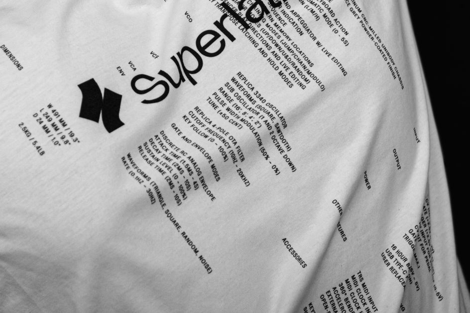
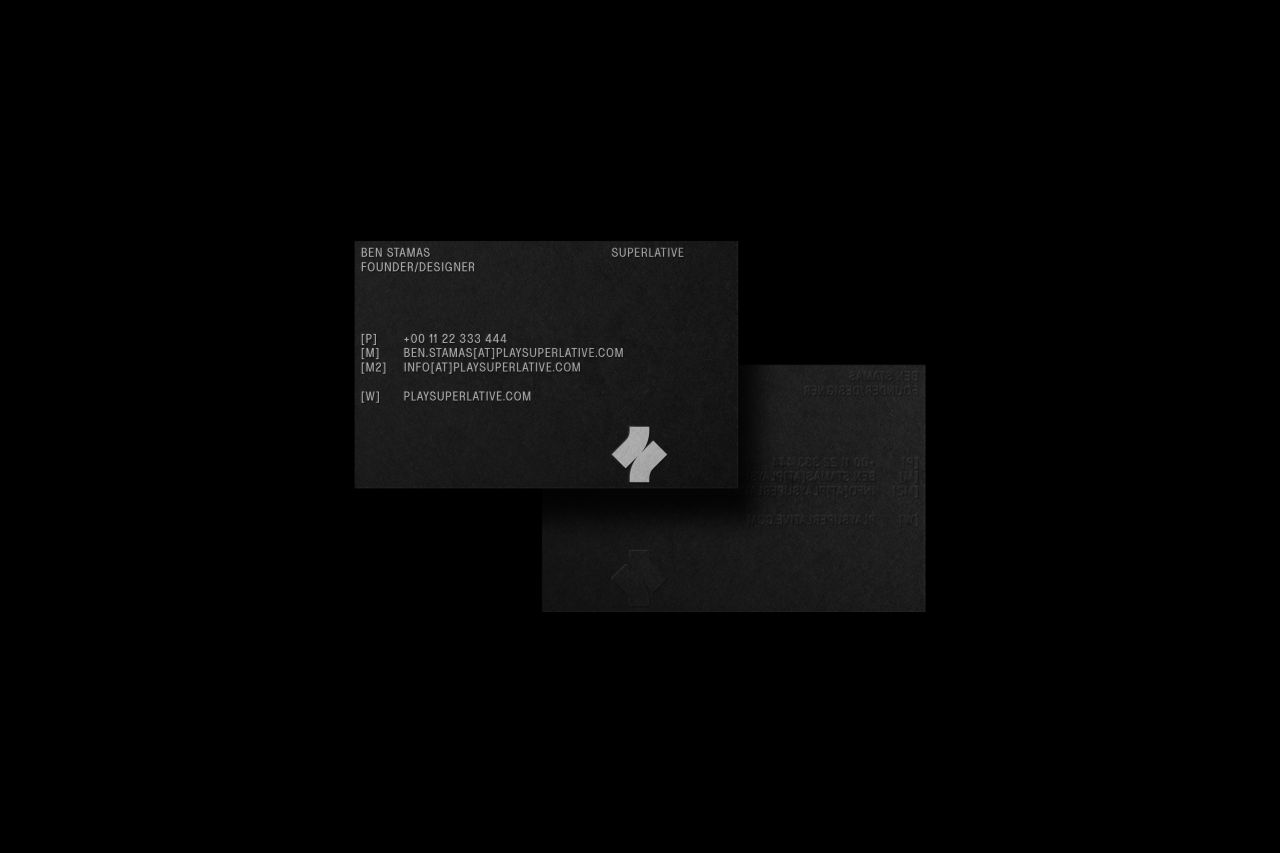
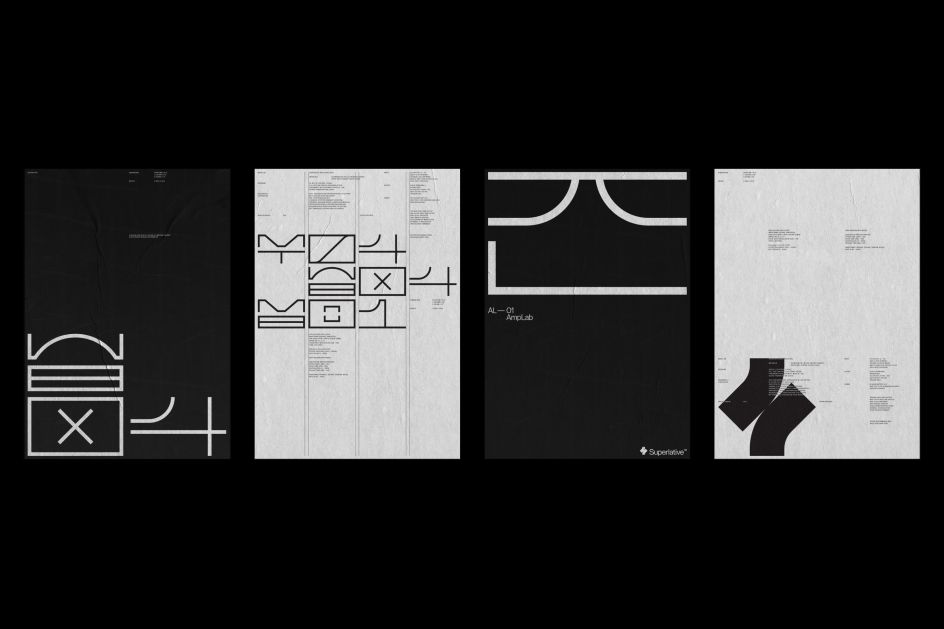
"We were looking for a visual toolbox with few elements—we wanted a strong, very simple symbol," says Kurppa. The symbol is inspired by the keys on the product, which use a wordmark set in bespoke typeface Superlative Grotesk.
The team then developed a series of hieroglyphs: "they become stronger than the corporate brand in a way, and can be integrated into headlines as well as products since they're tailor-made for the system," Kurppa adds. "We needed to do to make sure the type was suitable for the product, so very clean and legible at small sizes such as when its placed under different knobs."
Editor's Picks


Trending


](https://www.creativeboom.com/upload/articles/90/908fdb6378db1e95d12595416f54e6336d5e80b8_732.jpg)
Podcasts


Editor's Picks
Further Reading