Fiasco Design's new identity for education provider Bayswater
How do you harness the energy and excitement of international study in a way that will appeal across multiple global cultures and societies? Fiasco Design's new identity for Bayswater offers a great example.
Bayswater is a social education enterprise headquartered in London that's building out a global network of colleges for international students.
Following its recent acquisition by renowned language school Eurocentres and the opening of new campuses in locations around the world, Bayswater approached creative agency Fiasco Design to help them create a visual identity. One that would help them on their mission: to educate and inspire the next generation through a life-changing educational experience.
"We established Bayswater in 2017," says Stephan Roussounis, its founder and managing director. "But after rapid expansion and the integration of a variety of legacy industry brands, we wanted a reset and to double down on the Bayswater name with an exciting new brand canvas."
The brief
"Building communities of global thinkers and explorers around the world, Bayswater combines two of life's greatest adventures: education and travel," says Ben Steers, co-founder and creative director at Fiasco Design. "They tasked us with developing a dynamic, progressive and optimistic identity, a fresh take for an educational brand."

The new branding needed to capture the company's progressive outlook on education, challenge the status quo; and design a visual brand that is fit for the expansion of the business.
"Learning at Bayswater extends beyond the classroom walls," notes Ben. "So we took this idea and ran with it. Harnessing the spirit of adventure, the brand celebrates the big wide world and all its endless opportunities."
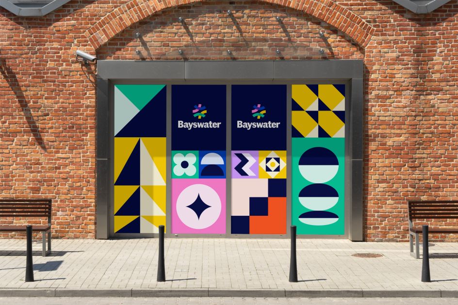
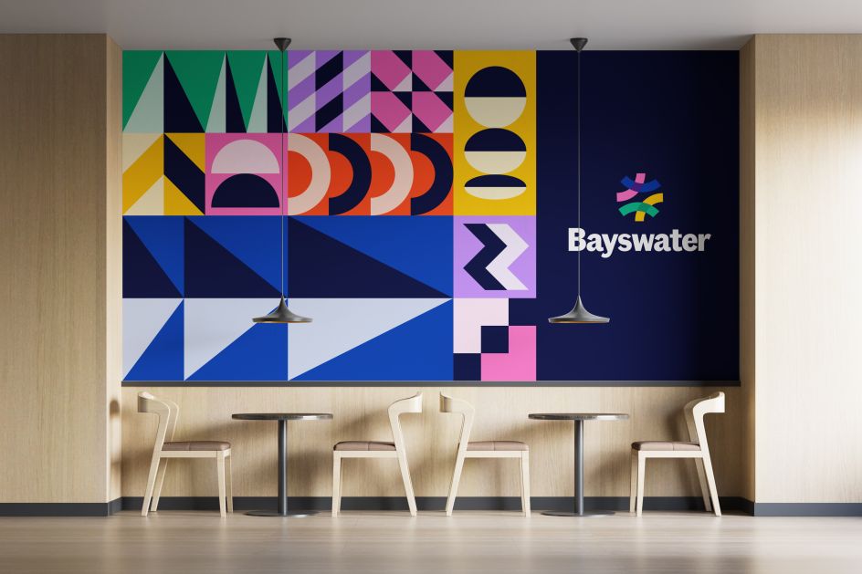
Graphic elements
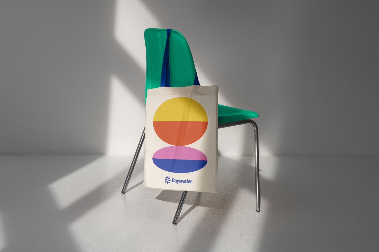
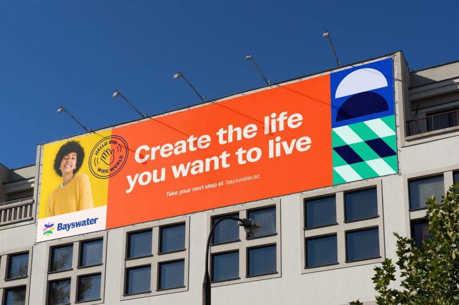
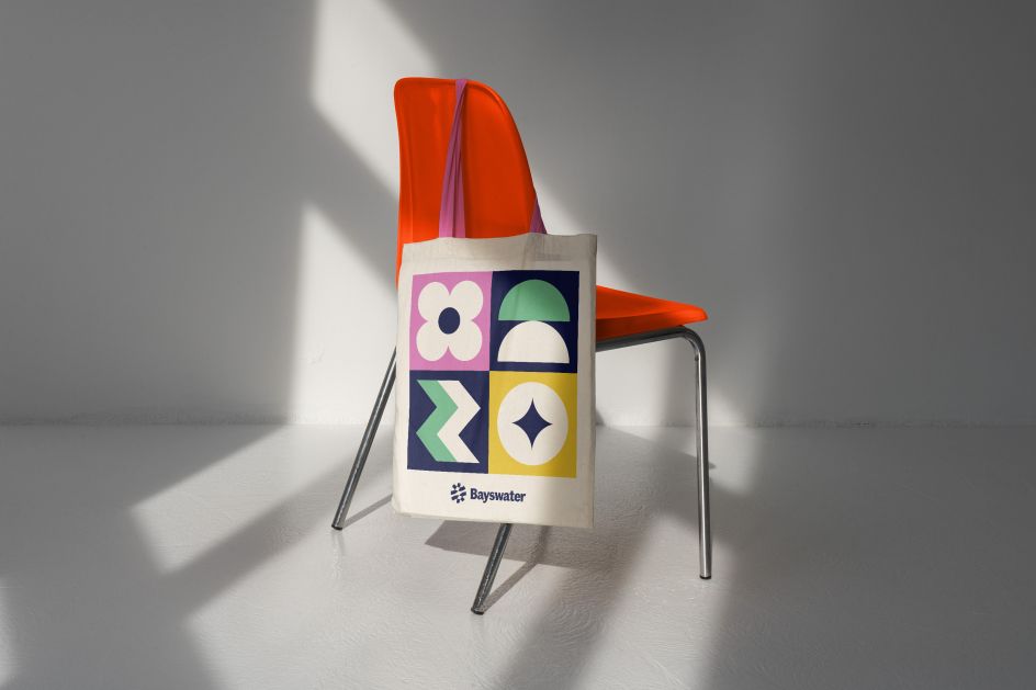
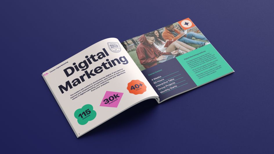
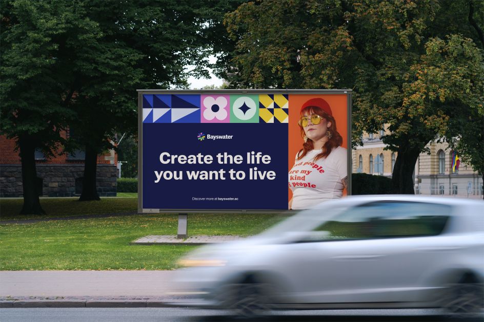
A suite of bold, colourful patterns is the backbone of the new designs. "This reflects the vibrant and diverse community taking a bold leap into new experiences," explains Ben. "Meanwhile, the brand palette and typographic system work to capture the aspirational and energetic tone of the brand."
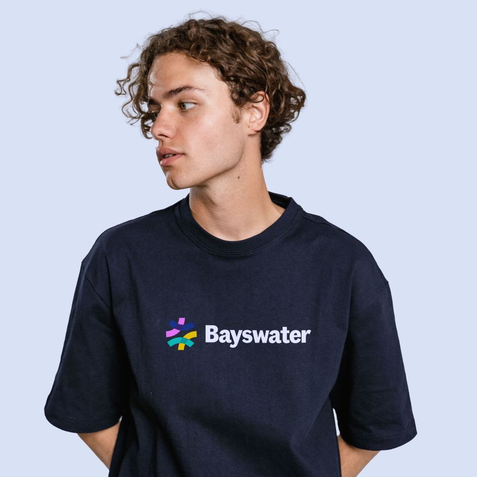

He adds that "the logo, with its coloured pathways, represents students of different backgrounds following their own unique pathway, uniting in the Bayswater community to be a part of something greater. Plus, the Fann Grotesque typeface helps to ground the playful visual identity, giving the brand name a characterful yet trustworthy feel: a reassuring nod to parents."
A flexible grid system was created to allow the pattern work and content to flex proportionally across various formats and orientations. And the photography was intended to feel active and optimistic, adds Ben. "Celebrating individual personalities, the imagery is inclusive of a diverse global community of students.
"The result is a spirited brand that inspires the next generation to embark on the educational adventure of a lifetime," concludes Ben.
"It's been great working with Fiasco on our full rebrand," says Stephan. "We've appreciated the process: it's been very collaborative. And it's very exciting to see the new look come to life across so many different platforms and formats."
Editor's Picks


Trending


Podcasts


Editor's Picks
Further Reading