Emm, the world's first smart cup, gets a visual identity crafted by How&How
It's hard to argue against the idea that period products are due for an upgrade. And Emm, the world's first smart cup, aims to be part of that great leap forward for women. Global branding agency How&How explain how they crafted a visual identity for this groundbreaking new device.
Around 26% of the global population menstruates, making it a highly universal experience, yet it's an incredibly personal and individual one at the same time. This monthly event varies widely from person to person in terms of things like the length of a cycle and the quality of blood. And these biological differences are further complicated by a widespread education gap, which means this natural process remains a stigmatised experience for many.
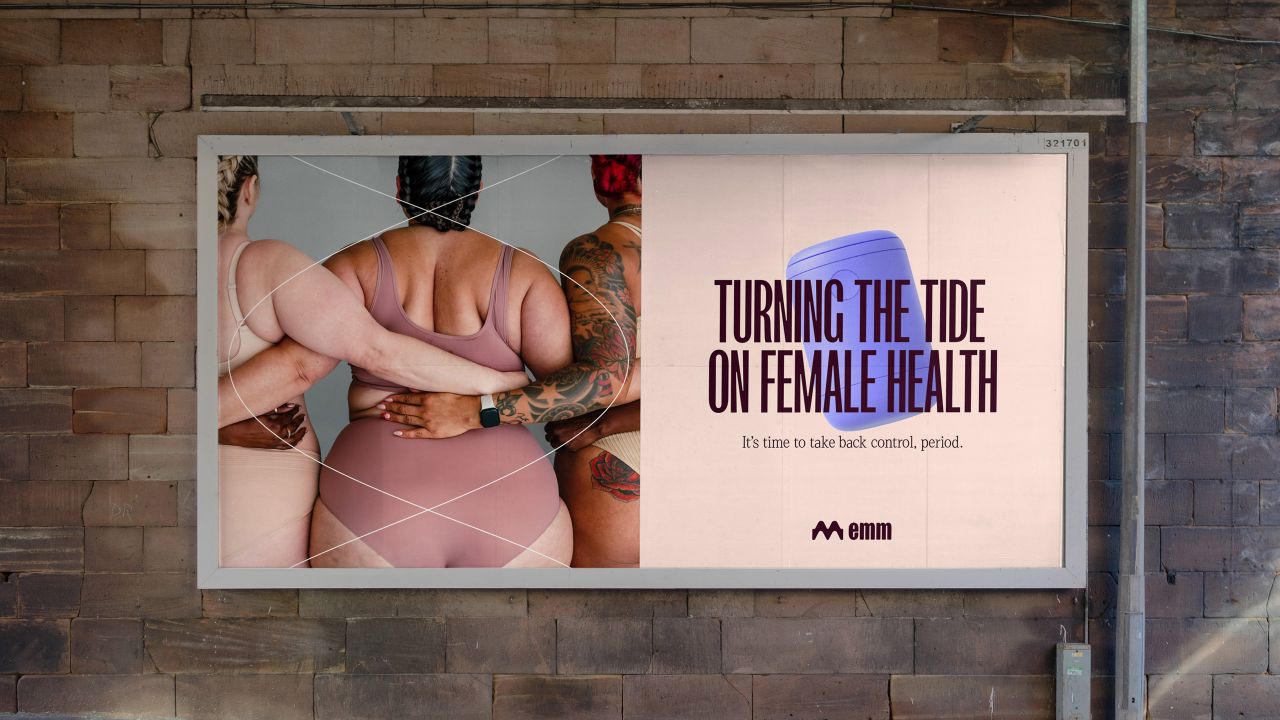
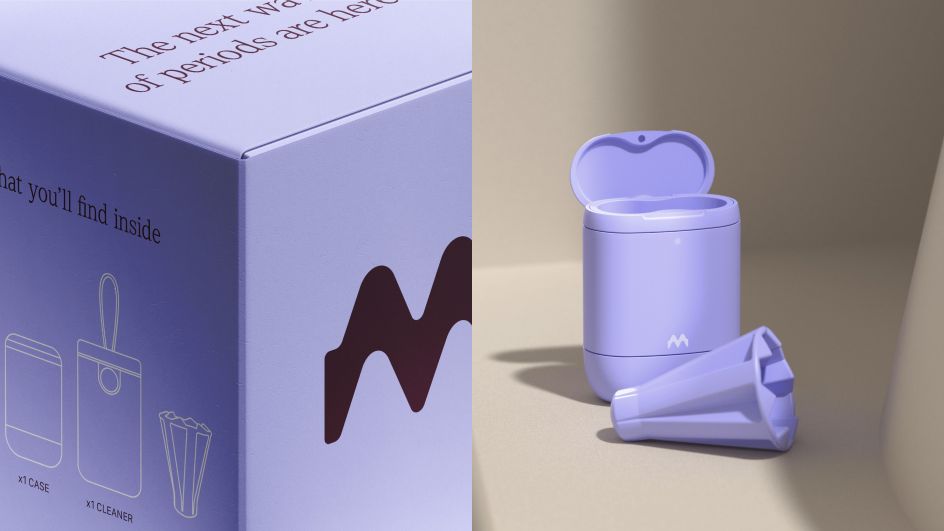
This can be a huge missed opportunity for improving life, as period health can offer useful insights into more general health issues. That's why Emm, the world's first smart cup, combines wearable tech with accurate, personalised data to give women valuable awareness of their menstrual health.
In a society where period health is still seen by many as a low priority – witness the current controversy over UK supermarkets not passing on the abolition of the "tampon tax" – it's a welcome, positive step forward.
For its branding, femtech company Emm partnered with How&How, a creative agency based in London, Lisbon and LA whose innovative tree-planting browser extension we covered a few months back.
Brand concept
"In a category defined by unheard voices and invalidated experiences, we worked closely with Emm to turn a monthly inconvenience into a positive health experience," explains creative director Cat How. "We aimed to help them open new conversations between patients and doctors, using data to nurture effective care and better health outcomes, particularly when it came to periods."
How&How built on this brand strategy, creating a new visual identity and tone of voice that reflects the inherently cyclical movements of periods. They designed everything around the central organising concept of 'waves'.
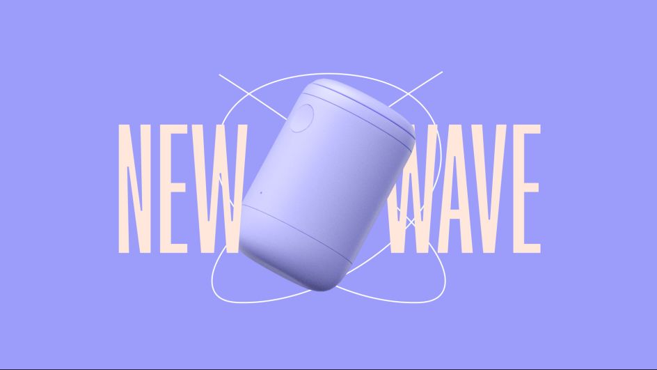
"Waves lie at the heart of this experience, from the different phases of the menstrual cycle to the metaphorical tides of symptoms that are felt, as well as the shape of the product itself," explains Cat. "They were integral to Emm's brand idea: 'Catch Your Wave'.
"On the surface, it reflects the product's ability to capture blood," she continues. "But at its core, it speaks to an opportunity: the opportunity to use tech to do something new with your health and fundamentally transform it."
The logo
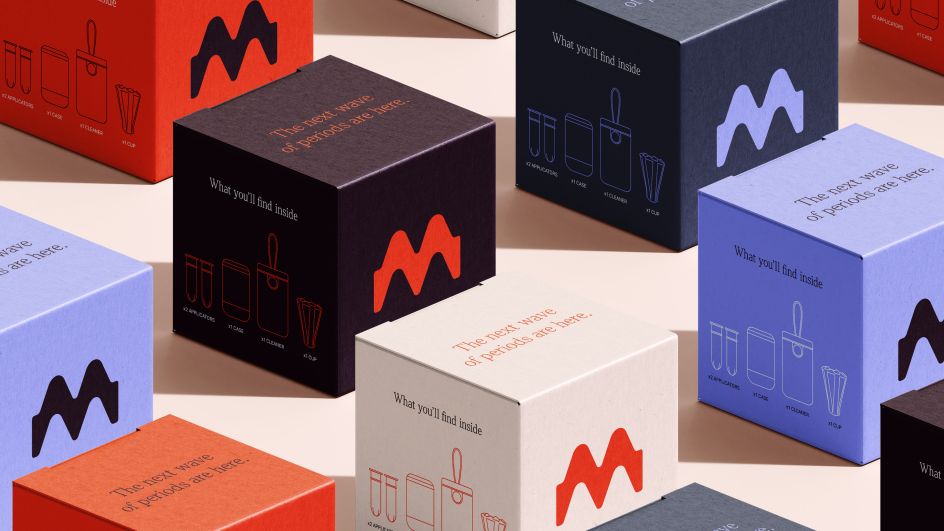
Consequently, Emm's logo has been designed to reflect the patterns and waveforms of data, female cycles and health. A thick, bold, visceral icon supported by a powerful wordmark. This combination of strength and fluidity is a key tension that permeates the brand.
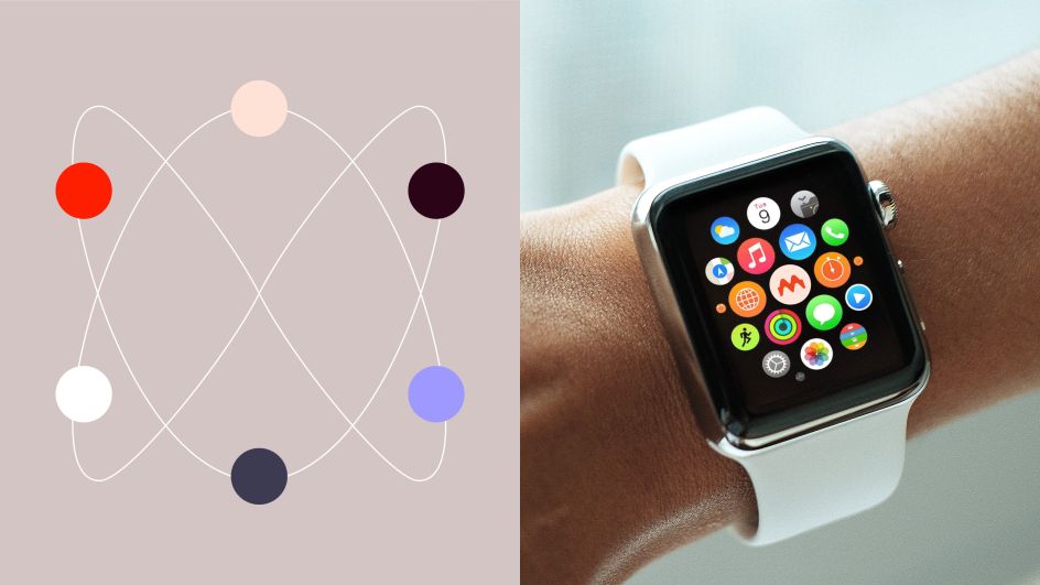
Emm's logo is supported by a colour palette that reflects integral aspects of the brand, with its innovative and optimistic nature reflected in its primary colour, Bold Orange. "The colour stimulates, uplifts, and promotes the possibility of a positive period," explains Cat. "This is balanced by white, peach, violet, lead and aubergine, emphasising cues of credibility, technology and health."

Inspired by this icon, the How&How team created a suite of illustrative waveforms which emulate the cycles and patterns of female health and are used to champion people and products. There are two primary typefaces. "For punchy, powerful headlines, we use FK Screamer," Cat says. "Its tight spacing and compact proportions make it a robust, bold type. Denton was used as secondary for warmth and refinement."
Clear voice
"We're so grateful that How&How agreed to work with us on building our brand," says Emm's founder and CEO, Jenny Button. "We've been blown away by the result: it has a life of its own beyond what we ever imagined for it.
"This brand is our platform to build a relationship with consumers that will fundamentally impact their quality of life," she adds. "Through our collaboration with the How&How team, we have a brand with a clear, powerful voice that will connect with people across the diversity of the female experience. We all felt the care and responsibility that How&How exercised in building an expression of our company vision with us."