Jiyung Lee's illustrations of everyday items are organised 'almost like a catalogue layout'
The Korean illustrator draws objects in grids and collections, finding rhythm and narrative in the most ordinary of things.
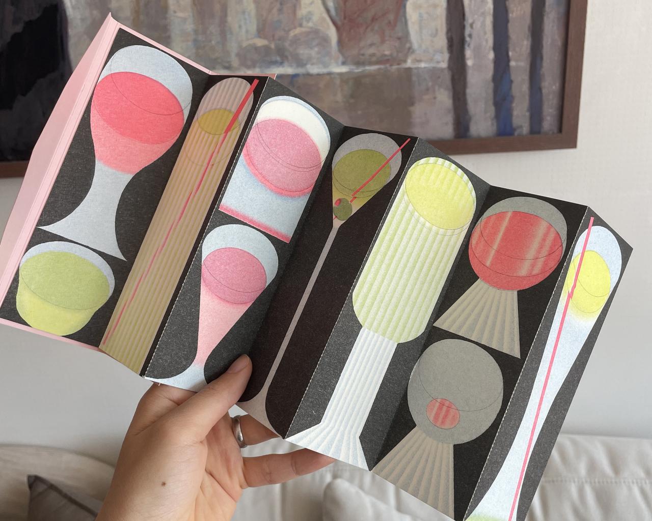
Pocket pages bookmark, designed by Bureau BCD
Before Jiyung Lee draws anything, she chooses a single word and then expands outward into every possible form it might take. From that word comes a subject, and from the subject comes a grid. And from the grid – ruled in pencil, measured with circle and ellipse templates – comes something that looks, at first glance, like a catalogue. Then, a few moments later, you realise it's more like a poem.
Jiyung grew up in South Korea, where she studied fine art with 80 students. After graduating, she moved to France to study Communication Design, which she chose out of curiosity: "I thought if I learned the design language, I would also gain another skill to express myself."
The French school was small and intimate, and students could take any classes they wanted,, regardless of the degree they chose. Jiyung moved between printmaking, drawing, installation, editorial and graphic design. "Looking back, it helped me a lot to translate ideas into a visual language using the right instrument or medium." Drawing, though, stayed constant. "Drawing remains the foundation of my practice, and I'm interested in exploring many forms through it."
Jiyung works as an illustrator, but prefers not to restrict herself to a single medium – "I don’t see myself limited to one label". What really fascinates her is how images can be viewed as symbols, the point at which something sits between painting, design and illustration without quite belonging to any of them.
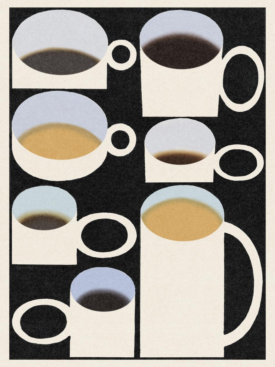
Coffee, personal work. Digital drawing. 2026
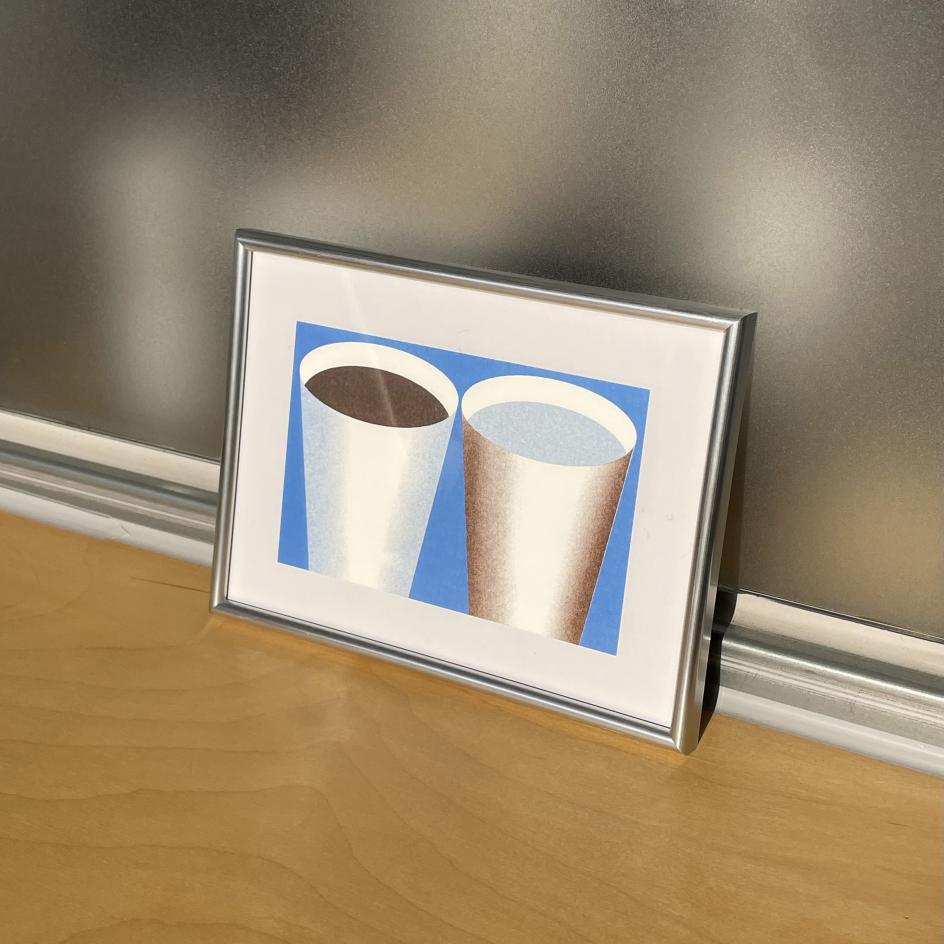
Coffee and Water, personal work, risoprint, 2026
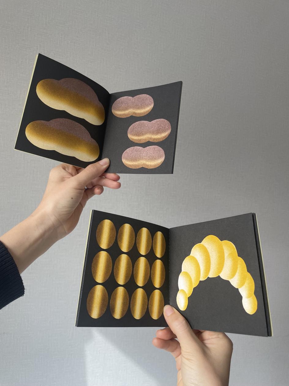
Glutton book, printed and designed by Quintal Atelier
Her inspiration tends to come from structure and organisation in everyday situations. "I'm drawn to the way everyday objects are organised and presented rather than a single object," she explains. Market stalls are a recurring source of ideas, especially when the fruits, vegetables, and household goods are arranged in a way that is simultaneously chaotic and ordered, almost pattern-like. Supermarket flyers and catalogues have a similar appeal, especially the way items are grouped, repeated, and systemised into some kind of visual logic. "When images begin to function like language, when composition starts to tell a story through arrangement alone, that's the moment I find most exciting."
The process that follows involves Jiyung choosing a subject, before dividing the page into a grid – "almost like a catalogue layout" – and drawing each object within its own space. Rulers, circle templates, and ellipse guides are productive limitations that she uses to restrict certain gestures while opening up new and unexpected ones. The forms themselves are stripped back to their essentials, pushed towards the abstract pictogram, and then pulled back just enough to remain legible. "To find a balance where you remove or add just the right amount so it is recognisable is something I continually enjoy exploring."
Pocket pages bookmark, designed by Bureau BCD
Personal work. risoprint
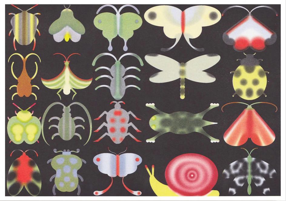
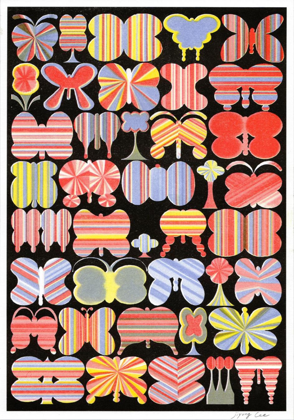
Insects Poster, printed by RFI gallery
In her bread series, you'll spot croissants, baguettes, buns, pretzels and rolls arranged across a dark background in warm golds and yellows, each forming a silhouette. The whole thing reads like a taxonomy of carbohydrates and also, somehow, like a love letter to the boulangerie. The insect Riso print does something similar but wilder, with beetles, moths, butterflies and centipedes pinned across a black base in vivid colour, equal parts field guide and fever dream. Both were made in collaboration with print studios: the bread series with Quintal Studio in Paris, the insects with RFI Gallery in Hamburg. "I love the texture and colour qualities of Risograph printing," she says. "Seeing the digital drawing transformed into something tactile and physical is especially rewarding."
What ties all the objects together – the coffee cups, the teapots, the bread and the bugs – is a belief that nothing is ever purely visual. "For me, there is always a human presence behind an object," she explains. "Someone designed it, made it, chose it, used it, arranged it or left it there. Even the most ordinary item carries traces of intention and everyday life."
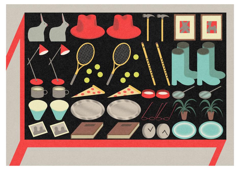
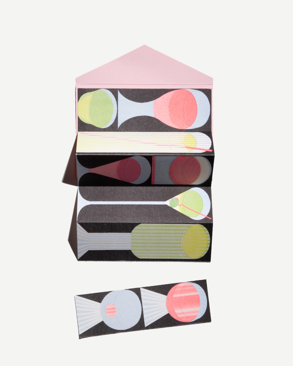
Yardsale for two, printed by RFI gallery
Further Information
Editor's Picks


Trending


Podcasts


Editor's Picks
Further Reading