Pia Salzer: A love letter to everyday aesthetics
Meet the up-and-coming German illustrator who has been blowing our minds line by line in rich pinks, reds, yellows and oranges.
Riding a bus, going to the shop, sitting in the kitchen… It can all seem so dull. But if you stop, take a deep breath and get into the moment, you might notice that the world around us is full of wonder. To artists like Pia Salzer, everyday life is an endless source of inspiration.
And that's not to say her work is ordinary. Anything but. Built up like a collage of naïve, hand-drawn strokes, instinctively and expressively applied, an illustration by Pia seems to shimmer with motion. She renders her own unique perspectives on any subject in the vicinity.
"When I don't know what I want to draw but really feel like illustrating, I usually start by drawing whatever is in front of me," says Pia. "Over time, this has resulted in various still lifes and figurative snapshots from my home and studio space."
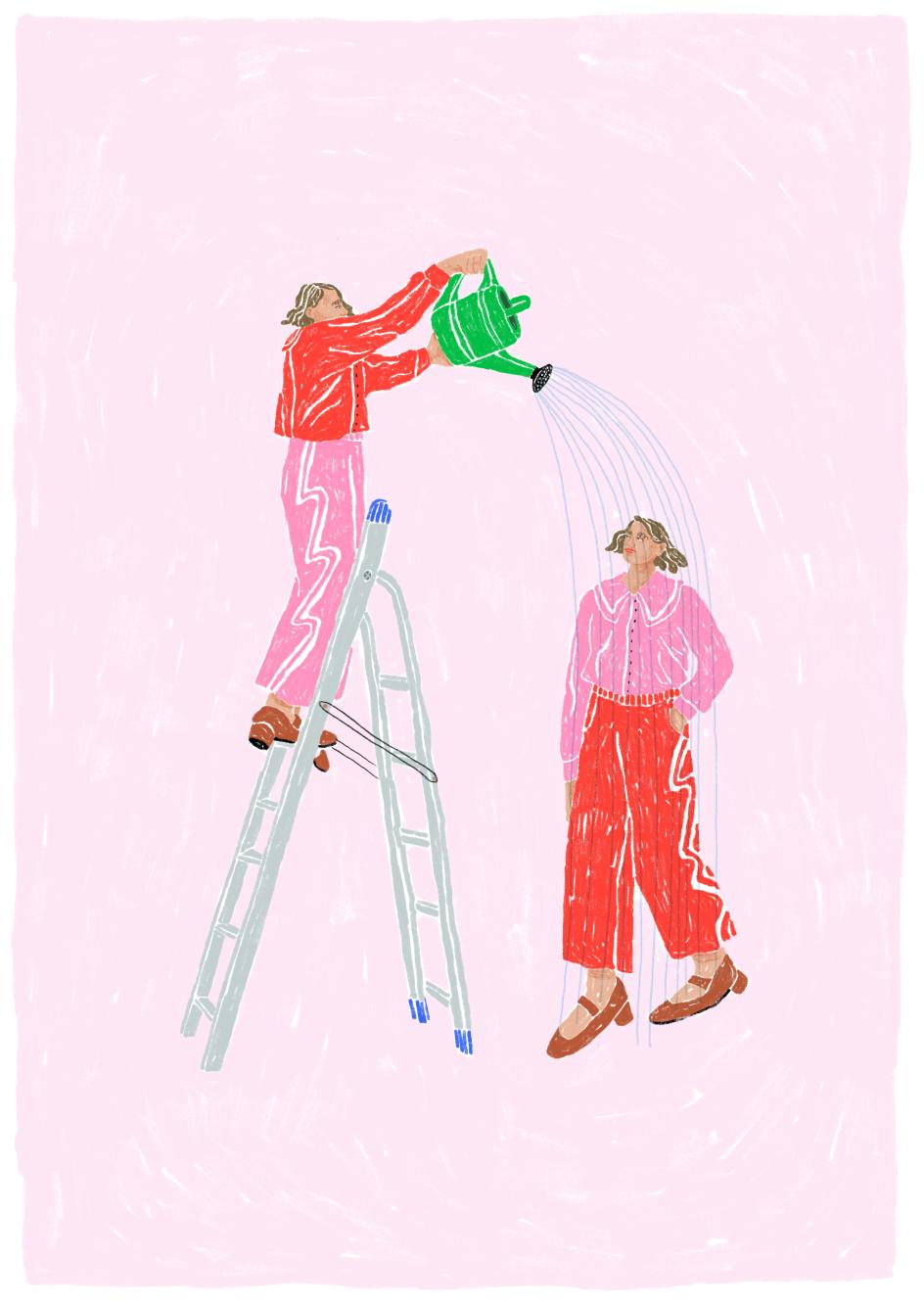
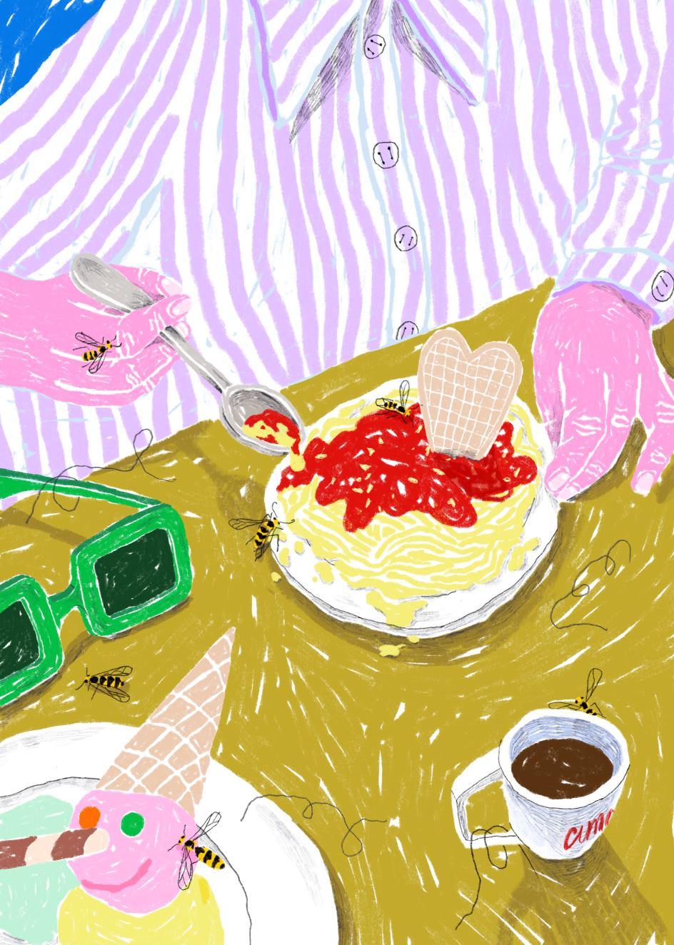
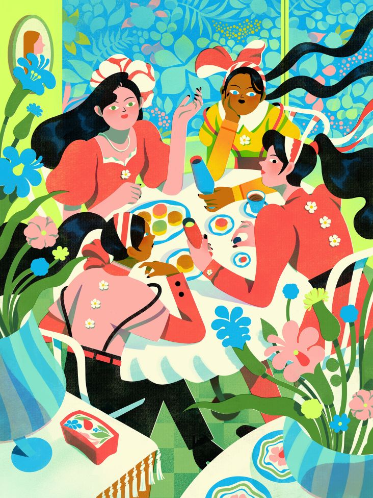
Personal work
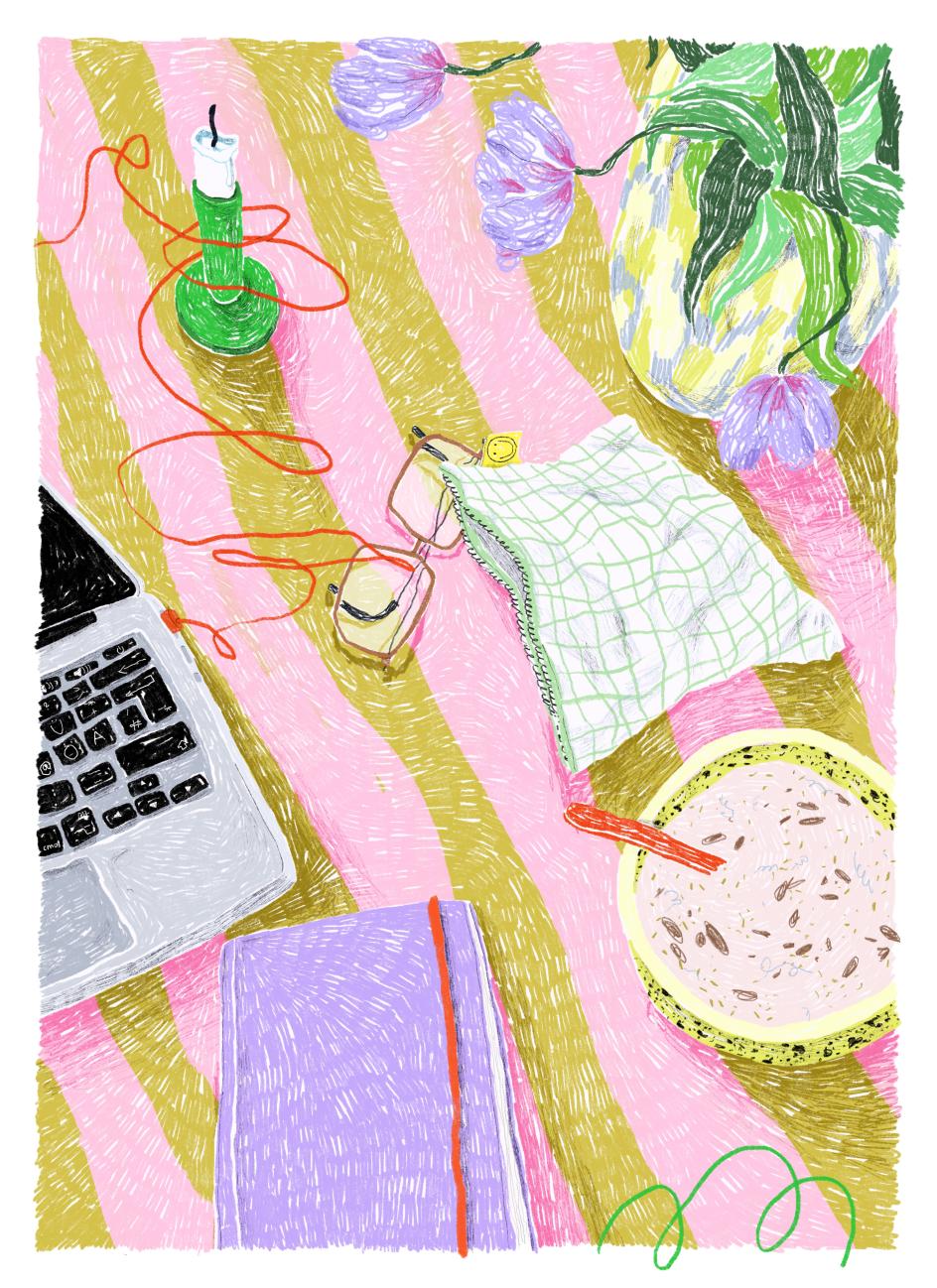
Still life at home
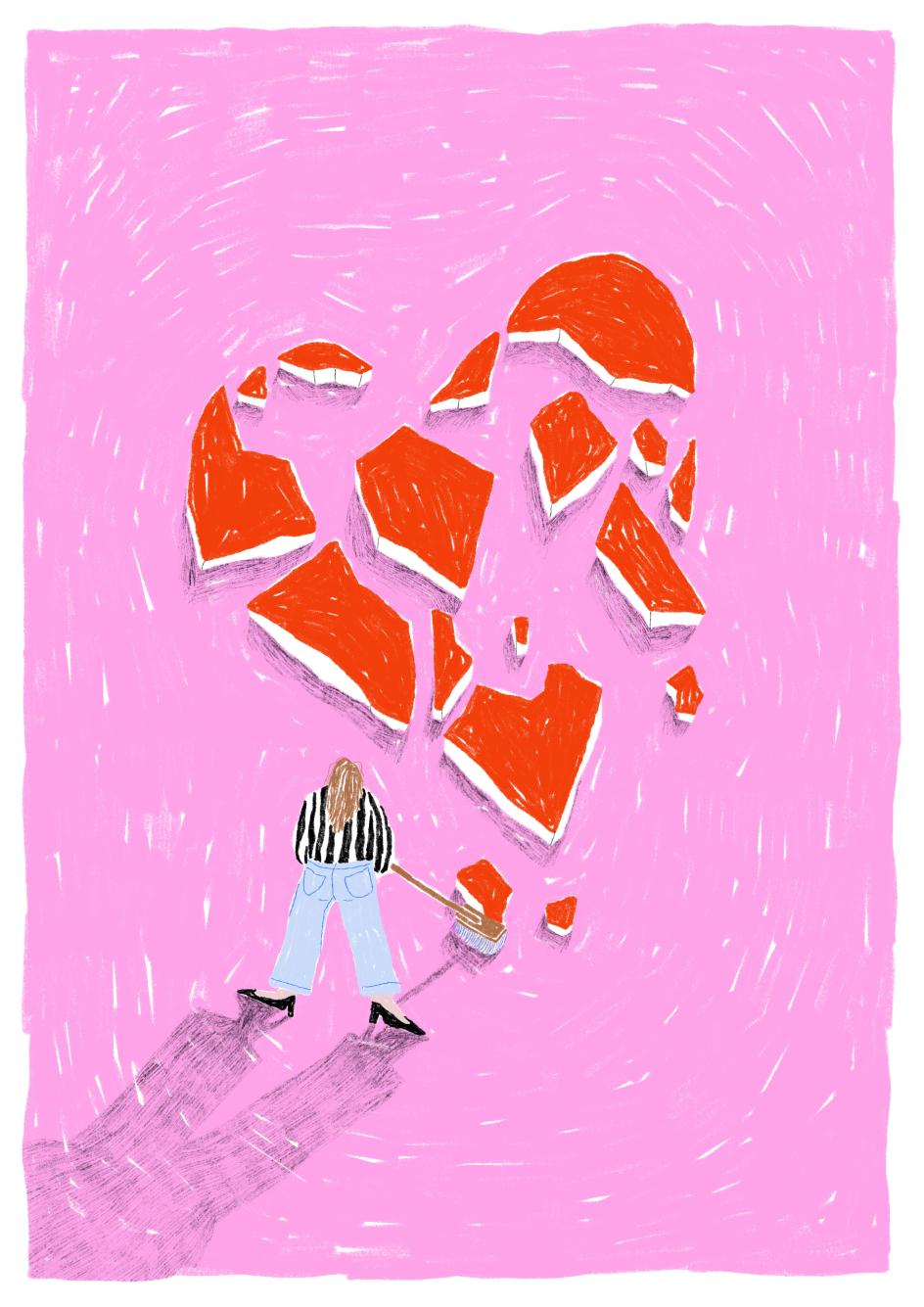
Personal work
With her talent, Pia has continually proven that the extraordinary can be found in the ordinary. After graduating from the Technical University of Nuremberg in 2020, she worked in a design studio in Berlin, all the while building up her portfolio. On social media, her drawings attracted an audience and requests to buy prints. They also found her clients, and in 2025, she went freelance full-time.
"Every self-initiated piece is incredibly important and has had a strong influence on my commercial work as well. Most clients send me screenshots of my personal illustrations as references for their briefs, and only rarely examples of my commissioned work. In that sense, self-initiated projects not only nourish my artistic practice, but often also pay off financially later on," she says.
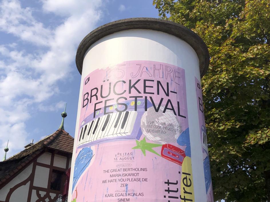
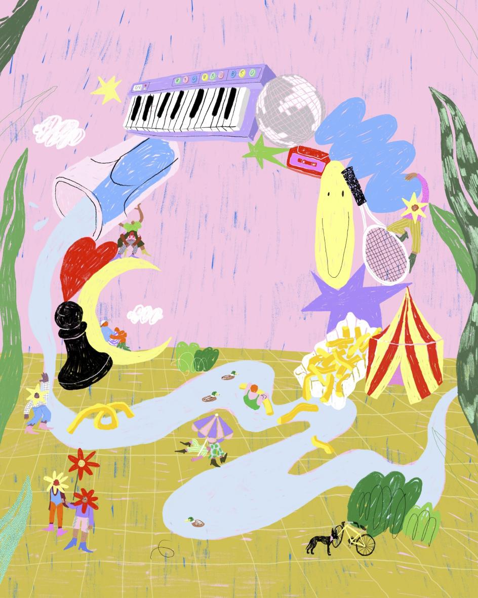
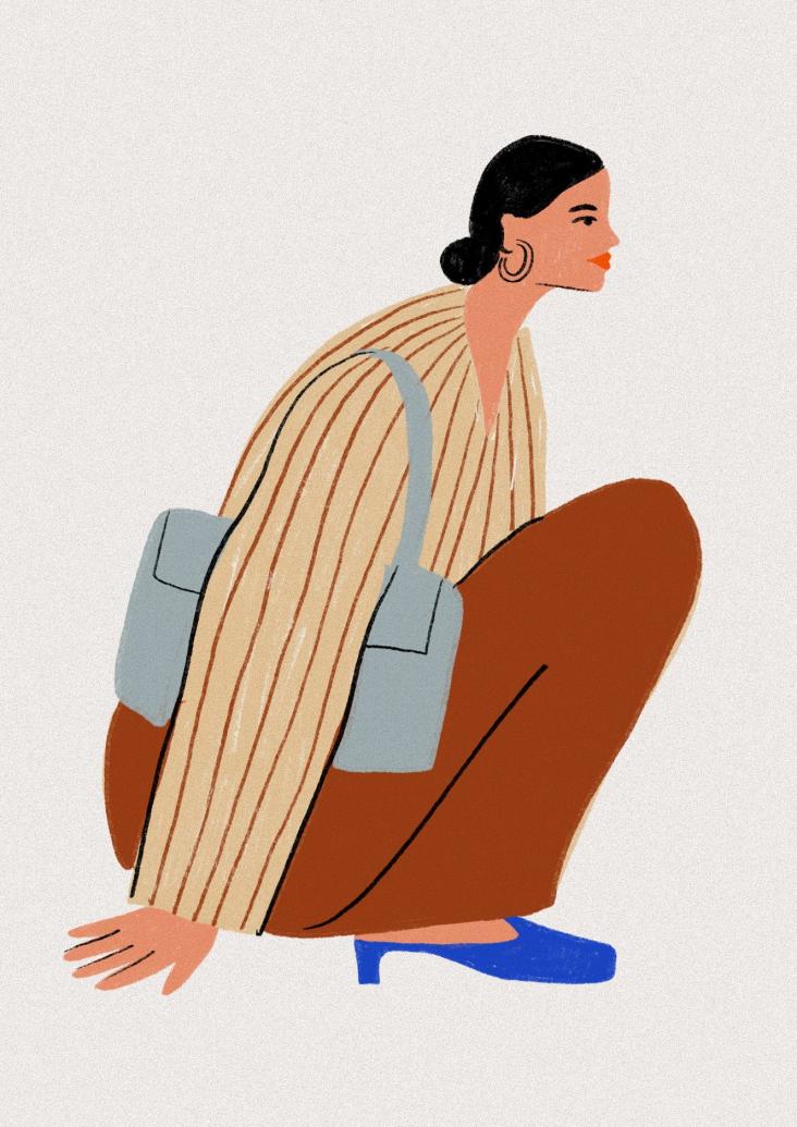
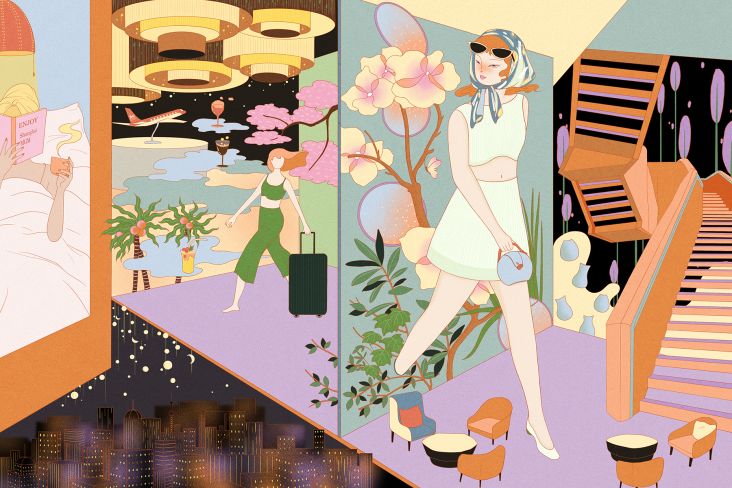
Key art for the Brücken Festival
There have been other unintended side effects, too. For example, the rich colour palette Pia uses to celebrate the everyday has gradually found its way into her wardrobe, she says.
While highlighting the beauty in everyday objects is a way of expressing gratitude to the world around us, Pia uses her visual language to lower the barriers viewers may perceive, inviting them to engage with a topic or experience an emotion. However, her intentions reach beyond simple issues to express deeper messages as she explores social themes such as feminism.
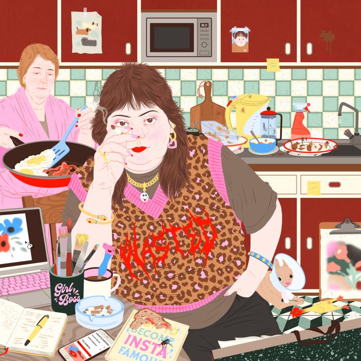
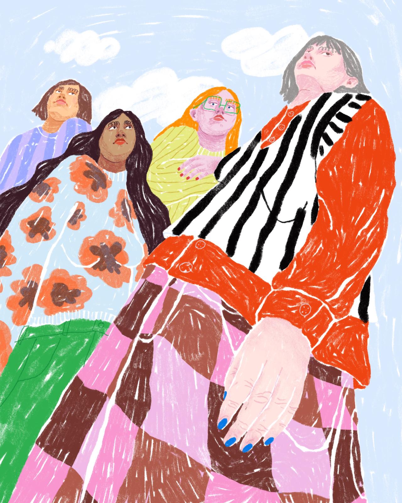
"One example of this is my personal piece FCKNZSGRL, which was later featured in the publication Slanted Bavaria," she explains. "It's also very important to me that people feel seen through my illustrations, and that they can form a sense of connection with the work. Like with a good friend."
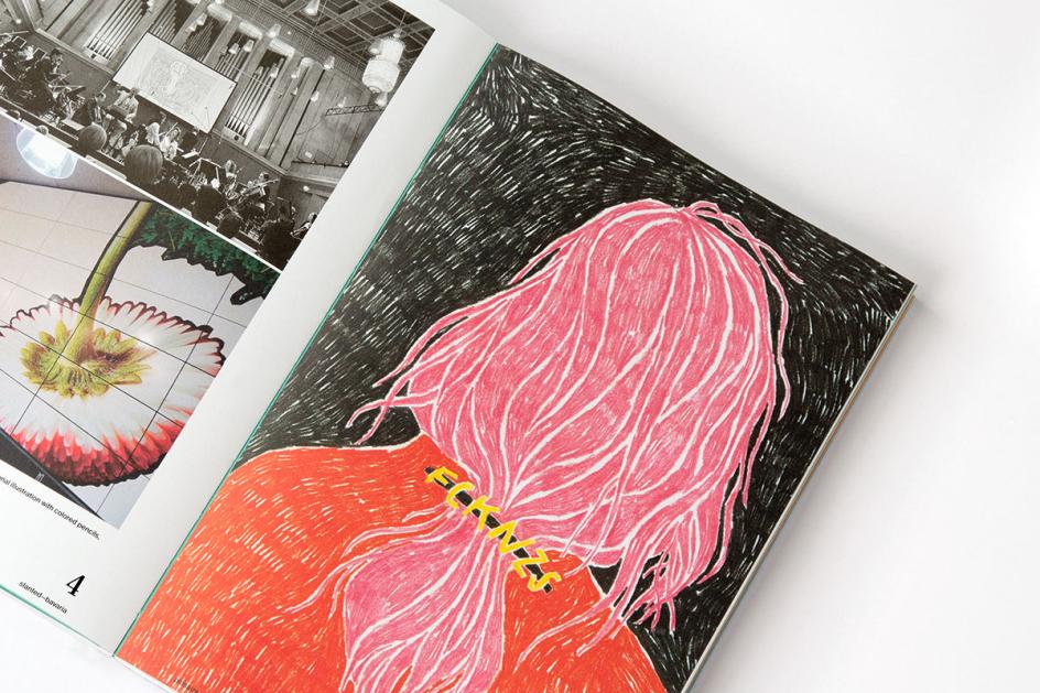
FCKNZSGRL in Slanted Bavaria
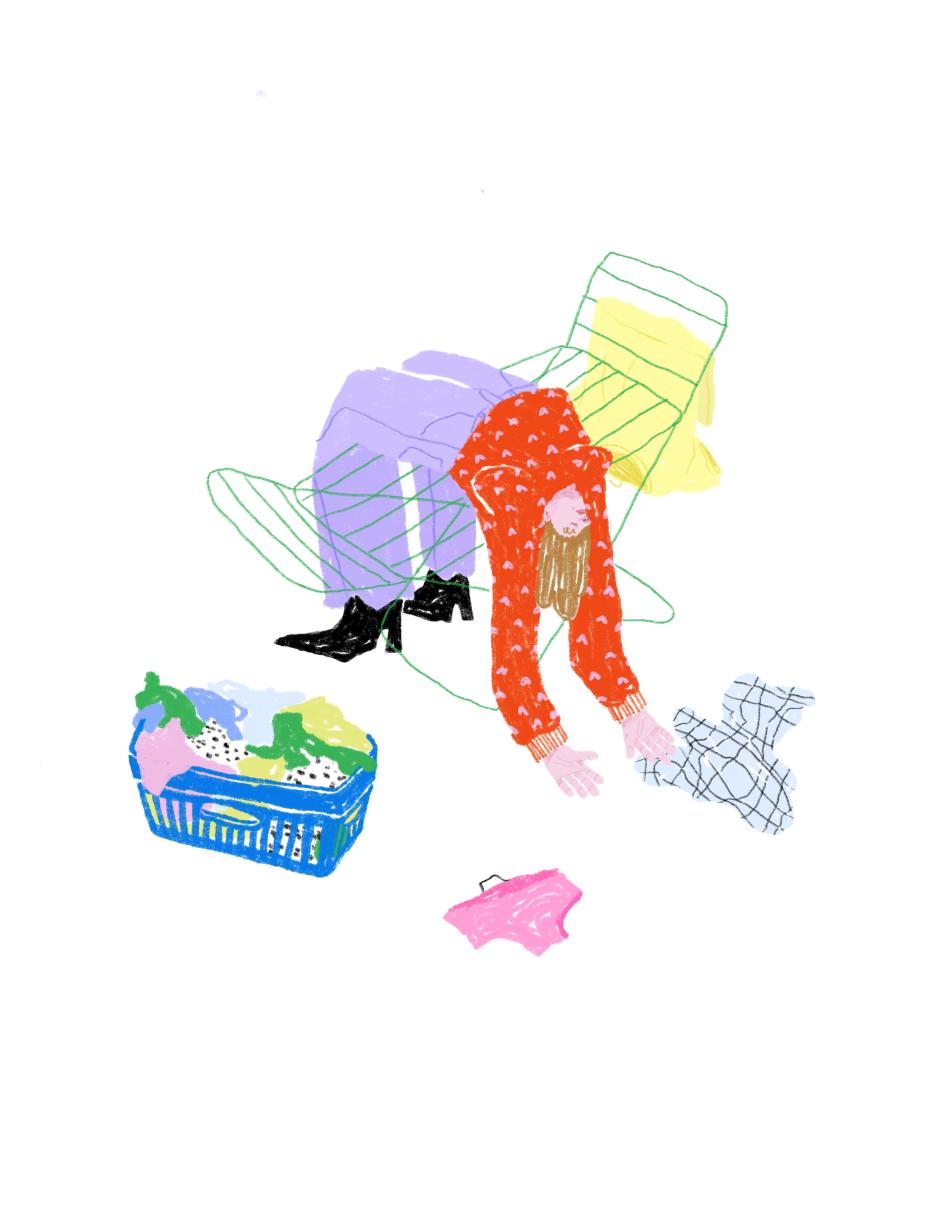
Illustration for carer feature in Brigitte magazine
One of Pia's favourite recent client projects is a series of illustrations for Brigitte magazine depicting care workers. This included the cover artwork and five spot illustrations that bring out the emotions of diverse women in the care sector. She enjoyed interpreting an important topic which was new to her.
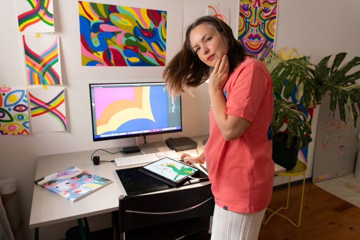
Pia's visual style comes from her background working in pencil, coloured pencil and acrylic paint. Though nowadays she works digitally using a tablet to simulate the natural media, her loose drawing style remains. "I would say my style is somehow well drawn, but also slightly off. That's partly because I struggle with perceiving perspective well. A fellow student once called my way of drawing perspective 'Pia's flip-up perspective'," she says.
It's a phrase she now proudly owns.
While we've worked on this piece with Pia, she's been as busy as can be, and has plenty of ambition for the future. "I would absolutely love to illustrate large-scale campaigns, for example, for a fashion or footwear brand, or paint huge murals for public buildings or stores. Also, I would love to illustrate a tarot card deck," she concludes.