Avoiding the unnecessary: Brodie Kaman's tactile, typographically-led practice
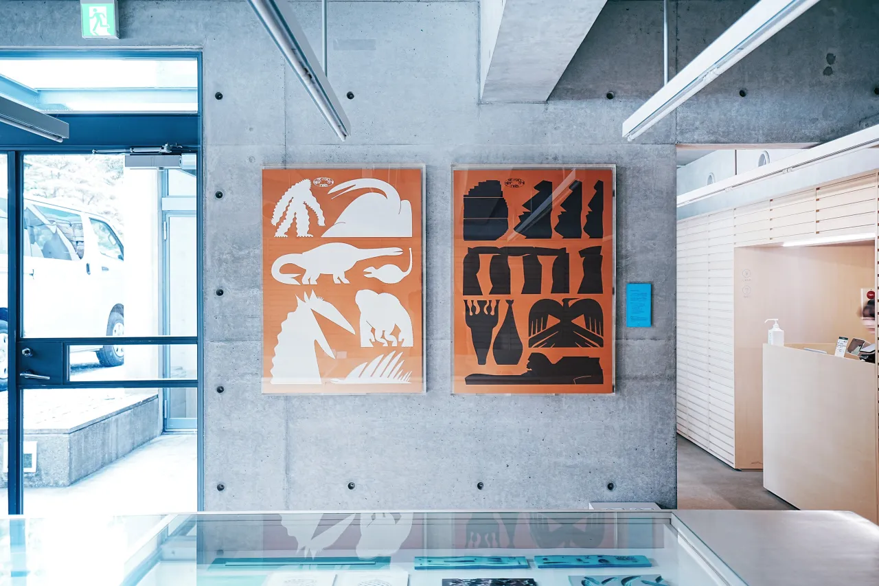
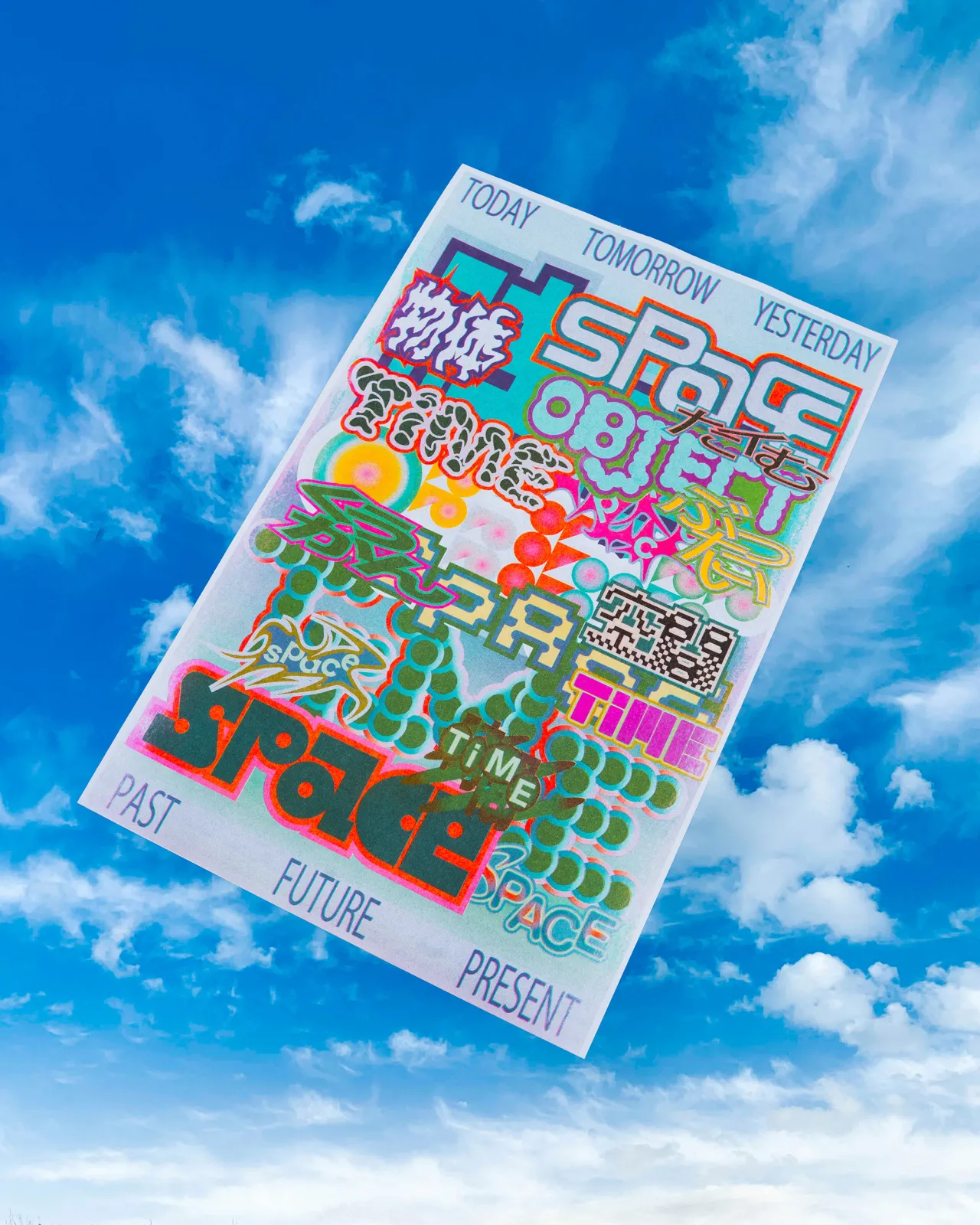
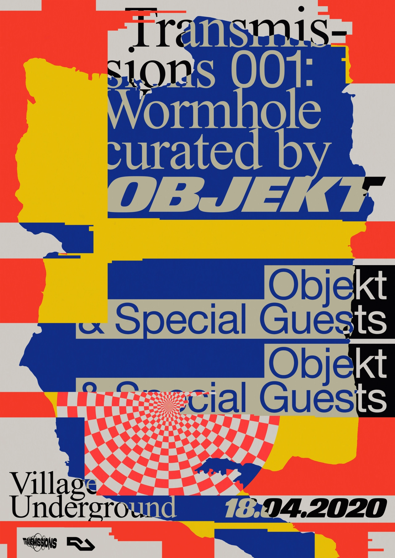
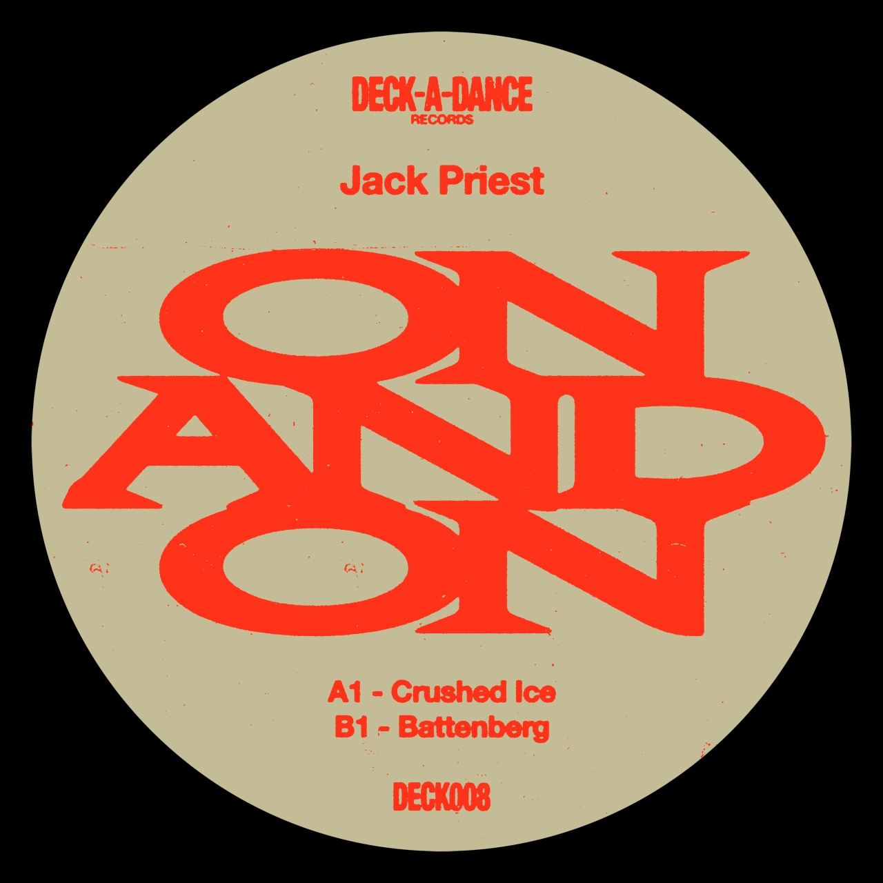
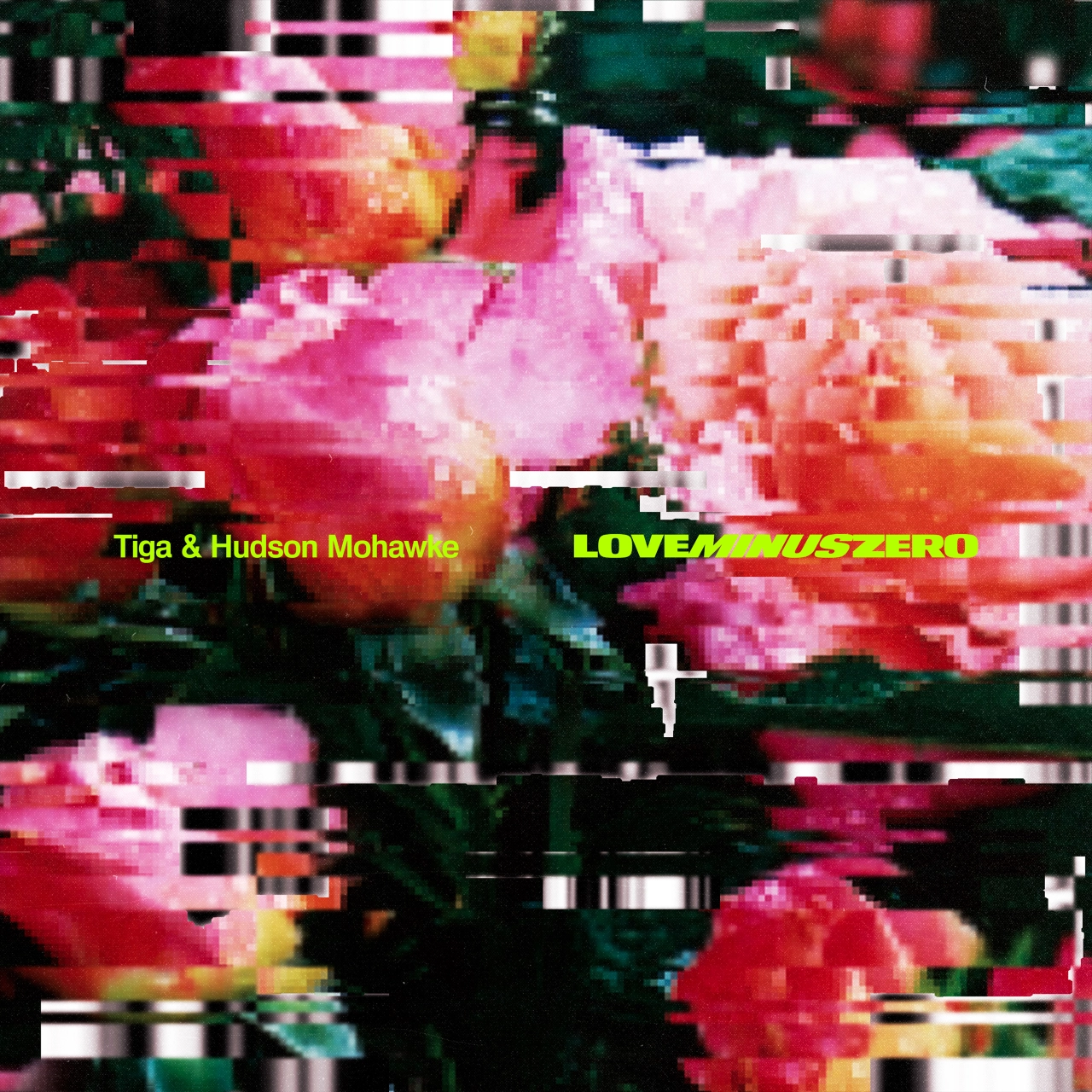
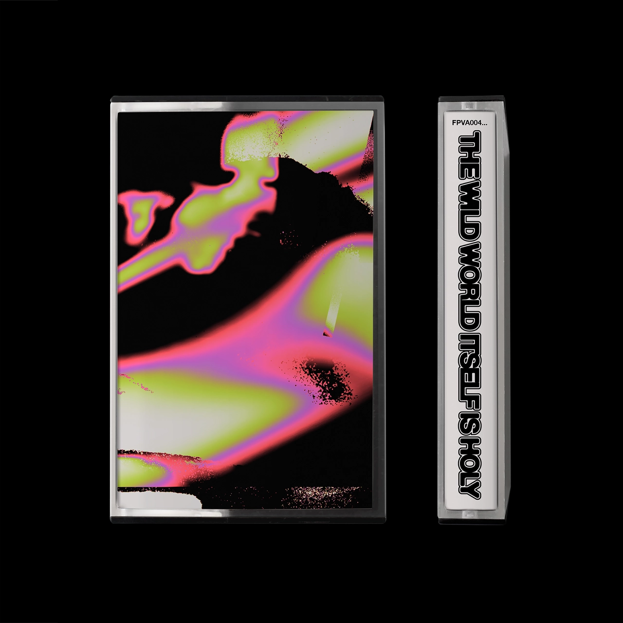
Berlin-based art director and graphic designer Brodie Kaman is a force to be reckoned with, boasting a captivating practice that combines a dynamic starkness with a relaxed, somewhat free-hand candidness across the work he does.
"I like to switch up my approach per the task at hand," Brodie tells us. He works primarily in the music industry, having recently created the design and typography for FKA Twigs' latest album Magdalene – a record cover and brand that is slick, striking and sophisticated at the record itself.
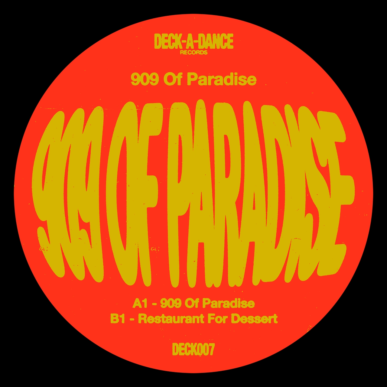
Producing designs with a solid punch to them, Brodie explains, "I don't set an intention for things to come across that way, but I prefer not to get caught up with unnecessary details for the sake of it. I've always been attracted to strong imagery," – where the visuals of which are a strong concept in themselves and not necessarily reliant on a rigorous, academic underpinning.
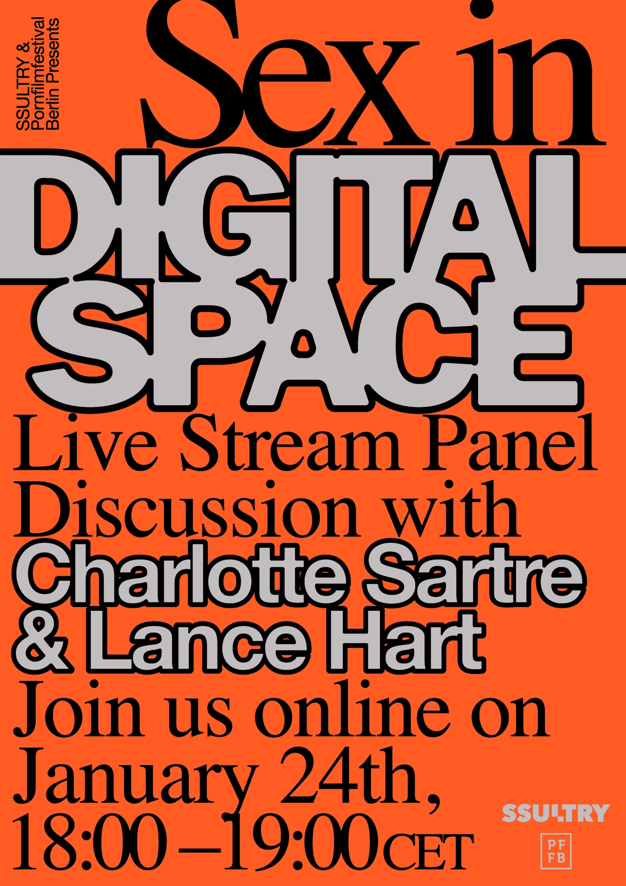
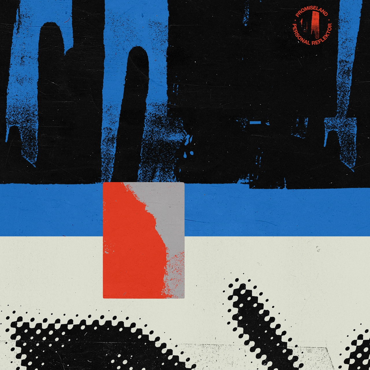
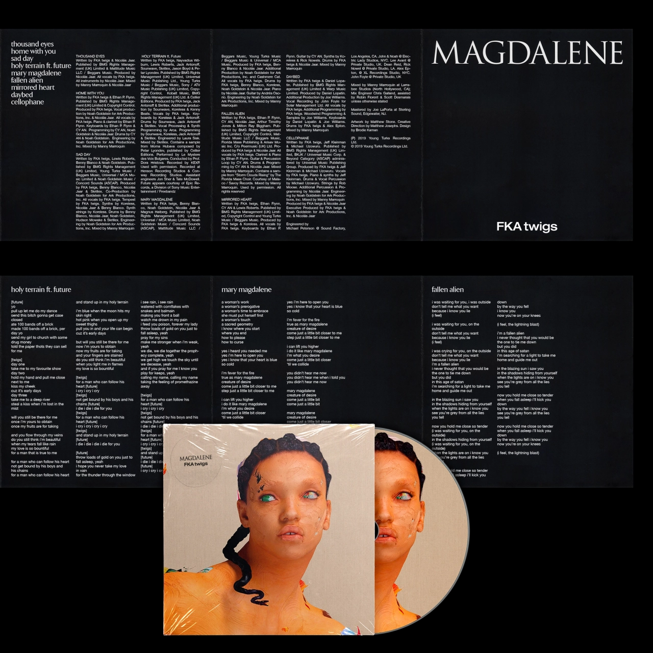
Creating work that bridges the gap between a rough, tactile, '90s aesthetic and aggressively contemporary design, Brodie commits to a very distinct style. It, however, is something that he tries hard to deviate from.
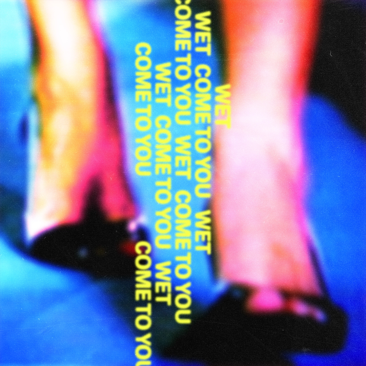
"Having had more downtime than usual over the last 12 months, my approach has evolved and become less structured," Brodie recalls, "which has informed my work." That's whether it's his playful typography and direction for ADE's latest video for 'Another Weekend,' or Brodie's rebrand for Companion.
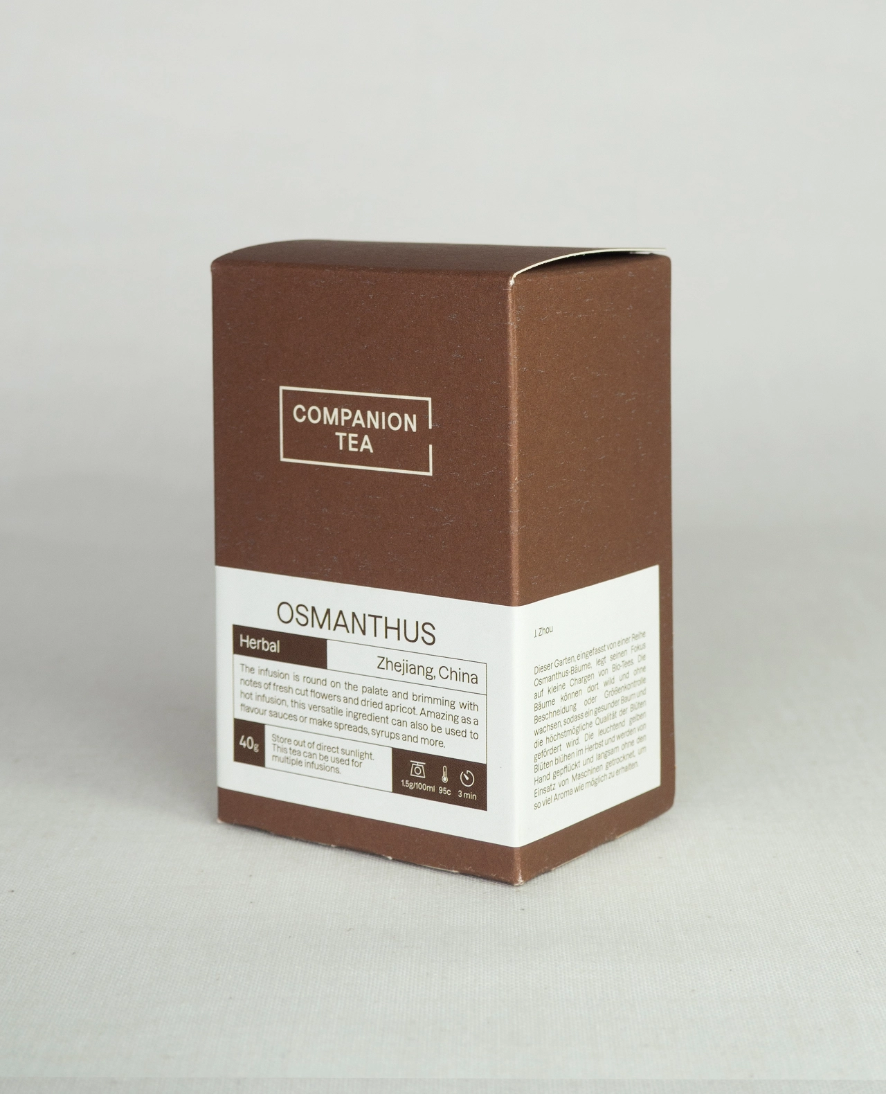
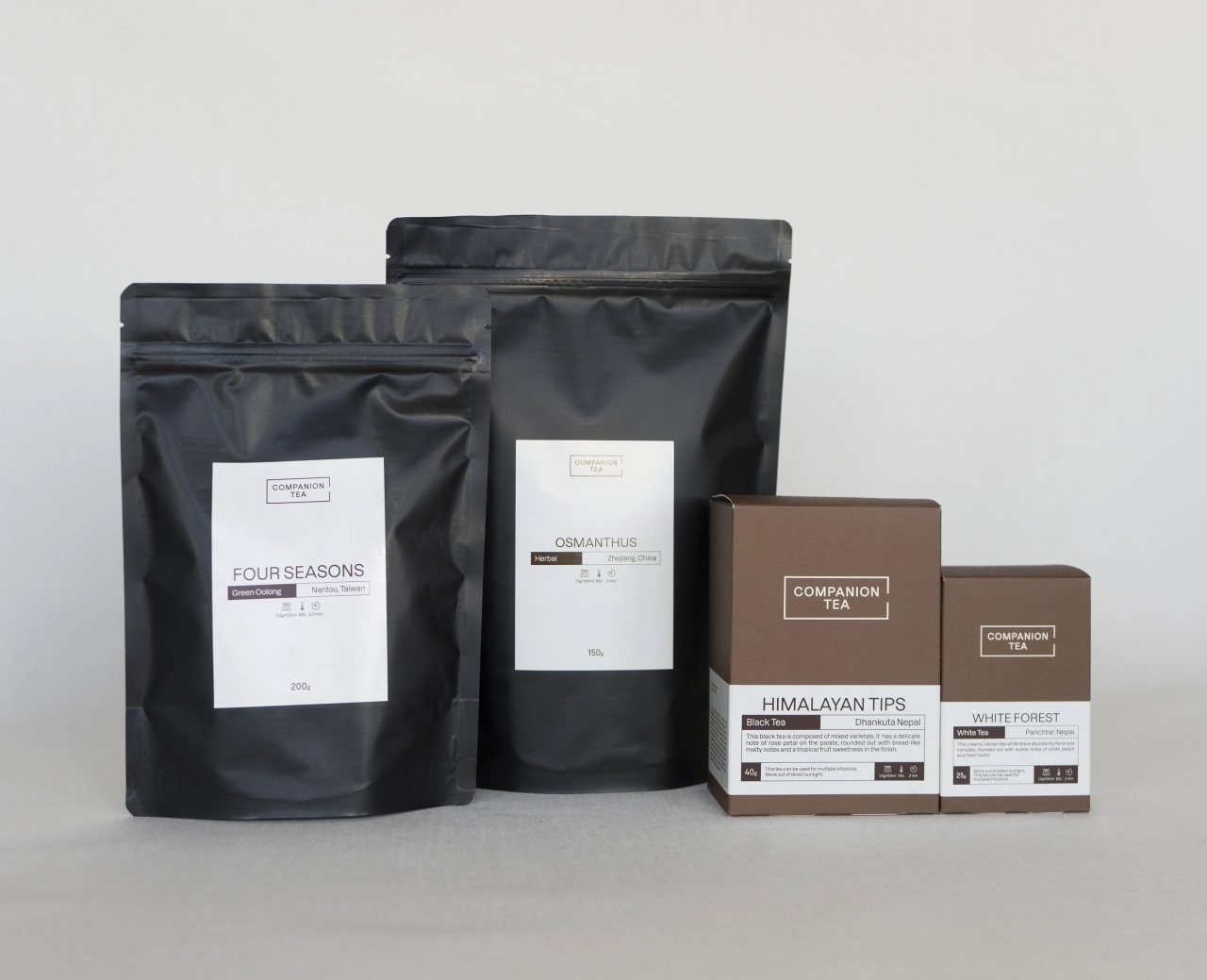
Based in Berlin, Companion is a cafe and boutique tea importer in need of an update, turning to Brodie for a fresh face. "As an established business, we didn't want to have a complete departure from the existing branding," Brodie concludes.
"We aimed to bring the visual identity of Companion up to speed with how the business has grown and matured since its inception in 2013," fundamentally reflecting Brodie's independent practice that is equal parts referential and future-facing.
Editor's Picks





Trending






Latest Jobs
Senior Creative Lead at Random Studio
Full-time·Amsterdam / Paris·€90k-€110k
Junior Project Coordinator at Colorido Studios
Full-time·Twickenham·£28k–£32k
Design Lead at Madeo
Full-time·New York City·$85k–$120k
Senior Digital Designer at Red Antler
Full-time·New York·$95k-$130k
Design Director at Koto
Full-time·London·£72k-£90k
Midweight Designer at All Purpose
Full-time·London·£30k–38k