Cannabis-based brand Breez gets a dope new identity courtesy of Robot Food
Leeds-based branding consultancy Robot Food has collaborated with Californian company Breez to breathe new life into its range of cannabis-infused products.
This was the first time Robot Food had worked in a cannabis product
The last few years have seen cannabis-based products become a booming industry. And leading the charge in that sector is Breez, which has recently been given a new identity courtesy of Robot Food that establishes its position as a fully-realised global brand.
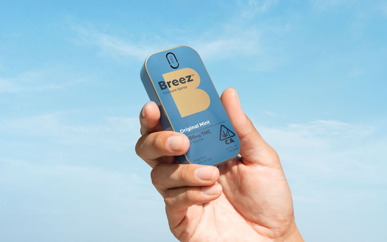
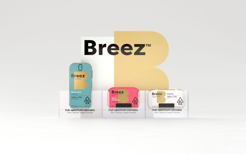
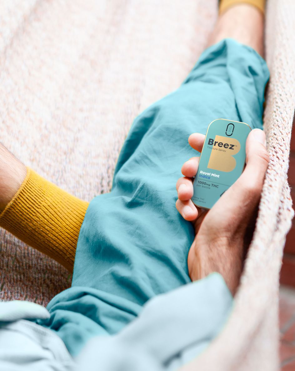
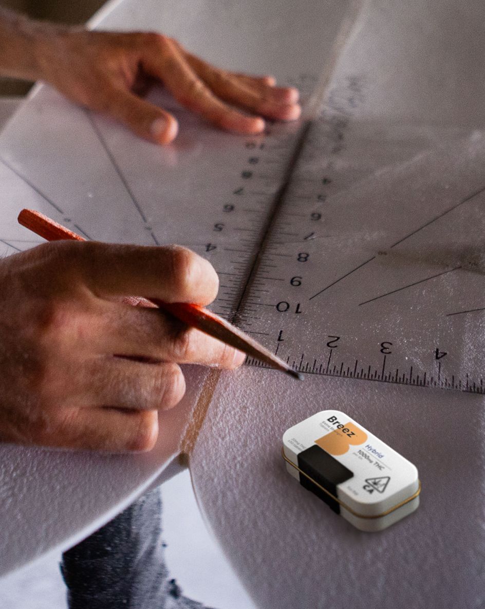
For the uninitiated, Breez is a cannabis lifestyle product brand which sells mints, tincture sprays and tablets that are made using "the highest quality full-spectrum extracts to preserve the full natural goodness of the cannabis plant." Following changes in legalisation, Breez has become the number one cannabis pill in California and the number one non-gummy edible.
Breez is the number one cannabis pill in California
Changes in legalisation have lead to a Cannabis boom
But given the broader perception of cannabis, brands in this sector still face a series of uphill struggles. Chiefly, they need to have a sense of authority and establish trust with the public due to the market being cluttered with inconsistent products that don't live up to their promises.
And these are the areas Robot Food honed in on. Recognising that there was a void for a "beacon brand", the consultancy focused on positioning Breez as a "functional and utilitarian lifestyle product".
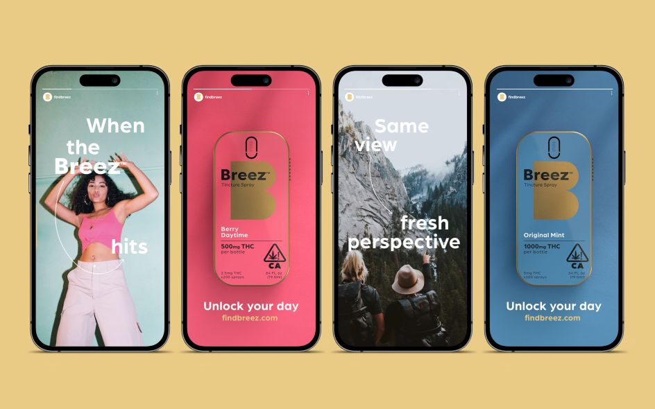
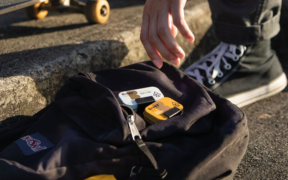
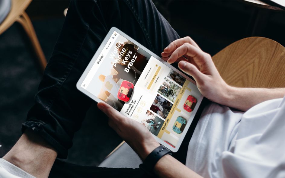
Running with the idea that Breez's products are part of an essential ritual in people's daily routines, Robot Food wanted the brand to be seen as empowering and capable of "unlocking the benefits of cannabis from an easy, reliable and trusted source."
To do this, Robot Food leans on vibrant colours and bold illustrations. These are based on the central idea of helping people to 'unlock' their day, hence the inclusion of swooping arrows which grounds the idea in relatable actions. And as each product in Breez's range of tablets, mints, and sprays directly targets specific well-being issues, these are reflected in the colours and packaging designs.
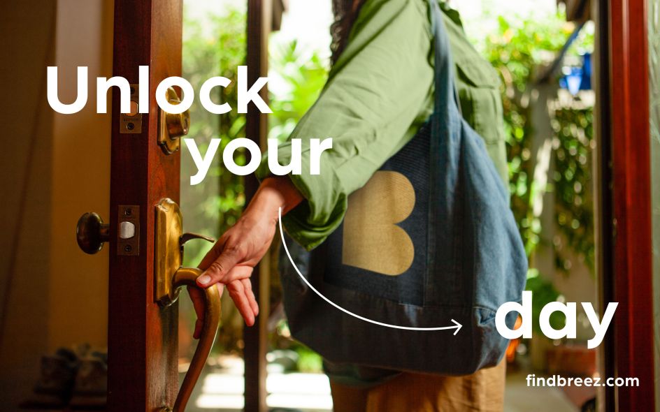
At the hear of the new brand is the idea of unlocking your day
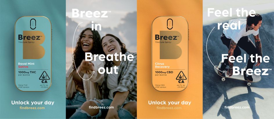
Bright colours and illustrations are the the heart of the identity
Robot Food client director Jess Cook reveals that during the workshop phase for this project, she found that the customer base was "very broad", which provided plenty of scope for the branding. "They have so many amazing stories in the feedback from their users – real people saying how the products have helped them with things from aches and pains to creative inspiration," she reveals.
These stories showcased the benefits of Breez's products humanly and fulfilled the need to reinforce trust with customers. They also indicated that Breez would be better off not pitching itself as a 'hipster' brand as this would come across as too niche and alienate some of its customer base. Instead, this workshop data proved that Breez was well-placed to open itself up to a larger segment of the population by positioning itself as a commonplace accessory to everyday life.
Curiously, Robot Food had never worked with a cannabis product before. However, the team applied its expertise in FMCG branding to the brief and soon realised its ignorance was somewhat advantageous.
"We were quite naive about the category until we started working on it," says Robot Food founder and executive creative director Simon Forster. "That was a real benefit because it meant we could look across the existing brands and ask, 'why does it all look the same?' There's no reason for it.
"The category was still missing a beacon brand that stands above the rest, bridging functional, emotional, flavourful and benefit-led in a way that just fits into your life," he adds.
Robot Food positions Breez as an everyday accessory
Previous design elements were retained and reworked
User profiles helped to create the new brand
The brand wants to be accessible for new users
And as well as reflecting Breez's status as a leading brand, the new identity was also a welcome opportunity for a bit of a tidy-up. Over the years, Breez's brand architecture had become somewhat confused as new products were added, so Robot Food decided to simplify the range and establish clear differences between phenotypes, cannabinoids, strengths and flavours.
It wasn't a total overhaul, though. The vibrant colours of Breez's identity are still present, and its familiar, blocky typography has been carried over and given a slight reworking. All of these changes help Breez to lead with functionality and consistency, which helps the packaging to convey a lot in a limited space without compromising aesthetics.
"The packaging is almost functional, but it sits within this beautiful brand world," Forster adds. "A lot of consumers in California are very aware of the category, and they know what they're looking for. But for many, it's still quite scary if you don't know anything about it. Breez's new branding feels much more accessible: not this closed-off cannabis' club.' If it's the easiest to read and get to grips with, then you're on to a winner."
He concludes: "We referred to Breez almost like a Swiss Army Knife. It has a utilitarian feel, but it still feels friendly, and our positioning is all about unlocking your potential."
Editor's Picks


Trending


](https://www.creativeboom.com/upload/articles/90/908fdb6378db1e95d12595416f54e6336d5e80b8_732.jpg)
Podcasts


Editor's Picks
Further Reading