NFUZD is the cannabis brand identity that dares to look completely different
José Manuel Vega's bold new branding project proves the cannabis industry doesn't have to look like, well, the cannabis industry... and the results are gloriously, unapologetically fun.
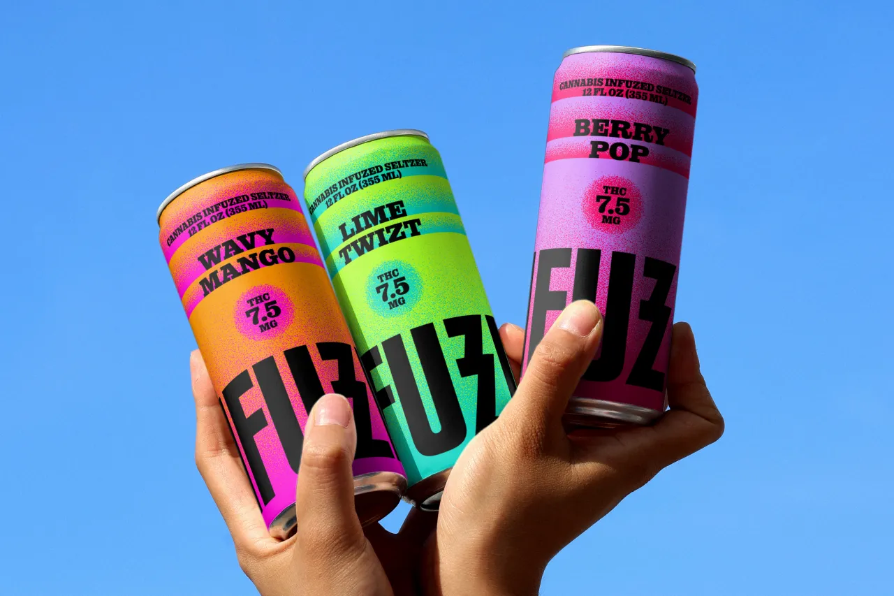
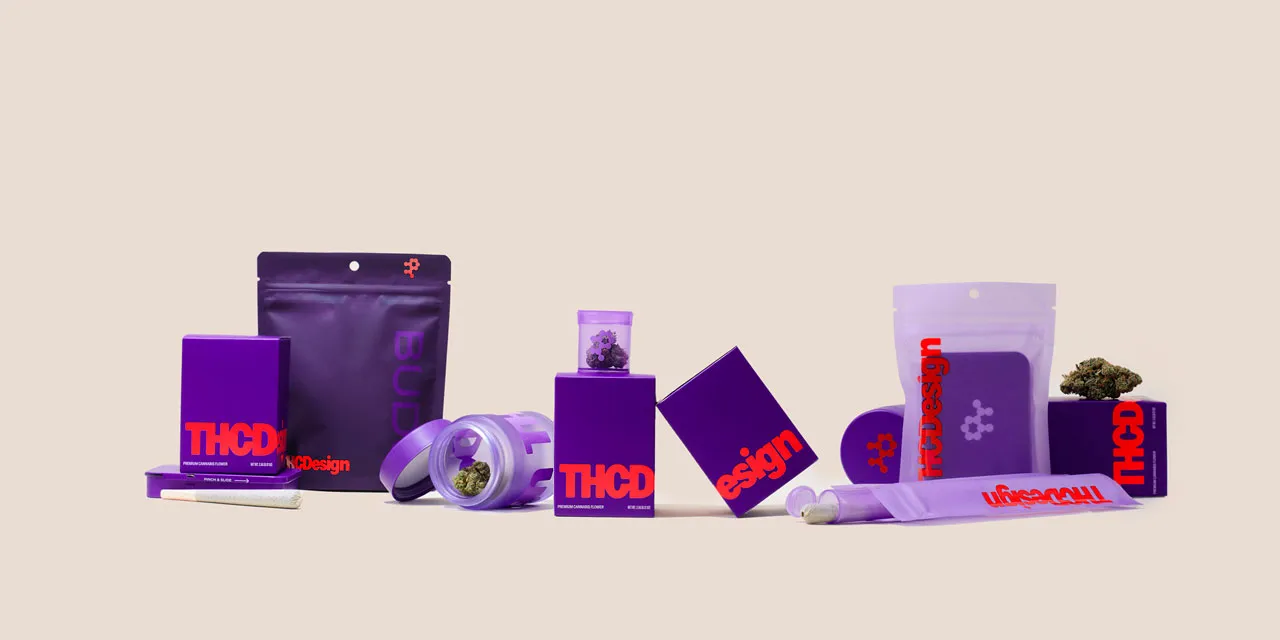
Cannabis branding is so visually established that breaking from it feels almost radical. That's the problem José Manuel Vega set out to solve with NFUZD, a brand of cannabis-infused seltzers that wanted nothing to do with the usual aesthetic playbook. No massive green type or obvious symbols, just a riot of unexpected colour and joy.
Vega is a brand designer currently based in Malaga, Spain, though his story is anything but local. Over the past 12 years, he's lived and worked across Germany, the UK, the USA, and Spain, enjoying a roving life that shaped a properly international design approach.
He studied at the University of Málaga but discovered his passion for the craft during a year abroad in Stuttgart. Hip-hop, he'll tell you, is a big influence. You can feel it in the work: bold and direct.
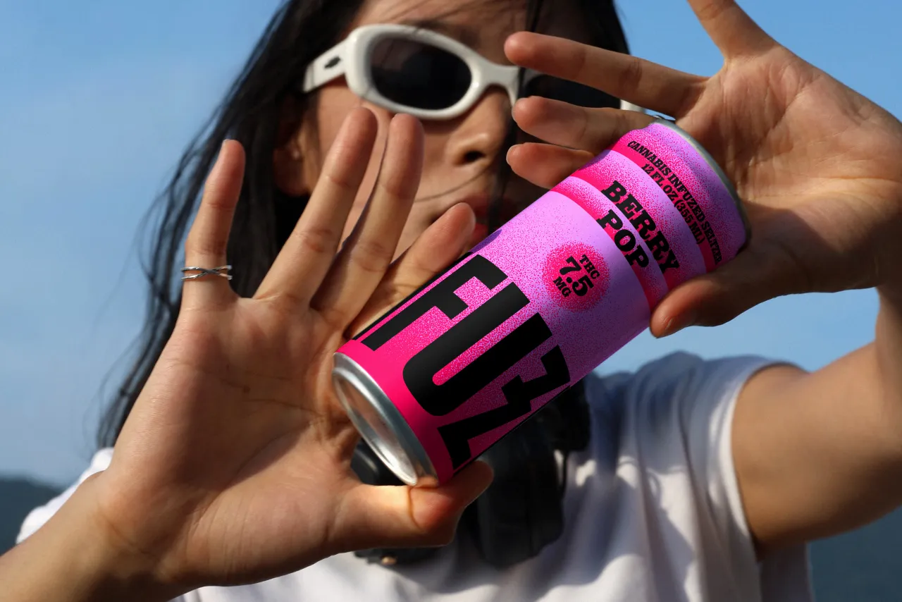
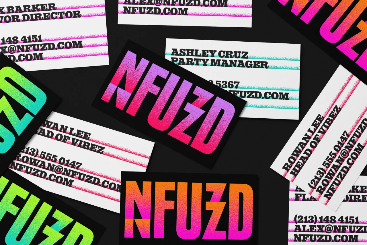
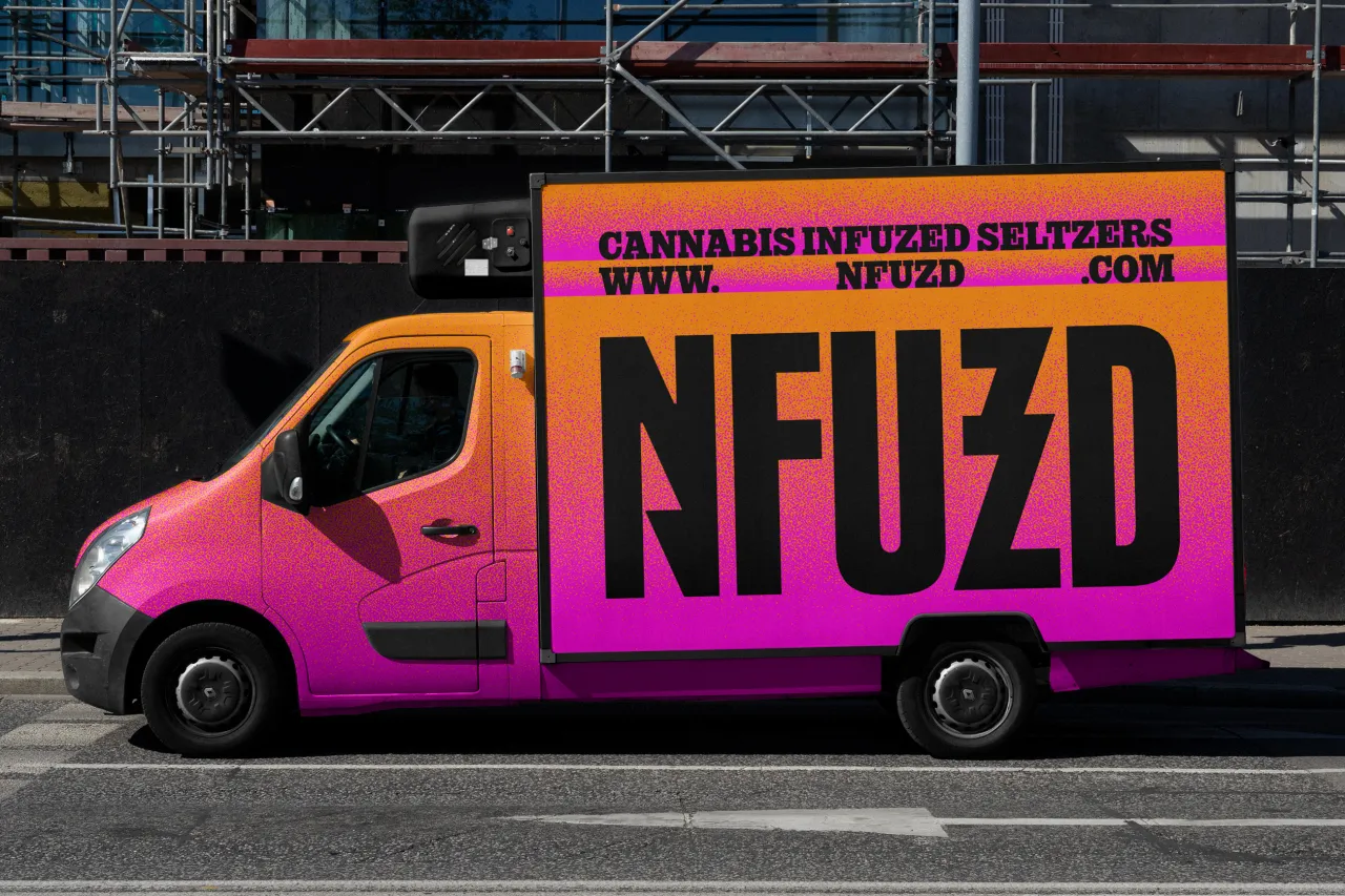
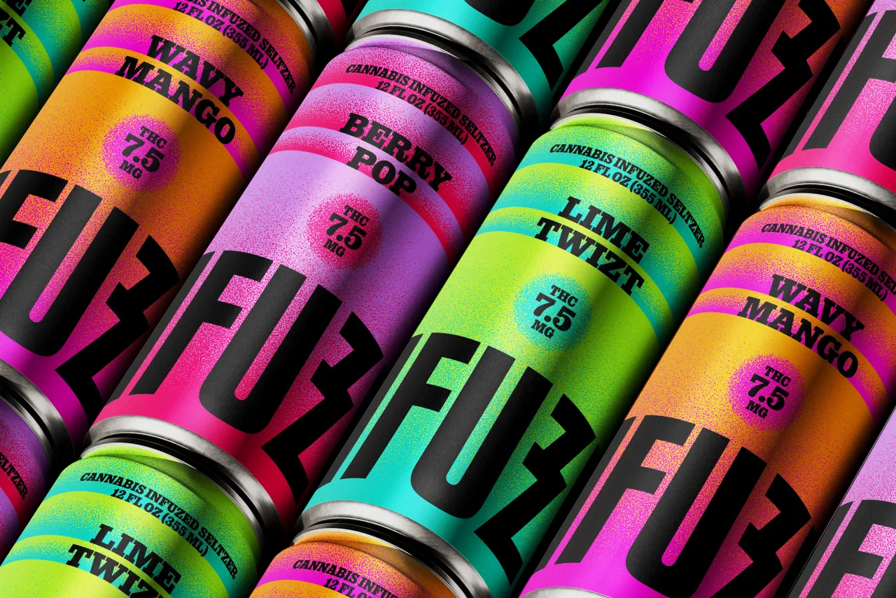
With NFUZD, he had a client willing to go somewhere different, and he ran with it. The dream brief everyone wants. But when Vega considered the cannabis category, he realised it tends to default to a familiar visual language: earthy tones, hand-drawn botanicals, overworked script typefaces. "It's not that these don't work," he explains, "it's that they've become a kind of visual shorthand that stops brands from saying anything new." But NFUZD wasn't interested in blending in.
Instead, Vega looked to the '80s and '90s for inspiration – an era that understood maximalism in a way that still feels exciting rather than exhausting. Think saturated palettes, layered gradients, and a subtle grain texture that evokes both the sparkle of seltzer and a little more sensory appeal. Vega's resulting colour system is vivid but controlled; there's real craft in knowing how many bright colours you can hold in tension before things fall apart.
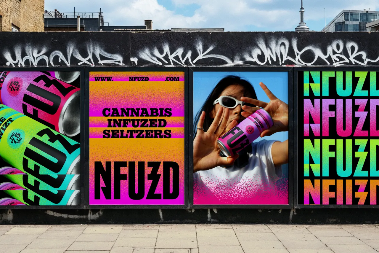
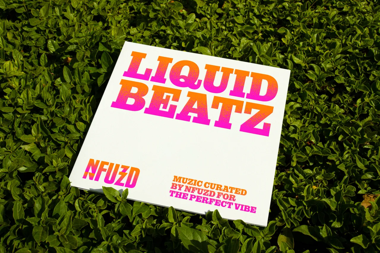
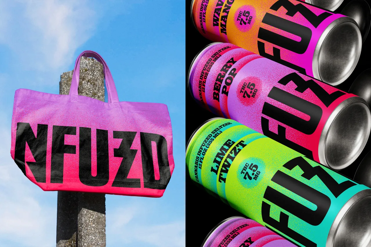
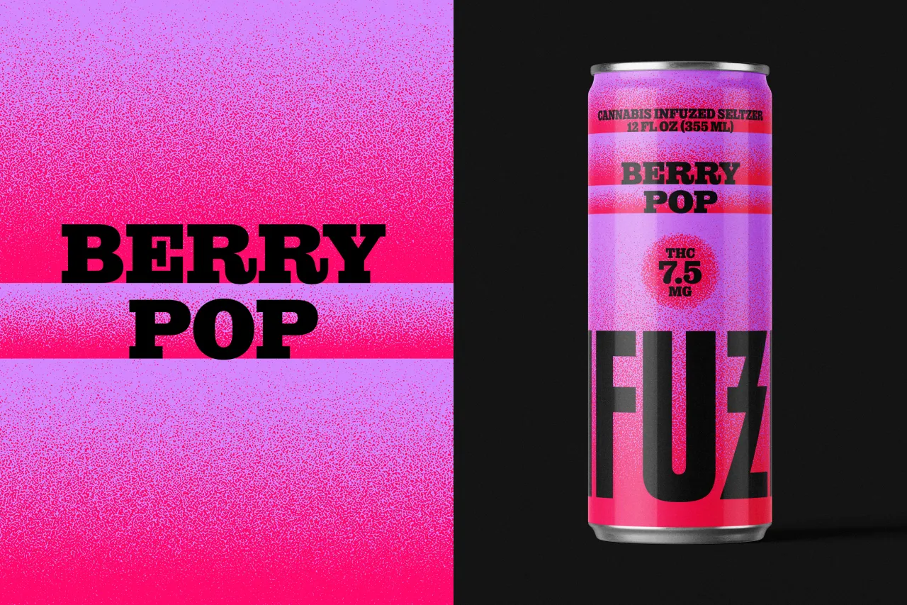
The typography is retro without tipping into pastiche. The primary typeface sits naturally within the gradient-heavy world Vega has built around it. And the logo itself channels something of the spirit of '90s rock bands: bold enough to read from a distance, with a visual shift built into certain letterforms that quietly nods to the product's effects without spelling anything out. It's confident, a little rebellious, and exactly right for a brand that describes itself as "the life of the party".
Vega believes that a brand should be "an oasis where the eye wants to rest and stay". With NFUZD, he's done a pretty good job at that; only the oasis he imagined is neon.
Editor's Picks





Trending


Latest Jobs
Account Manager at BUILDHOLLYWOOD
Full-time·London·£34k–£38k
Growth and Client Development Director at 3800
Part-time·Sheffield·£60k-80k
Digital Marketing Executive at Arise
Full-time·Sheffield·From £23,750
Head of design at Cog Design
Full-time·London·£55K
Principal Software Engineer at BBC Media Tech
Full-time·Glasgow·Up to £83,790
Project Manager at A Practice for Everyday Life
Full-time·London·£37k-£46k