YumBun’s 'optimistic' new look features a 'bunrise' and a mascot called Bowie
Branding agency How&How has created a new identity for the 'street side bar' brand YumBun, rooted in 'progressive optimism'.
The studio started working with YumBun founder and CEO Lisa Meyer on the project in November last year. How&How co-founder and Creative Director Cat How designed the original Yum Bun logo when the brand launched 15 years ago. "It has had a few design iterations since," says How, "so it was great to have a crack at a new version."
Meyer, who is half Japanese and half Swiss, briefed How&How to reposition YumBun's strategy, visual and verbal brand, and create a new website based around the "fusion of East meets West present in the bao buns," says How.
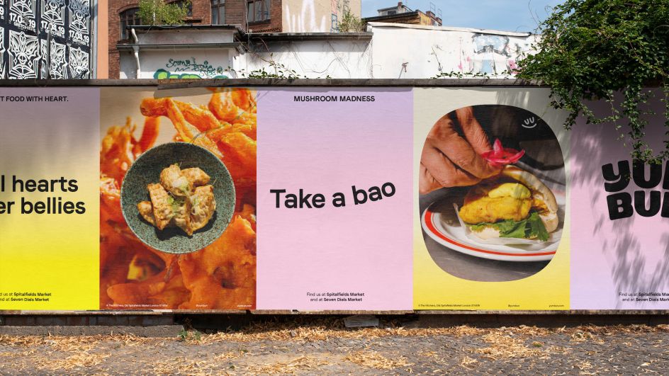
The "optimistic" new look also had to highlight how Yum Bun is raising the bar of street food in London through things like ethical sourcing practices and profit-share with employees.
Since YumBun is "London's original streetside bao" and "takes street food back to its OG meaning," according to How&How, the brand strategy, visual identity, and tone of voice look to reflect that sense of "progressive optimism".
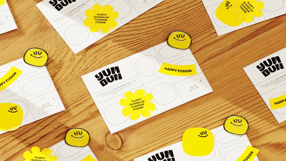
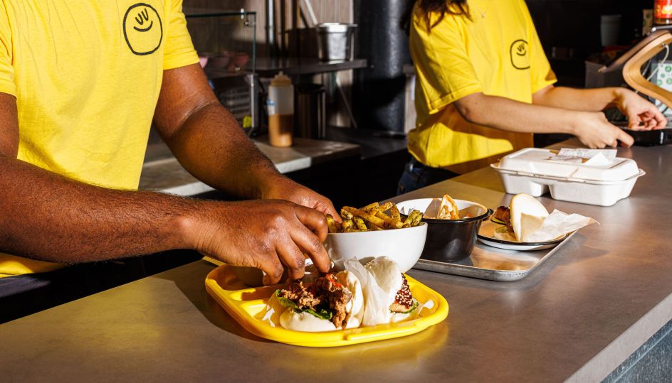
The new look aims to amp up the former branding's "feel-good vibes" through a soft pastel colour palette. How&How introduced a "bouncy bao mascot" dubbed Bowie – one of the studio's project highlights. "It was so much fun working on the different iterations of this little guy," says How. "We did loads of different tests and illustrations of him in different poses, with or without arms etc. In the end, something nice and simple turned out to be the best."
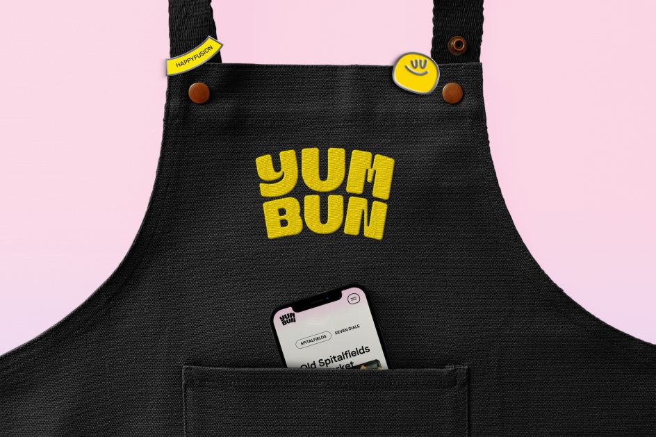
How&How embedded the identity with "an emotional narrative which paired the rising of the buns in their steaming baskets; with the raising up of standards in the food industry," says How. "The metaphor we used for this was a sunrise — an elevating and optimistic moment at the beginning of the day. We called it our 'bunrise'."
The new Yum Bun logo is based on the bold footprint of Japanese Kanji Hanko stamps. The use of that influence recalls the idea of Yum Bun's culinary merging of classical with contemporary influences and East with West. The custom Yum Bun word mark is based on the font Ogre Mono Grotesk by Brazil-based Leme Studio.
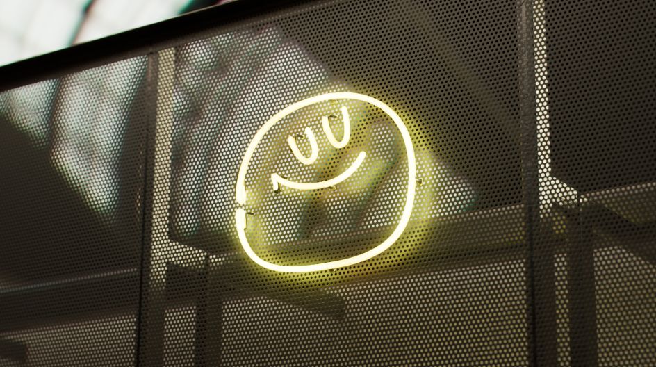
The revamped colour palette was inspired by sunrises, using yellow as a primary colour to further underscore the sense of optimism. The gradients draw on the patterning formed by clouds at dusk and also reference the steam from bao buns. "Gradients were a great way of visually communicating steam and elevation," says How.
Christian Beck, How&How creative director, adds, "The brand idea was 'Bounce and Rise', speaking to the bouncy buns, playful energy and standard-raising culture. The new logo mimics YumBun's fusion of Japanese craft and belly-rubbing warmth. The signature brand bao goes full-blown fluffy friend. We also created typography formats to reflect different sights and sounds of the kitchen, such as 'Steamy', 'Sizzling', and 'Goodness'."
Editor's Picks


Trending


Podcasts


Editor's Picks
Further Reading