Jack Renwick Studio's identity for Veg NI builds on the 'parful' benefits of buying local produce
Jack Renwick Studio is behind a new identity for Veg NI, a cooperative of growers in Northern Ireland set up by four farmers to promote their produce in the face of narrowing margins and fierce competition from abroad.
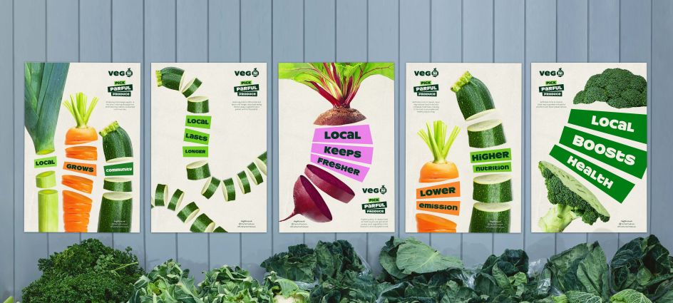
The fresh brand, positioning and messaging are centred around the core idea of 'parful produce' – that's 'powerful produce' in NI dialect (if you're not familiar) – a warm sentiment that aims to communicate the benefits of buying local veg and its positive contribution to health, economy, society and planet.
"In Northern Ireland, 'parful' is a good thing," explains the Studio. "Locally grown parful produce is fresh, in-season, vibrant and packed with flavour. It's had less time to lose valuable nutrients, which is fantastic for our health. It lowers emissions and waste in the supply chain, so it has a positive impact on our planet. And keeping things local means keeping money local, so it's parful for farmers, growers, pickers, drivers and grocers, creating employment and fostering vibrant, connected communities."
From the off, the wholesome project was based on a very tight budget, with funding awarded via a grant from the Agri-Food Co-op Scheme. Veg NI wanted a "cost-effective" identity and logo for a new initiative to build awareness of its cause, i.e. getting more people in Northern Ireland to enjoy local produce and support local producers to build future-proof solid businesses.
As photoshoots were out of the question, the solution by Jack Renwick Studio was to create a "low cost, flexible, easily adapted approach to representing the variety of farmed NI produce and its many benefits". It made "bursting" veg from various free and affordable stock photography and paired it with graphic veg slices with key messaging. A dash of motion brings everything to life.
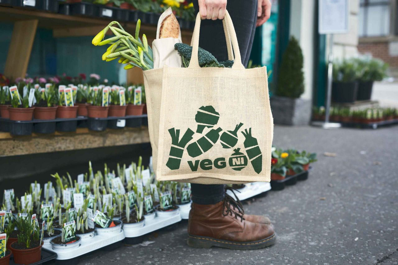
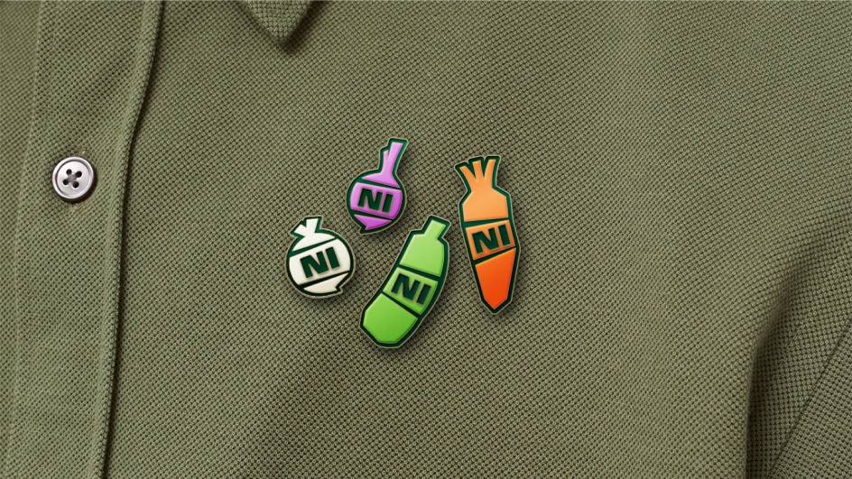
The characterful logo is based on a unicase font that cost just $12, which nods to traditional Celtic lettering and helps put Northern Ireland at the heart of the veg. "It seeks to build ownership and pride," says the studio. The veg icon, meanwhile, easily changes to give farmers a choice of logo to reflect their speciality and feel represented.
The colour palette is primarily an earthy green with different veg icons in their natural colour – for instance, the vibrant orange carrot and the cheerful purple beetroot.
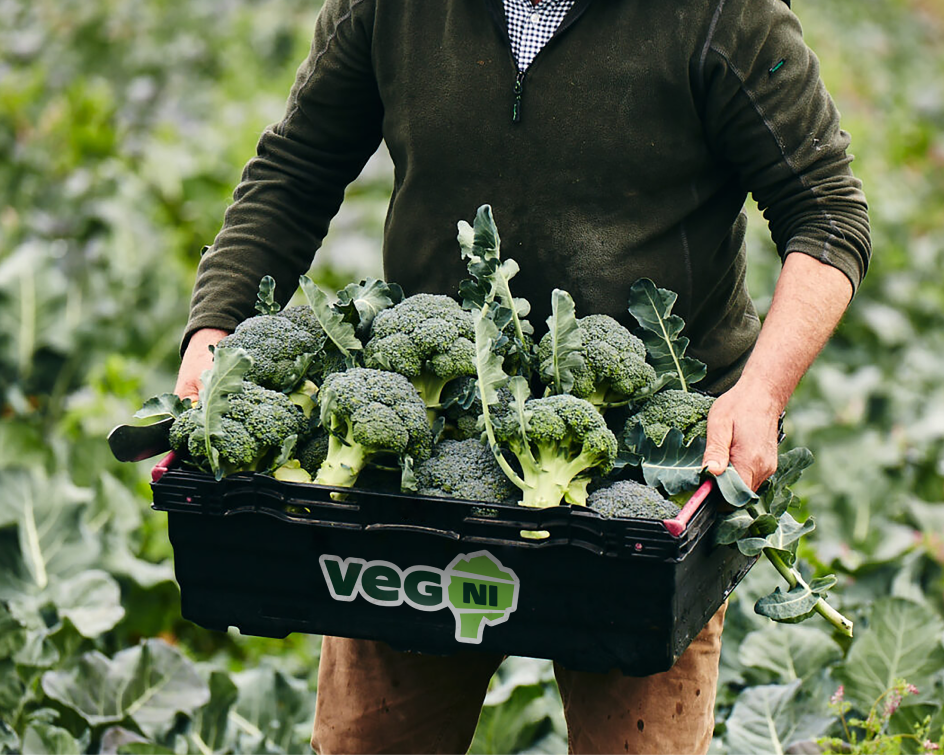
The new identity for Veg NI has been rolled out across Northern Ireland via social media channels, the brand's website, various trade shows, farm shops, digital screens, vehicles, crates and much more.
Stickers were also created to give an affordable yet bold way to help Veg NI raise further awareness. "Local shops, cafes and restaurants can support the initiative by adding one of these stickers to identify that they stock, sell and serve NI's parful produce," adds the Studio. Even the posters were designed to be A3 size, so they can be "easily produced, distributed and displayed in windows or on walls".
Editor's Picks


Trending


Podcasts


Editor's Picks
Further Reading